The second toolset contains image design tools. This toolset includes the following tools.
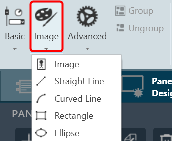
- Image
- Straight Line
- Curved Line
- Rectangle
- Ellipse
Image
The Image control is a basic Custom Panel control used for custom images such as a company logo or icon.
| Property Type |
Options |
| General |
- Control Info: Shows control type. Read only
- Locked: Specifies if the control is locked out so that it cannot be moved or re-sized.
- Checked = Locked
- Unchecked = Unlocked
|
| Appearance |
- Location: Control location (in pixels) of the control on the Custom Panel. Change X (horizontal) and Y (vertical) values in relation to upper left corner. You can also drag the control to a different location
- Size: Control size (in pixels). Change width and height values. You can also re-size the control manually.
- Image: Brings up the Select Image file window.
- Image Layout: The image layout used by the control. None, Tile, Center, Stretch, or Zoom
- Background Color: Background color of the image control. Brings up the Select Color window.
|
Straight Line
Allows to add a straight line in the custom panel.
| Property Type |
Options |
| General |
- Control Info: Shows control type. Read only
- Locked: Specifies if the control is locked out so that it cannot be moved or re-sized.
- Checked = Locked
- Unchecked = Unlocked
|
| Appearance |
- Location: Control location (in pixels) of the control on the Custom Panel. Change X (horizontal) and Y (vertical) values in relation to upper left corner. You can also drag the control to a different location
- Size: Control size (in pixels). Change width and height values. You can also re-size the control manually.
- Fore Color: The color of the line. Brings up the Select Color window.
|
| Line Properties |
- Anti-alias: When checked, turns on the anti-aliasing filter.
- Start Point: The location on the panel of the line starting point.
- End Point: The location on the panel of the line ending point.
- Thickness: The thickness, in pixels of the line.
- Line Template: The orientation of the line.
- Horizontal, Vertical, Diagonal Ascending, and Diagonal Descending
|
Curved Line
Allows to add a curved line in the custom panel.
| Property Type |
Options |
| General |
- Control Info: Shows control type. Read only
- Locked: Specifies if the control is locked out so that it cannot be moved or re-sized.
- Checked = Locked
- Unchecked = Unlocked
|
| Appearance |
- Location: Control location (in pixels) of the control on the Custom Panel. Change X (horizontal) and Y (vertical) values in relation to upper left corner. You can also drag the control to a different location
- Size: Control size (in pixels). Change width and height values. You can also re-size the control manually.
- Fore Color: The color of the line. Brings up the Select Color window.
|
| Line Properties |
- Curve Type: The quadrant that the curved line occupies. Choose from drop down list
- Anti-alias: When checked, turns on the anti-aliasing filter.
- Thickness: The thickness, in pixels of the line.
|
Rectangle
Allows to add a rectangle in the custom panel.
| Property Type |
Options |
| General |
- Control Info: Shows control type. Read only
- Locked: Specifies if the control is locked out so that it cannot be moved or re-sized.
- Checked = Locked
- Unchecked = Unlocked
|
| Appearance |
- Location: Control location (in pixels) of the control on the Custom Panel. Change X (horizontal) and Y (vertical) values in relation to upper left corner. You can also drag the control to a different location
- Size: Control size (in pixels). Change width and height values. You can also re-size the control manually.
- Fore Color: The color of the line. Brings up the Select Color window.
- Gradient Color Start: The starting color of a gradient fill or the color of a solid fill. Brings up the Select Color window.
- Gradient Color End: The ending color of a gradient fill. Not used for a solid fill. Brings up the Select Color window.
- Gradient Mode: The direction that a color gradient fill will flow. Horizontal, Vertical, Forward Diagonal or Backward Diagonal
- Paint Style: The type of background fill. Empty Brush, Solid Brush or Gradient Brush
- Rounded Corners: When checked the corners of the box will be rounded by the Corner Radius amount.
- Corner Radius: The radius of the corners.
|
| Line Properties |
- Anti-alias: When checked, turns on the anti-aliasing filter.
- Thickness: The thickness, in pixels of the line.
|
Ellipse
Allows to add ellipse in the custom panel.
| Property Type |
Options |
| General |
- Control Info: Shows control type. Read only
- Locked: Specifies if the control is locked out so that it cannot be moved or re-sized.
- Checked = Locked
- Unchecked = Unlocked
|
| Appearance |
- Location: Control location (in pixels) of the control on the Custom Panel. Change X (horizontal) and Y (vertical) values in relation to upper left corner. You can also drag the control to a different location
- Size: Control size (in pixels). Change width and height values. You can also re-size the control manually.
- Fore Color: The color of the line. Brings up the Select Color window.
- Gradient Color Start: The starting color of a gradient fill or the color of a solid fill. Brings up the Select Color window.
- Gradient Color End: The ending color of a gradient fill. Not used for a solid fill. Brings up the Select Color window.
- Gradient Mode: The direction that a color gradient fill will flow. Horizontal, Vertical, Forward Diagonal or Backward Diagonal
- Paint Style: The type of background fill. Empty Brush, Solid Brush or Gradient Brush
|
| Line Properties |
- Anti-alias: When checked, turns on the anti-aliasing filter.
- Thickness: The thickness, in pixels of the line.
|