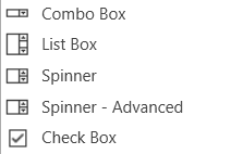
Combo Box
A Combo Box allows the user to select the value of a device parameter from a drop-down list.Controls can be managed in the Custom Panel designer and, once the Custom Panel is activated, utilized by the end user. This control must be linked to a parameter to function properly.
List Box
A List Box allows the user to select the value of a device parameter from a list. Controls can be managed in the Custom Panel designer and, once the Custom Panel is activated, utilized by the end user. This control must be linked to a parameter to function properly.
Spinner
A Spinner allows the user to change the value of a device parameter by adjusting it up or down; the increment can be specified by the Custom Panel designer. Controls can be managed in the Custom Panel designer and, once the Custom Panel is activated, utilized by the end user. This control must be linked to a parameter to function properly.
Check Box
A Checkbox turns on or off a device parameter value when pressed. Controls can be managed in the Custom Panel designer and, once the Custom Panel is activated, utilized by the end user. This control must be linked to a parameter to function properly.
Common Roter Design Properties
Properties Type
|
Description |
| General |
- Control Info: Shows control type. This propery is Read only.
- Locked: Specifies if the control is locked out so that it cannot be moved or re-sized.
- Checked = Locked
- Unchecked = Unlocked
|
| Parameters |
- Addresses: Enables panel designer to edit addressing information with the added benefit that the values can be validated as a group before being applied to the device.
This editor also allows the user to assign multiple parameters to the control. Click to select Parameter Address Editor.
- Properties correspond to the system explorer.
- Information: Shows information about the Parameter Address.
- Read only. Properties correspond to the system explorer
- Value List: Allows editing of the value range of the control. Brings up the Discrete Values Editor.
- Maximum: Maximum parameter value.
- The largest parameter value.
- Minimum: Minimum parameter value.
- The smallest parameter value.
- Reset Text: Optional text to display in right click context popup.
- Disable Mixed-sate Editor: When checked, disables the mixed-state context menu and editor
|
| Appearance |
- Location: Control location (in pixels) of the control on the Custom Panel. Change X (horizontal) and Y (vertical) values in relation to upper left corner.
You can also drag the control to a different location
- Size: Control size (in pixels). Change width and height values. You can also re-size the control manually.
- Border Style: The style of the Spinner border.
- Choose from drop down menu.
- Border Color: The color of the Spinner border
- Top Margin: The amount of space, in pixels at the top of the control where a label may be placed.
- Bottom Margin: The amount of space, in pixels at the bottom of the control where a label may be placed.
- Left Margin: The amount of space, in pixels to the left of the control where a label may be placed.
- Right Margin: The amount of space, in pixels to the right of the control where a label may be placed.
- Background Image: Brings up the Select Background Image window.
- Background Color: Background color of the control.
- Tool Tip Text: The text that appears on control mouse-over.
- Tab Index: Determines the position of the control in the tab order
- Tab Stop: Specifies whether the control appears in the tab order.
- Checked = Appears
- Unchecked = Does not appear
|
| Combo Box |
- Background Color: The background color of the Combo Box.
- Text Color: The color of the Combo Box text
- Font: Font style for the text in the box. Click on “…” to select desired font.
- Selects from Windows fonts.
- Style: Sets the appearance and functionality of the Combo Box.
- Select from Drop Downlist, Simple or Drop-down
- Selected Item Color: The color of the selected item.
- Check Box Text: The text shown in the Checkbox.
- Checkbox Size: The size of the Checkbox in pixels.
- Checkbox Style: The Checkbox style. Normal, flat, and various colors.
- Label Separation: The space, in pixels between the checkbox and the checkbox text.
|
| List Box |
- Background Color: The background color of the Combo Box Brings up the Select Color window
- Text Color: The color of the Combo Box text. Brings up the Select Color window
- Font: Font style for the text in the box. Click on “…” to select desired font. Selects from Windows fonts.
- Border Style: Sets the style of the List Box border. Choose from syles in a drop down list
Selected Item Color: The color of the selected item. Brings up the Select Color window
|
| Text Attributes |
- Text Font: The font of the Spinner text. Choose from Windows fonts.
- Text Color: The color of the Spinner text. Brings up the Select Color window
- Background Color: The background color of the text area. Brings up the Select Color window
- Value Format: The format used when displaying the value. This is an advanced feature and must follow English conventions.
- Text Alignment: The horizontal alignment of the text. Left, center or right.
- Text Border Style: The border style of the text area. Choose from drop down menu.
|
| Nudge Buttons |
- Nudge Type: Together with the Increment Amount, determines the amount that the control will increment/decrement when a Nudge Button is pressed. Percent, bump or value
- Increment: Together with the Nudge Type, determines the amount that the control will increment/decrement when a Nudge Button is pressed.
|
| Spinner Attributes |
- Spinner Position: Specifies where the up/down arrows are to be located. Right or TopBottom
- Spinner Width: Sets the size of the up/down arrow buttons, in percent of width or height.
- Spinner Button Color: The color of the up/down arrow buttons. Brings up the Select Color window
- Spinner Arrow Color: The color of the up/down arrows. Brings up the Select Color window
- Arrow Width: The width of the base as a percentage of the spinner button width.
|