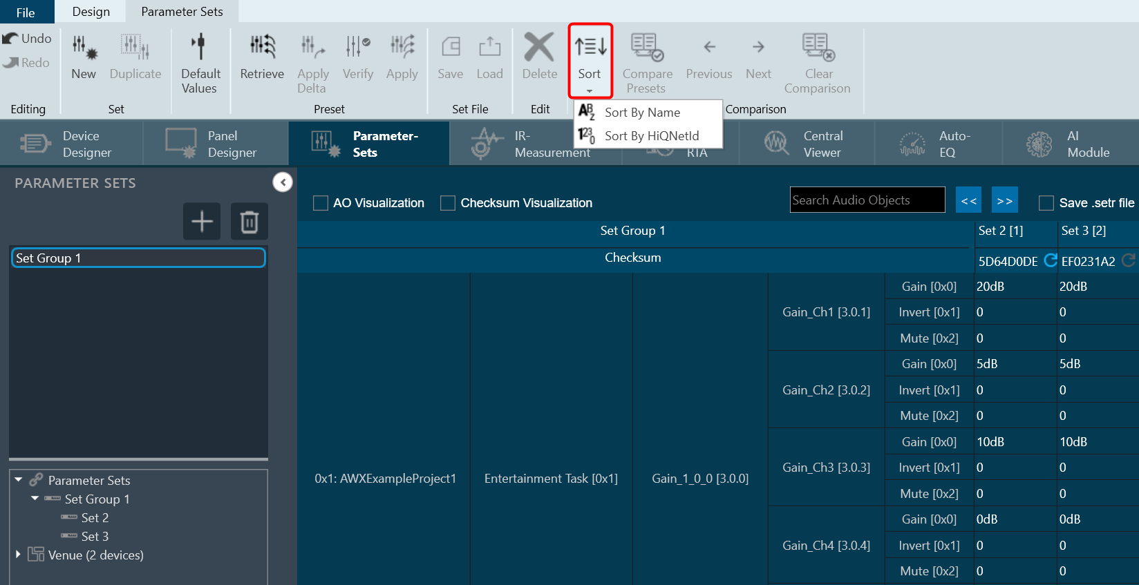
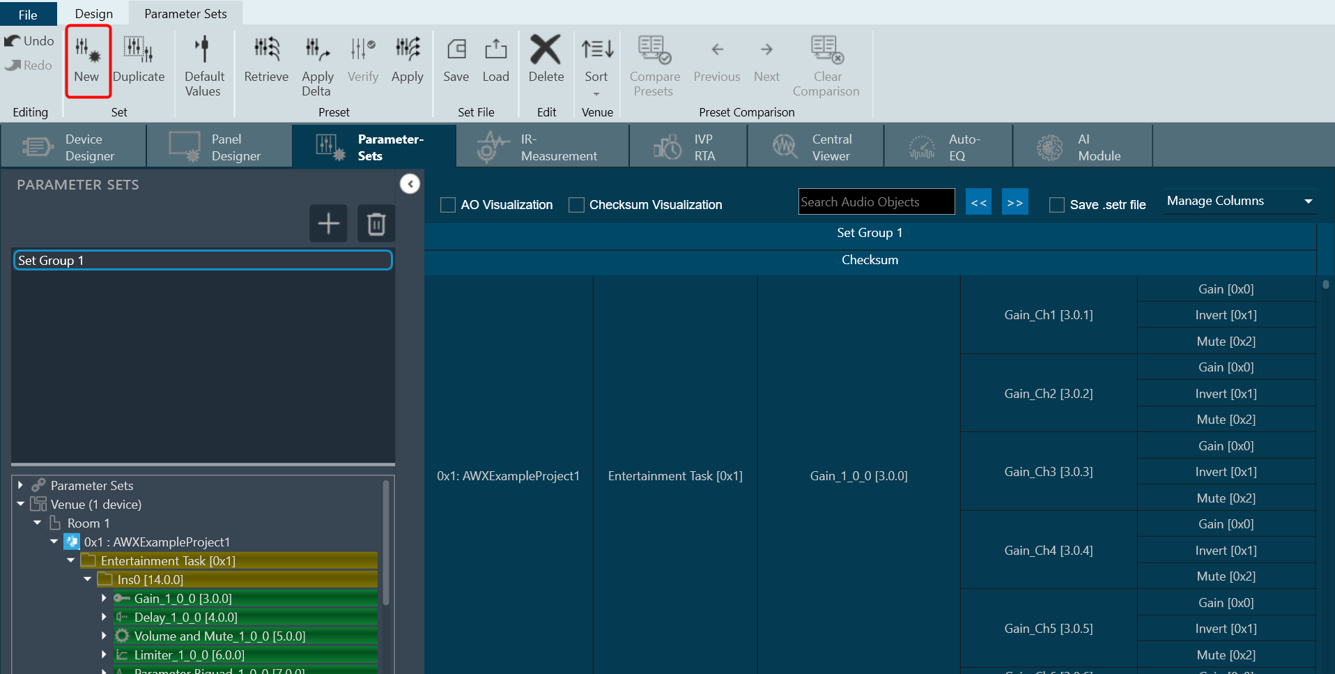
The Advance toolset contains additional design tools. This toolset includes the following tools.
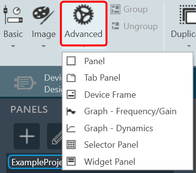
Panel
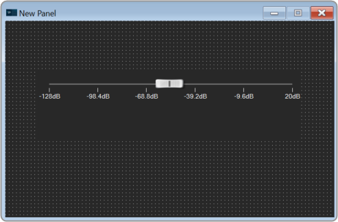
A panel is a box that allows you to manage the look of your Custom Panel.
| Property Type |
Options |
| General
|
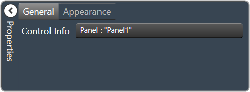
Control Info: Shows control type.
Read only |
| Appearance

|
- Back Color: Background color of the panel.Brings up the Select Color window.
- Location: Control location (in pixels) of the control on the Custom Panel. Change X (horizontal) and Y (vertical) values in relation to upper left corner.You can also drag the control to a different location
- Size: Control size (in pixels). Change width and height values. You can also re-size the control manually.
- Paint Style: The type of background fill. Solid Brush or Gradient Brush
- Gradient Mode: The direction that a color gradient fill will flow. Horizontal, Vertical, Forward Diagonal or Backward Diagonal
- Gradient Color Start: The starting color of a gradient fill or the color of a solid fill.Brings up the Select Color window.
- Gradient Color End: The ending color of a gradient fill. Not used for a solid fill.Brings up the Select Color window.
- Background Image: Background image of the control.
- Background Image Layout: The way the background image is drawn. None, Tile, Center, Stretch or Zoom
- Border Style: Click to select border style. Default style is flat.
- Draw Border: When checked, a border is drawn around the Panel.
- Rounded Corners: When checked the corners of the box will be rounded by the Corner Radius amount.
- Corner Radius: The radius of the corners.
- Tab Index: If tab stop is set to true, determines the position of the control in the tab order.
- Tab Stop: Specifies whether the control appears in the tab order.
- Checked = Appears
- Unchecked = Won’t appear
|
Tab Panel
A tab panel is a box with selectable tabs that allows you to manage the look of your Custom Panel as well as group controls together in a functional, attractive manner. Tab panels can be managed in the Custom Panel designers and, once the Custom Panel is activated, viewed by the end user. They can also select the desired tab.
Add a Tab Panel by dragging and dropping the Tab Panel icon, then add controls to the panel the same way you would a Custom Panel. After the tab panel has been added, add controls to the tab panel the same way you would a Custom Panel.
If the controls are not on the tab panel, select them and drag them over to the panel.
There are two levels to the panel – the entire panel and the tab portion of the panel.
| Property Type |
Options |
| Appearance
|
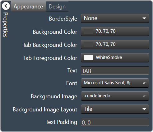
- Border Style: Click to select border style. Default style is flat.
- Background Color: Background color behind the tab. Brings up the Select Color
- Tab Background Color: Background color of the tab area. Brings up the Select Color
- Tab Foreground Color: The color of the Tab’s text. Brings up the Select Color
- Text: The header text for this tab.
- Font: Click on “…” to select desired font. Brings up a Font Select window. Selects from Windows fonts.
- Background Image: Background image of the control.
- Background Image Layout: The way the background image is drawn.None, Tile, Center, Stretch or Zoom
- Text Padding: The amount of space around the text for this tab page.
|
| Design
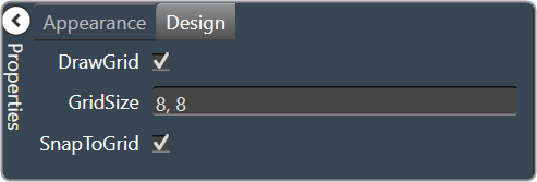
|
- Draw Grid: When checked, the positioning grid will be drawn
- Grid Size: Adjusts the size of the grid points within the panel. 8,8 is the default. Making this number smaller, such as 6,6 will add more grid points.
- Snap To Grid: Snaps each element in the Panel to the nearest grid point.
|
Device Frame
The Device Frame looks and behaves similar to a standard Panel. Like a standard Panel, Parameter controls are added into it. Unlike a standard Panel, it has the power to change which Parameters its controls are attached to at run time (as opposed to design time).
At the top of the Design Frame is a combo box which lists devices of the same type. When the Device Frame is running, you can change which device is currently selected. All the controls in the Device Frame should then switch Parameters moving to corresponding State Variables on the newly selected device. In this way, you can create one small control panel which potentially controls or monitors any number of devices.
| Property Type |
Options |
| General
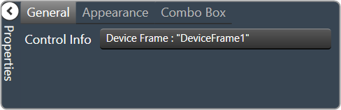
|
Control Info: Shows control type.
Read only |
| Appearance
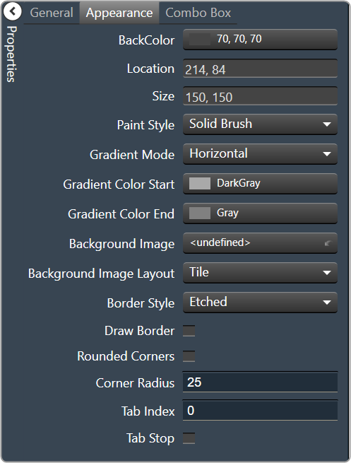
|
- Back Color: Background color of the panel. Brings up the Select Color window.
- Location: Control location (in pixels) of the control on the Custom Panel. Change X (horizontal) and Y (vertical) values in relation to upper left corner. You can also drag the control to a different location
- Size: Control size (in pixels). Change width and height values. You can also re-size the control manually.
- Paint Style: The type of background fill. Solid Brush or Gradient Brush
- Gradient Mode: The direction that a color gradient fill will flow. Horizontal, Vertical, Forward Diagonal or Backward Diagonal
- Gradient Color Start: The starting color of a gradient fill or the color of a solid fill. Brings up the Select Color window.
- Gradient Color End: The ending color of a gradient fill. Not used for a solid fill. Brings up the Select Color window.
- Background Image: Background image of the control.
- Background Image Layout: The way the background image is drawn. None, Tile, Center, Stretch or Zoom
- Border Style: Click to select border style. Default style is flat.
- Draw Border: When checked, a border is drawn around the Panel.
- Rounded Corners: When checked the corners of the box will be rounded by the Corner Radius amount.
- Corner Radius: The radius of the corners.
- Tab Index: If tab stop is set to true, determines the position of the control in the tab order.
- Tab Stop: Specifies whether the control appears in the tab order.
- Checked = Appears
- Unchecked = Won’t appear
|
| Combo Box
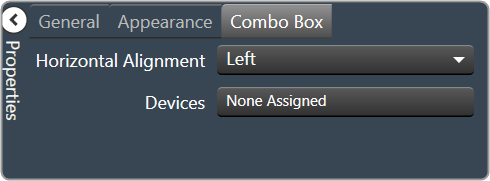
|
Horizontal Alignment: The alignment of the Combo Box within the Device Frame. Left, Center or Right
Devices: Brings up a Devices select window where you will select the available devices to assign to the Device Frame.
|
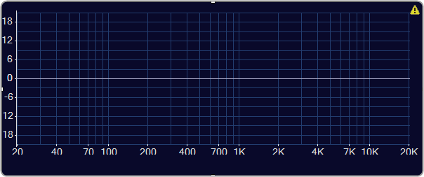
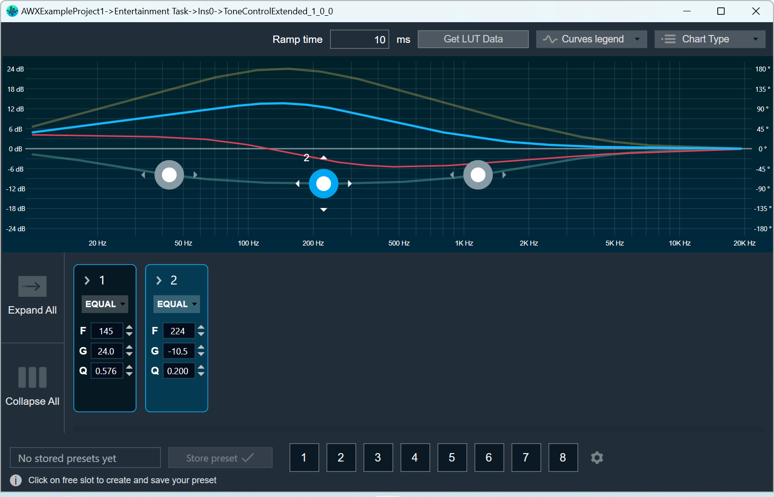
Graph Frequency/Gain
| Property Type |
Options |
| General
|
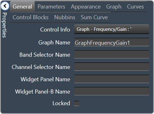
- Control Info: Shows control type. Read only
- Graph Name: The name of the graph. Required to link to a Selector Panel or Widget Panel.
- Band Selector Name: The name of the band selector panel associated with this graph.
- Channel Selector Name: The name of the Selector Panel to which the graph is linked.
- Widget Panel Name. The name of the Widget Panel to which the graph is linked.
- Widget Panel-B Name: The name of a secondary Widget Panel associated with this graph.
- Locked: Specifies if the control is locked out so that it cannot be moved or re-sized.
- Checked = Locked
- Unchecked = Unlocked
|
| Parameters
|
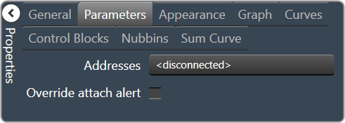
- Addresses: The addresses for the parameters attached to the graph hierarchy. Opens the Graph Parameters window.
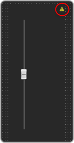
- Override attached alert: Whether to display the warning for disconnected controls.
- Checked = Display
- Unchecked = No Display
|
| Appearance
|
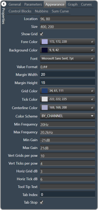
- Location: Control location (in pixels) of the control on the Custom Panel. Change X (horizontal) and Y (vertical) values in relation to upper left corner. You can also drag the control to a different location
- Size: Control size (in pixels). Change width and height values. You can also re-size the control manually
- Show Grid: Whether or not to display the grid lines.
- Checked = Display
- Unchecked = No Display
- Fore Color The foreground color for this graph. Brings up the Select Color window.
- Background Color: Background color of the graph. Brings up the Select Color window.
- Font: Font for tick labels. Click on “…” to select desired font. Selects from Windows fonts.
- Value Format: The format of the values next to the major tick marks.
- 0.## means whole number with two decimal places.
- Margin Width: The width of the margin from the sides to the graph (in pixels).
- Margin Height: The height of the margin from the sides to the graph (in pixels).
- Grid Color: Grid line color. Brings up the Select Color window.
- Tick Color: Color of the tick marks. Brings up the Select Color window.
- Centerline Color: Color of the graph centre line. Brings up the Select Colorwindow.
- Color Scheme: The manner in which the Channel Colors are to be used. By Index, By Band or By Channel
- Min Frequency: Lower bound frequency for the graph.
- Max Frequency: Upper bound frequency for the graph.
- Min Gain: Lower bound gain for the graph.
- Max Gain: Upper bound gain for the graph.
- Vert Grids per pow: The number of grid lines to display for each power of 10 in frequency.
- Vert Ticks per pow: The number of ticks to display for each power of 10 in frequency.
- Horiz Grid dB: The number of dB between each horizontal grid line.
- Horiz Tick dB: The number of dB between each horizontal tick mark.
- Tool Tip Text: The text that appears on control mouse over.
- Tab Index: If tab stop is set to true, determines the position of the control in the tab order.
- Tab Stop: Specifies whether the control appears in the tab order.
- Checked = Appear
- Unchecked = Doesn’t Appear
|
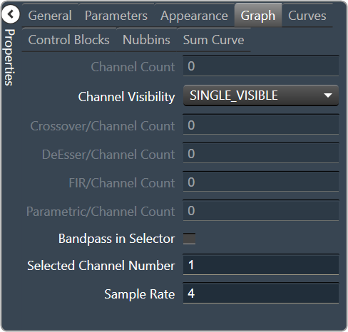
| Graph
|
- Channel Count: The number of channels currently in the graph.
- Channel Visibility: How many channels should be visible. Single Visible or All Visible
- Crossover/Channel Count: The number of Crossover/Bandpass curves currently in each channel.
- DeEsser/Channel Count: The number of DeEsser curves currently in each channel.
- FIR/Channel Count: The number of FIR filter curves currently in each channel.
- Parametric/Channel Count: The number of Parametric curves currently in each channel.
- Bandpass in Selector: If checked, the bandpass curves will be in the selector panels.
- Selected Channel Number: The number of the currently selected channel.
- Sample Rate: The interval at which the curve is sampled.
|
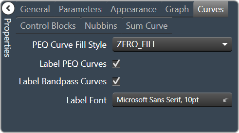
| Curves
|
- PEQ Curve Fill Style: The fill style for Parametric EQ curves. Zero Fill, Bandpass Fill or Base Fill
- Label PEQ Curves: When checked, the Parametric EQ curves will be labeled.
- Label Bandpass Curves: When checked, the Bandpass curves will be labeled.
- Label Font: The font for curve labels.
- Choose from Windows fonts.
|
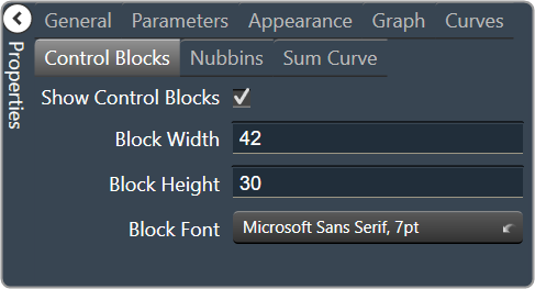
| Control Blocks
|
- Show Control Blocks: Enable the display of the filter control blocks.
- Block Width: The width of the filter control blocks.
- Block Height: The height of the filter control blocks.
- Block Font: The font for the filter control blocks.
- Choose from Windows fonts.
|
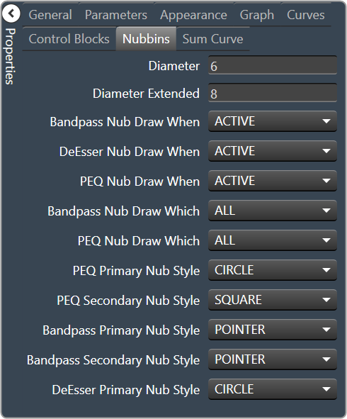
| Nubbins
|
- Diameter: Drawing diameter for control point nubs.
- Diameter Extended: Interaction diameter for control point nubs.
- Bandpass Nub Draw When: Selects when the Bandpass nubs should be drawn.
- Active, Never, Selected or Always
- DeEsser Nub Draw When: Selects when the DeEsser nubs should be drawn.
- Active, Never, Selected or Always
- PEQ Nub Draw When: Selects when the Parametric EQ nubs should be drawn.
- Active, Never, Selected or Always
- Bandpass Nub Draw Which: Selects which bandpass nubs should be drawn.
- All, None, Primary or Secondary
- PEQ Nub Draw Which: Selects which Parametric EQ nubs should be drawn.
- All, None, Primary or Secondary
- PEQ Primary Nub Style: Selects the style of the parametric EQ primary nubs.
- Circle, Square, Diamond or Pointer
- PEQ Secondary Nub Style: Selects the style of the parametric EQ secondary nubs.
- Circle, Square, Diamond or Pointer
- Bandpass Primary Nub Style: Selects the style of the Bandpass primary nubs.
- Circle, Square, Diamond or Pointer
- Bandpass Secondary Nub Style: Selects the style of the Bandpass secondary nubs.
- Circle, Square, Diamond or Pointer
- DeEsser Primary Nub Style: Selects the style of the DeEsser primary nubs.
- Circle, Square, Diamond or Pointer
|
| Sum Curve
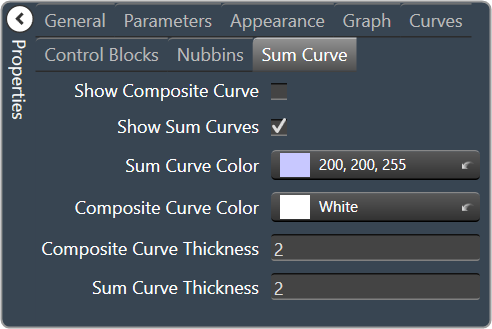
|
- Show Composite Curve: When checked, the overall composite curve will be displayed.
- Show Sum Curves: When checked, the channel’s sum curve will be displayed.
- Sum Curve Color: The color of the channel sum curve. Brings up the Select Color window.
- Composite Curve Color: The color of the composite curve. Brings up the Select Colorr window.
- Composite Curve Thickness: The thickness, in pixels of the Composite Curve.
- Sum Curve Thickness: The thickness, in pixels of the Sum Curve.
|
Graph Dynamics
| Property Type |
Options |
| General
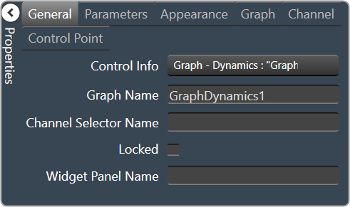
|
- Control Info: Shows control type. Read only
- Graph Name: The name of the graph. Required to link to a Selector Panel or Widget Panel.
- Channel Selector Name: The name of the Selector Panel to which the graph is linked.
- Locked: Specifies if the control is locked out so that it cannot be moved or re-sized.
- Checked = Locked
- Unchecked = Unlocked
- Widget Panel Name. The name of the Widget Panel to which the graph is linked.
|
| Parameters
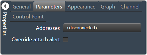
|
- Addresses: The addresses for the parameters attached to the graph hierarchy.
- Override attached alert: Whether to display the warning for disconnected controls.
- Checked = Display
- Unchecked = No Display
|
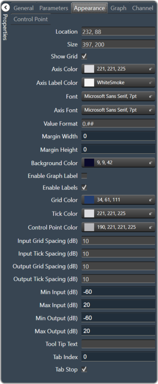
| Appearance
|
- Location: Control location (in pixels) of the control on the Custom Panel. Change X (horizontal) and Y (vertical) values in relation to upper left corner. You can also drag the control to a different location
- Size: Control size (in pixels). Change width and height values. You can also re-size the control manually
- Show Grid: Whether or not to display the grid lines.
- Checked = Display
- Unchecked = No Display
- Axis Color The color of the grid axis. Brings up the Select Color window.
- Axis Label Color: The color of the grid axis label. Brings up the Select Color window.
- Font: Font for tick labels. Click on “…” to select desired font. Selects from Windows fonts.
- Axis Font: The font for Input (dB) and Output (dB) labels. Selects from Windows fonts.
- Value Format: The format of the values next to the major tick marks.
- 0.## means whole number with two decimal places.
- Margin Width: The width of the margin from the sides to the graph (in pixels).
- Margin Height: The height of the margin from the sides to the graph (in pixels).
- Background Color: Background color behind the tab. Brings up the Select Color window.
- Enable Graph Label: Whether to display the graph label.
- Checked = Display
- Unchecked = No Display
- Enable Labels: Whether to display the graph axis labels.
- Checked = Display
- Unchecked = No Display
- Grid Color: Grid line color. Brings up the Select Color window.
- Tick Color: Color of the tick marks. Brings up the Select Color window.
- Control Point Color: Color of the control point. Brings up theSelect Color window.
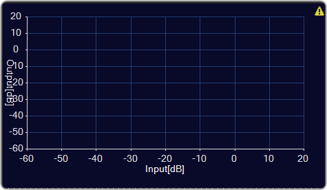
- Input Grid Spacing: Spacing (in dB) between vertical grid lines
- Input Tick Spacing: Spacing (in dB) between vertical tick marks
- Output Grid Spacing: Spacing (in dB) between horizontal grid lines
- Output Tick Spacing: Spacing (in dB) between horizontal tick marks
- Min Input: Minimum input level (in dB) shown on the graph
- Max Input: Maximum input level (in dB) shown on the graph
- Min Output: Minimum output level (in dB) shown on the graph
- Max Output: Maximum output level (in dB) shown on the graph
- Tool Tip Text: The text that appears on control mouse over.
- Tab Index: If tab stop is set to true, determines the position of the control in the tab order.
- Tab Stop: Specifies whether the control appears in the tab order.
- Checked = Appear
- Unchecked = Doesn’t Appear
|
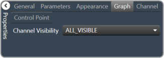
| Graph
|
Channel Visibility: How many channels should be visible. Single Visible or All Visible |
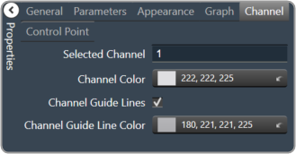
| Channels
|
- Selected Channel: Sets the selected channel
- Channel Color: The color of the channel line
- Channel Guidelines: Whether to display channel guidelines or not.
- Checked = Display
- Unchecked = No Display
- Channel Guideline Color: The color of the channel guidelines.
|
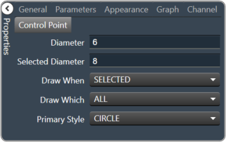
| Control Point
|
- Diameter: Diameter for control points (nubs) on an un-selected channel.
- Selected Diameter: Diameter for control points (nubs) on a selected channel.
- Draw When: When control points (nubs) are drawn.
- Selected, Never, Active or Always
- Draw Which: Which control points (nubs) should be drawn.
- All, None, Primary or Secondary
- Primary Style: Style of the parametric primary control points (nubs). Circle, Square, Diamond or Pointer
|
Selector Panel
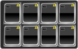
A selector panel is a control that can link to a graph. It has buttons that allow the control panel user to select channels or bands on the graph.
Once the Selector Panel is tied to a graph, you can change its properties, including whether it will select bands or channels on the graph. To select the panel for editing, click anywhere between its borders and the buttons on the panel:
Individual selector buttons may be edited as well.
Overlapping controls, especially graph controls, can result in unexpected behavior and/or the appearance of controls. Use caution if you choose to overlap controls.
| Property Type |
Options |
| Appearance
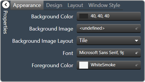
|
- Background Color: The background color of the text area Brings up the Select Color window.
- Background Image: Background image of the control. Brings up the Select Color window.
- Background Image Layout: Background layout of the image. Tile, Centre, Stretch, and Zoom
- Font: Click on “…” to select desired font. Choose from Windows fonts.
- Foreground Color: The foreground color for the panel. Brings up the Select Color window.
|
| Design
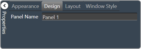
|
Panel Name: Enter the name of the panel. Default text is “Panel 1”. |
| Layout
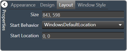
|
- Size: Control size (in pixels). Change width and height values. You can also re-size the control manually.
- Start Behavior: Behavior of the panel. Manual, CenterScreen, and WindowsDefaultLocation.
- Start Location: Control location (in pixels) of the control on the Custom Panel. Change X (horizontal) and Y (vertical) values in relation to upper left corner. You can also drag the control to a different location
|
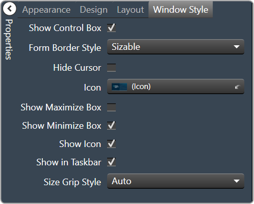
| Window Style
|
- Show Control Box: Whether to display control box or not.
- Form Border Style: Click to select form border style.
- FixedSingle
- Fixed3D
- FixedDialog
- FixedToolWindow
- Sizable
- SizableToolWindow
- Hide Cursor: Whether to display cursor or not.
- Icon: Click on “…” to select desired icon.
- Show Maximize Box: Whether to display maximize box or not.
- Show Minimize Box: Whether to display minimize box or not.
- Show Icon: Whether to display icon or not.
- Show in Taskbar: Whether to display taskbar or not.
- Size Grip Style: Click to select size grip style. Auto, Show, and Hide
|
Widget Panel
A widget panel is a control on a Custom Panel that links all controls inside its borders to one or more curves of a graph. The entire widget panel is linked to the graph, so individual controls do not (and cannot) link to individual parameters; individual control assignments are made in the “assignments” property of the widget panel.
Controls on a widget panel are similar to other Custom Panel controls except that they are tied to elements of a graph. The widget panel controls the band or channel that is specified on the selector panel of an activated panel.
The entire widget panel is linked to the graph, so individual controls do not (and cannot) link to individual parameters; individual control assignments are made in the “Assignments” property of the widget panel.
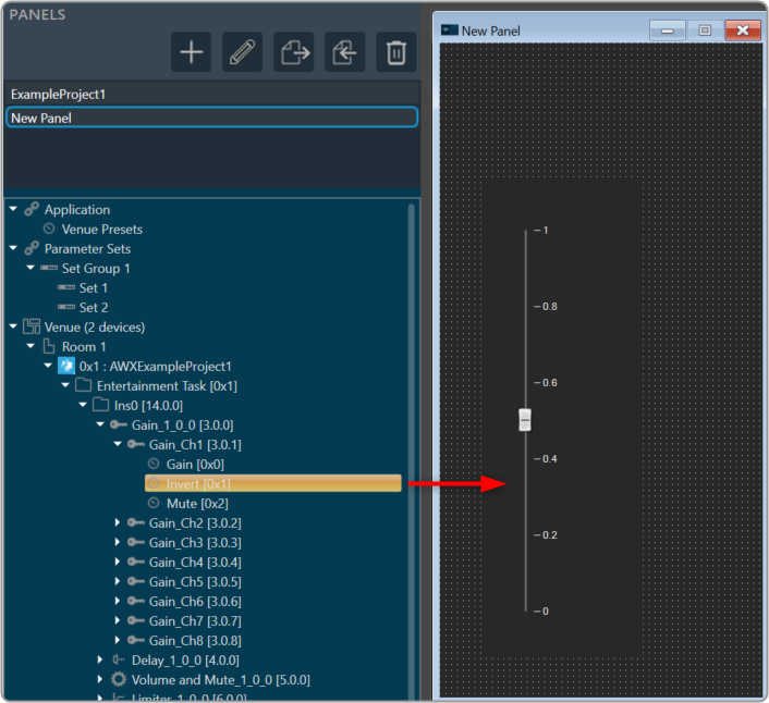
For example, a fader can control one parameter of one band on one channel.
Even if multiple parameters are added to the fader, all of the parameters change to the same value. However, a fader is added to a widget panel that is linked to a graph (and a selector panel), the fader can control ALL bands individually with one control of the graph.
Once a new band is selected on the selector panel, the fader controls the same parameter on that band as well.
To set up a widget panel
- Add a widget panel to the Custom Panel.
- Link the widget panel to the desired graph using graph collaboration.
- Add controls to the widget panel.
- Assign those graph parameters to the controls.
Graphs can be managed in the Custom Panel designer and, once the Custom Panel is activated, utilized by the end user.
Overlapping controls, especially graphs, can result in unexpected behavior and/or appearance of controls. Use caution if you choose to overlap controls.
| Property Type |
Options |
| General
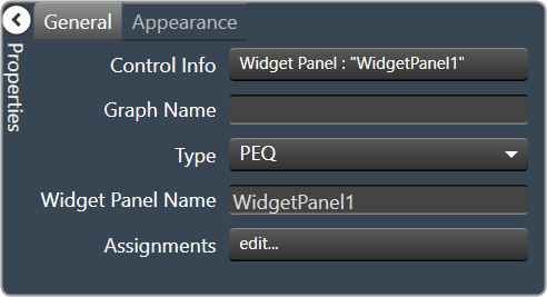
|
- Control Info: Shows control type. Read only
- Graph Name: Allows graph to be named.
- Type: Select which type of EQ to be used for collaboration.
- Widget Panel Name: The name of the widget panel. Used for graph collaboration.
- Assignments: Allows editing of assignments on Widget Panel.
|
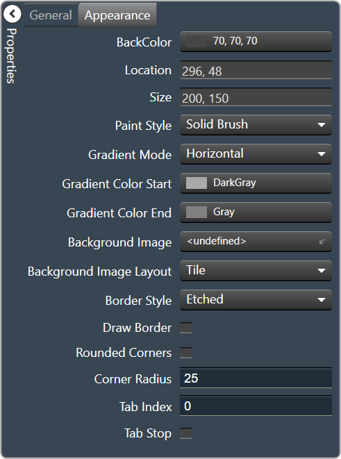
| Appearance
|
- Back Color: Background color of the panel. Brings up the Select Color window.
- Location: Control location (in pixels) of the control on the Custom Panel. Change X (horizontal) and Y (vertical) values in relation to upper left corner. You can also drag the control to a different location
- Size: Control size (in pixels). Change width and height values. You can also re-size the control manually.
- Paint Style: The type of background fill. Solid Brush or Gradient Brush
- Gradient Mode: The direction that a color gradient fill will flow. Horizontal, Vertical, Forward Diagonal or Backward Diagonal
- Gradient Color Start: The starting color of a gradient fill or the color of a solid fill. Brings up the Select Color window.
- Gradient Color End: The ending color of a gradient fill. Not used for a solid fill. Brings up the Select Color window.
- Background Image: Background image of the control.
- Background Image Layout: The way the background image is drawn. None, Tile, Center, Stretch or Zoom
- Border Style: Click to select border style. Default style is flat.
- Draw Border: When checked, a border is drawn around the Panel.
- Rounded Corners: When checked the corners of the box will be rounded by the Corner Radius amount.
- Corner Radius: The radius of the corners.
- Tab Index: If tab stop is set to true, determines the position of the control in the tab order.
- Tab Stop: Specifies whether the control appears in the tab order.
- Checked = Appears
- Unchecked = Won’t appear
|
