State Indication Setup Window

The State Indication Setup window allows you to customize the look of a control such as a button.

Graphical user interface, application Description automatically generated

  • Label: Enter the name of the label for the current state.
  • Label Color: The color of the label. Select the color from the Select Color window.
  • Backing Color: The color of the label background (such as the color of a button). Select the color from the Select Color window.
  • Backing Image: An image for the label. Select the image from the Select Image File window.

System Function Editor

The System Function Editor is a separate window that allows you to assign a certain System Function or functions upon an action such as pressing a button or receiving an external control signal.

Graphical user interface, application, Teams Description automatically generated

Function: Here you can select which function is to be assigned. Depending on which function you choose, other options below this will open offering supporting parameters or functions.

Below is the list of the functions that can be assigned.
Graphical user interface, text, application, chat or text message Description automatically generated

  • None
  • Close Current Panel: Closes the current Panel
  • Close Custom Panel: Closes a selected Custom Panel
  • Close Device Panel: Closes a selected Device Panel
  • Close Master Panel: Closes a selected Master Panel
  • Launch Custom Panel: Launches a selected Custom Panel
  • Launch Device Panel: Launches a selected Device Panel
  • Launch Master Panel: Launches a selected Master Panel
  • Locate: Select a device in the venue and determine whether you want it’s Locate feature on or off
  • Mute Device: Mutes a selected Device
  • Unmute Device: Unmutes a selected Device
  • Mute Channel: Select a device in the venue and select a channel within that device to mute
  • Unmute Channel: Select a device in the venue and select a channel within that device to unmute
  • Solo Channel: Select a device in the venue and select a channel within that device to solo
  • Recall Device Preset: Select a device in the venue and recall a preset within that device
  • Recall Panel Preset: Select a custom Panel and recall a preset within that panel
  • Recall Venue Preset: Brings up the Venue Presets window.
  • Save File: Saves the current project file.
  • Logout: Logout the current user from GTT.
  • Switch User: Brings up a window to login a different GTT user.
  • Close Application: Shuts down GTT.
  • Shutdown Computer: Shuts down the computer GTT is running on.
  • Play Sound File: Brings up a window to select a sound file. Selections include MP3, MIDI, Windows Audio or Windows Media files
  • Launch Scheduler: Activates the Scheduler
  • Launch Event Log: Activates the Event Log

Parameter Address Editor

The Parameter Address Editor allows you to add or remove parameters linked to a control. It is accessed in the Custom Panel Designer Tab from Properties, Parameters, Address or with a right click on the control and selecting Edit parameters.

The top section of the parameter address editor shows all available parameter assignments Device, Object and Parameter.

  • Device, Object, and Parameter Search: Since there are often a large number of items in the Device, Object and Parameter lists, the Search window allows you to narrow down the number of items in that list. For example, if you want to narrow the search to all Crown, Output Faders you would enter these into the Search windows.
    The bottom half of the Parameter Address Editor shows assignments made to the control.
  • Add Assignment: On the top section, select the parameters to be added to the control. Only devices that have been added to the venue will display in the “device” column.
    Click the Add button or drag and drop the selection to the lower section. The parameters are assigned to the control.
  • Remove Assignment: Select the parameters to be removed from the control then click the Remove button.
  • Data Type: Shows the Address data type.
  • Device Address: A drop-down list showing current available device addresses.
  • Device Type: Shows type of device.
  • Device Name: Shows the name of the device given in the venue.
  • Object Address: A drop-down list showing current available object addresses.
  • Object Name: Shows the name of the object where the parameter resides.
  • Parameter Address: A drop-down list showing current addresses available for the selected parameter.
  • Parameter Name: The name of the selected parameter

Panels View

The Panels view in Panel Designer lists all custom panels. You can use the Panel view to create a new panel, export a panel, import a panel, and delete the panel. You can access additional options like Application, Parameter Sets, and Venue in the panel menu.

Icon Description
Icon Description automatically generated Add Panel: Click on this option to add new panel.
Rename Panel: Allows you to rename the existing panel.
Import Panel: Click on this option to import a panel.
Export Panel: Click on this option to export a panel.
A picture containing text, monitor Description automatically generated Remove Devices: Click on this option to delete the panel.

Custom Panel Properties View

The Property View displays the properties of each of the components that are used to design the panel and also allows you to customize the panel. The Properties view is displayed on the right side of the screen.

Graphical user interface, application Description automatically generated

The custom panel workspace has the following

properties

  1. Appearance: Allows you to edit the background color and, background image, image layout, font style, and foreground color.
    Graphical user interface, application Description automatically generated

      • Background Color: Opens the Select Color editor, and sets the background color of the Panel.
      • Background Image: Opens a separate window where an image file is located and selected. Note: it is highly recommended that the background image fit the panel size for the best look. See Layout > Size for these dimensions.
      • Background Image Layout: Sets the layout of the Background Image – whether it be None, Tile, Center, Stretch, or Zoom.
      • Font: Select the text font used by the form.
      • Foreground Color: The foreground color of the component, which is used to display text.
  2. Design: Allows you to rename the panel.
    Graphical user interface, text, application, chat or text message Description automatically generated

      • Panel Name: Sets the name of the panel.
  3. Layout: Allows you to edit the panel layout size, behavior, and location.
    Graphical user interface, application Description automatically generated

      • Size: Sets the pixel size of the panel.
      • Start Behavior: Determines the location of the form when it is launched. Selections are Windows Default Location, Center Screen, or Manual.
      • Start Location: The point on the screen, in pixels, that the form will appear when the Start Behavior is set to Manual.
  4. Window Style: Allows you to edit the panel styling properties.
    Graphical user interface, application Description automatically generated

      • Show Control Box: Determines whether or not the Minimize, Maximize, and Close buttons will be shown.
      • Form Border Style: Determines the Border Style for this Custom Panel. Selections are Sizable, None, Fixed Single, Fixed 3D, Fixed Dialog, Fixed Tool Window, and Sizable Tool Window.
      • Hide Cursor: When selected will hide the mouse cursor when it is over the panel. This may be useful when using touchscreen monitors to display Custom Panels.
      • Icon: Select the icon for the form. This icon is displayed in the form’s system menu box and when the form is minimized. When clicked, a widow opens for you to locate and select the icon file (*.ico).
      • Show Maximize Box: Determines whether or not this Custom Panel can be maximized.
      • Show Minimize Box: Determines whether or not this Custom Panel can be minimized.
      • Show Icon: Sets whether or not to show an icon for this Custom Panel.
      • Show in Taskbar: Determines whether or not to show this Custom Panel in the taskbar when active.
      • Size Grip Style: Sets the size grip style for this Custom Panel – selections are Auto, Show or Hide.
  5. Parameters : Allows to configure control with specific audio object state variable. This is helpful in tuning the audio object.
    Different user control has different set to properties which can be configured.
    Below are the examples of different user control.

    Rotary Encoder user control

    On/Off Button user control

    Horizontal Fader user control

Below are some common properties and values which can be set.

    • Address: This establishes a link between a UI control (like a button or slider) and a state variable, allowing the control to modify the variable’s value.
    • Minimum: This UI control allows setting a minimum value for the state variable. The minimum value should be within the state variable predefined minimum range.
    • Maximum: This UI control allows setting a maximum value for the state variable. The maximum value should be within the state variable predefined maximum range.
    • Reset Text: This is to control right-click context menu option (Rest Param) for resetting state variable to its predefined default value. The Rest Param option in the context menu is associated with default value setting in State Variable.

Below example shows default SV value is 1kHZ. Clicking on “Reset Param” option would reset the SV variable to its default value.

You can override the default value and add custom message to the Reset Text. The Text box UI control associated with EQ.
Open the Parameters properties and enter the required test in the “Reset Text” field.
In the below example, for the Frequency state variable the “Reset Text” is set to text “Set to default value”.

The update text for “Reset Param” would appear as per below image.

IMPORTANT
You can disable the “Reset Param” option on the right-click context menu.  Open the Parameters properties and set the “Reset Text” field to .

This will disable the “Reset Param” option from the context menu without impacting  the other options.

Designer Workspace

In the Designer workspace, you can create a custom panel using various tools available on the Tool panel. Below is an example of the custom panel.

Panel Designer Ribbon

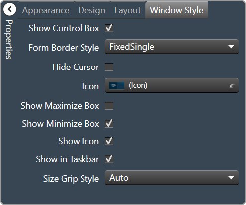
The Panel Designer ribbon contains a tool for designing and editing the custom panel.

The Panel Designer ribbon comprises the following group.
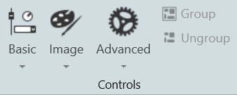
Controls

The Control group comprises of designer tools that allow you to design the custom panel. This includes Basic, Image, Advanced, Group, and Ungroup.

Clipboard

The Clipboard group is a set of copy and paste menus. This includes Duplicate, Cut, Copy, Paste, Copy Visual, and Paste Visual.
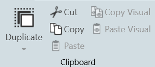
Duplicate

  • Duplicate: Duplicates the selected control.
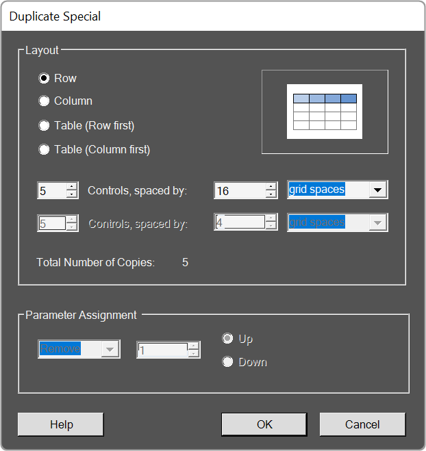
  • Duplicate Special: Brings up the following window.
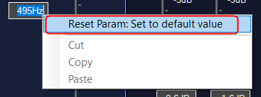
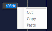
    Graphical user interface, application Description automatically generated

Cut / Copy / Paste

Acts as standard Windows function in that you may Cut/ Copy/ Paste the selected control.

Copy Visual / Paste Visual

This brings up the Select Control Properties window.

Graphical user interface Description automatically generated

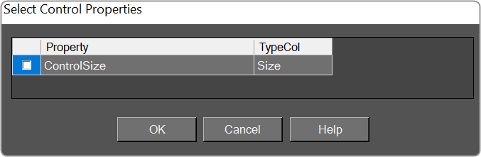
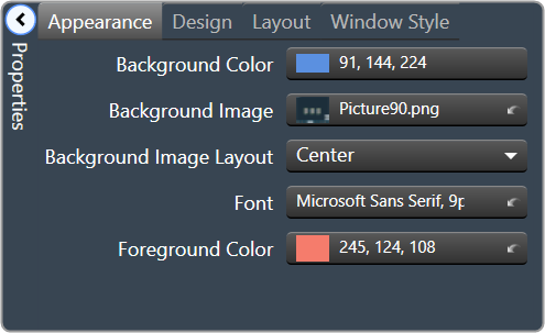
The visual properties of a single control are copied and pasted with the appropriate menu entry in the right-click context menu for a selection of controls, and with the appropriate button in the Clipboard control group within the Custom Panel Designer pop-up Ribbon.
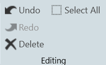
Editing

The Editing group is a set of edit menus. This includes Delete, Select All, Undo, and Redo.

    • Delete: You may delete a selected device or multiple selections of devices from the Venue using the Delete button or with the Delete keyboard key.
    • Select All: Use this to select all devices within the current view, or with the standard CTRL-A Windows keyboard shortcut.
    • Undo / Redo: Use these buttons to Undo or Redo all operations or with the standard CTRL-Z (Undo), and CTRY-Y (Redo) Windows keyboard shortcuts.
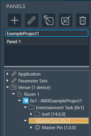
Panels

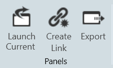
  • Launch Current: This option allows you to open the current active Custom Panel.
  • Duplicate: This option allows you to create a copy of the current active Custom Panel.
  • Create Link: This option allows you to create a link on a custom panel.

Layout

The Layout group is a set of tools that allow you to arrange your design items just the way you want them. This includes Align tools, Size tools, Spacing tools, and Order tools.
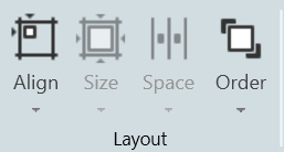
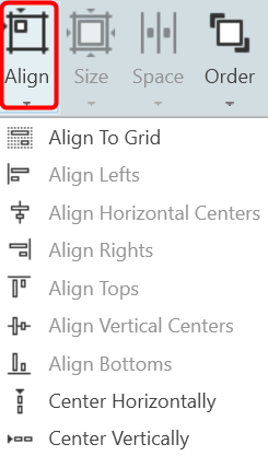
Align

A drop-down menu to align the current selection(s) within the panel.
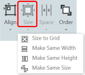
Size

Drop-down menu with options for sizing the current selection(s) as Size to Grid, Make the Same Width, Make the Same Height, or make all selected controls the Same Size.
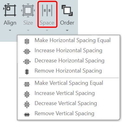
Spacing

Drop-down menu with options for spacing the controls within the Panel.
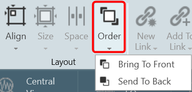
Order

Bring-to-Front or Send-to-Back options for selected controls.
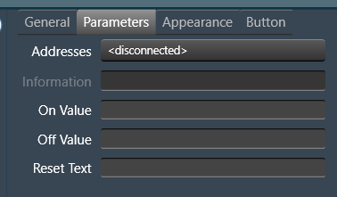
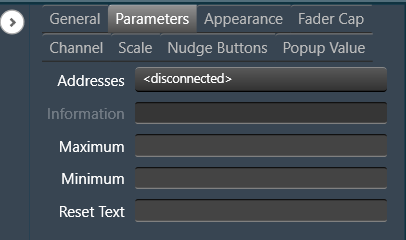
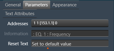
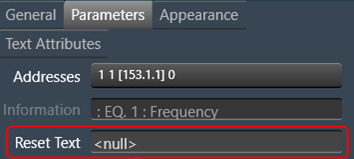
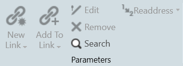
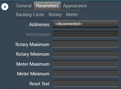
Parameters

The tools in the Parameter group allow you to Edit, Remove, and Search the parameters.

    • New Link:
    • Add To Link:
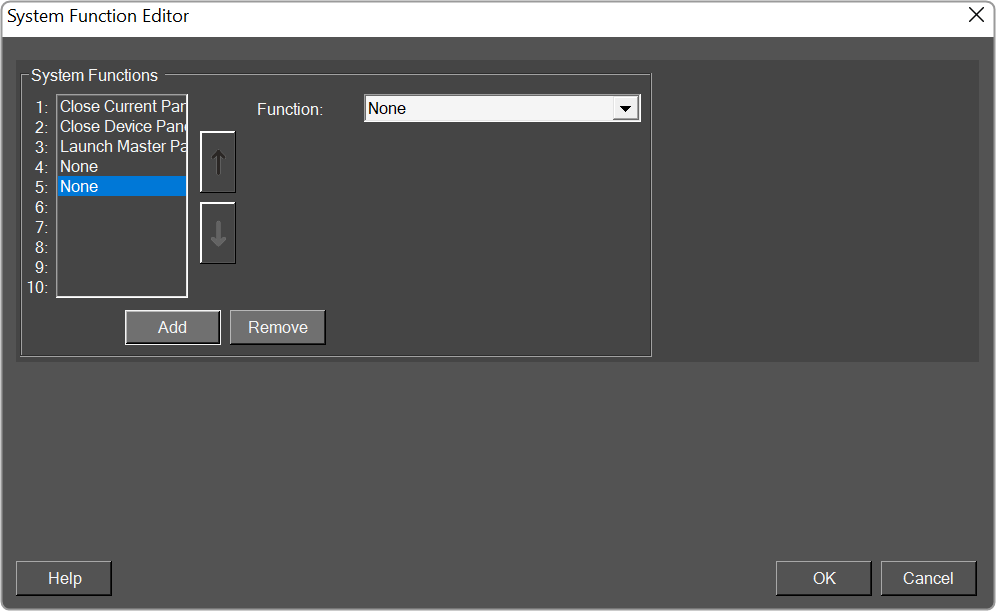
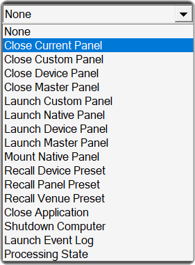
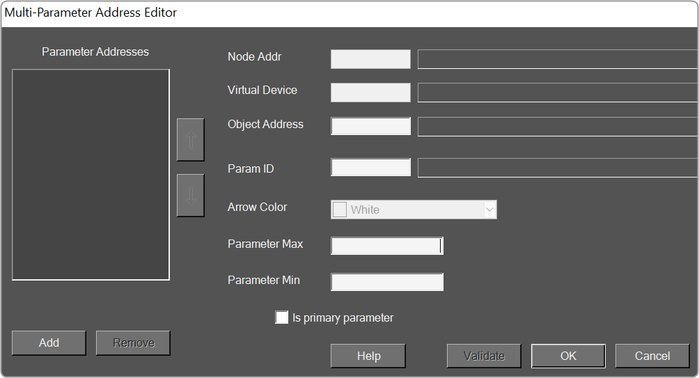
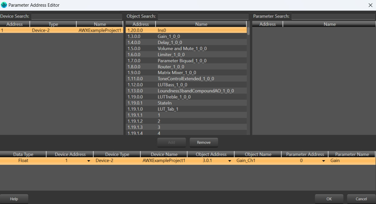
    • Edit: Click to select Parameter Address Editor.
    • Remove: Removes the selected parameters.
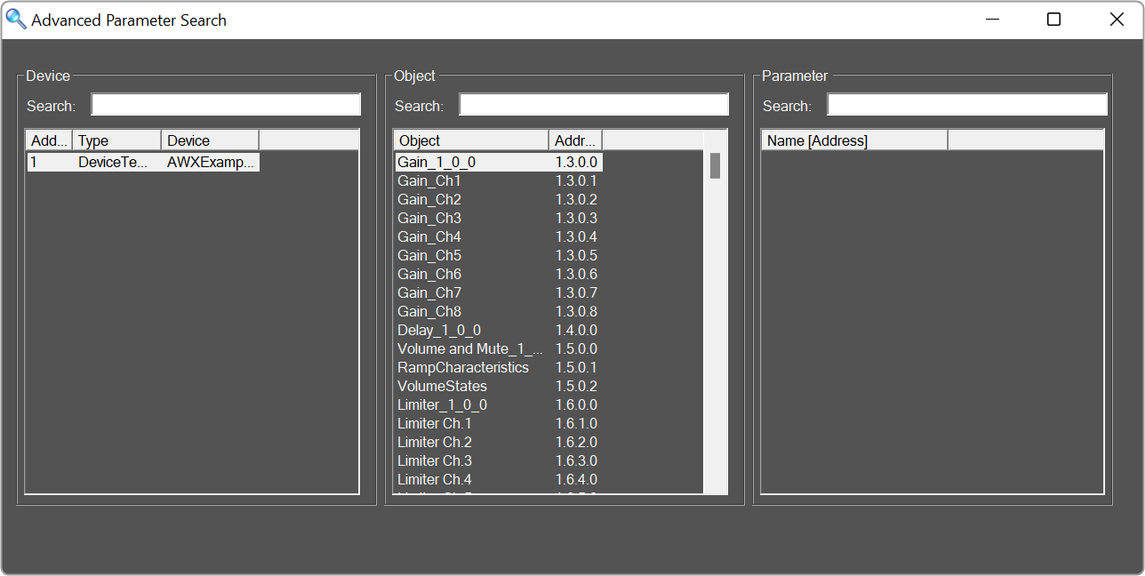
    • Search: Brings up the Advanced Parameter Search window.
      Graphical user interface Description automatically generated
    • Readdress:

Scale Editor

The Scale Editor provides a way to customize ticks on a fader or rotary control.

  • Type: Select between Real Values (default), Arbitrary or .
  • Real Values: Shows the actual values on the control. The Values may be edited.
    A screenshot of a cell phone Description automatically generated with medium confidence
  • Arbitrary: This shows the values of the table in two columns. The left column lists the actual values and the right column lists their corresponding labels.
    A screenshot of a phone Description automatically generated with medium confidence
  • : Default settings or the display settings from the device panel.
  • Ticks: List of the ticks shown on the control.
    • Add: Adds a new tick.
    • Remove: Removes the selected tick.
    • Default: Resets the ticks back to the default setting.
  • Manipulate Values: Edits the selected tick.
  • Value: Changes the actual value of the control.
  • Label: Sets what the tick will display as the control in the panel.
  • Generate New Values: Automatically Generate Ticks using the following properties.
  • Anchor: Reference point where the automatically generated ticks will cross.
  • Step: Sets the initial spacing between the anchor and the next tick.
  • Linear: Sets the spacing between each automatically created tick to the Step value.
  • Logarithmic: Spaces the automatically created ticks logarithmically with respect to the anchor.
  • Integers: Automatically changes the labels to integers starting with the lowest tick value at 0.