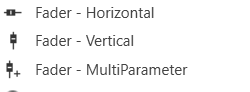
Fader Design

Fader Horizontal

A Fader Horizontal is an adjustable horizontally-positioned fader control that manipulates a device parameter.

Controls can be managed in the Custom Panel designer and, once the Custom Panel is activated, utilized by the end user. This control must be linked to a parameter to function properly.

Fader Vertical

A vertical fader is an adjustable vertically-positioned control that manipulates a device parameter.
Controls can be managed in the Custom Panel designer and, once the Custom Panel is activated, utilized by the end user. This control must be linked to a parameter to function properly.

Fader Multi Parameter

A multiparameter fader manipulates multiple device parameters.
Controls can be managed in the Custom Panel designer and, once the Custom Panel is activated, utilized by the end user. This control must be linked to a parameter to function properly.
On an activated Custom Panel, levels on a multiparameter fader can be adjusted together or individually

Common Fader Design Properties

Properties Type
Description
General
  • Control Info: Shows control type. This propery is Read only.
  • Locked: Specifies if the control is locked out so that it cannot be moved or re-sized.
    • Checked = Locked
    • Unchecked = Unlocked
Parameters
  • Addresses: Enables panel designer to edit addressing information with the added benefit that the values can be validated as a group before being applied to the device.
    This editor also allows the user to assign multiple parameters to the control. Click to select Parameter Address Editor.

    • Properties correspond to the system explorer.
  • Information: Shows information about the Parameter Address.
    • Read only. Properties correspond to the system explorer
  • Maximum: Maximum parameter value.
    • The largest parameter value.
  • Minimum: Minimum parameter value.
    • The smallest parameter value.
  • Reset Text: Optional text to display in right click context popup.
Appearance
  • Location: Control location (in pixels) of the control on the Custom Panel. Change X (horizontal) and Y (vertical) values in relation to upper left corner.
    You can also drag the control to a different location
  • Size: Control size (in pixels). Change width and height values. You can also re-size the control manually
  • Background Image: Brings up the Select Background Image window
  • Background Color: Background color of the control
  • Tool Tip Text: The text that appears on control mouse-over.
  • Tab Index: Determines the position of the control in the tab order
  • Tab Stop: Specifies whether the control appears in the tab order.
    • Checked = Appears
    • Unchecked = Does not appear
Arrow
  • Maximum Arrows: The maximum number of arrows to display.
  • Arrow Direction: The direction the arrows should point.
    • Point Left or Point Right
Fader Cap
  • Fader Cap Image: The image displayed for the fader cap.
    • Click Browse to locate custom fader caps
  • Fader Cap Size: How large the fader cap will be
  • Arrow Box Width: The width of the arrow box in pixels
  • Vertical Offset: The vertical offset of the fader cap, in pixels, from the fader channel
  • Horizontal Offset: The horizontal offset of the fader cap, in pixels, from the fader channel
  • Hot Spot: Sets mouse sensitivity to the fader cap or the entire length of the slider
  • Highlight Color: The channel highlight color
  • Arrow Box Separation: The distance between the arrow box and the fader channel in pixels.
  • Label Margin: The amount of space, as a decimal fraction of the width of the control, between the center channel and the tick marks
Channel
  • Channel Color: Color of the fader channel. Default is Dim Gray
  • Channel Width: Width of the fader channel in pixels
  • Channel Start: Distance, as a percentage of length, from the bottom or left edge to where the fader channel will start.
  • Channel End: Distance, as a percentage of length, from the bottom or left edge to where the fader channel will end.
  • Channel Center: Distance, as a percentage of width, from the bottom or left edge to where the fader channel will be located.
Scale
  • Display Tick Marks: Option to display the tick marks of the control. Must be set to true for custom ticks to display.
    • Checked = Display
    • Unchecked = Do not display
  • Number of Major Ticks: How many major ticks are displayed.
  • Tick Location: The location of the tick marks relative to the fader channel.
  • Custom Ticks: Whether to use custom tick values by utilizing the scale editor or not.
    • Checked = Display
    • Unchecked = Do not display
  • Display Tick Values: The value of the ticks to be displayed.
  • Value Format: The format of the tick values.
  • Labels Inside:
  • Major Tick Color: The color of the major tick.
  • Major Tick Length: The length of the major tick.
  • Number of Minor Ticks: How many minor ticks are displayed.
  • Minor Tick Color: The color of the minor tick.
  • Minor Tick Length: The length of the minor tick.
  • Tick Location: The location of the tick marks relative to the fader channel.
  • Font: The font for the ticks.
  • Labels Inside: Whether labels are drawn between tick marks and fader channel.
    Whether labels are drawn between tick marks and fader channel or not.

    • Checked = labels drawn between tick marks and channel.
    • Unchecked = tick marks drawn between labels and channel.
  • Labels Vertical: Whether labels are displayed vertically or horizontally.
    • Checked = labels display vertically
    • Unchecked = labels display horizontally, left to right.
  • Label Margin: The amount of space, as a decimal fraction of the width of the control, between the center channel and the tick marks.
Nudge Button
  • Nudge Button Location: Location of the nudge buttons.
    • None, Center, Above or Below
  • Nudge Type: Determines, with the increment amount, how much the control will adjust when a nudge button is pressed.
    • Percent – percentage of the total visual display of the control. For non-logarithmic controls, the visual display and the total value of the control will be the same. For logarithmic controls, the visual display will differ from the total value.
    • Bump – small increment
    • Value – specified increment amount.
  • Increment Amount: Determines, with the nudge type, how much the control will adjust when a nudge button is pressed.
  • Nudge Button Separation: Distance, in pixels, from the edge to the nudge button.
  • Up Image: The static image for the “up” nudge button. Click the button to select a new image.
  • Up Pushed Image: The image that displays when the “up” nudge button is pushed. Click the button to select a new image.
  • Down Image: The static image for the “down” nudge button. Click the button to select a new image.
  • Down Pushed Image: The image that displays when the “down” nudge button is pushed. Click the button to select a new image.
Popup Value
  • Popup Value Position – Fraction: The location of the popup value as a decimal fraction of the width (X) and height (Y) of the control.
  • Display Popup Value: Displays the value of the control in a popup, if set to true
    • Checked = Display
    • Unchecked = Do not display