
Table of Content

Box Design
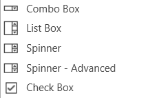
Combo Box
A Combo Box allows the user to select the value of a device parameter from a drop-down list.Controls can be managed in the Custom Panel designer and, once the Custom Panel is activated, utilized by the end user. This control must be linked to a parameter to function properly.
List Box
A List Box allows the user to select the value of a device parameter from a list. Controls can be managed in the Custom Panel designer and, once the Custom Panel is activated, utilized by the end user. This control must be linked to a parameter to function properly.
Spinner
A Spinner allows the user to change the value of a device parameter by adjusting it up or down; the increment can be specified by the Custom Panel designer. Controls can be managed in the Custom Panel designer and, once the Custom Panel is activated, utilized by the end user. This control must be linked to a parameter to function properly.
Check Box
A Checkbox turns on or off a device parameter value when pressed. Controls can be managed in the Custom Panel designer and, once the Custom Panel is activated, utilized by the end user. This control must be linked to a parameter to function properly.
Common Roter Design Properties
| Properties Type |
Description |
| General |
|
| Parameters |
|
| Appearance |
|
| Combo Box |
|
| List Box |
|
| Text Attributes |
|
| Nudge Buttons |
|
| Spinner Attributes |
|