Table of Content

About Global Tuning Tool
The Global Tuning Tool (GTT) is a software tool developed by Harman International, a leading audio and electronics company. The tool is designed to help audio engineers to create audio post-processing pipelines and tune audio the systems to get the best audio performance.
This is a windows-based tool that is part of the Harman AudioworX product suite. The Global Tuning Tool includes a comprehensive set of core audio functions, a powerful signal flow designer, tuning tool, and the framework for processing the entire audio signal path, enabling easy integration of both HARMAN and 3rd party technologies.
Key Features of Global Tuning Tool
- Real-Time Analysis: The software provides real-time analysis of audio system performance, allowing engineers to quickly tune the system as per requirement.
- System Optimization: The Global Tuning Tool uses advanced algorithms to optimize the audio system performance, based on the specific acoustics of the venue and the desired sound quality.
- Intuitive User Interface: The Global Tuning Tool features an intuitive user interface, with easy-to-use tools and visualizations, making it easier for engineers to make adjustments and optimize the sound system performance.
- Preset Management: The software includes a library of preset configurations for different types of venues and events, making it easier for engineers to get started and save time during the tuning process.
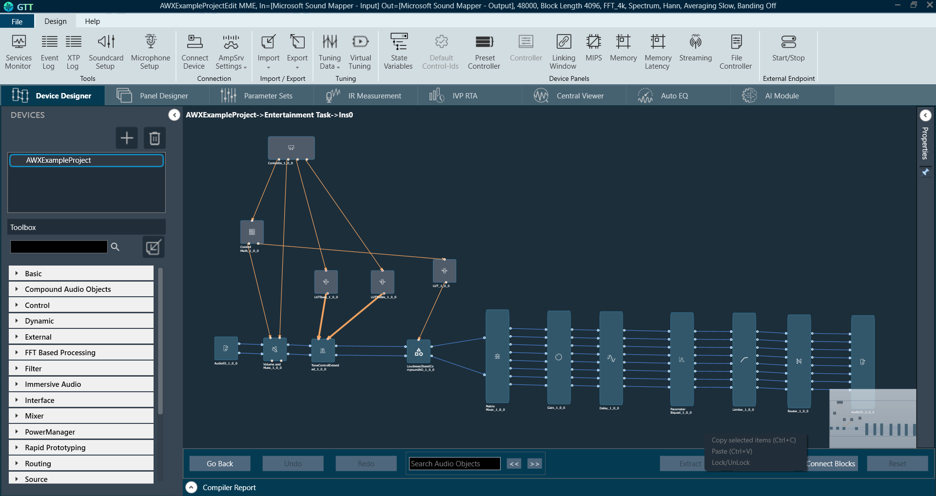
- Signal Flow Designer: The software allows users to drag and drop audio processing modules such as volume, limiter, filters, and mixers onto a virtual canvas, and then connect the input/output pins of modules to create a signal flow diagram. The signal flow diagram provides a visual representation of the path that an audio signal takes through a system, including where it is processed, amplified, and mixed with other signals.
Relative Topics