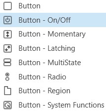
Button
A standard button sends a single value each time that it is pressed. While a button can be linked to a device parameter, it is more typically linked to a system function.
Controls can be managed in the Custom Panel designer and, once the Custom Panel is activated, utilized by the end user. This control must be linked to a parameter to function properly.
On the following example, if “Preset 1” button is pushed, the 1st preset is selected for DriveRack #1. If “Preset 2” button is pushed, the 2nd preset is selected. Each button push overrides the value of the previous button push.
Button On/Off
An on/off button alternately turns on or off a device parameter value when pressed. Controls can be managed in the Custom Panel designer and, once the Custom Panel is activated, utilized by the end user. This control must be linked to a parameter to function properly.
Button Momentary
A momentary button turns on a device parameter value while it is being pressed and turns the value off when released.
Controls can be managed in the Custom Panel designer and, once the Custom Panel is activated, utilized by the end user. This control must be linked to a parameter to function properly.
Button Latching
A latching button alternately turns on or off a device parameter value when pressed.
Controls can be managed in the Custom Panel designer and, once the Custom Panel is activated, utilized by the end user. This control must be linked to a parameter to function properly.
Button MultiState
A multi-state button both sets and displays a defined value of a device parameter. While the multi-state button is somewhat complex to set-up, its function can be very powerful. To set up an MS button, first you add (and link) the button, then change its properties. You must also define the button action. You can also change its other properties.
Controls can be managed in the Custom Panel designer and, once the Custom Panel is activated, utilized by the end user. This control must be linked to a parameter to function properly.
A multi-state button can be powerful but very complex, save your venue before adding or editing a multi-state button.
- Sets Value: Once the multi-state button is linked and defined, the parameter on the Custom Panel changes the parameter(s) on the device control panel(s).
- Multiple Device Parameters – If the multi-state button is linked to more than one device parameter, when the multi-state button on the Custom Panel is pushed, all the attached device parameters will be set to the specified value.
- Displays Value: Once the multi-state button is linked and defined, the parameter on the device control changes the parameter on the Custom Panel as defined in the properties section:
- Multiple Device Parameters – If the multi-state button is linked to more than one device parameter, the multi-state button on the Custom Panel will update the device parameters with the new value.
- Add Multi-State Button: Add a multi-state button the same way you add other controls and link it to one or more device parameters
- Change button properties – In order for the linked multi-state button to work properly, you must define how the property works. This is accomplished in Properties in the “Value Indication Matrix” window. You must also set the button action.
Button Radio
A radio button allows the user to select the value of a device parameter from a list. Controls can be managed in the Custom Panel designer and, once the Custom Panel is activated, utilized by the end user. This control must be linked to a parameter to function properly.
Button Region
This button sends a single value each time that it is pressed. While a button can be linked to a device parameter, it is more typically linked to a system function.
Controls can be managed in the Custom Panel designer and, once the Custom Panel is activated, utilized by the end user. This control must be linked to a parameter or system function to function properly. You can also easily add a pre-defined label.
On the following example, if “Preset 1” button is pushed, the 1st preset is selected for DriveRack #1. If “Preset 2” button is pushed, the 2nd preset is selected. Each button push overrides the value of the previous button push.
Button System Functions
A System Functions button sends a single value each time that it is pressed. This button is specifically linked to a system function.
Controls can be managed in the Custom Panel designer and, once the Custom Panel is activated, utilized by the end user. This control must be linked to a parameter to function properly.
Common Button Design Properties
Properties Type
|
Description |
| General |
- Control Info: Shows control type. This propery is Read only.
- Locked: Specifies if the control is locked out so that it cannot be moved or re-sized.
- Checked = Locked
- Unchecked = Unlocked
|
| Parameters |
- Addresses: Enables panel designer to edit addressing information with the added benefit that the values can be validated as a group before being applied to the device.
This editor also allows the user to assign multiple parameters to the control. Click to select Parameter Address Editor.
- Properties correspond to the system explorer.
- Information: Shows information about the Parameter Address.
- Read only. Properties correspond to the system explorer.
- Press Value: Value sent when button is pressed.
- On Value: Value sent when button is pressed.
- Off Value: Value sent when button is released.
- Value Matrix: Allows changes to the button states, and images associated with each state.
- Value List: Allows editing of the value range of the control. Brings up the Discrete Values Editor.
- Color 0 to Color 63: Background color of control. Brings up the Select Color window.
- Indication same as Button: The value sent when the button is pressed.
- Reset Text: Optional text to display in right click context popup.
|
| Appearance |
- Location: Control location (in pixels) of the control on the Custom Panel.
Change X (horizontal) and Y (vertical) values in relation to upper left corner. You can also drag the control to a different location.
- Size: Control size (in pixels). Change width and height values. Change width and height values. You can also re-size the control manually.
- Font: Font style for the text on the control. Click on “…” to select desired font. Selects from Windows fonts.
- Center Text: Centers the tool tip text on the control.
- Background Image: Background graphic of control. Brings up the Select Image File window.
- Background Color: Background color of the control. Brings up the Select Color window.
- Tool Tip Text: Text that appears when mouse pointer hovers over control.
- Tab Index: Indicates the sequence of an element within the tabbing order of all focusable elements in the document.
- Tab Stop: Whether the control appears in the tab order.
- Checked = Appears
- Unchecked = Does not appear
- Transparency: Percent transparent, between 0 (opaque) and 90 (very transparent). Brings up the Select Image File window.
- Hover Transparency: Percent transparent when the mouse pointer is over the region.
- Border Color: The color of the border. Brings up the Select Color window.
- Border Width: The width of the border (in pixels)
|
| Button |
- Primary Font: Font style for the text on the control. Click on “…” to select desired font. Selects from Windows fonts.
- Text: Text appearing on the control. Select and type desired label. Default text is “Button” with the number of the control (order added to the panel)
- Font: Font style for the text on the control. Click on “…” to select desired font. Selects from Windows fonts.
- Text Color: Color of the text on the control
- Fill Color: Changes the Fill Color of the control, will not be visible if you have an image selected.
- Border Color: The color of the Button border.
- On Primary Indication: Sets the button label, label color, background color, and background image for the “on” state.
- Off Primary Indication: Sets the button label, label color, background color, and background image for the “off” state. Brings up the State Indication Setup window.
- Enable Flashing: Enables button to flash.
- Flash Frequency: If flashing is enabled, sets the flashing frequency.
- Flash In Phase: If flashing is enabled, determines if button will flash in or out of phase with other buttons
- Flash On Indication: Sets the button label, label color, background color, and background image for the “flash on” state. Brings up the State Indication Setup window.
- Flash Off Indication: Sets the button label, label color, background color, and background image for the “flash off” state. Brings up the State Indication Setup window.
- Multi-line: When checked, changes the button for multi-line operation. A secondary set of certain properties are added to the button: Secondary Font, Secondary On Indication and Secondary Off Indication.
- Default state is unchecked. The Secondary Font, On Indication and Off indication options are identical to the Primary Font, On Indication and Off indication options.
- Bump up: When checked, bumps up the assigned parameter by the Bump % amount.
- Bump %: Sets the percentage amount for the Bump function.
- Bump Down: When checked, bumps down the assigned parameter by the Bump % amount.
- Button Action: When an event occurs when the button is clicked. OnUp, OnDown, or OnBoth.
- Button Image: The image displayed as the button. Brings up the Select Image File window.
- Alignment: Alignment of the button nubs. vertical and horizontal.
- Diameter: Diameter of the radio button nubs
- Style: The style (color) of the nubs.
- Select from the pull-down list.
- Border Style: The style of the control border.
- Select from the pull-down list
- Top Margin: Distance of the values, in pixels, from the top border of the control.
- Bottom Margin: Distance of the values, in pixels, from the bottom border of the control.
- Left Margin: Distance of the values, in pixels, from the left border of the control.
- Right Margin: Distance of the values, in pixels, from the right border of the control.
- On Color: The color of the button in the On state. Brings up the Select Color window.
- Off Color: The color of the button in the Off state. Brings up the Select Color window.
- On Text: The text displayed on the button in the On state.
- Off Text: The text displayed on the button in the Off state.
- Mixed Text: The text displayed on the button when in a mixed state.
|
| System Indication |
|
| System Functions |
- System Functions: Assign specific system operations to be performed when the button is pressed.
Brings up the System Function editor.
|