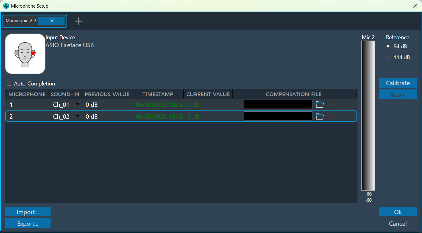
The seat measurements can be performed using a mannequin equipped with two microphones placed in the left and right ears.
The process to define a mannequin measurement is the same as that for other microphone arrays, with a few additional steps required to specify movement or rotation details for each sequence.
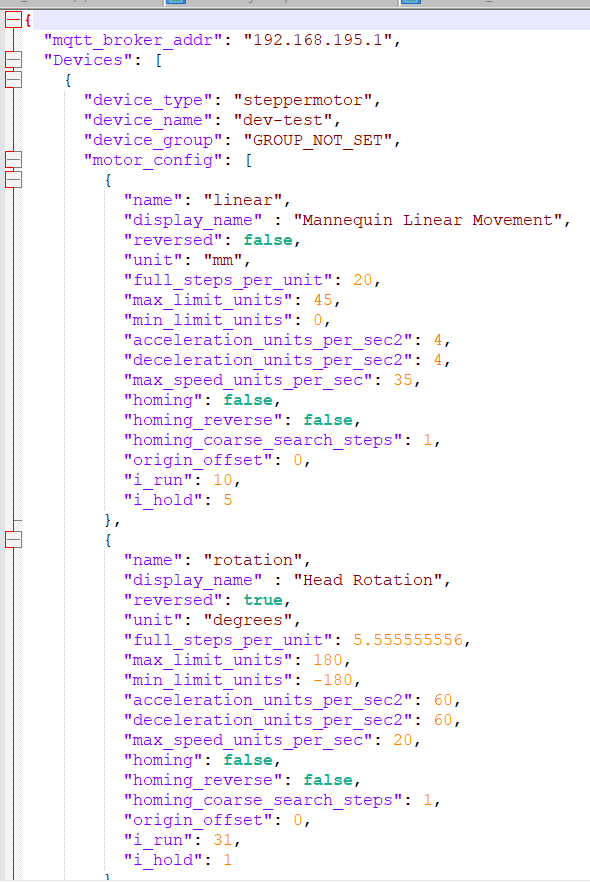
Mannequin Configuration file: Harman AudioworX has established a file template to enable mannequin movement and rotation functionalities. This includes defining minimum and maximum limits for rotation or linear movements, specifying their units, and providing the MQTT broker address necessary for motor communication and execution of mannequin movements.
In the microphone setup, select the mannequin option. The mannequin microphone array setup follows the same procedure as microphone arrays.
On the Mannequin Measurement, follow the same procedure as the microphone measurement with a few additional steps. For more details, refer to understand measurement process.
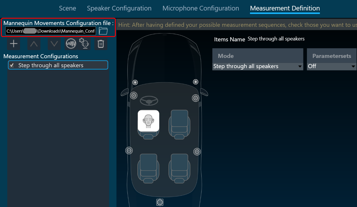
On the Measurement Definition, select the browse option and open the “Mannequin template file.
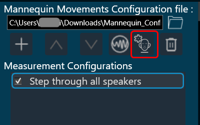
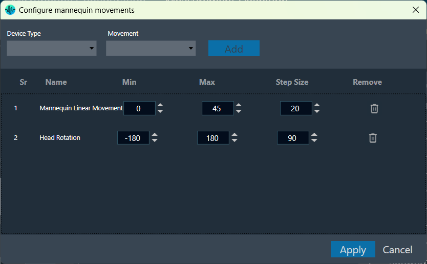
Select the Mannequin Setting to configure mannequin movements.
In the Mannequin dialog box, the details of the configuration file selected in the previous step are parsed, and the available movements along with their minimum and maximum values are listed here. You can select the required movement and configure its minimum, maximum, and step size values within the provided limits.
Based on this configuration, measurement steps for each sequence will be generated.
Once you have configured all the measurements, click on Start Measurement Session to activate the measurement mode. This opens a new measurement window. For more details, refer to the Measurement Session.
This document contains complete information on how to build an AudioworX Starter Kit by interfacing and configuring hardware components from the ground up. The scope of the document is limited to the steps that are required to be completed as a pre-requisite to the Getting Started Guide in AudioworX Starter Kit Overview only when the components of the Starter Kit are sourced independently.
Caution: Some of the steps given here require careful handling of the electronic components and we encourage users to observe caution during the hardware installation steps.
Following is a list of hardware components along with approx. cost (without shipping and taxes) and their recommended variants to be procured before getting started with the assembly of the AudioworX Starter Kit.
Power supply for the JBL DSP-4086/Infinity DSP6840 amplifier.
$20
6
Miscellaneous items
Audio cables for providing audio input to the Starter Kit audio input ports (3.5mm to 3.5 mm Stereo Audio Cable) – 1 for stereo input or 4 for 7.1 input.
Audio cables to connect speakers/power amplifier to the Starter Kit audio output ports (3.5 mm to RCA audio cables) – 3 for 5.1 output or 4 for 7.1 output.
Connectors for interfacing speakers to the amplifier,
Assembling the HiFiBerry HATs on to the Raspberry Pi 5
In the latest version of the AudioworX Starter Kit, the HiFiBerry DAC8x (8-channel line audio input HAT) and the HiFiBerry ADC8x Add-on (8-channel line audio output HAT) are the default and recommended audio interface for the setup’s compactness, robust interfacing and multi-channel capabilities.
The HiFiBerry HATs must be stacked on top of the Raspberry Pi 5 (the bottom-most layer in the stack) using the 40-pin header in the given order:
HiFiBerry DAC8x (middle layer in the stack) on top of the Raspberry Pi,
HiFiBerry ADC8x Add-on (top-most layer in the stack) on top of the DAC8x.
Observe caution when stacking the HATs. Disconnect the power from the Raspberry Pi 5 before installing the HATs.
It is important that the pins perfectly align with no open pins visible upon installation. Use the plastic spacers provided with the HiFiBerry HATs to ensure that the hardware is secured in place and does not budge while connecting cables to the audio input and output ports.
The below figure shows a complete Starter Kit setup.
A Fully Setup AudioworX Starter Kit (Bottom Layer: Raspberry Pi 5, Middle Layer: HiFiBerry DAC8x, Top Layer: HiFiBerry ADC8x Add-on)
Flashing the AudioworX Starter Kit Custom Image on the MicroSD Card
The AudioworX download page contains a Starter Kit Package, which is a pre-configured disk image for the Raspberry Pi 5, pre-installed with all dependencies and configured to run the AWX Amp application with the Starter Kit example SFD upon successful boot-up (refer to Getting Started with the Example Project. This section provides instructions on how to make a bootable MicroSD card for the Raspberry Pi 5 using the custom image.
Mount the SD card in the card reader and plug it into your PC for flashing.
Open the Raspberry Pi Imager. Under “Device”, select the “Raspberry Pi 5”.
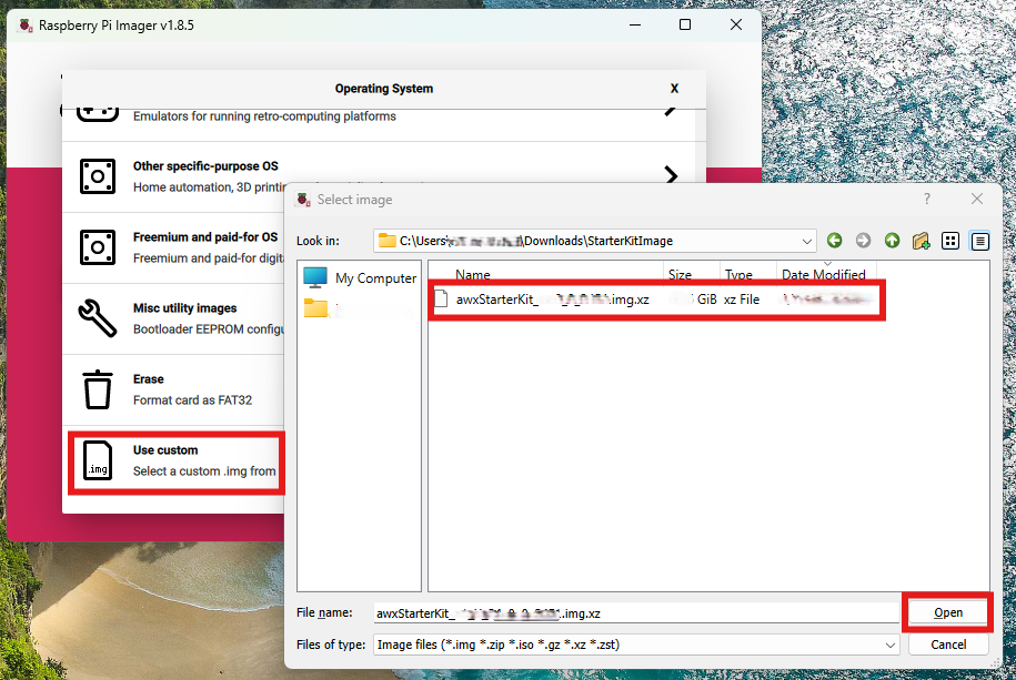
Under “Operating System”, click “Choose OS”, scroll down and click “Use Custom”.
In the pop-up, browse for the downloaded image file and select it.
Now, in the main Raspberry Pi Imager window click the “Choose Storage” button, select the mounted drive to be flashed and click “next”.
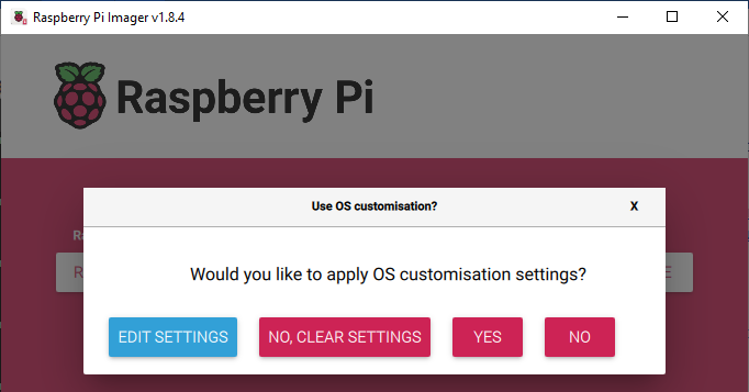
The Imager will then show a prompt for OS customizations. Click on “Edit Settings”.
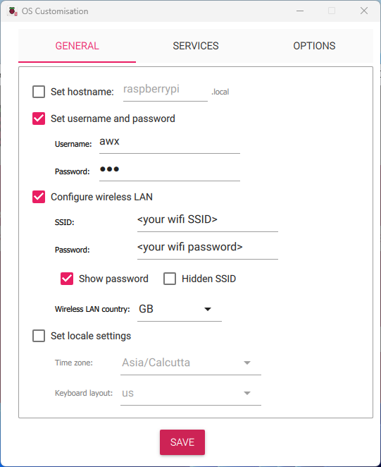
In the OS Customization → General tab (shown below):
Enter “awx” in both the username and password fields. Alternatively, users may enter a username and password of their choice and use the same in the SKUtility to login to the Starter Kit later.
(Optional) If direct ethernet connection between the Raspberry Pi and the PC is not possible:
Tick the check box “Configure Wireless LAN” and enter your home Wi-Fi/mobile hotspot credentials in the SSID (Wi-Fi name) and password fields,
Specify the Wireless LAN country code according to the country that the Starter Kit is being used from the drop-down menu. Here, it is set to GB (Great Britain).
Direct ethernet connection between the PC and the Raspberry Pi is recommended for stable connection to the Starter Kit. Refer to the Troubleshooting Guide for alternative ways to establish connection between the PC and the Raspberry Pi.
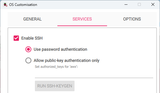
In the “Services” tab, enable SSH login and click “Save”.
In the following window, click “Yes” to apply OS customizations.
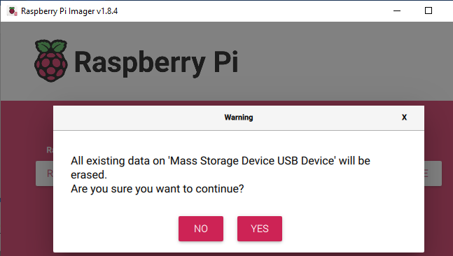
You might see a warning (shown below). Click on “Yes” to continue.
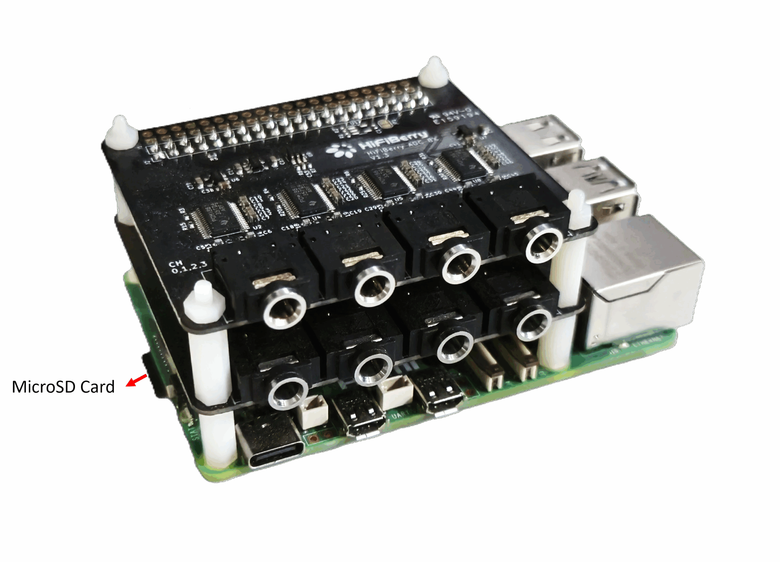
Once the image has been flashed, eject the MicroSD card from the card reader, insert it into the Raspberry Pi’s Micro SD card slot on the underside (shown below) and power it on.
First-time boot could take a few minutes since the disk partitions get resized at this time. The Power LED on the Raspberry Pi 5 will turn static Red after some time, after which the power needs to be reset by pulling out the power cable and plugging it back in. On successful boot-up, the Power LED will light-up Green and blink randomly, indicating disk activity. A noticeable pattern in the Power LED blinking could indicate a possible issue in booting. Refer to Unresponsive Raspberry Pi5 on First Boot – Troubleshooting Steps for instructions on how to fix the issue.
Verifying the Setup using the SKUtility
To verify if the Raspberry Pi has been configured properly, connect it to the host PC using an ethernet cable (or ensure that the PC and the Raspberry Pi are configured to connect to the same network), run the SKUtility Diagnostics as described “Verifying Hardware Connections with the AudioworX Starter Kit Utility” section in Hardware Components Setup. This tool is installed as part of the Global Tuning Tool (for instructions on installation of GTT, refer to Installing AudioworX Setup.
Verify from the log printed on the right-hand side pane if step 1 of the diagnostics is successful, i.e., the PC can reach the Raspberry Pi over the network. If the Raspberry Pi is inaccessible even after resetting power, follow the instructions in the next section to troubleshoot.
Unresponsive Raspberry Pi5 on First Boot – Troubleshooting Steps
There may be cases where the Raspberry Pi is inaccessible due to issues while booting up. In such cases, the Power LED on the Raspberry Pi may flash in a regular pattern corresponding to an error code listed in the official Raspberry Pi website. One common issue when using a PC that has USB-write restrictions to flash the MicroSD card could be the “start*.elf not found” error preventing the Raspberry Pi from booting up. In this case, the Power LED flashes 4 times in short bursts, followed by a pause and repeats the same pattern.
The following are the steps to fix this issue:
Remove SD card from Raspberry Pi, insert it into the Micro SD card reader and plug it into the PC.
Open the Raspberry Pi Imager tool, select the “Erase” option in the “Operating System” menu and select the inserted SD card in the Storage menu.
Click the next button in the main menu and click on “Erase” when prompted to fully format the SD card.
Once the formatting is complete, from the main menu of the Raspberry Pi Imager:
Select “Raspberry Pi 5” in the “Raspberry Pi Device” menu,
Open the “Operating System” menu and select “Misc Utility Images → Boot loader (Pi 5 family) → SD card Boot”.
Select the SD card in the “Storage” menu and write the image.
Now, insert the SD card in the Raspberry Pi, power it up and wait for the green LED to continuously blink at a constant interval.
The final step is critical in configuring the boot loader of the Raspberry Pi 5. Complete all the steps in the same order to rectify the issue.
Upgrading the Starter Kit Software from an Earlier Release of AudioworX
The AudioworX Starter Kit software binaries and other resources are installed on the PC along with GTT to allow for upgrading an existing Starter Kit to the version of GTT installed. The SKUtility Tool can be used to upgrade the version as detailed below.
Before upgrading the AudioworX installation on the Starter Kit, it is highly recommended to take a back-up of the exiting AudioworX installation directory Raspberry Pi.
If the pre-installed AudioworX version on the Starter Kit is before Y-release (v25.x.x.x), run the below command using the older version of the SKUtility Tool (CLI tool installed with the old version of GTT): python3 SKUtility.py rmt -snp For AudioworX installations on the Starter Kit post Y-release, use the SKUtilityGUI using the Remote > Snapshot option. The back-up will be saved in C:/ProgramData/Harman/StarterKit (SKSnap_<date_and_time_stamp>.zip).
Steps for Upgrading the AudioworX Version on the Starter Kit
Click Yes to install the version of AudioworX on the Starter Kit hardware associated with the GTT installation,
Finally, reboot the Starter Kit using Remote > Reboot.
Since the binaries and data files for the Starter Kit are installed along with GTT, the above instructions can also be used to revert to any older releases of the AudioworX Starter Kit post W+1 (v24.1.1.2444) by performing Factory Reset with the SKUtility Tool associated with the GTT installation.
The Starter Kit software can be installed on an existing Raspberry Pi 5 with the Raspbian OS using the SKUtility Tool by logging into a sudo user account following the same steps as above. However, there could be missing dependencies that may need to be installed before being able to use the Raspberry Pi 5 as an AudioworX Starter Kit.
Additional Changes Required for HiFiBerry HATs on Older Releases of the Starter Kit
The support for the HiFiBerry DAC8x and ADC8x Add-on HATs with the Starter Kit has been added by default in the custom image only from the Y-release of AudioworX (July 2025). However, if using an existing release of the AudioworX Starter Kit or if installing the Starter Kit software on an existing Raspberry Pi 5 with the Raspbian OS, additional steps are required for enabling their use.
The support for HiFiBerry ADC8x Add-on HAT was added to the official Linux Kernel’s February 2025 release (see the official HiFiBerry post on this topic). This necessitates a Kernel update on Raspberry Pies with older kernels.
Step 5 (Linux Kernel update) requires internet access in the Raspberry Pi and using direct ethernet connection to the PC may not work. The recommended method for enabling support for the HiFiBerry HATs is by using the custom image for Y-release of AudioworX (see Flashing the AudioworX Starter Kit Custom Image on the MicroSD Card).
To install support on an existing Starter Kit, ensure that the Starter Kit and the PC are connected to a Wi-Fi network or a wired-LAN with internet access. To configure the Starter Kit to connect to an external Wi-Fi, refer to “Starter Kit Configuration > Wi-Fi Config” in SKUtility Tool – Graphical Application.
SSH into the Raspberry Pi 5 using the Windows Command Prompt by running the following command:
ssh awx@raspberrypi.localEnter the password when prompted (The password will not appear as you type. Type the full password and hit the “Enter” key.). If the hostname and username are different from that of the default Starter Kit, run the SSH command as given below:
ssh <username>@<hostname>
Run the following command in the ssh terminal:
sudo nano /boot/firmware/config.txt
Add the following line to the end of the file:
dtoverlay=hifiberry-dac8x
Press Crtl+S to save the file and Crtl+X to exit.
Update the Linux Kernel on the Raspberry Pi by running the following command: sudo rpi-update
Reboot the Raspberry Pi from the SKUtility Tool (Remote > Reboot) to complete the installation.
To verify that the HiFiBerry HATs are accessible using the SKUtility Tool, connect to the Starter Kit, go to Configuration > Audio Config, and verify that “sndrpihifiberry” is available under both, the input and output audio device drop-down menu as shown below:
HiFiBerry HATs Chosen as the Audio Interface in the SKUtility Tool
Configuring the JBL DSP-4086/Infinity DSP6840 Amplifier (Only for Passive Speaker Systems)
The JBL DSP-4086 amplifier and Infinity DSP6840 are the recommended amplifiers for the Starter Kit for their robustness in car systems. Users may choose to opt for an amplifier of their choice depending on the speaker specification and availability of the amplifier.
The JBL DSP-4086 and the Infinity DSP6840 (both amplifiers are very similar in appearance and identical in specification and operation) are capable of simple DSP operations for equalizations, volume and distance tuning which can be configured via the DSP tuning application provided. In the Starter Kit context, ideally, the DSP processing is expected to be confined to the Starter Kit hardware (Raspberry Pi 5). The JBL DSP-4086 and the Infinity DSP6840 must be reconfigured for the Starter Kit use-case to turn off all DSP processing. The following are instructions to reconfigure the amplifier.
Amplifier’s DSP tuning application (this application can also be installed from the USB thumb-drive supplied with the amplifier):
JBL DSP application for the JBL DSP-4086 amplifier, or,
Infinity DSP application for the Infinity DSP6840.
AWX_SKAmpConfig.bin – Preset file containing the required configuration of the amplifier.
Instructions for Configuring the Amplifier
Download and install the DSP tuning application.
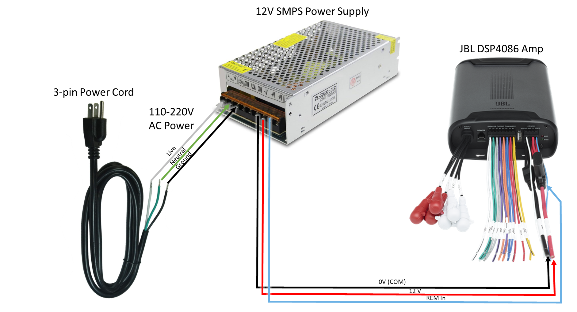
Power up the amplifier as follows:
Connect the SMPS power supply’s AC power input using the 3-pin Power Cord (exact connections shown in the image below)
Connect the Power Harness of the amplifier as follows:
Red thick wire (+12V) to the +V port of the SMPS power supply,
Black thick wire (0V COM) to the -V port of the SMPS power supply,
Blue thin wire (Remote In) to the +V port of the SMPS power supply.
Connect the amplifier to the PC via USB (USB cable supplied with the amplifier).
If using the JBL DSP-4086 amplifier, set the PC to flight mode.
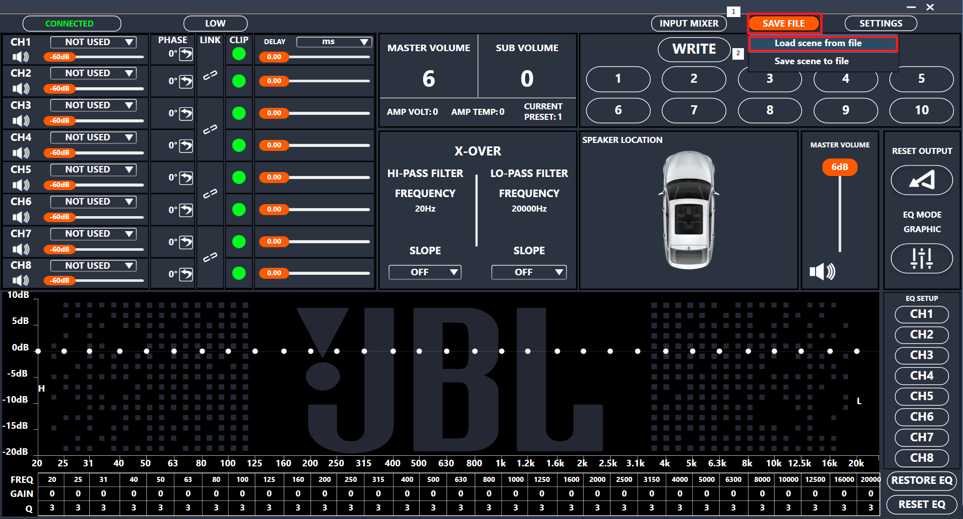
Now, open the JBL/Infinity DSP application from the Windows Start menu. If the amplifier is properly connected, it will be clearly shown on the top-left of the application.
Load the file from the “Save File → Load Scene” menu:
In this configuration, output channels 7 and 8 of the amplifier are unused. They may be enabled to drive additional speakers with signals derived from the 6 input channels. For example, an additional sub-woofer or front stereo tweeters may be driven by the amplifier.
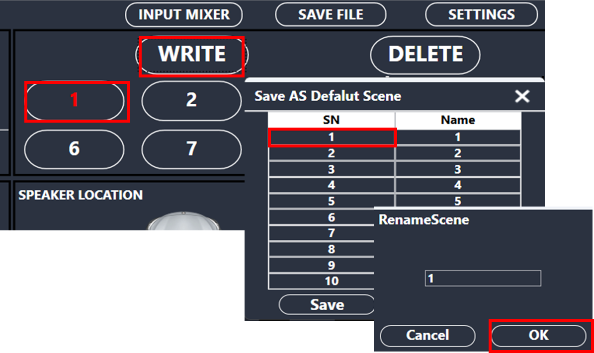
Finally,
Select preset “1” from the top-right preset list,
Click the “Write” button,
Select the first row,
Click “Ok” in the renaming window,
Click “Save” in the “Save as Default Scene” window to write the preset into the amplifier.
The amplifier configuration is now complete, and the amplifier may be unplugged from the PC.
Step 4 above (putting the PC in Flight-mode when using the JBL DSP-4086 amplifier) is necessary to ensure that the DSP software starts up correctly and connects to the amplifier (as mentioned in this post). Once the application starts up and the amplifier is connected, Flight-mode may be deactivated.
The Panel Designer includes several features grouped into categories to assist you in designing custom panels effectively.
Panel Designer Ribbon: The Panel Designer ribbon contains tools for designing and editing the custom panel. The ribbon is divided into the following groups: Tools, Current Panel, Controls, Clipboard, Editing, Layout, and Parameters.
The Panel Designer ribbon contains tools for designing and editing custom panels.
The Panel Designer ribbon comprises the following groups.
Panels View: The Panels view in Panel Designer displays all the custom panels and allows you to create, delete, and import the custom panels. In addition, you can access the Venue Explorer to view available devices, Applications, and Parameter Sets.
Custom Panel Properties View: The Properties view displays the properties of each component used to design the custom Panel and also allows you to customize the Panel to meet your needs. The Properties view is displayed on the right-hand side of the screen.
Designer Workspace: You can use various tools available in the Toolbox to create a custom panel in the Designer workspace.
Editor Windows: In the Properties view, you can customize the Panel using various editor windows. These editor windows are mapped to the corresponding properties.
A text display is a dynamic text control on a Custom Panel that can be linked to the value of a specific device parameter. It shows the control value as it changes, much like a text box, but cannot be changed by the user.
Use either the Text Label or Note control to add static text to a Custom Panel.
A Text Display control can be managed in the Custom Panel designer and, once the Custom Panel is activated, viewed (but not changed) by the end user.
Unlinked (Static) Text: If a label is not linked to a control, the text does not change on the control but is merely the default text as defined in the text attributes. Once another control is linked, the value is overridden by the parameter value.
Linked (Updating) Text: If a label is linked to a control, on the activated Custom Panel it will reflect the value of the control as it changes, much like a text box. However, the value cannot be changed by the user.
Once a label is linked to a control, you can add a label showing the parameter address of the label.
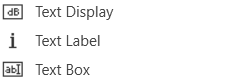
Text Label
A text label is a static text control on a Custom Panel. It is text only, cannot be linked to a device parameter, and is not interactive for the user.
Text Label controls can be managed in the Custom Panel designer and, once the Custom Panel is activated, viewed (but not changed) by the end user.
Text Box
A text box allows the user to specify the exact value of a device parameter by typing it in rather than running through a long list of values. In tablet mode, a keypad loads when a text box is selected.
Controls can be managed in the Custom Panel designer and, once the Custom Panel is activated, utilized by the end user. This control must be linked to a parameter to function properly.
Common Text Design Properties
Properties Type
Description
General
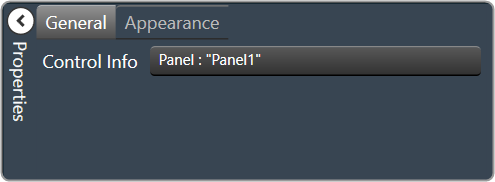
Control Info: Shows control type. This propery is Read only.
Locked: Specifies if the control is locked out so that it cannot be moved or re-sized.
Checked = Locked
Unchecked = Unlocked
Parameters
Address: Enables panel designer to edit addressing information with the added benefit that the values can be validated as a group before being applied to the device.
This editor also allows the user to assign multiple parameters to the control.
Properties correspond to the system explorer.
Information: Shows information about the Parameter Address.
Read only. Properties correspond to the system explorer.
Rest Text: Optional text to display in right click context popup
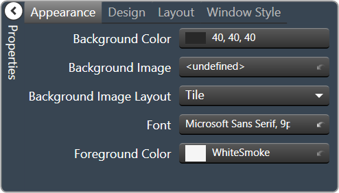
Appearance
Location: Control location (in pixels) of the control on the Custom Panel. Change X (horizontal) and Y (vertical) values in relation to upper left corner.
You can also drag the control to a different location.
Size: Control size (in pixels). Change width and height values. You can also re-size the control manually.
Background Image: Background image of the control.
Background Color: Background color of the control.
Paint Style: Background paint style of the control.
Solid Brush: solid background
Gradient Brush: gradient fill background
Gradient Color Start: Beginning gradient color if gradient is selected in Paint Style.
Gradient Color End: Ending gradient color if gradient is selected in Paint Style.
Gradient Mode: Type of gradient fill if gradient is selected in Paint Style.Click to select type of gradient.
Border Color: Border color of the control.
Brings up the Select Color window. Default color is transparent.
Border Style: Click to select border style.Default style is flat.
Text Attributes
Text: Enter the text for the Text Display.Default text is “TextDisplay1”.
Text Font: Click on “…” to select desired font. Brings up a Font Select window.Selects from Windows fonts.
Text Color: Text color of the control.Default color is black.
Text Alignment: Alignment of the label text.Default alignment is middle center
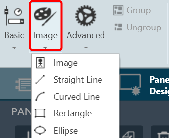
The Image control is a basic Custom Panel control used for custom images such as a company logo or icon.
Property Type
Options
General
Control Info: Shows control type. Read only
Locked: Specifies if the control is locked out so that it cannot be moved or re-sized.
Checked = Locked
Unchecked = Unlocked
Appearance
Location: Control location (in pixels) of the control on the Custom Panel. Change X (horizontal) and Y (vertical) values in relation to upper left corner. You can also drag the control to a different location
Size: Control size (in pixels). Change width and height values. You can also re-size the control manually.
Image: Brings up the Select Image file window.
Image Layout: The image layout used by the control. None, Tile, Center, Stretch, or Zoom
Background Color: Background color of the image control. Brings up the Select Color window.
Straight Line
Allows to add a straight line in the custom panel.
Property Type
Options
General
Control Info: Shows control type. Read only
Locked: Specifies if the control is locked out so that it cannot be moved or re-sized.
Checked = Locked
Unchecked = Unlocked
Appearance
Location: Control location (in pixels) of the control on the Custom Panel. Change X (horizontal) and Y (vertical) values in relation to upper left corner. You can also drag the control to a different location
Size: Control size (in pixels). Change width and height values. You can also re-size the control manually.
Fore Color: The color of the line. Brings up the Select Color window.
Line Properties
Anti-alias: When checked, turns on the anti-aliasing filter.
Start Point: The location on the panel of the line starting point.
End Point: The location on the panel of the line ending point.
Thickness: The thickness, in pixels of the line.
Line Template: The orientation of the line.
Horizontal, Vertical, Diagonal Ascending, and Diagonal Descending
Curved Line
Allows to add a curved line in the custom panel.
Property Type
Options
General
Control Info: Shows control type. Read only
Locked: Specifies if the control is locked out so that it cannot be moved or re-sized.
Checked = Locked
Unchecked = Unlocked
Appearance
Location: Control location (in pixels) of the control on the Custom Panel. Change X (horizontal) and Y (vertical) values in relation to upper left corner. You can also drag the control to a different location
Size: Control size (in pixels). Change width and height values. You can also re-size the control manually.
Fore Color: The color of the line. Brings up the Select Color window.
Line Properties
Curve Type: The quadrant that the curved line occupies. Choose from drop down list
Anti-alias: When checked, turns on the anti-aliasing filter.
Thickness: The thickness, in pixels of the line.
Rectangle
Allows to add a rectangle in the custom panel.
Property Type
Options
General
Control Info: Shows control type. Read only
Locked: Specifies if the control is locked out so that it cannot be moved or re-sized.
Checked = Locked
Unchecked = Unlocked
Appearance
Location: Control location (in pixels) of the control on the Custom Panel. Change X (horizontal) and Y (vertical) values in relation to upper left corner. You can also drag the control to a different location
Size: Control size (in pixels). Change width and height values. You can also re-size the control manually.
Fore Color: The color of the line. Brings up the Select Color window.
Gradient Color Start: The starting color of a gradient fill or the color of a solid fill. Brings up the Select Color window.
Gradient Color End: The ending color of a gradient fill. Not used for a solid fill. Brings up the Select Color window.
Gradient Mode: The direction that a color gradient fill will flow. Horizontal, Vertical, Forward Diagonal or Backward Diagonal
Paint Style: The type of background fill. Empty Brush, Solid Brush or Gradient Brush
Rounded Corners: When checked the corners of the box will be rounded by the Corner Radius amount.
Corner Radius: The radius of the corners.
Line Properties
Anti-alias: When checked, turns on the anti-aliasing filter.
Thickness: The thickness, in pixels of the line.
Ellipse
Allows to add ellipse in the custom panel.
Property Type
Options
General
Control Info: Shows control type. Read only
Locked: Specifies if the control is locked out so that it cannot be moved or re-sized.
Checked = Locked
Unchecked = Unlocked
Appearance
Location: Control location (in pixels) of the control on the Custom Panel. Change X (horizontal) and Y (vertical) values in relation to upper left corner. You can also drag the control to a different location
Size: Control size (in pixels). Change width and height values. You can also re-size the control manually.
Fore Color: The color of the line. Brings up the Select Color window.
Gradient Color Start: The starting color of a gradient fill or the color of a solid fill. Brings up the Select Color window.
Gradient Color End: The ending color of a gradient fill. Not used for a solid fill. Brings up the Select Color window.
Gradient Mode: The direction that a color gradient fill will flow. Horizontal, Vertical, Forward Diagonal or Backward Diagonal
Paint Style: The type of background fill. Empty Brush, Solid Brush or Gradient Brush
Line Properties
Anti-alias: When checked, turns on the anti-aliasing filter.
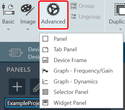
A panel is a box that allows you to manage the look of your Custom Panel.
Property Type
Options
General
Control Info: Shows control type.
Read only
Appearance
Back Color: Background color of the panel.Brings up the Select Color window.
Location: Control location (in pixels) of the control on the Custom Panel. Change X (horizontal) and Y (vertical) values in relation to upper left corner.You can also drag the control to a different location
Size: Control size (in pixels). Change width and height values. You can also re-size the control manually.
Paint Style: The type of background fill. Solid Brush or Gradient Brush
Gradient Mode: The direction that a color gradient fill will flow. Horizontal, Vertical, Forward Diagonal or Backward Diagonal
Gradient Color Start: The starting color of a gradient fill or the color of a solid fill.Brings up the Select Color window.
Gradient Color End: The ending color of a gradient fill. Not used for a solid fill.Brings up the Select Color window.
Background Image: Background image of the control.
Background Image Layout: The way the background image is drawn. None, Tile, Center, Stretch or Zoom
Border Style: Click to select border style. Default style is flat.
Draw Border: When checked, a border is drawn around the Panel.
Rounded Corners: When checked the corners of the box will be rounded by the Corner Radius amount.
Corner Radius: The radius of the corners.
Tab Index: If tab stop is set to true, determines the position of the control in the tab order.
Tab Stop: Specifies whether the control appears in the tab order.
Checked = Appears
Unchecked = Won’t appear
Tab Panel
A tab panel is a box with selectable tabs that allows you to manage the look of your Custom Panel as well as group controls together in a functional, attractive manner. Tab panels can be managed in the Custom Panel designers and, once the Custom Panel is activated, viewed by the end user. They can also select the desired tab.
Add a Tab Panel by dragging and dropping the Tab Panel icon, then add controls to the panel the same way you would a Custom Panel. After the tab panel has been added, add controls to the tab panel the same way you would a Custom Panel.
If the controls are not on the tab panel, select them and drag them over to the panel.
There are two levels to the panel – the entire panel and the tab portion of the panel.
Property Type
Options
Appearance
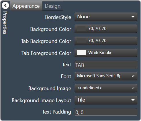
Border Style: Click to select border style. Default style is flat.
Background Color: Background color behind the tab. Brings up the Select Color
Tab Background Color: Background color of the tab area. Brings up the Select Color
Tab Foreground Color: The color of the Tab’s text. Brings up the Select Color
Text: The header text for this tab.
Font: Click on “…” to select desired font. Brings up a Font Select window. Selects from Windows fonts.
Background Image: Background image of the control.
Background Image Layout: The way the background image is drawn.None, Tile, Center, Stretch or Zoom
Text Padding: The amount of space around the text for this tab page.
Design
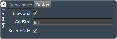
Draw Grid: When checked, the positioning grid will be drawn
Grid Size: Adjusts the size of the grid points within the panel. 8,8 is the default. Making this number smaller, such as 6,6 will add more grid points.
Snap To Grid: Snaps each element in the Panel to the nearest grid point.
Device Frame
The Device Frame looks and behaves similar to a standard Panel. Like a standard Panel, Parameter controls are added into it. Unlike a standard Panel, it has the power to change which Parameters its controls are attached to at run time (as opposed to design time).
At the top of the Design Frame is a combo box which lists devices of the same type. When the Device Frame is running, you can change which device is currently selected. All the controls in the Device Frame should then switch Parameters moving to corresponding State Variables on the newly selected device. In this way, you can create one small control panel which potentially controls or monitors any number of devices.
Property Type
Options
General
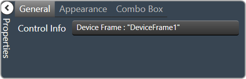
Control Info: Shows control type.
Read only
Appearance
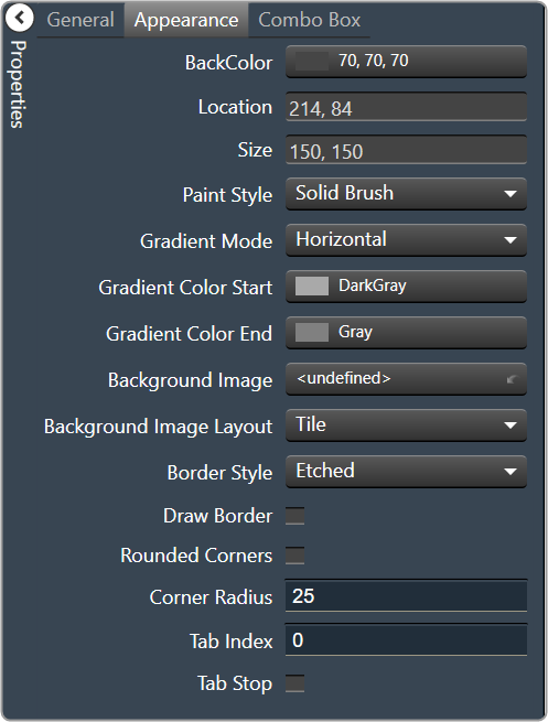
Back Color: Background color of the panel. Brings up the Select Color window.
Location: Control location (in pixels) of the control on the Custom Panel. Change X (horizontal) and Y (vertical) values in relation to upper left corner. You can also drag the control to a different location
Size: Control size (in pixels). Change width and height values. You can also re-size the control manually.
Paint Style: The type of background fill. Solid Brush or Gradient Brush
Gradient Mode: The direction that a color gradient fill will flow. Horizontal, Vertical, Forward Diagonal or Backward Diagonal
Gradient Color Start: The starting color of a gradient fill or the color of a solid fill. Brings up the Select Color window.
Gradient Color End: The ending color of a gradient fill. Not used for a solid fill. Brings up the Select Color window.
Background Image: Background image of the control.
Background Image Layout: The way the background image is drawn. None, Tile, Center, Stretch or Zoom
Border Style: Click to select border style. Default style is flat.
Draw Border: When checked, a border is drawn around the Panel.
Rounded Corners: When checked the corners of the box will be rounded by the Corner Radius amount.
Corner Radius: The radius of the corners.
Tab Index: If tab stop is set to true, determines the position of the control in the tab order.
Tab Stop: Specifies whether the control appears in the tab order.
Checked = Appears
Unchecked = Won’t appear
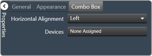
Combo Box
Horizontal Alignment: The alignment of the Combo Box within the Device Frame. Left, Center or Right
Devices: Brings up a Devices select window where you will select the available devices to assign to the Device Frame.
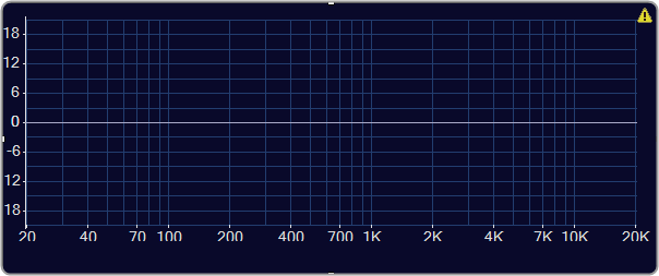
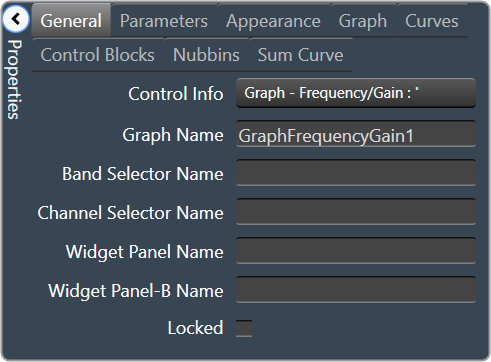
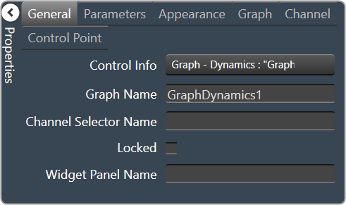
Band Selector Name: The name of the band selector panel associated with this graph.
Channel Selector Name: The name of the Selector Panel to which the graph is linked.
Widget Panel Name. The name of the Widget Panel to which the graph is linked.
Widget Panel-B Name: The name of a secondary Widget Panel associated with this graph.
Locked: Specifies if the control is locked out so that it cannot be moved or re-sized.
Checked = Locked
Unchecked = Unlocked
Parameters
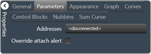
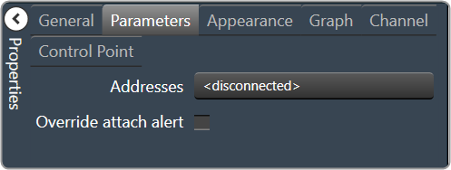
Addresses: The addresses for the parameters attached to the graph hierarchy. Opens the Graph Parameters window.
Override attached alert: Whether to display the warning for disconnected controls.
Checked = Display
Unchecked = No Display
Appearance
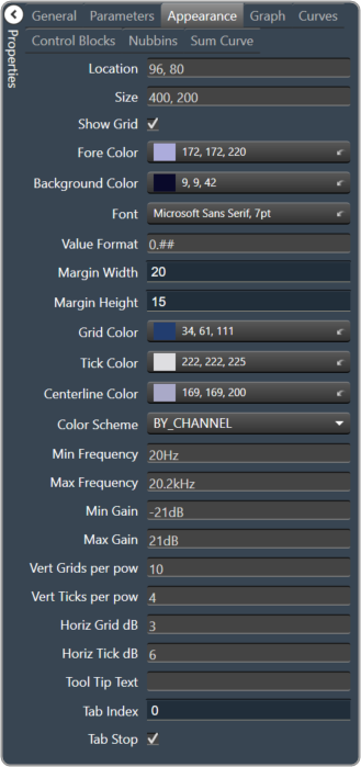
Location: Control location (in pixels) of the control on the Custom Panel. Change X (horizontal) and Y (vertical) values in relation to upper left corner. You can also drag the control to a different location
Size: Control size (in pixels). Change width and height values. You can also re-size the control manually
Show Grid: Whether or not to display the grid lines.
Checked = Display
Unchecked = No Display
Fore Color The foreground color for this graph. Brings up the Select Color window.
Background Color: Background color of the graph. Brings up the Select Color window.
Font: Font for tick labels. Click on “…” to select desired font. Selects from Windows fonts.
Value Format: The format of the values next to the major tick marks.
0.## means whole number with two decimal places.
Margin Width: The width of the margin from the sides to the graph (in pixels).
Margin Height: The height of the margin from the sides to the graph (in pixels).
Grid Color: Grid line color. Brings up the Select Color window.
Tick Color: Color of the tick marks. Brings up the Select Color window.
Centerline Color: Color of the graph centre line. Brings up the Select Colorwindow.
Color Scheme: The manner in which the Channel Colors are to be used. By Index, By Band or By Channel
Min Frequency: Lower bound frequency for the graph.
Max Frequency: Upper bound frequency for the graph.
Min Gain: Lower bound gain for the graph.
Max Gain: Upper bound gain for the graph.
Vert Grids per pow: The number of grid lines to display for each power of 10 in frequency.
Vert Ticks per pow: The number of ticks to display for each power of 10 in frequency.
Horiz Grid dB: The number of dB between each horizontal grid line.
Horiz Tick dB: The number of dB between each horizontal tick mark.
Tool Tip Text: The text that appears on control mouse over.
Tab Index: If tab stop is set to true, determines the position of the control in the tab order.
Tab Stop: Specifies whether the control appears in the tab order.
Checked = Appear
Unchecked = Doesn’t Appear
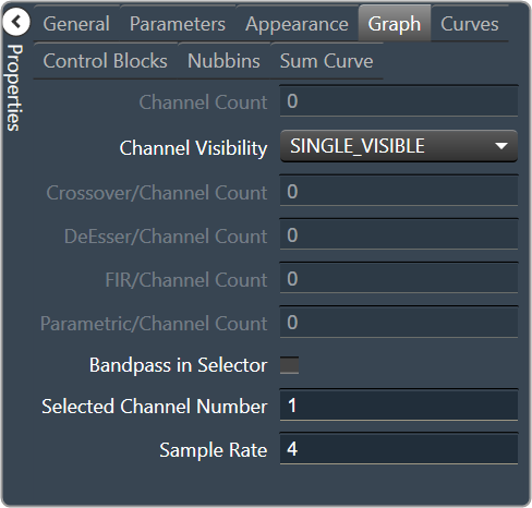
Graph
Channel Count: The number of channels currently in the graph.
Channel Visibility: How many channels should be visible. Single Visible or All Visible
Crossover/Channel Count: The number of Crossover/Bandpass curves currently in each channel.
DeEsser/Channel Count: The number of DeEsser curves currently in each channel.
FIR/Channel Count: The number of FIR filter curves currently in each channel.
Parametric/Channel Count: The number of Parametric curves currently in each channel.
Bandpass in Selector: If checked, the bandpass curves will be in the selector panels.
Selected Channel Number: The number of the currently selected channel.
Sample Rate: The interval at which the curve is sampled.
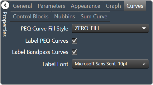
Curves
PEQ Curve Fill Style: The fill style for Parametric EQ curves. Zero Fill, Bandpass Fill or Base Fill
Label PEQ Curves: When checked, the Parametric EQ curves will be labeled.
Label Bandpass Curves: When checked, the Bandpass curves will be labeled.
Label Font: The font for curve labels.
Choose from Windows fonts.
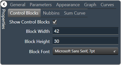
Control Blocks
Show Control Blocks: Enable the display of the filter control blocks.
Block Width: The width of the filter control blocks.
Block Height: The height of the filter control blocks.
Block Font: The font for the filter control blocks.
Choose from Windows fonts.
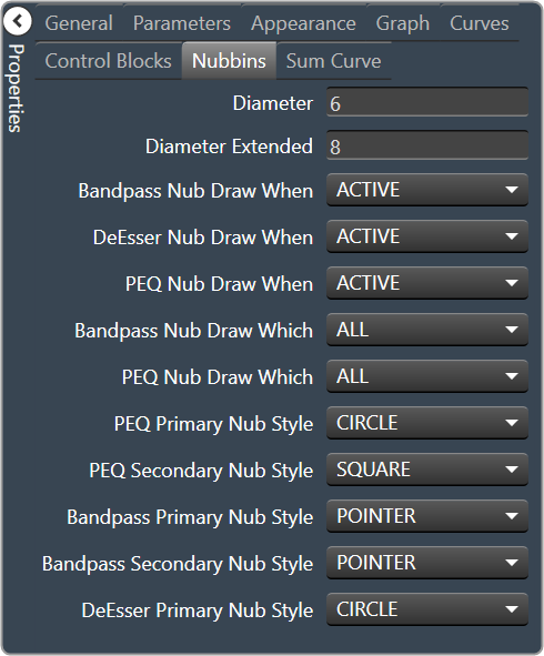
Nubbins
Diameter: Drawing diameter for control point nubs.
Diameter Extended: Interaction diameter for control point nubs.
Bandpass Nub Draw When: Selects when the Bandpass nubs should be drawn.
Active, Never, Selected or Always
DeEsser Nub Draw When: Selects when the DeEsser nubs should be drawn.
Active, Never, Selected or Always
PEQ Nub Draw When: Selects when the Parametric EQ nubs should be drawn.
Active, Never, Selected or Always
Bandpass Nub Draw Which: Selects which bandpass nubs should be drawn.
All, None, Primary or Secondary
PEQ Nub Draw Which: Selects which Parametric EQ nubs should be drawn.
All, None, Primary or Secondary
PEQ Primary Nub Style: Selects the style of the parametric EQ primary nubs.
Circle, Square, Diamond or Pointer
PEQ Secondary Nub Style: Selects the style of the parametric EQ secondary nubs.
Circle, Square, Diamond or Pointer
Bandpass Primary Nub Style: Selects the style of the Bandpass primary nubs.
Circle, Square, Diamond or Pointer
Bandpass Secondary Nub Style: Selects the style of the Bandpass secondary nubs.
Circle, Square, Diamond or Pointer
DeEsser Primary Nub Style: Selects the style of the DeEsser primary nubs.
Circle, Square, Diamond or Pointer
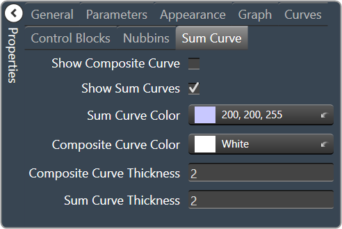
Sum Curve
Show Composite Curve: When checked, the overall composite curve will be displayed.
Show Sum Curves: When checked, the channel’s sum curve will be displayed.
Sum Curve Color: The color of the channel sum curve. Brings up the Select Color window.
Composite Curve Color: The color of the composite curve. Brings up the Select Colorr window.
Composite Curve Thickness: The thickness, in pixels of the Composite Curve.
Sum Curve Thickness: The thickness, in pixels of the Sum Curve.
Override attached alert: Whether to display the warning for disconnected controls.
Checked = Display
Unchecked = No Display
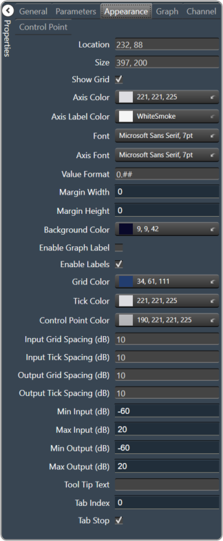
Appearance
Location: Control location (in pixels) of the control on the Custom Panel. Change X (horizontal) and Y (vertical) values in relation to upper left corner. You can also drag the control to a different location
Size: Control size (in pixels). Change width and height values. You can also re-size the control manually
Show Grid: Whether or not to display the grid lines.
Checked = Display
Unchecked = No Display
Axis Color The color of the grid axis. Brings up the Select Color window.
Axis Label Color: The color of the grid axis label. Brings up the Select Color window.
Font: Font for tick labels. Click on “…” to select desired font. Selects from Windows fonts.
Axis Font: The font for Input (dB) and Output (dB) labels. Selects from Windows fonts.
Value Format: The format of the values next to the major tick marks.
0.## means whole number with two decimal places.
Margin Width: The width of the margin from the sides to the graph (in pixels).
Margin Height: The height of the margin from the sides to the graph (in pixels).
Background Color: Background color behind the tab. Brings up the Select Color window.
Enable Graph Label: Whether to display the graph label.
Checked = Display
Unchecked = No Display
Enable Labels: Whether to display the graph axis labels.
Checked = Display
Unchecked = No Display
Grid Color: Grid line color. Brings up the Select Color window.
Tick Color: Color of the tick marks. Brings up the Select Color window.
Control Point Color: Color of the control point. Brings up theSelect Color window.
Input Grid Spacing: Spacing (in dB) between vertical grid lines
Input Tick Spacing: Spacing (in dB) between vertical tick marks
Output Grid Spacing: Spacing (in dB) between horizontal grid lines
Output Tick Spacing: Spacing (in dB) between horizontal tick marks
Min Input: Minimum input level (in dB) shown on the graph
Max Input: Maximum input level (in dB) shown on the graph
Min Output: Minimum output level (in dB) shown on the graph
Max Output: Maximum output level (in dB) shown on the graph
Tool Tip Text: The text that appears on control mouse over.
Tab Index: If tab stop is set to true, determines the position of the control in the tab order.
Tab Stop: Specifies whether the control appears in the tab order.
Checked = Appear
Unchecked = Doesn’t Appear
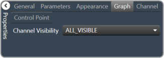
Graph
Channel Visibility: How many channels should be visible. Single Visible or All Visible
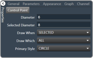
Diameter: Diameter for control points (nubs) on an un-selected channel.
Selected Diameter: Diameter for control points (nubs) on a selected channel.
Draw When: When control points (nubs) are drawn.
Selected, Never, Active or Always
Draw Which: Which control points (nubs) should be drawn.
All, None, Primary or Secondary
Primary Style: Style of the parametric primary control points (nubs). Circle, Square, Diamond or Pointer
Selector Panel
A selector panel is a control that can link to a graph. It has buttons that allow the control panel user to select channels or bands on the graph.
Once the Selector Panel is tied to a graph, you can change its properties, including whether it will select bands or channels on the graph. To select the panel for editing, click anywhere between its borders and the buttons on the panel:
Individual selector buttons may be edited as well.
Overlapping controls, especially graph controls, can result in unexpected behavior and/or the appearance of controls. Use caution if you choose to overlap controls.
Property Type
Options
Appearance
Background Color: The background color of the text area Brings up the Select Color window.
Background Image: Background image of the control. Brings up the Select Color window.
Background Image Layout: Background layout of the image. Tile, Centre, Stretch, and Zoom
Font: Click on “…” to select desired font. Choose from Windows fonts.
Foreground Color: The foreground color for the panel. Brings up the Select Color window.
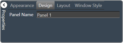
Design
Panel Name: Enter the name of the panel. Default text is “Panel 1”.
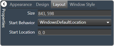
Layout
Size: Control size (in pixels). Change width and height values. You can also re-size the control manually.
Start Behavior: Behavior of the panel. Manual, CenterScreen, and WindowsDefaultLocation.
StartLocation: Control location (in pixels) of the control on the Custom Panel. Change X (horizontal) and Y (vertical) values in relation to upper left corner. You can also drag the control to a different location
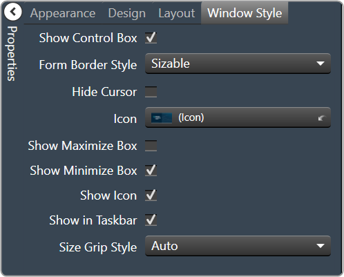
Window Style
Show Control Box: Whether to display control box or not.
Form Border Style: Click to select form border style.
FixedSingle
Fixed3D
FixedDialog
FixedToolWindow
Sizable
SizableToolWindow
Hide Cursor: Whether to display cursor or not.
Icon: Click on “…” to select desired icon.
Show Maximize Box: Whether to display maximize box or not.
Show Minimize Box: Whether to display minimize box or not.
Show Icon: Whether to display icon or not.
Show in Taskbar: Whether to display taskbar or not.
Size Grip Style: Click to select size grip style. Auto, Show, and Hide
Widget Panel
A widget panel is a control on a Custom Panel that links all controls inside its borders to one or more curves of a graph. The entire widget panel is linked to the graph, so individual controls do not (and cannot) link to individual parameters; individual control assignments are made in the “assignments” property of the widget panel.
Controls on a widget panel are similar to other Custom Panel controls except that they are tied to elements of a graph. The widget panel controls the band or channel that is specified on the selector panel of an activated panel.
The entire widget panel is linked to the graph, so individual controls do not (and cannot) link to individual parameters; individual control assignments are made in the “Assignments” property of the widget panel.
For example, a fader can control one parameter of one band on one channel.
Even if multiple parameters are added to the fader, all of the parameters change to the same value. However, a fader is added to a widget panel that is linked to a graph (and a selector panel), the fader can control ALL bands individually with one control of the graph.
Once a new band is selected on the selector panel, the fader controls the same parameter on that band as well.
To set up a widget panel
Add a widget panel to the Custom Panel.
Link the widget panel to the desired graph using graph collaboration.
Add controls to the widget panel.
Assign those graph parameters to the controls.
Graphs can be managed in the Custom Panel designer and, once the Custom Panel is activated, utilized by the end user.
Overlapping controls, especially graphs, can result in unexpected behavior and/or appearance of controls. Use caution if you choose to overlap controls.
Property Type
Options
General
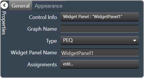
Control Info: Shows control type. Read only
Graph Name: Allows graph to be named.
Type: Select which type of EQ to be used for collaboration.
Widget Panel Name: The name of the widget panel. Used for graph collaboration.
Assignments: Allows editing of assignments on Widget Panel.
Appearance
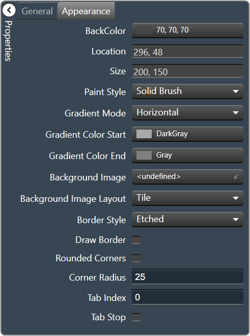
Back Color: Background color of the panel. Brings up the Select Color window.
Location: Control location (in pixels) of the control on the Custom Panel. Change X (horizontal) and Y (vertical) values in relation to upper left corner. You can also drag the control to a different location
Size: Control size (in pixels). Change width and height values. You can also re-size the control manually.
Paint Style: The type of background fill. Solid Brush or Gradient Brush
Gradient Mode: The direction that a color gradient fill will flow. Horizontal, Vertical, Forward Diagonal or Backward Diagonal
Gradient Color Start: The starting color of a gradient fill or the color of a solid fill. Brings up the Select Color window.
Gradient Color End: The ending color of a gradient fill. Not used for a solid fill. Brings up the Select Color window.
Background Image: Background image of the control.
Background Image Layout: The way the background image is drawn. None, Tile, Center, Stretch or Zoom
Border Style: Click to select border style. Default style is flat.
Draw Border: When checked, a border is drawn around the Panel.
Rounded Corners: When checked the corners of the box will be rounded by the Corner Radius amount.
Corner Radius: The radius of the corners.
Tab Index: If tab stop is set to true, determines the position of the control in the tab order.
Tab Stop: Specifies whether the control appears in the tab order.
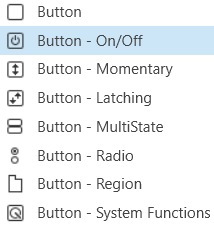
A standard button sends a single value each time that it is pressed. While a button can be linked to a device parameter, it is more typically linked to a system function.
Controls can be managed in the Custom Panel designer and, once the Custom Panel is activated, utilized by the end user. This control must be linked to a parameter to function properly.
On the following example, if “Preset 1” button is pushed, the 1st preset is selected for DriveRack #1. If “Preset 2” button is pushed, the 2nd preset is selected. Each button push overrides the value of the previous button push.
Button On/Off
An on/off button alternately turns on or off a device parameter value when pressed. Controls can be managed in the Custom Panel designer and, once the Custom Panel is activated, utilized by the end user. This control must be linked to a parameter to function properly.
Button Momentary
A momentary button turns on a device parameter value while it is being pressed and turns the value off when released.
Controls can be managed in the Custom Panel designer and, once the Custom Panel is activated, utilized by the end user. This control must be linked to a parameter to function properly.
Button Latching
A latching button alternately turns on or off a device parameter value when pressed.
Controls can be managed in the Custom Panel designer and, once the Custom Panel is activated, utilized by the end user. This control must be linked to a parameter to function properly.
Button MultiState
A multi-state button both sets and displays a defined value of a device parameter. While the multi-state button is somewhat complex to set-up, its function can be very powerful. To set up an MS button, first you add (and link) the button, then change its properties. You must also define the button action. You can also change its other properties.
Controls can be managed in the Custom Panel designer and, once the Custom Panel is activated, utilized by the end user. This control must be linked to a parameter to function properly.
A multi-state button can be powerful but very complex, save your venue before adding or editing a multi-state button.
Sets Value: Once the multi-state button is linked and defined, the parameter on the Custom Panel changes the parameter(s) on the device control panel(s).
Multiple Device Parameters – If the multi-state button is linked to more than one device parameter, when the multi-state button on the Custom Panel is pushed, all the attached device parameters will be set to the specified value.
Displays Value: Once the multi-state button is linked and defined, the parameter on the device control changes the parameter on the Custom Panel as defined in the properties section:
Multiple Device Parameters – If the multi-state button is linked to more than one device parameter, the multi-state button on the Custom Panel will update the device parameters with the new value.
Add Multi-State Button: Add a multi-state button the same way you add other controls and link it to one or more device parameters
Change button properties – In order for the linked multi-state button to work properly, you must define how the property works. This is accomplished in Properties in the “Value Indication Matrix” window. You must also set the button action.
Button Radio
A radio button allows the user to select the value of a device parameter from a list. Controls can be managed in the Custom Panel designer and, once the Custom Panel is activated, utilized by the end user. This control must be linked to a parameter to function properly.
Button Region
This button sends a single value each time that it is pressed. While a button can be linked to a device parameter, it is more typically linked to a system function.
Controls can be managed in the Custom Panel designer and, once the Custom Panel is activated, utilized by the end user. This control must be linked to a parameter or system function to function properly. You can also easily add a pre-defined label.
On the following example, if “Preset 1” button is pushed, the 1st preset is selected for DriveRack #1. If “Preset 2” button is pushed, the 2nd preset is selected. Each button push overrides the value of the previous button push.
Button System Functions
A System Functions button sends a single value each time that it is pressed. This button is specifically linked to a system function.
Controls can be managed in the Custom Panel designer and, once the Custom Panel is activated, utilized by the end user. This control must be linked to a parameter to function properly.
Common Button Design Properties
Properties Type
Description
General
Control Info: Shows control type. This propery is Read only.
Locked: Specifies if the control is locked out so that it cannot be moved or re-sized.
Checked = Locked
Unchecked = Unlocked
Parameters
Addresses: Enables panel designer to edit addressing information with the added benefit that the values can be validated as a group before being applied to the device.
This editor also allows the user to assign multiple parameters to the control. Click to select Parameter Address Editor.
Properties correspond to the system explorer.
Information: Shows information about the Parameter Address.
Read only. Properties correspond to the system explorer.
Press Value: Value sent when button is pressed.
On Value: Value sent when button is pressed.
Off Value: Value sent when button is released.
Value Matrix: Allows changes to the button states, and images associated with each state.
Value List: Allows editing of the value range of the control. Brings up the Discrete Values Editor.
Color 0 to Color 63: Background color of control. Brings up the Select Color window.
Indication same as Button: The value sent when the button is pressed.
Reset Text: Optional text to display in right click context popup.
Appearance
Location: Control location (in pixels) of the control on the Custom Panel.
Change X (horizontal) and Y (vertical) values in relation to upper left corner. You can also drag the control to a different location.
Size: Control size (in pixels). Change width and height values. Change width and height values. You can also re-size the control manually.
Font: Font style for the text on the control. Click on “…” to select desired font. Selects from Windows fonts.
Center Text: Centers the tool tip text on the control.
Background Image: Background graphic of control. Brings up the Select Image File window.
Background Color: Background color of the control. Brings up the Select Color window.
Tool Tip Text: Text that appears when mouse pointer hovers over control.
Tab Index: Indicates the sequence of an element within the tabbing order of all focusable elements in the document.
Tab Stop: Whether the control appears in the tab order.
Checked = Appears
Unchecked = Does not appear
Transparency: Percent transparent, between 0 (opaque) and 90 (very transparent). Brings up the Select Image File window.
Hover Transparency: Percent transparent when the mouse pointer is over the region.
Border Color: The color of the border. Brings up the Select Color window.
Border Width: The width of the border (in pixels)
Button
Primary Font: Font style for the text on the control. Click on “…” to select desired font. Selects from Windows fonts.
Text: Text appearing on the control. Select and type desired label. Default text is “Button” with the number of the control (order added to the panel)
Font: Font style for the text on the control. Click on “…” to select desired font. Selects from Windows fonts.
Text Color: Color of the text on the control
Fill Color: Changes the Fill Color of the control, will not be visible if you have an image selected.
Border Color: The color of the Button border.
On Primary Indication: Sets the button label, label color, background color, and background image for the “on” state.
Off Primary Indication: Sets the button label, label color, background color, and background image for the “off” state. Brings up the State Indication Setup window.
Enable Flashing: Enables button to flash.
Flash Frequency: If flashing is enabled, sets the flashing frequency.
Flash In Phase: If flashing is enabled, determines if button will flash in or out of phase with other buttons
Flash On Indication: Sets the button label, label color, background color, and background image for the “flash on” state. Brings up the State Indication Setup window.
Flash Off Indication: Sets the button label, label color, background color, and background image for the “flash off” state. Brings up the State Indication Setup window.
Multi-line: When checked, changes the button for multi-line operation. A secondary set of certain properties are added to the button: Secondary Font, Secondary On Indication and Secondary Off Indication.
Default state is unchecked. The Secondary Font, On Indication and Off indication options are identical to the Primary Font, On Indication and Off indication options.
Bump up: When checked, bumps up the assigned parameter by the Bump % amount.
Bump %: Sets the percentage amount for the Bump function.
Bump Down: When checked, bumps down the assigned parameter by the Bump % amount.
Button Action: When an event occurs when the button is clicked. OnUp, OnDown, or OnBoth.
Button Image: The image displayed as the button. Brings up the Select Image File window.
Alignment: Alignment of the button nubs. vertical and horizontal.
Diameter: Diameter of the radio button nubs
Style: The style (color) of the nubs.
Select from the pull-down list.
Border Style: The style of the control border.
Select from the pull-down list
Top Margin: Distance of the values, in pixels, from the top border of the control.
Bottom Margin: Distance of the values, in pixels, from the bottom border of the control.
Left Margin: Distance of the values, in pixels, from the left border of the control.
Right Margin: Distance of the values, in pixels, from the right border of the control.
On Color: The color of the button in the On state. Brings up the Select Color window.
Off Color: The color of the button in the Off state. Brings up the Select Color window.
On Text: The text displayed on the button in the On state.
Off Text: The text displayed on the button in the Off state.
Mixed Text: The text displayed on the button when in a mixed state.
A rotary is an adjustable control that manipulates a device parameter. Controls can be managed in the Custom Panel designer and, once the Custom Panel is activated, utilized by the end user. This control must belinked to a parameter to function properly.
Rotary Encoder
A rotary encoder is an adjustable rotary control that manipulates a device parameter and displays values of a device parameter.
When a Custom Panel is activated, the rotary control (inner ring) changes the linked parameter values as the end user clicks and slides it around it to the desired value position (like twisting a nob). The rotary encoder is controlled by right-clicking with the mouse and moving to the top or right to increase the value and moving to the bottom or left to decrease the value.
The LED meter (outer ring) reflects the selected parameter values, which are usually the same as those linked to and adjusted by the rotary control.
Controls can be managed in the Custom Panel designer and, once the Custom Panel is activated, utilized by the end user. This control must be linked to a parameter to function properly.
Common Roter Design Properties
Properties Type
Description
General
Control Info: Shows control type. This propery is Read only.
Locked: Specifies if the control is locked out so that it cannot be moved or re-sized.
Checked = Locked
Unchecked = Unlocked
Parameters
Addresses: Enables panel designer to edit addressing information with the added benefit that the values can be validated as a group before being applied to the device.
This editor also allows the user to assign multiple parameters to the control. Click to select Parameter Address Editor.
Properties correspond to the system explorer.
Information: Shows information about the Parameter Address.
Read only. Properties correspond to the system explorer
Rotary Maximum: Maximum parameter value. The largest parameter value.
Rotary Minimum: Minimum parameter value. The smallest parameter value.
Meter Maximum: Maximum meter value. The largest meter value
Meter Minimum: Minimum meter value. The smallest meter value
Reset Text: Optional text to display in right click context popup.
Appearance
Location: Control location (in pixels) of the control on the Custom Panel. Change X (horizontal) and Y (vertical) values in relation to upper left corner.
You can also drag the control to a different location.
Size: Control size (in pixels). Change width and height values. You can also re-size the control manually.Background Image: Brings up the Select Background Image window.
Background Image: Click to select background image.
Background Color: Background color of the control.
Foreground Color: Foreground color of the control.
Font: Font style for the text on the control. Click on “…” to select desired font. Selects from Windows fonts.
Mode String: User-definable description of mode.
Anti-Aliasing: Whether to draw with anti-aliasing or not.
Checked = With anti-aliasing.
Unchecked = Without anti-aliasing
Tool Tip Text: The text that appears on control mouse-over.
Tab Index: If tab stop is set to true, determines the position of the control in the tab order.
Tab Stop: Specifies whether the control appears in the tab order.
Checked = Appears
Unchecked = Does not appear
Knob
Base Image: The image displayed for the inside of the knob
Ring Image: The image displayed for the outside of the knob.
Shading Image: The image used to simulate lighting/shading effects of the knob.
Knob Size: The size of the knob.
Set to 0,0 to reset to the actual image size.
Start Position: The angular starting point from vertical.
End Position: The angular ending point from vertical.
Orientation: The movement of the knob from min to max.
Backing Circle
Radius: Radius for the backing circle as fraction of control size.
Color: Color of the backing circle.
Use “Transparent” to disable.
Border Width: Width of the backing circle border.
Border Color: Color of the backing circle border.
Rotary
Encoder Multiplier: The amount that the turn of the rotary is multiplied to tune sensitivity.
Base Image: The image displayed for the inside of the knob.
Brings up the Select Image File window.
Ring Image: The image displayed for the outside of the knob.
Brings up the Select Image File window.
Knob Radius: The radius of the rotary knob as percent of control size.
Must be less than meter inner radius but greater than half of the meter inner radius.
Nudge Amount: Determines, with the nudge type, how much the control will adjust when up and down arrow keys are pressed.
Nudge Type: Determines, with the nudge amount, how much the control will adjust when up and down arrow keys are pressed.
Percent: Percentage of the total visual display of the control. For non-logarithmic controls, the visual display and the total value of the control will be the same. For logarithmic controls, the visual display will differ from the total value.
Bump: Small increment.
Value: Specified nudge amount.
Fader Cap
Fader Cap Image: The image displayed for the fader cap.
Click Browse to locate custom fader caps
Fader Cap Size: How large the fader cap will be
Arrow Box Width: The width of the arrow box in pixels
Vertical Offset: The vertical offset of the fader cap, in pixels, from the fader channel
Horizontal Offset: The horizontal offset of the fader cap, in pixels, from the fader channel
Hot Spot: Sets mouse sensitivity to the fader cap or the entire length of the slider
Highlight Color: The channel highlight color
Arrow Box Separation: The distance between the arrow box and the fader channel in pixels.
Label Margin: The amount of space, as a decimal fraction of the width of the control, between the center channel and the tick marks
Channel
Channel Color: Color of the fader channel. Default is Dim Gray
Channel Width: Width of the fader channel in pixels
Channel Start: Distance, as a percentage of length, from the bottom or left edge to where the fader channel will start.
Channel End: Distance, as a percentage of length, from the bottom or left edge to where the fader channel will end.
Channel Center: Distance, as a percentage of width, from the bottom or left edge to where the fader channel will be located.
Scale
Display Tick Marks: Option to display the tick marks of the control. Must be set to true for custom ticks to display.
Checked = Display
Unchecked = Do not display
Number of Major Ticks: How many major ticks are displayed.
Tick Location: The location of the tick marks relative to the fader channel.
Custom Ticks: Whether to use custom tick values by utilizing the scale editor or not.
Checked = Display
Unchecked = Do not display
Display Tick Values: The value of the ticks to be displayed.
Value Format: The format of the tick values.
Labels Inside:
Major Tick Color: The color of the major tick.
Major Tick Length: The length of the major tick.
Number of Minor Ticks: How many minor ticks are displayed.
Minor Tick Color: The color of the minor tick.
Minor Tick Length: The length of the minor tick.
Tick Location: The location of the tick marks relative to the fader channel.
Font: The font for the ticks.
Labels Inside: Whether labels are drawn between tick marks and fader channel.
Whether labels are drawn between tick marks and fader channel or not.
Checked = labels drawn between tick marks and channel.
Unchecked = tick marks drawn between labels and channel.
Labels Vertical: Whether labels are displayed vertically or horizontally.
Checked = labels display vertically
Unchecked = labels display horizontally, left to right.
Label Margin: The amount of space, as a decimal fraction of the width of the control, between the center channel and the tick marks.
Nudge Button
Nudge Button Location: Location of the nudge buttons.
None, Center, Above or Below
Nudge Type: Determines, with the increment amount, how much the control will adjust when a nudge button is pressed.
Percent – percentage of the total visual display of the control. For non-logarithmic controls, the visual display and the total value of the control will be the same. For logarithmic controls, the visual display will differ from the total value.
Bump – small increment
Value – specified increment amount.
Increment Amount: Determines, with the nudge type, how much the control will adjust when a nudge button is pressed.
Nudge Button Separation: Distance, in pixels, from the edge to the nudge button.
Up Image: The static image for the “up” nudge button. Click the button to select a new image.
Up Pushed Image: The image that displays when the “up” nudge button is pushed. Click the button to select a new image.
Down Image: The static image for the “down” nudge button. Click the button to select a new image.
Down Pushed Image: The image that displays when the “down” nudge button is pushed. Click the button to select a new image.
Meter
Encoder Mode: The display mode for the LED elements. Clockwise is the default.
Outer Radius: The outside edge of the display meter as a percentage of the entire circle. Must be less than 1 (outer edge of control) and greater than the inner radius.
Inner Radius: The inside edge of the display meter as a percentage of the entire circle. Must be less than meter outer radius.
Starting Angle: Where the meter display starts. Measured in degrees from where “0” is straight up (-180…180).
Ending Angle: Where the meter display ends. Measured in degrees from where “0” is straight up (-180…180).
Separation Angle: The angle, in degrees, separating each segment.
Segment Count (1..360): The number of segments in the display.
Off Color: The “off” color of the control.
On Color: The “on” color of the control.
Segment Border Color: The color of the segment border.
Popup Value
Popup Value Position – Fraction: The location of the popup value as a decimal fraction of the width (X) and height (Y) of the control.
Display Popup Value: Displays the value of the control in a popup, if set to true
A Fader Horizontal is an adjustable horizontally-positioned fader control that manipulates a device parameter.
Controls can be managed in the Custom Panel designer and, once the Custom Panel is activated, utilized by the end user. This control must be linked to a parameter to function properly.
Fader Vertical
A vertical fader is an adjustable vertically-positioned control that manipulates a device parameter.
Controls can be managed in the Custom Panel designer and, once the Custom Panel is activated, utilized by the end user. This control must be linked to a parameter to function properly.
Fader Multi Parameter
A multiparameter fader manipulates multiple device parameters.
Controls can be managed in the Custom Panel designer and, once the Custom Panel is activated, utilized by the end user. This control must be linked to a parameter to function properly.
On an activated Custom Panel, levels on a multiparameter fader can be adjusted together or individually
Common Fader Design Properties
Properties Type
Description
General
Control Info: Shows control type. This propery is Read only.
Locked: Specifies if the control is locked out so that it cannot be moved or re-sized.
Checked = Locked
Unchecked = Unlocked
Parameters
Addresses: Enables panel designer to edit addressing information with the added benefit that the values can be validated as a group before being applied to the device.
This editor also allows the user to assign multiple parameters to the control. Click to select Parameter Address Editor.
Properties correspond to the system explorer.
Information: Shows information about the Parameter Address.
Read only. Properties correspond to the system explorer
Maximum: Maximum parameter value.
The largest parameter value.
Minimum: Minimum parameter value.
The smallest parameter value.
Reset Text: Optional text to display in right click context popup.
Appearance
Location: Control location (in pixels) of the control on the Custom Panel. Change X (horizontal) and Y (vertical) values in relation to upper left corner.
You can also drag the control to a different location
Size: Control size (in pixels). Change width and height values. You can also re-size the control manually
Background Image: Brings up the Select Background Image window
Background Color: Background color of the control
Tool Tip Text: The text that appears on control mouse-over.
Tab Index: Determines the position of the control in the tab order
Tab Stop: Specifies whether the control appears in the tab order.
Checked = Appears
Unchecked = Does not appear
Arrow
Maximum Arrows: The maximum number of arrows to display.
Arrow Direction: The direction the arrows should point.
Point Left or Point Right
Fader Cap
Fader Cap Image: The image displayed for the fader cap.
Click Browse to locate custom fader caps
Fader Cap Size: How large the fader cap will be
Arrow Box Width: The width of the arrow box in pixels
Vertical Offset: The vertical offset of the fader cap, in pixels, from the fader channel
Horizontal Offset: The horizontal offset of the fader cap, in pixels, from the fader channel
Hot Spot: Sets mouse sensitivity to the fader cap or the entire length of the slider
Highlight Color: The channel highlight color
Arrow Box Separation: The distance between the arrow box and the fader channel in pixels.
Label Margin: The amount of space, as a decimal fraction of the width of the control, between the center channel and the tick marks
Channel
Channel Color: Color of the fader channel. Default is Dim Gray
Channel Width: Width of the fader channel in pixels
Channel Start: Distance, as a percentage of length, from the bottom or left edge to where the fader channel will start.
Channel End: Distance, as a percentage of length, from the bottom or left edge to where the fader channel will end.
Channel Center: Distance, as a percentage of width, from the bottom or left edge to where the fader channel will be located.
Scale
Display Tick Marks: Option to display the tick marks of the control. Must be set to true for custom ticks to display.
Checked = Display
Unchecked = Do not display
Number of Major Ticks: How many major ticks are displayed.
Tick Location: The location of the tick marks relative to the fader channel.
Custom Ticks: Whether to use custom tick values by utilizing the scale editor or not.
Checked = Display
Unchecked = Do not display
Display Tick Values: The value of the ticks to be displayed.
Value Format: The format of the tick values.
Labels Inside:
Major Tick Color: The color of the major tick.
Major Tick Length: The length of the major tick.
Number of Minor Ticks: How many minor ticks are displayed.
Minor Tick Color: The color of the minor tick.
Minor Tick Length: The length of the minor tick.
Tick Location: The location of the tick marks relative to the fader channel.
Font: The font for the ticks.
Labels Inside: Whether labels are drawn between tick marks and fader channel.
Whether labels are drawn between tick marks and fader channel or not.
Checked = labels drawn between tick marks and channel.
Unchecked = tick marks drawn between labels and channel.
Labels Vertical: Whether labels are displayed vertically or horizontally.
Checked = labels display vertically
Unchecked = labels display horizontally, left to right.
Label Margin: The amount of space, as a decimal fraction of the width of the control, between the center channel and the tick marks.
Nudge Button
Nudge Button Location: Location of the nudge buttons.
None, Center, Above or Below
Nudge Type: Determines, with the increment amount, how much the control will adjust when a nudge button is pressed.
Percent – percentage of the total visual display of the control. For non-logarithmic controls, the visual display and the total value of the control will be the same. For logarithmic controls, the visual display will differ from the total value.
Bump – small increment
Value – specified increment amount.
Increment Amount: Determines, with the nudge type, how much the control will adjust when a nudge button is pressed.
Nudge Button Separation: Distance, in pixels, from the edge to the nudge button.
Up Image: The static image for the “up” nudge button. Click the button to select a new image.
Up Pushed Image: The image that displays when the “up” nudge button is pushed. Click the button to select a new image.
Down Image: The static image for the “down” nudge button. Click the button to select a new image.
Down Pushed Image: The image that displays when the “down” nudge button is pushed. Click the button to select a new image.
Popup Value
Popup Value Position – Fraction: The location of the popup value as a decimal fraction of the width (X) and height (Y) of the control.
Display Popup Value: Displays the value of the control in a popup, if set to true
A Fast Meter is an output meter that shows the state of a device parameter. Controls can be managed in the Custom Panel designer and, once the Custom Panel is activated, utilized by the end user. This control must be linked to a parameter to function properly.
Meter Gradient
A gradient meter is an output meter that shows the state of a device parameter in specifically designed gradients. Controls can be managed in the Custom Panel designer and, once the Custom Panel is activated, utilized by the end user. This control must be linked to a parameter to function properly.
Meter Segmented
A segmented meter is an output meter that shows the state of a device parameter.Controls can be managed in the Custom Panel designer and, once the Custom Panel is activated, utilized by the end user. This control must be linked to a parameter to function properly.
Meter Segmented Advanced
A segmented advanced meter is an output meter that shows the state of a device parameter.Controls can be managed in the Custom Panel designer and, once the Custom Panel is activated, utilized by the end user. This control must be linked to a parameter to function properly.
Meter Segmented Dial
A segmented dial meter is an output meter that shows the state of a device parameter.Controls can be managed in the Custom Panel designer and, once the Custom Panel is activated, utilized by the end user. This control must be linked to a parameter to function properly.
Common Roter Design Properties
Properties Type
Description
General
Control Info: Shows control type. This propery is Read only.
Locked: Specifies if the control is locked out so that it cannot be moved or re-sized.
Checked = Locked
Unchecked = Unlocked
Parameters
Addresses: Enables panel designer to edit addressing information with the added benefit that the values can be validated as a group before being applied to the device.
This editor also allows the user to assign multiple parameters to the control. Click to select Parameter Address Editor.
Properties correspond to the system explorer.
Information: Shows information about the Parameter Address.
Read only. Properties correspond to the system explorer
Maximum: Maximum parameter value.
The largest parameter value.
Minimum: Minimum parameter value.
The smallest parameter value.
Reset Text: Optional text to display in right click context popup.
Value Equation: When specified, this equation combines the attached parameter’s values and returns the value that the control will display.
Gain Reduction: Check if this meter is to be a Gain Reduction style. The negative dB gains are reported (shown) as increasing positive gains.
Appearance
Location: Control location (in pixels) of the control on the Custom Panel. Change X (horizontal) and Y (vertical) values in relation to upper left corner.
You can also drag the control to a different location
Size: Control size (in pixels). Change width and height values. You can also re-size the control manually.
Border: The margin, in pixels around the outside of the LEDs.
Background Image: Brings up the Select Background Image window
Background Color: background color used in the gradient behind the meter itself. Brings up the Select Color window.
Tool Tip Text: The text that appears on control mouse-over.
Tab Index: Determines the position of the control in the tab order
Tab Stop: Specifies whether the control appears in the tab order.
Checked = Appears
Unchecked = Does not appear
Anti-Aliasing: When checked, the meter will draw with anti-aliasing.
Tool Tip Text: Text that appears on control mouse-over.
Optimized for Speed: Enables the meter to draw faster.
This decreases the aesthetic properties of the meter.
Meter
Outer Radius: The fractional position of the outermost portion of the segments.
Inner Radius: The fractional position of the innermost portion of the segments.
Starting Angle: The clockwise angle, in degrees where 0 is straight up
Ending Angle: The clockwise angle, in degrees where 0 is straight up.
Separation Angle: The angle, in degrees separating each segment
Segment Count: The total number of segments in the display.
Segment Height: The height of individual LEDs in the meter.
Segment Width: The width of individual LEDs in the meter.
Segment Spacing: The distance, in pixels between segments.
Off Color: The color of the Off segments. Brings up the Select Color window.
High Color: The color of the upper section of the meter Brings up the Select Color window.
Mid Color: The color of the mid-section of the meter. Brings up the Select Color window.
Low Color: The color of the lower section of the meter. Brings up the Select Color window.
Peak Color: The color of the peak line.
Gradient Fraction: Determines which portion of a meter section is gradient filled.
Draw Peak: If checked, the peak line will be displayed.
Peak Thickness: The thickness, in pixels of the Peak Line.
Peak Decay Rate: Percent of the meter that the Peak Line will drop per second.
Border Style: The border style drawn around the meter. Select from drop down list
Segment Border Color: The total number of segments in the display.
High Threshold: The value at which the upper section ends, and the mid-section begins.
Mid Threshold: The value at which the mid-section ends, and the lower section begins.
Orientation: The orientation of the meter; Vertical or Horizontal. Select Left to Right, Right to Left, Top to Bottom, or Bottom to Top.
Top Border: Distance, in pixels, between the top edge of the control and the top of the meter.
Bottom Border: Distance, in pixels, between the bottom edge of the control and the bottom of the meter.
Left Border: Distance, in pixels, between the left edge of the control and the left side of the meter.
Right Border: Distance, in pixels, between the right edge of the control and the right side of the meter.
Scale
Display Scale: When checked, the scale is enabled.
Font: Click on “…” to select desired font. Brings up a Font Select window. Selects from Windows fonts
Background Color: The background color of the text area. Brings up the Select Color window.
Fore Color: The foreground color for the scale. Brings up the Select Color window.
Scale Location: Placement for the scale (the scale must be enabled first). Right or Bottom, Left or Top
Custom Ticks: Customized ticks for the control. Parameters must be set first.
Scale Count: The number of scale entries to display.