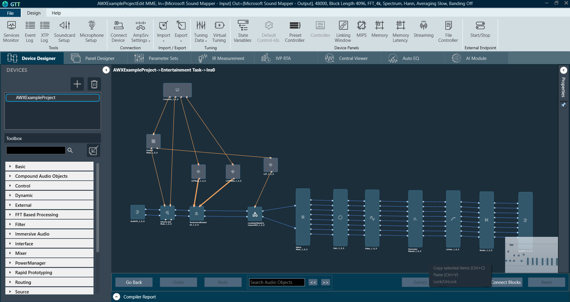
The Device Designer comprises of various tools and interfaces that are used to create and run audio processing systems on hardware. The Device Designer contains the canvas and modules needed to create the signal processing template, while the SFD interface handles most of the target and audio object interactions.
When you launch a project in GTT, the Device Designer screen appears, which includes the following elements:
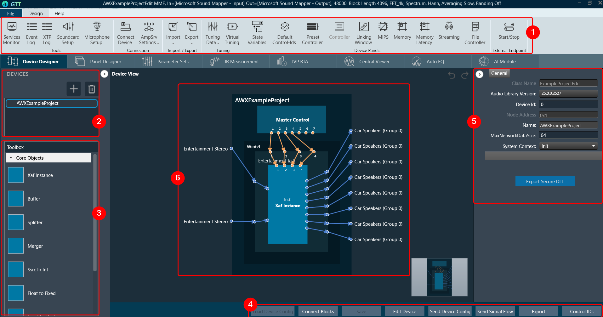
- Ribbon and Group: The ribbon is composed of six groups, each of which represents a subset of program functionality. In addition to these programs, there are also additional contextual programs that automatically appear depending on what is currently selected.
The GTT ribbon comprises six groups: Tools, Connection, File, Tuning, Device Panels, and External Endpoints. Each group has specific tools of related functions. It gives you quick access to the tools and functions you need to complete a task.

- Tools: This group includes three tools: Services Monitor, Event Log, and xTP Log. The event log and xTP log in GTT can both be checked and monitored using all these tools.
- Connection: This group includes tools to set up the connection between the physical or virtual device, such as configuring socket connections and port settings. Additionally, it facilitates you to establish the connection once it has been configured.
- Import/Export: This group allows you to import and export device files, tuning data files, device description data files, and corporate pin data.
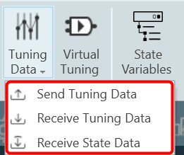
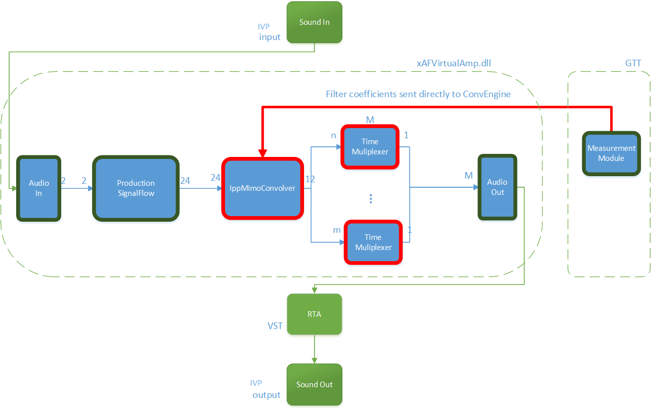
- Tuning: This group includes Tuning Data and Virtual Tuning. Using Tuning Data, you can open and tune the audio files. Virtual Tuning enables the measurement of impulse responses of an acoustic environment using the AudioworX measurement Module.
- Device Panels: This group includes the following tools: State Variables, Default Control-Ids, Present Controller, Controller, Linking Window, Mips, Memory, Memory Latency, Streaming, and File Controller. Each of these tools is equipped with a unique set of functions.
- External Endpoints: This feature allows external tuning to communicate with the device. The GTT will receive the requests from external tuning tools and send them to the device via GTT. This is made possible by a WCF service endpoint that third-party tools can access.
- Devices List: This section displays the list of projects. In addition, you can add and delete a device.
- Toolbox: This section display core levels of processing, such as block length conversion, merger/splitter, and sample rate conversion within the audio processing pipeline.
- Device Operations: This section contains several functions related to physical/virtual devices like Load Device Config, Edit Device, Send Device Config, Send Signal Flow, Export SFD, and Control Ids.
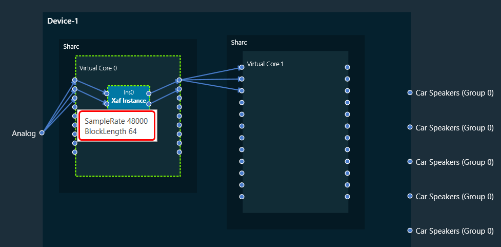
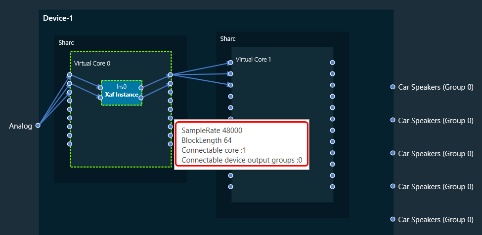
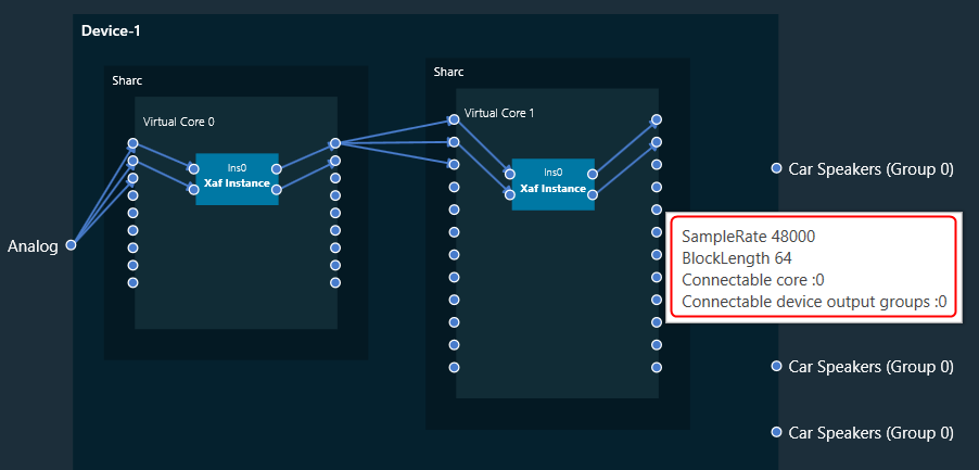
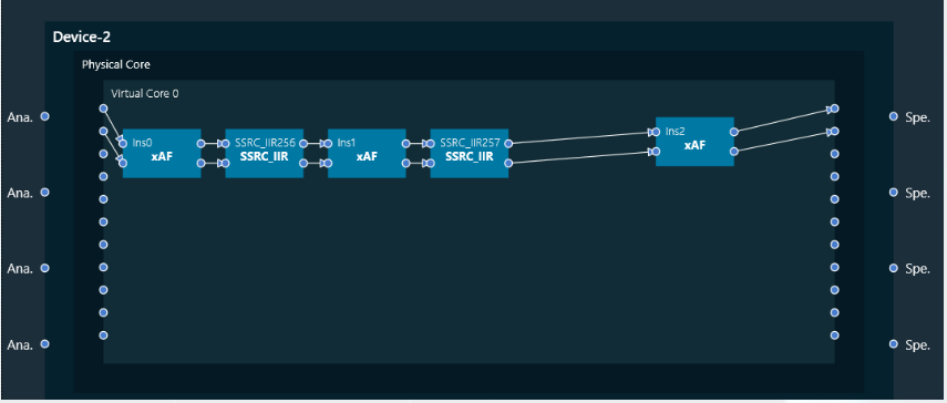
- Properties Panel: A Device Template is a combination of three layers – Physical Layer, Virtual Core, and Core Object. When you select one of the cores, the properties of the core are displayed on the right side. If required you can modify the core properties.
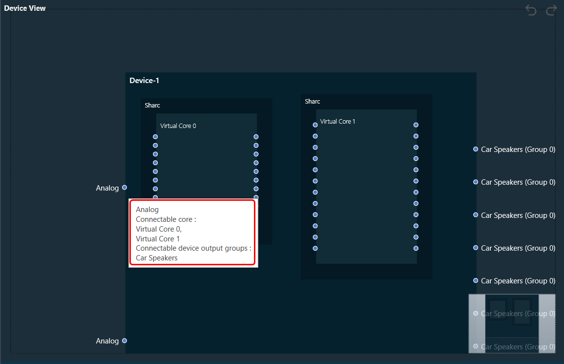
- Device View: The workspace is used to add devices and program the device core. You can use the magnifier function to adjust and change the size of the design workspace.