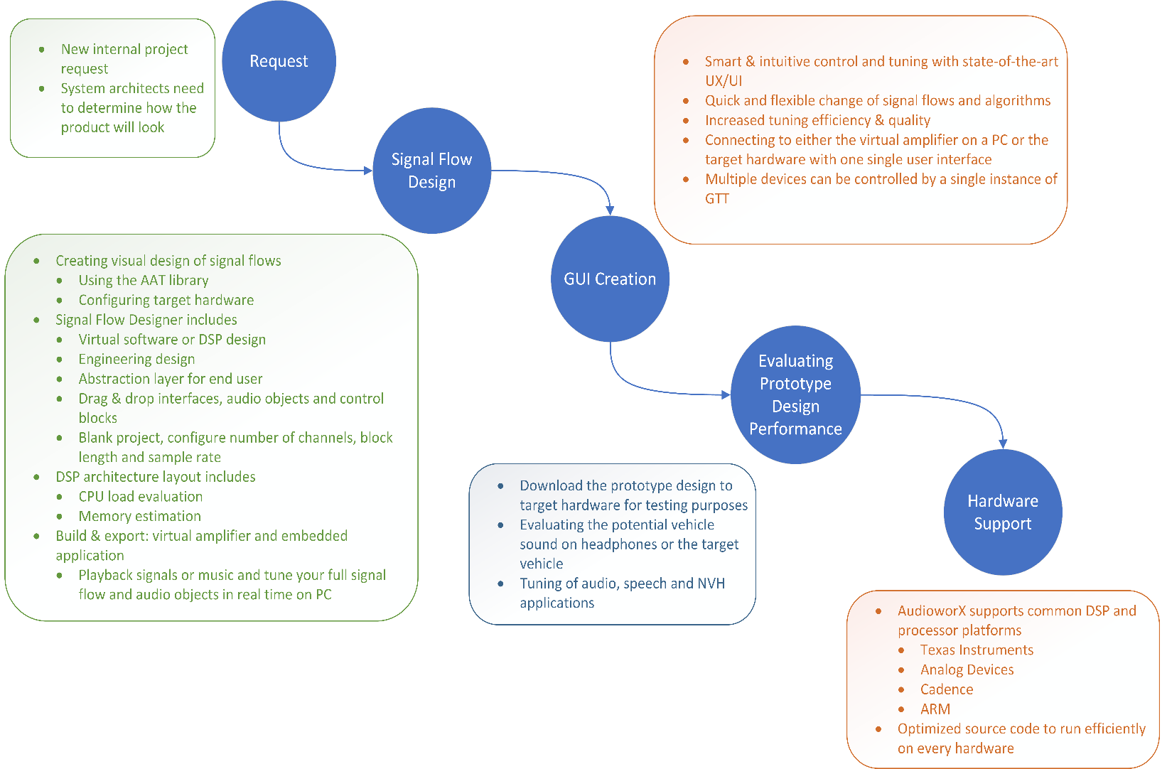
The Home Screen enables various operations, including creating a project, importing projects/audio libraries, exporting selected projects, delete selected projects, set default audio library, opening pre-configured templates, and launching default features.
When you launch GTT, the home screen appears, which includes the following tabs:
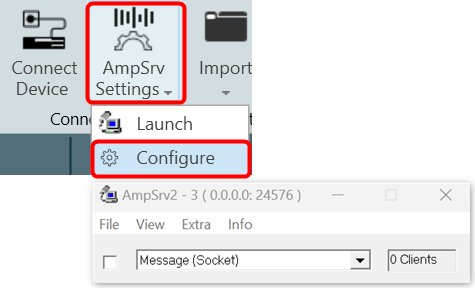
Also, on the left side of the GTT home screen, you will find a File Menu which provides various sub menus like export project, import/export project settings, clone project, display license information and renew license, configure GTT settings, display GTT Tool information and an option to open GTT documentation site; refer Homescreen options.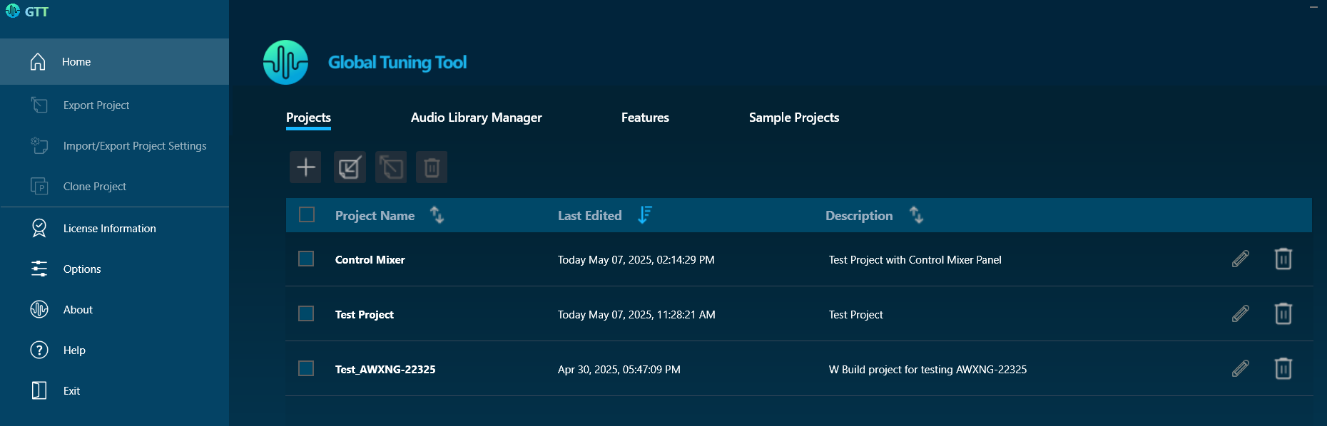
Projects
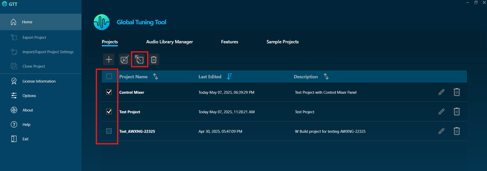
In the Project tab, you can create new projects, edit existing ones, and import a project, export selected project(s) or delete selected project(s).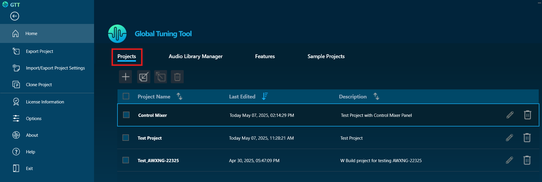
On the Project tab, you can perform the following operations:
Create a Project
Use the create option to create a new project.

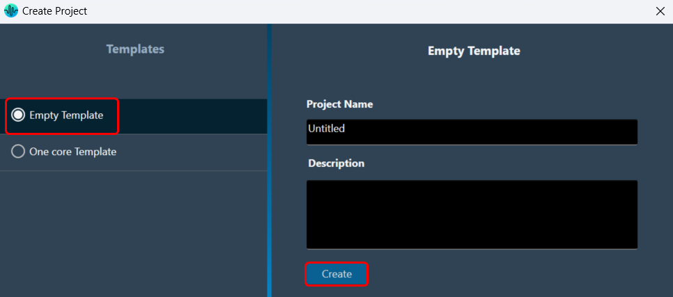
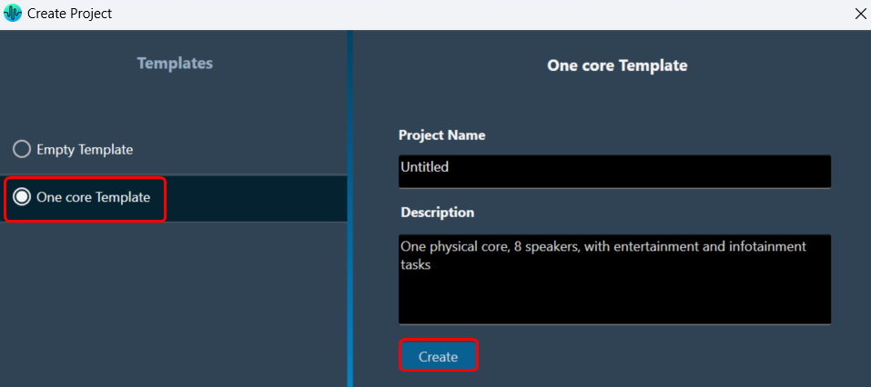
On the Create Project window, you can choose the Empty Template or One Core Template option to create a project.
The project name will be automatically filled when selecting any template. You can manually change the project name by editing the default project name.
By default, empty projects do not contain a description; you have to enter the details manually.
- Empty Template: Select the Empty Template, enter the project name and project description, and click Create. This creates a new project. Now you can add a device or discover a device to the project.
- One Core Template: Select the One Core Template, edit the project name and description as per requirement, and click Create. A new project is created with pre-configured template settings.
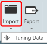
Import a Project
Use the import option to import a project. 
The Import Project window contains a browse option to open the gttd file. Additionally, you have options to exclude or include the Project dependencies like Audio Library and Measurement Data in the imported project.
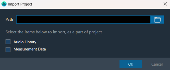
Steps to import a project:
- Click on Import Project.
- On the Import Project window, click on the browse button, select the project file (gttd), and click Open.
- Select the project dependencies(Audio library, Measurement data) options if you want to include them in the project and click Ok. The project import will start.
- Once the project is imported successfully, the project will open.
A warning will appear if the Audio Library option is selected and a version already exists in the GTT application.
If you click “OK,” the existing audio library will be replaced with the associated audio library. If you click “No,” the existing audio library will remain unchanged. The project will be imported along with the selected project dependencies.
While importing, if you select dependencies (Audio Library or Measurement Data) that are not available in the project file, a popup message will display indicating that these dependencies are not associated with the project.
Make sure to provide the path before clicking OK, as this will help avoid any errors and ensure a successful process.
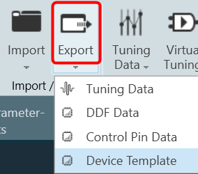
Export Selected Projects
Use the export option to export selected projects. 
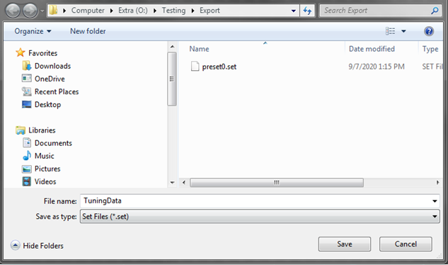
The “Export Selected Projects” window provides a browse option, enabling you to easily select the directory where you’d like to save your exported files. Furthermore, you have the flexibility to include or exclude project dependencies, such as the Audio Library and Measurement Data, based on your needs. These customizable settings will apply to all the selected projects, enhancing your control over the export process.
Audio Library dependency is included by default for exporting selected projects, you can unselect the option to exclude the dependency.
To export projects, follow these steps:
- In the Project tab, select the projects you want to export by checking the corresponding checkboxes.
- Click the “Export” button located next to the “Import” button.
- The “Export Selected Projects” window will open. Navigate to the folder or directory where you want to export the selected projects.
- If you wish to include or exclude other project dependencies (e.g., measurement data, audio library) in the export, use checkboxes to select or unselect them.
Audio Library checkbox is selected by default. These settings will apply to all selected projects.
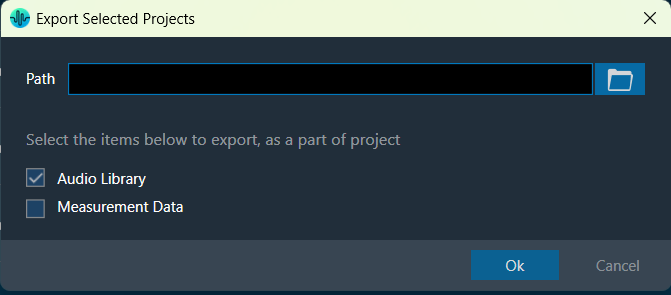
- Click “OK” to begin exporting the selected projects.
Once the export process starts, a progress bar will appear, displaying the total number of projects and the name of the project currently being exported. You can cancel the operation at any time during the export process.
If there are any unsaved or currently open projects before starting the export, a prompt will appear asking the user to either save or discard the changes. The prompt will also ask whether to close the open projects before proceeding.
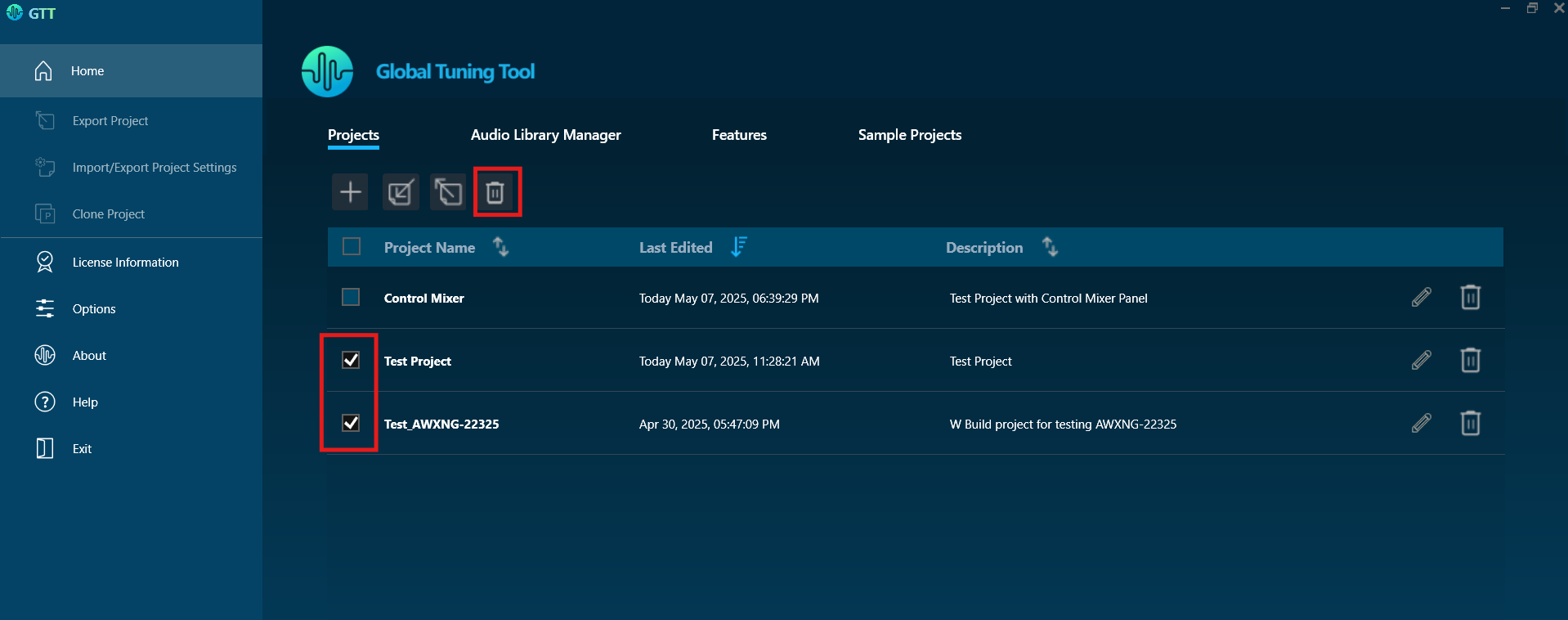
Delete Project
Use the delete option to remove a project. 
You can delete multiple projects as well as a single project.
The Delete button is disabled by default until one or more projects are selected for deletion.
- Select the header checkbox and click Delete. This will delete all the available projects from GTT.
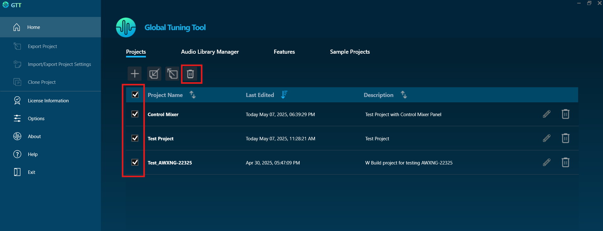
- Select the required checkbox present in each row of the project and click Delete. This will delete the specific projects from the project list.
- Use this delete option to delete the respective project.

Edit Project
Use the edit option to change the project name and description. 
On the Project tab, navigate to the respective project, and click the Edit option. Modify the name and description as required and click Update.

Sort Projects
Use the sort option to reorder projects. 
Projects can be sorted by Project Name, Last Edited, or Description columns in ascending or descending order.
The sort icons are displayed alongside column headers. Click these icons to sort the projects in ascending or descending order based on the data in the selected column. The icon’s appearance also signifies the current sorting state of the column.
- Click on the unsorted sort icon to sort the projects in descending order of that particular column and the sort order will be indicated by a descending icon.
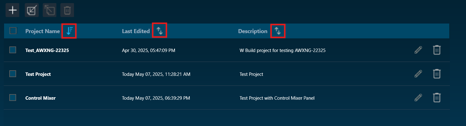
- Click on the descending sort icon will sort projects in ascending order of that particular column and the sort order will be indicated by an ascending icon.
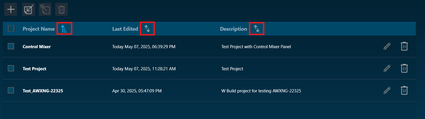
- When projects are sorted by a particular column, the remaining columns reset with the unsorted icon.
On performing actions like Create Project / Import Project / Clone Project / Delete projects, the sort icons will reset to unsorted icons for all three columns.
By default, projects are sorted by the last edited column.
Audio Library Manager
The GTT interacts with the audio library service, which is a Windows service. This service hosts the C++ dynamic linked library xAFVirtualAmp.dll. This DLL exposes several methods that GTT calls from the managed environment, to determine what audio algorithms and memory layouts are available in the DLL.
Every audio library has a version, and GTT stores this information alongside the data received from the xAF service.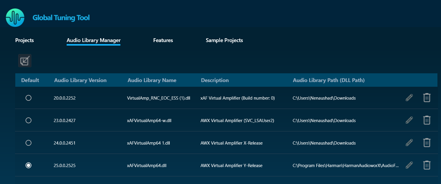
GTT requires an audio library to perform operations required for tuning amplifiers. It obtains audio objects, their properties, memory layout, and so on from the audio library. This library is hosted in a Windows service and communicates with it via IPC. The Windows service is called Harman audio library. The block diagram below shows high-level communication between GTT and an audio library service.

| Column |
Description |
| Default |
This column shows which DLL has been set as the default. |
| Audio Library Version |
This column displays the version of the DLL. |
| Audio Library Name |
This column displays the Audio Library file name (DLL name). |
| Description |
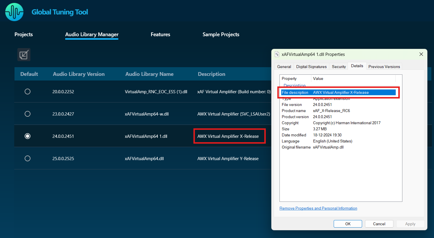
This column displays the description of the DLL. By default, the description will be taken from the file description property of the DLL metadata. |
| Audio Library Path (DLL Path) |
This column displays the source path of the DLL. |
You can perform the following actions on the Audio Library Manager tab.
- Select the radio button in the default column to set the audio library as default.
- Click on the edit icon to edit the audio library description.
- Click on the Delete option to delete the audio library.
Load Audio Library
On the Audio Library Manager tab, click on the Load Audio Library icon. You can load multiple xAF libraries.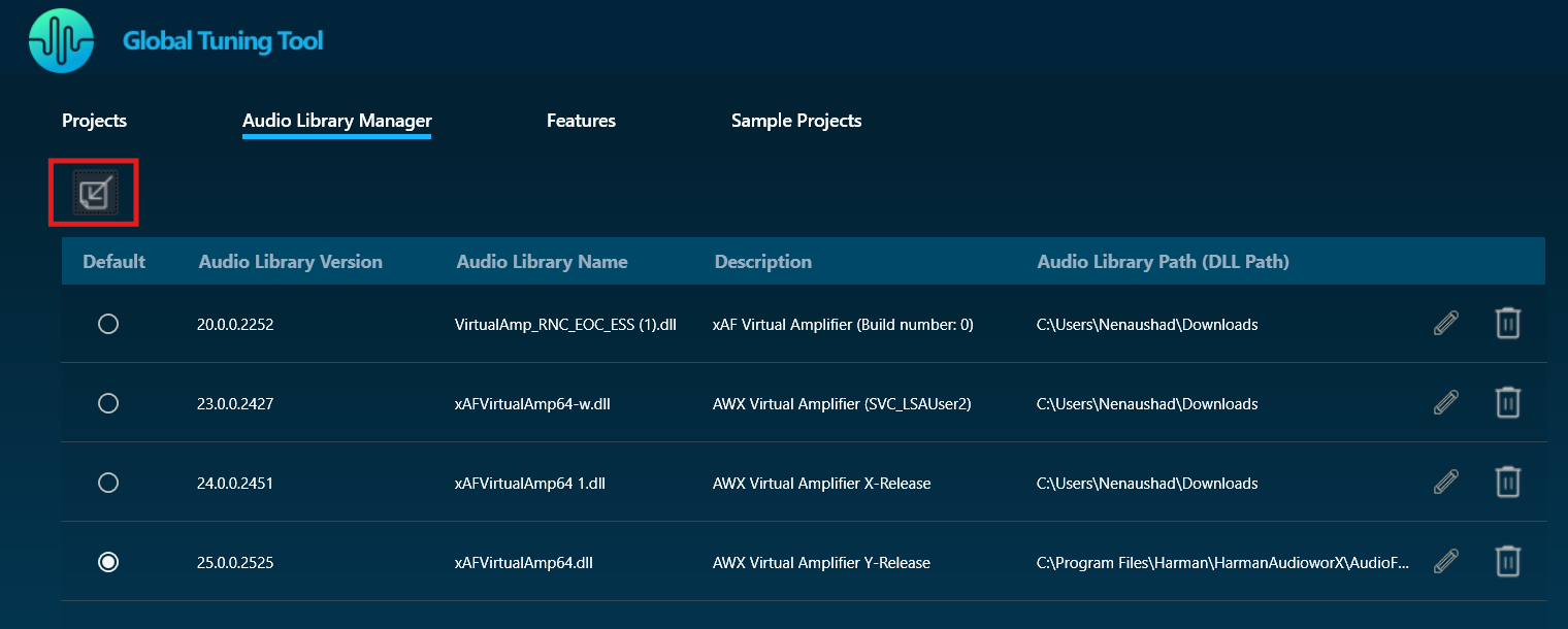
If the same xAF library version is already present in GTT, a prompt will appear before overwriting the DLL.
When a new audio library is loaded, it will not set to default automatically; instead, you need to select the checkbox to make it default.
After extending support for multiple libraries, each version of xAF libraries will be separately stored for simultaneous use in GTT. Before this, existing xAF dlls were overwritten when another DLL file was loaded, and GTT could only work with one xAF dll version at a time.
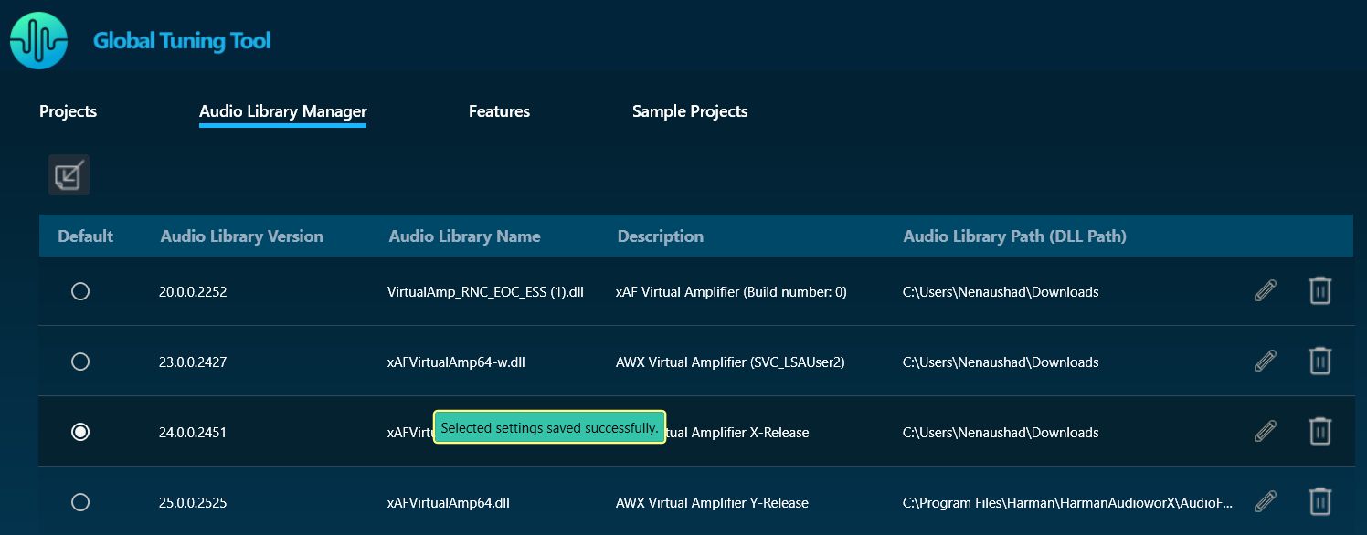
Set Default Audio Library
Installed audio library will be set to default when first time launch of the GTT application. You can change the default audio library by selecting the radio button in the Default column and the same will be updated and notified to the user.
The default audio library version set from this screen would be used for basic GTT operations – Add Device/ Discover Device/Project import (if the last saved audio library is not loaded in GTT).
- Set the default audio library version by selecting the radio button.
- Only one audio library version can be set as default.
- Settings shall be saved once clicked on the radio button of the selected audio library.
On GTT installation, the latest audio library will be loaded automatically and set as default.
Edit Audio Library Description
You can modify the description of the audio library DLL by clicking on the Edit Description option. After changing the description, click on Update to save the changes.
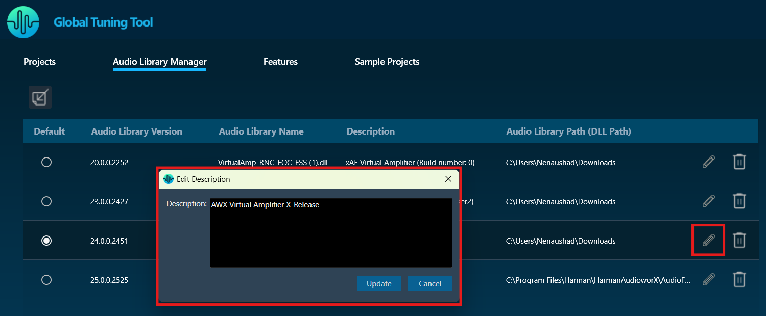
By default, the Description is taken from the file description of DLL metadata until the user manually updates it by clicking the Edit icon.
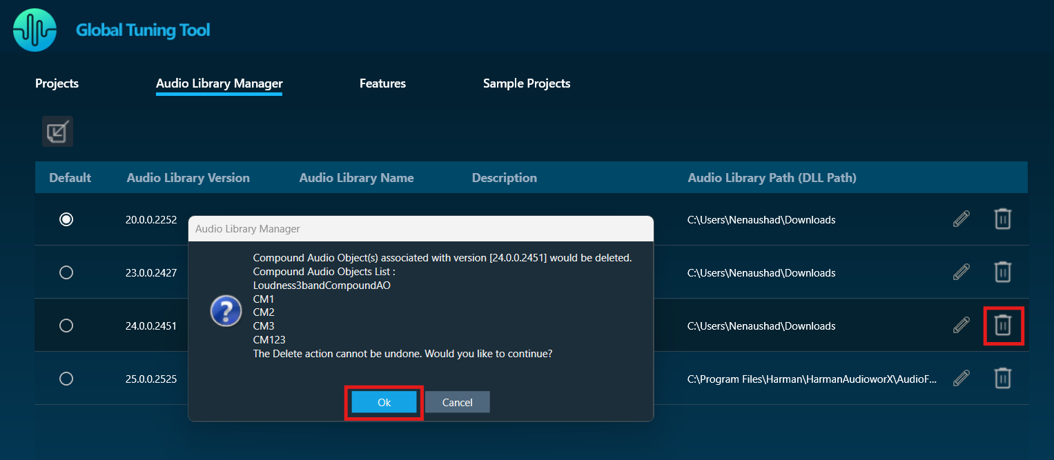
Delete Audio Library
Click on the Delete icon to delete an audio library.
Audio Library can be loaded/deleted, even if GTT is launched in normal mode.
Audio libraries can be deleted only when associated devices and compound audio objects are deleted.
Audio library which is set as default cannot be deleted.
Any unsaved settings should be saved before the audio library is deleted.
Features
The Feature tab allows you to directly access the MM-IR (Measurement Module for synchronous and asynchronous impulse response measurement, and recording) and MM-RTA (Measurement Module for Real Time Analyzer) features without having to go through the entire process of creating a regular GTT project. The description of each feature is provided in the ‘Description’ column of the Features tab.
If a project is in the open state and you double-click on the MM-IR or MM-RTA features, a feature window will open, and the relevant data will be updated and stored in the project.
If you double-click on the MM-IR or MM-RTA features from the home screen, a dummy project will be created in the background and you will be directed to the feature window. However, it is not possible to export the dummy project.
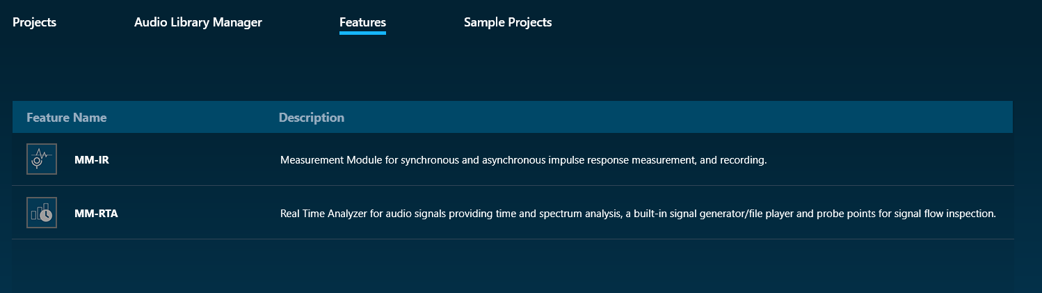
MM-IR: The MM-IR defines the Measurement Module for synchronous and asynchronous impulse response measurement and recording. A device is not necessary for the Measurement Module to function in the project. The Measurement Module enables direct sound card measurements without an intermediate device, whereas tests controlled by gain channels can be carried out via a device.
To open the Measurement Module dashboard, double-click on MM-IR.
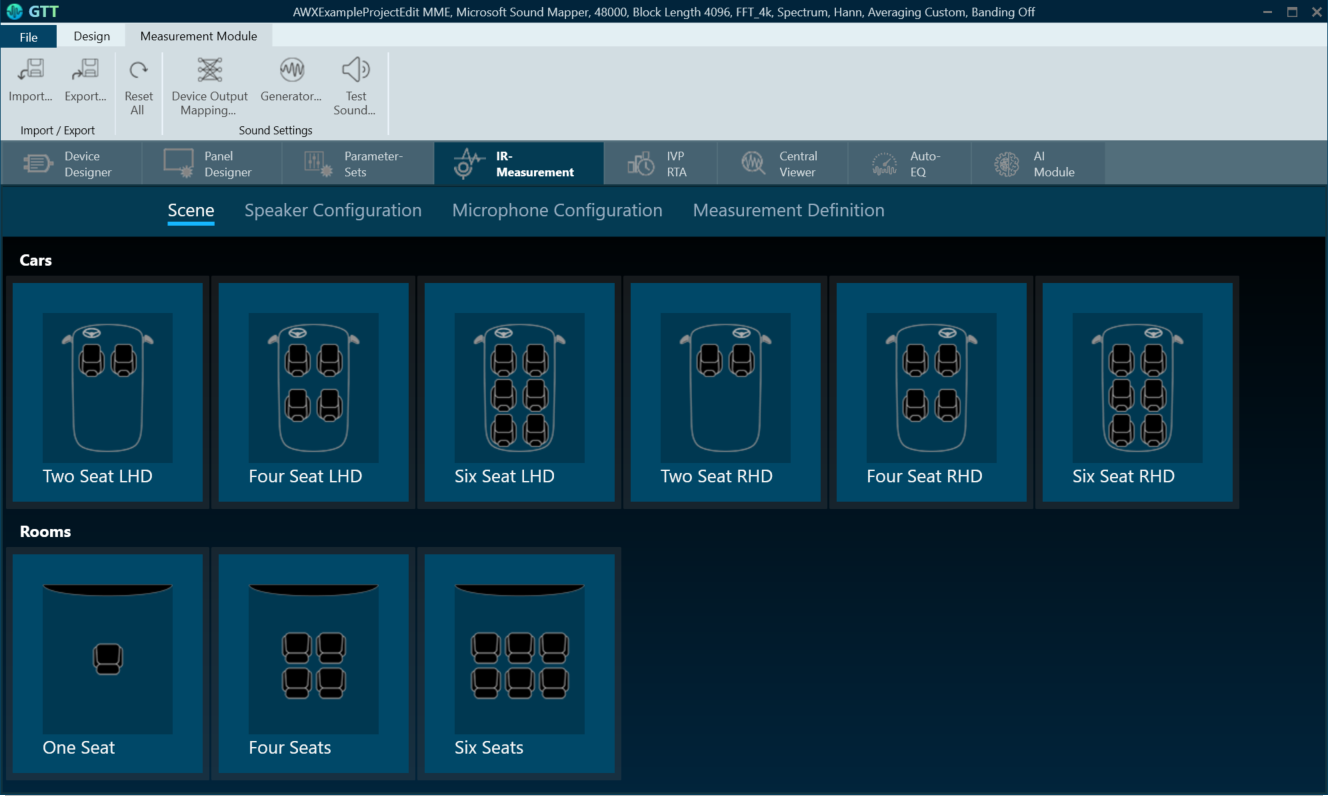
For more information, refer to the Measurement Module 2.0 User Guide.
MM-RTA: The MM-RTA defines the Measurement Module for multi-channel Real-Time analyzers for audio signals.
It provides time and frequency domain analysis tools for measuring RMS/peak levels, frequencies, THD, delays, magnitude, and phase responses. In addition, a built-in signal generator provides sine tones, sweeps, pulses, and various noise signals. Analyzing recorded signals is possible with a file player.
To open the Measurement Module dashboard, double-click on MM-RTA.
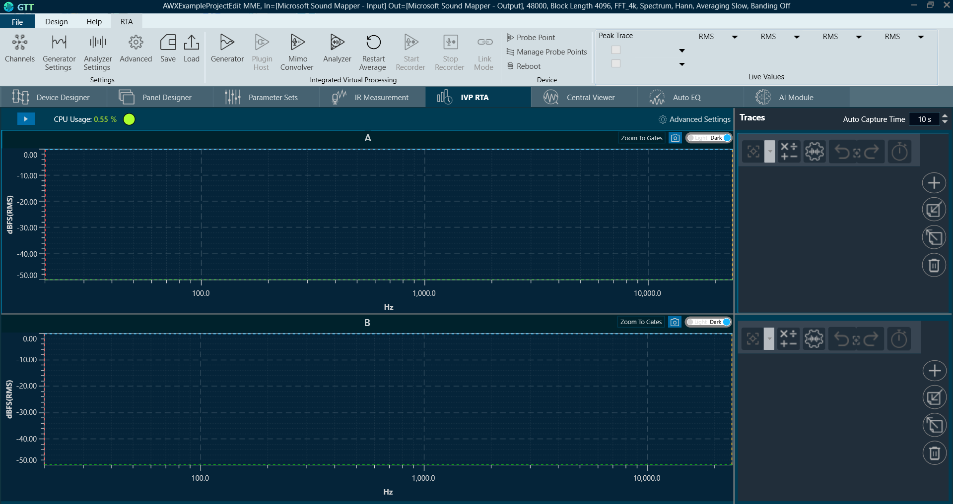
For more information, refer to the Real Time Analyzer User Guide.
Sample Projects
The Sample Projects tab allows you to get access to the example projects. This will help you to understand how various audio objects are configured in the Signal Flow Designer.
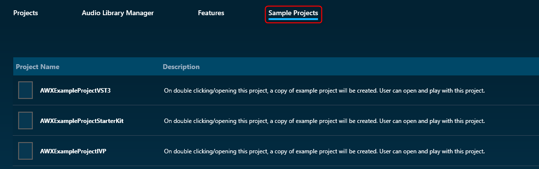
Double-click on any of the example project, this will create a copy of the example project. You can modify the newly created example project. Similarly, you can create any number of copies of an example project.
All tabs of the home page display items in a list view, listing one below the other. The ‘Description’ column provides description for each item.