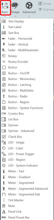
The first toolset is a group of basic design tools. The tools are grouped into the following toolset.
| Text design |
 |
| Fader design |
 |
| Rotary design |
 |
| Button design |
 |
| Box design |
 |
| LED design |
 |
| Meter design |
 |
| Note design |
 |
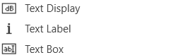
Text Design
Text Display
A text display is a dynamic text control on a Custom Panel that can be linked to the value of a specific device parameter. It shows the control value as it changes, much like a text box, but cannot be changed by the user.
Use either the Text Label or Note control to add static text to a Custom Panel.
A Text Display control can be managed in the Custom Panel designer and, once the Custom Panel is activated, viewed (but not changed) by the end user.
- Unlinked (Static) Text: If a label is not linked to a control, the text does not change on the control but is merely the default text as defined in the text attributes. Once another control is linked, the value is overridden by the parameter value.
- Linked (Updating) Text: If a label is linked to a control, on the activated Custom Panel it will reflect the value of the control as it changes, much like a text box. However, the value cannot be changed by the user.
Once a label is linked to a control, you can add a label showing the parameter address of the label.
Text Label
A text label is a static text control on a Custom Panel. It is text only, cannot be linked to a device parameter, and is not interactive for the user.
Text Label controls can be managed in the Custom Panel designer and, once the Custom Panel is activated, viewed (but not changed) by the end user.
Text Box
A text box allows the user to specify the exact value of a device parameter by typing it in rather than running through a long list of values. In tablet mode, a keypad loads when a text box is selected.
Controls can be managed in the Custom Panel designer and, once the Custom Panel is activated, utilized by the end user. This control must be linked to a parameter to function properly.
Common Text Design Properties
Properties Type
|
Description |
| General |
- Control Info: Shows control type. This propery is Read only.
- Locked: Specifies if the control is locked out so that it cannot be moved or re-sized.
- Checked = Locked
- Unchecked = Unlocked
|
| Parameters |
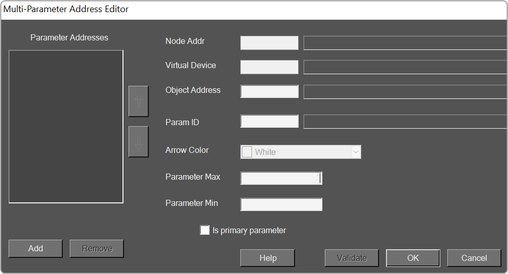
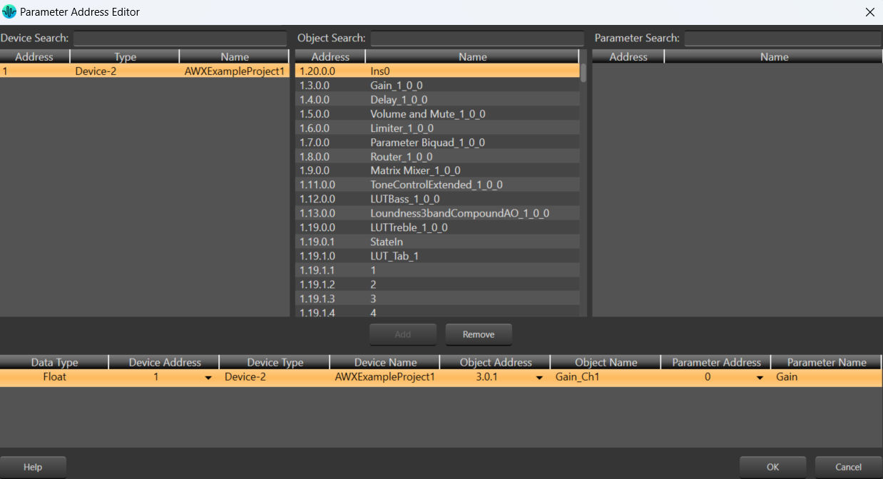
- Address: Enables panel designer to edit addressing information with the added benefit that the values can be validated as a group before being applied to the device.
This editor also allows the user to assign multiple parameters to the control.
- Properties correspond to the system explorer.
- Information: Shows information about the Parameter Address.
- Read only. Properties correspond to the system explorer.
- Rest Text: Optional text to display in right click context popup
|
| Appearance |
- Location: Control location (in pixels) of the control on the Custom Panel. Change X (horizontal) and Y (vertical) values in relation to upper left corner.
You can also drag the control to a different location.
- Size: Control size (in pixels). Change width and height values. You can also re-size the control manually.
- Background Image: Background image of the control.
- Background Color: Background color of the control.
- Paint Style: Background paint style of the control.
- Solid Brush: solid background
- Gradient Brush: gradient fill background
- Gradient Color Start: Beginning gradient color if gradient is selected in Paint Style.
- Gradient Color End: Ending gradient color if gradient is selected in Paint Style.
- Gradient Mode: Type of gradient fill if gradient is selected in Paint Style.Click to select type of gradient.
- Border Color: Border color of the control.
Brings up the Select Color window. Default color is transparent.
- Border Style: Click to select border style.Default style is flat.
|
| Text Attributes |
- Text: Enter the text for the Text Display.Default text is “TextDisplay1”.
- Text Font: Click on “…” to select desired font. Brings up a Font Select window.Selects from Windows fonts.
- Text Color: Text color of the control.Default color is black.
- Text Alignment: Alignment of the label text.Default alignment is middle center
|
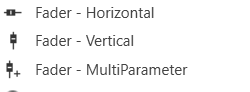
Fader Design
Fader Horizontal
A Fader Horizontal is an adjustable horizontally-positioned fader control that manipulates a device parameter.
Controls can be managed in the Custom Panel designer and, once the Custom Panel is activated, utilized by the end user. This control must be linked to a parameter to function properly.
Fader Vertical
A vertical fader is an adjustable vertically-positioned control that manipulates a device parameter.
Controls can be managed in the Custom Panel designer and, once the Custom Panel is activated, utilized by the end user. This control must be linked to a parameter to function properly.
Fader Multi Parameter
A multiparameter fader manipulates multiple device parameters.
Controls can be managed in the Custom Panel designer and, once the Custom Panel is activated, utilized by the end user. This control must be linked to a parameter to function properly.
On an activated Custom Panel, levels on a multiparameter fader can be adjusted together or individually
Common Fader Design Properties
Properties Type
|
Description |
| General |
- Control Info: Shows control type. This propery is Read only.
- Locked: Specifies if the control is locked out so that it cannot be moved or re-sized.
- Checked = Locked
- Unchecked = Unlocked
|
| Parameters |
- Addresses: Enables panel designer to edit addressing information with the added benefit that the values can be validated as a group before being applied to the device.
This editor also allows the user to assign multiple parameters to the control. Click to select Parameter Address Editor.
- Properties correspond to the system explorer.
- Information: Shows information about the Parameter Address.
- Read only. Properties correspond to the system explorer
- Maximum: Maximum parameter value.
- The largest parameter value.
- Minimum: Minimum parameter value.
- The smallest parameter value.
- Reset Text: Optional text to display in right click context popup.
|
| Appearance |
- Location: Control location (in pixels) of the control on the Custom Panel. Change X (horizontal) and Y (vertical) values in relation to upper left corner.
You can also drag the control to a different location
- Size: Control size (in pixels). Change width and height values. You can also re-size the control manually
- Background Image: Brings up the Select Background Image window
- Background Color: Background color of the control
- Tool Tip Text: The text that appears on control mouse-over.
- Tab Index: Determines the position of the control in the tab order
- Tab Stop: Specifies whether the control appears in the tab order.
- Checked = Appears
- Unchecked = Does not appear
|
| Arrow |
- Maximum Arrows: The maximum number of arrows to display.
- Arrow Direction: The direction the arrows should point.
- Point Left or Point Right
|
| Fader Cap |
- Fader Cap Image: The image displayed for the fader cap.
- Click Browse to locate custom fader caps
- Fader Cap Size: How large the fader cap will be
- Arrow Box Width: The width of the arrow box in pixels
- Vertical Offset: The vertical offset of the fader cap, in pixels, from the fader channel
- Horizontal Offset: The horizontal offset of the fader cap, in pixels, from the fader channel
- Hot Spot: Sets mouse sensitivity to the fader cap or the entire length of the slider
- Highlight Color: The channel highlight color
- Arrow Box Separation: The distance between the arrow box and the fader channel in pixels.
- Label Margin: The amount of space, as a decimal fraction of the width of the control, between the center channel and the tick marks
|
| Channel |
- Channel Color: Color of the fader channel. Default is Dim Gray
- Channel Width: Width of the fader channel in pixels
- Channel Start: Distance, as a percentage of length, from the bottom or left edge to where the fader channel will start.
- Channel End: Distance, as a percentage of length, from the bottom or left edge to where the fader channel will end.
- Channel Center: Distance, as a percentage of width, from the bottom or left edge to where the fader channel will be located.
|
| Scale |
- Display Tick Marks: Option to display the tick marks of the control. Must be set to true for custom ticks to display.
- Checked = Display
- Unchecked = Do not display
- Number of Major Ticks: How many major ticks are displayed.
- Tick Location: The location of the tick marks relative to the fader channel.
- Custom Ticks: Whether to use custom tick values by utilizing the scale editor or not.
- Checked = Display
- Unchecked = Do not display
- Display Tick Values: The value of the ticks to be displayed.
- Value Format: The format of the tick values.
- Labels Inside:
- Major Tick Color: The color of the major tick.
- Major Tick Length: The length of the major tick.
- Number of Minor Ticks: How many minor ticks are displayed.
- Minor Tick Color: The color of the minor tick.
- Minor Tick Length: The length of the minor tick.
- Tick Location: The location of the tick marks relative to the fader channel.
- Font: The font for the ticks.
- Labels Inside: Whether labels are drawn between tick marks and fader channel.
Whether labels are drawn between tick marks and fader channel or not.
- Checked = labels drawn between tick marks and channel.
- Unchecked = tick marks drawn between labels and channel.
- Labels Vertical: Whether labels are displayed vertically or horizontally.
- Checked = labels display vertically
- Unchecked = labels display horizontally, left to right.
- Label Margin: The amount of space, as a decimal fraction of the width of the control, between the center channel and the tick marks.
|
| Nudge Button |
- Nudge Button Location: Location of the nudge buttons.
- None, Center, Above or Below
- Nudge Type: Determines, with the increment amount, how much the control will adjust when a nudge button is pressed.
- Percent – percentage of the total visual display of the control. For non-logarithmic controls, the visual display and the total value of the control will be the same. For logarithmic controls, the visual display will differ from the total value.
- Bump – small increment
- Value – specified increment amount.
- Increment Amount: Determines, with the nudge type, how much the control will adjust when a nudge button is pressed.
- Nudge Button Separation: Distance, in pixels, from the edge to the nudge button.
- Up Image: The static image for the “up” nudge button. Click the button to select a new image.
- Up Pushed Image: The image that displays when the “up” nudge button is pushed. Click the button to select a new image.
- Down Image: The static image for the “down” nudge button. Click the button to select a new image.
- Down Pushed Image: The image that displays when the “down” nudge button is pushed. Click the button to select a new image.
|
| Popup Value |
- Popup Value Position – Fraction: The location of the popup value as a decimal fraction of the width (X) and height (Y) of the control.
- Display Popup Value: Displays the value of the control in a popup, if set to true
- Checked = Display
- Unchecked = Do not display
|
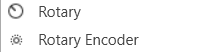
Rotary Design
Rotary
A rotary is an adjustable control that manipulates a device parameter. Controls can be managed in the Custom Panel designer and, once the Custom Panel is activated, utilized by the end user. This control must be linked to a parameter to function properly.
Rotary Encoder
A rotary encoder is an adjustable rotary control that manipulates a device parameter and displays values of a device parameter.
When a Custom Panel is activated, the rotary control (inner ring) changes the linked parameter values as the end user clicks and slides it around it to the desired value position (like twisting a nob). The rotary encoder is controlled by right-clicking with the mouse and moving to the top or right to increase the value and moving to the bottom or left to decrease the value.
The LED meter (outer ring) reflects the selected parameter values, which are usually the same as those linked to and adjusted by the rotary control.
Controls can be managed in the Custom Panel designer and, once the Custom Panel is activated, utilized by the end user. This control must be linked to a parameter to function properly.
Common Roter Design Properties
Properties Type
|
Description |
| General |
- Control Info: Shows control type. This propery is Read only.
- Locked: Specifies if the control is locked out so that it cannot be moved or re-sized.
- Checked = Locked
- Unchecked = Unlocked
|
| Parameters |
- Addresses: Enables panel designer to edit addressing information with the added benefit that the values can be validated as a group before being applied to the device.
This editor also allows the user to assign multiple parameters to the control. Click to select Parameter Address Editor.
- Properties correspond to the system explorer.
- Information: Shows information about the Parameter Address.
- Read only. Properties correspond to the system explorer
- Rotary Maximum: Maximum parameter value. The largest parameter value.
- Rotary Minimum: Minimum parameter value. The smallest parameter value.
- Meter Maximum: Maximum meter value. The largest meter value
- Meter Minimum: Minimum meter value. The smallest meter value
- Reset Text: Optional text to display in right click context popup.
|
| Appearance |
- Location: Control location (in pixels) of the control on the Custom Panel. Change X (horizontal) and Y (vertical) values in relation to upper left corner.
You can also drag the control to a different location.
- Size: Control size (in pixels). Change width and height values. You can also re-size the control manually.Background Image: Brings up the Select Background Image window.
- Background Image: Click to select background image.
- Background Color: Background color of the control.
- Foreground Color: Foreground color of the control.
- Font: Font style for the text on the control. Click on “…” to select desired font. Selects from Windows fonts.
- Mode String: User-definable description of mode.
- Anti-Aliasing: Whether to draw with anti-aliasing or not.
- Checked = With anti-aliasing.
- Unchecked = Without anti-aliasing
- Tool Tip Text: The text that appears on control mouse-over.
- Tab Index: If tab stop is set to true, determines the position of the control in the tab order.
- Tab Stop: Specifies whether the control appears in the tab order.
- Checked = Appears
- Unchecked = Does not appear
|
| Knob |
- Base Image: The image displayed for the inside of the knob
- Ring Image: The image displayed for the outside of the knob.
- Shading Image: The image used to simulate lighting/shading effects of the knob.
- Knob Size: The size of the knob.
- Set to 0,0 to reset to the actual image size.
- Start Position: The angular starting point from vertical.
- End Position: The angular ending point from vertical.
- Orientation: The movement of the knob from min to max.
|
| Backing Circle |
- Radius: Radius for the backing circle as fraction of control size.
- Color: Color of the backing circle.
- Use “Transparent” to disable.
- Border Width: Width of the backing circle border.
- Border Color: Color of the backing circle border.
|
| Rotary |
- Encoder Multiplier: The amount that the turn of the rotary is multiplied to tune sensitivity.
- Base Image: The image displayed for the inside of the knob.
- Brings up the Select Image File window.
- Ring Image: The image displayed for the outside of the knob.
- Brings up the Select Image File window.
- Knob Radius: The radius of the rotary knob as percent of control size.
- Must be less than meter inner radius but greater than half of the meter inner radius.
- Nudge Amount: Determines, with the nudge type, how much the control will adjust when up and down arrow keys are pressed.
- Nudge Type: Determines, with the nudge amount, how much the control will adjust when up and down arrow keys are pressed.
- Percent: Percentage of the total visual display of the control. For non-logarithmic controls, the visual display and the total value of the control will be the same. For logarithmic controls, the visual display will differ from the total value.
- Bump: Small increment.
- Value: Specified nudge amount.
|
| Fader Cap |
- Fader Cap Image: The image displayed for the fader cap.
- Click Browse to locate custom fader caps
- Fader Cap Size: How large the fader cap will be
- Arrow Box Width: The width of the arrow box in pixels
- Vertical Offset: The vertical offset of the fader cap, in pixels, from the fader channel
- Horizontal Offset: The horizontal offset of the fader cap, in pixels, from the fader channel
- Hot Spot: Sets mouse sensitivity to the fader cap or the entire length of the slider
- Highlight Color: The channel highlight color
- Arrow Box Separation: The distance between the arrow box and the fader channel in pixels.
- Label Margin: The amount of space, as a decimal fraction of the width of the control, between the center channel and the tick marks
|
| Channel |
- Channel Color: Color of the fader channel. Default is Dim Gray
- Channel Width: Width of the fader channel in pixels
- Channel Start: Distance, as a percentage of length, from the bottom or left edge to where the fader channel will start.
- Channel End: Distance, as a percentage of length, from the bottom or left edge to where the fader channel will end.
- Channel Center: Distance, as a percentage of width, from the bottom or left edge to where the fader channel will be located.
|
| Scale |
- Display Tick Marks: Option to display the tick marks of the control. Must be set to true for custom ticks to display.
- Checked = Display
- Unchecked = Do not display
- Number of Major Ticks: How many major ticks are displayed.
- Tick Location: The location of the tick marks relative to the fader channel.
- Custom Ticks: Whether to use custom tick values by utilizing the scale editor or not.
- Checked = Display
- Unchecked = Do not display
- Display Tick Values: The value of the ticks to be displayed.
- Value Format: The format of the tick values.
- Labels Inside:
- Major Tick Color: The color of the major tick.
- Major Tick Length: The length of the major tick.
- Number of Minor Ticks: How many minor ticks are displayed.
- Minor Tick Color: The color of the minor tick.
- Minor Tick Length: The length of the minor tick.
- Tick Location: The location of the tick marks relative to the fader channel.
- Font: The font for the ticks.
- Labels Inside: Whether labels are drawn between tick marks and fader channel.
Whether labels are drawn between tick marks and fader channel or not.
- Checked = labels drawn between tick marks and channel.
- Unchecked = tick marks drawn between labels and channel.
- Labels Vertical: Whether labels are displayed vertically or horizontally.
- Checked = labels display vertically
- Unchecked = labels display horizontally, left to right.
- Label Margin: The amount of space, as a decimal fraction of the width of the control, between the center channel and the tick marks.
|
| Nudge Button |
- Nudge Button Location: Location of the nudge buttons.
- None, Center, Above or Below
- Nudge Type: Determines, with the increment amount, how much the control will adjust when a nudge button is pressed.
- Percent – percentage of the total visual display of the control. For non-logarithmic controls, the visual display and the total value of the control will be the same. For logarithmic controls, the visual display will differ from the total value.
- Bump – small increment
- Value – specified increment amount.
- Increment Amount: Determines, with the nudge type, how much the control will adjust when a nudge button is pressed.
- Nudge Button Separation: Distance, in pixels, from the edge to the nudge button.
- Up Image: The static image for the “up” nudge button. Click the button to select a new image.
- Up Pushed Image: The image that displays when the “up” nudge button is pushed. Click the button to select a new image.
- Down Image: The static image for the “down” nudge button. Click the button to select a new image.
- Down Pushed Image: The image that displays when the “down” nudge button is pushed. Click the button to select a new image.
|
| Meter |
- Encoder Mode: The display mode for the LED elements. Clockwise is the default.
- Outer Radius: The outside edge of the display meter as a percentage of the entire circle. Must be less than 1 (outer edge of control) and greater than the inner radius.
- Inner Radius: The inside edge of the display meter as a percentage of the entire circle. Must be less than meter outer radius.
- Starting Angle: Where the meter display starts. Measured in degrees from where “0” is straight up (-180…180).
- Ending Angle: Where the meter display ends. Measured in degrees from where “0” is straight up (-180…180).
- Separation Angle: The angle, in degrees, separating each segment.
- Segment Count (1..360): The number of segments in the display.
- Off Color: The “off” color of the control.
- On Color: The “on” color of the control.
- Segment Border Color: The color of the segment border.
|
| Popup Value |
- Popup Value Position – Fraction: The location of the popup value as a decimal fraction of the width (X) and height (Y) of the control.
- Display Popup Value: Displays the value of the control in a popup, if set to true
- Checked = Display
- Unchecked = Do not display
|
Button design
Button
A standard button sends a single value each time that it is pressed. While a button can be linked to a device parameter, it is more typically linked to a system function.
Controls can be managed in the Custom Panel designer and, once the Custom Panel is activated, utilized by the end user. This control must be linked to a parameter to function properly.
On the following example, if “Preset 1” button is pushed, the 1st preset is selected for DriveRack #1. If “Preset 2” button is pushed, the 2nd preset is selected. Each button push overrides the value of the previous button push.
Button On/Off
An on/off button alternately turns on or off a device parameter value when pressed. Controls can be managed in the Custom Panel designer and, once the Custom Panel is activated, utilized by the end user. This control must be linked to a parameter to function properly.
Button Momentary
A momentary button turns on a device parameter value while it is being pressed and turns the value off when released.
Controls can be managed in the Custom Panel designer and, once the Custom Panel is activated, utilized by the end user. This control must be linked to a parameter to function properly.
Button Latching
A latching button alternately turns on or off a device parameter value when pressed.
Controls can be managed in the Custom Panel designer and, once the Custom Panel is activated, utilized by the end user. This control must be linked to a parameter to function properly.
Button MultiState
A multi-state button both sets and displays a defined value of a device parameter. While the multi-state button is somewhat complex to set-up, its function can be very powerful. To set up an MS button, first you add (and link) the button, then change its properties. You must also define the button action. You can also change its other properties.
Controls can be managed in the Custom Panel designer and, once the Custom Panel is activated, utilized by the end user. This control must be linked to a parameter to function properly.
A multi-state button can be powerful but very complex, save your venue before adding or editing a multi-state button.
- Sets Value: Once the multi-state button is linked and defined, the parameter on the Custom Panel changes the parameter(s) on the device control panel(s).
- Multiple Device Parameters – If the multi-state button is linked to more than one device parameter, when the multi-state button on the Custom Panel is pushed, all the attached device parameters will be set to the specified value.
- Displays Value: Once the multi-state button is linked and defined, the parameter on the device control changes the parameter on the Custom Panel as defined in the properties section:
- Multiple Device Parameters – If the multi-state button is linked to more than one device parameter, the multi-state button on the Custom Panel will update the device parameters with the new value.
- Add Multi-State Button: Add a multi-state button the same way you add other controls and link it to one or more device parameters
- Change button properties – In order for the linked multi-state button to work properly, you must define how the property works. This is accomplished in Properties in the “Value Indication Matrix” window. You must also set the button action.
Button Radio
A radio button allows the user to select the value of a device parameter from a list. Controls can be managed in the Custom Panel designer and, once the Custom Panel is activated, utilized by the end user. This control must be linked to a parameter to function properly.
Button Region
This button sends a single value each time that it is pressed. While a button can be linked to a device parameter, it is more typically linked to a system function.
Controls can be managed in the Custom Panel designer and, once the Custom Panel is activated, utilized by the end user. This control must be linked to a parameter or system function to function properly. You can also easily add a pre-defined label.
On the following example, if “Preset 1” button is pushed, the 1st preset is selected for DriveRack #1. If “Preset 2” button is pushed, the 2nd preset is selected. Each button push overrides the value of the previous button push.
Button System Functions
A System Functions button sends a single value each time that it is pressed. This button is specifically linked to a system function.
Controls can be managed in the Custom Panel designer and, once the Custom Panel is activated, utilized by the end user. This control must be linked to a parameter to function properly.
Common Button Design Properties
Properties Type
|
Description |
| General |
- Control Info: Shows control type. This propery is Read only.
- Locked: Specifies if the control is locked out so that it cannot be moved or re-sized.
- Checked = Locked
- Unchecked = Unlocked
|
| Parameters |
- Addresses: Enables panel designer to edit addressing information with the added benefit that the values can be validated as a group before being applied to the device.
This editor also allows the user to assign multiple parameters to the control. Click to select Parameter Address Editor.
- Properties correspond to the system explorer.
- Information: Shows information about the Parameter Address.
- Read only. Properties correspond to the system explorer.
- Press Value: Value sent when button is pressed.
- On Value: Value sent when button is pressed.
- Off Value: Value sent when button is released.
- Value Matrix: Allows changes to the button states, and images associated with each state.
- Value List: Allows editing of the value range of the control. Brings up the Discrete Values Editor.
- Color 0 to Color 63: Background color of control. Brings up the Select Color window.
- Indication same as Button: The value sent when the button is pressed.
- Reset Text: Optional text to display in right click context popup.
|
| Appearance |
- Location: Control location (in pixels) of the control on the Custom Panel.
Change X (horizontal) and Y (vertical) values in relation to upper left corner. You can also drag the control to a different location.
- Size: Control size (in pixels). Change width and height values. Change width and height values. You can also re-size the control manually.
- Font: Font style for the text on the control. Click on “…” to select desired font. Selects from Windows fonts.
- Center Text: Centers the tool tip text on the control.
- Background Image: Background graphic of control. Brings up the Select Image File window.
- Background Color: Background color of the control. Brings up the Select Color window.
- Tool Tip Text: Text that appears when mouse pointer hovers over control.
- Tab Index: Indicates the sequence of an element within the tabbing order of all focusable elements in the document.
- Tab Stop: Whether the control appears in the tab order.
- Checked = Appears
- Unchecked = Does not appear
- Transparency: Percent transparent, between 0 (opaque) and 90 (very transparent). Brings up the Select Image File window.
- Hover Transparency: Percent transparent when the mouse pointer is over the region.
- Border Color: The color of the border. Brings up the Select Color window.
- Border Width: The width of the border (in pixels)
|
| Button |
- Primary Font: Font style for the text on the control. Click on “…” to select desired font. Selects from Windows fonts.
- Text: Text appearing on the control. Select and type desired label. Default text is “Button” with the number of the control (order added to the panel)
- Font: Font style for the text on the control. Click on “…” to select desired font. Selects from Windows fonts.
- Text Color: Color of the text on the control
- Fill Color: Changes the Fill Color of the control, will not be visible if you have an image selected.
- Border Color: The color of the Button border.
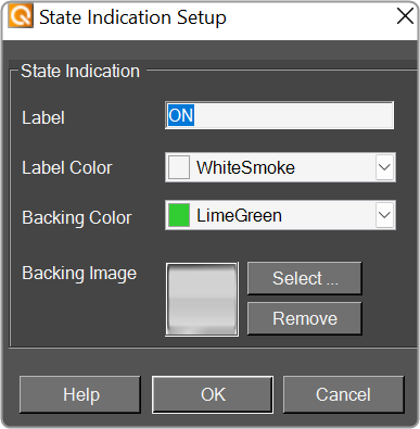
- On Primary Indication: Sets the button label, label color, background color, and background image for the “on” state.
- Off Primary Indication: Sets the button label, label color, background color, and background image for the “off” state. Brings up the State Indication Setup window.
- Enable Flashing: Enables button to flash.
- Flash Frequency: If flashing is enabled, sets the flashing frequency.
- Flash In Phase: If flashing is enabled, determines if button will flash in or out of phase with other buttons
- Flash On Indication: Sets the button label, label color, background color, and background image for the “flash on” state. Brings up the State Indication Setup window.
- Flash Off Indication: Sets the button label, label color, background color, and background image for the “flash off” state. Brings up the State Indication Setup window.
- Multi-line: When checked, changes the button for multi-line operation. A secondary set of certain properties are added to the button: Secondary Font, Secondary On Indication and Secondary Off Indication.
- Default state is unchecked. The Secondary Font, On Indication and Off indication options are identical to the Primary Font, On Indication and Off indication options.
- Bump up: When checked, bumps up the assigned parameter by the Bump % amount.
- Bump %: Sets the percentage amount for the Bump function.
- Bump Down: When checked, bumps down the assigned parameter by the Bump % amount.
- Button Action: When an event occurs when the button is clicked. OnUp, OnDown, or OnBoth.
- Button Image: The image displayed as the button. Brings up the Select Image File window.
- Alignment: Alignment of the button nubs. vertical and horizontal.
- Diameter: Diameter of the radio button nubs
- Style: The style (color) of the nubs.
- Select from the pull-down list.
- Border Style: The style of the control border.
- Select from the pull-down list
- Top Margin: Distance of the values, in pixels, from the top border of the control.
- Bottom Margin: Distance of the values, in pixels, from the bottom border of the control.
- Left Margin: Distance of the values, in pixels, from the left border of the control.
- Right Margin: Distance of the values, in pixels, from the right border of the control.
- On Color: The color of the button in the On state. Brings up the Select Color window.
- Off Color: The color of the button in the Off state. Brings up the Select Color window.
- On Text: The text displayed on the button in the On state.
- Off Text: The text displayed on the button in the Off state.
- Mixed Text: The text displayed on the button when in a mixed state.
|
| System Indication |
|
| System Functions |
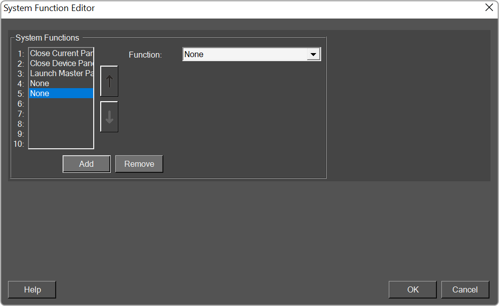
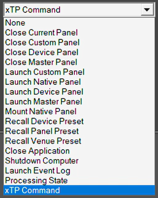
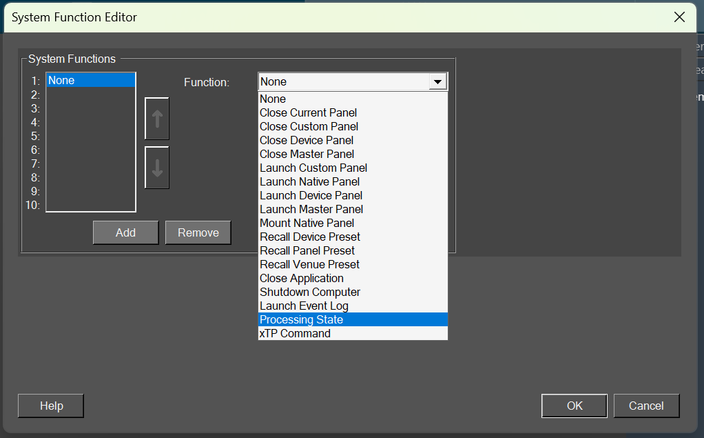
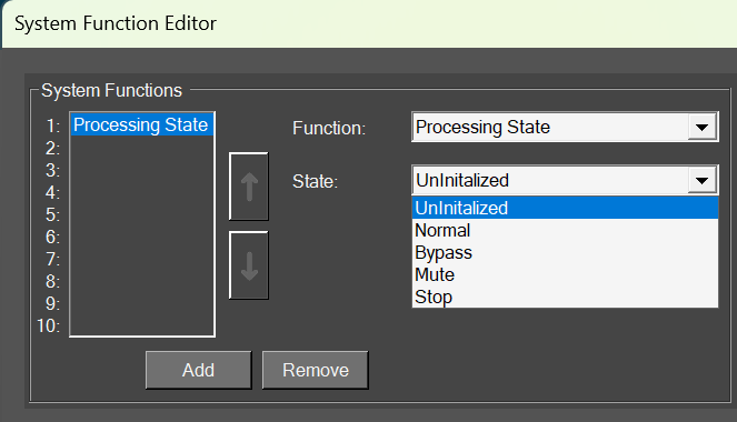
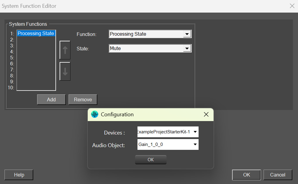
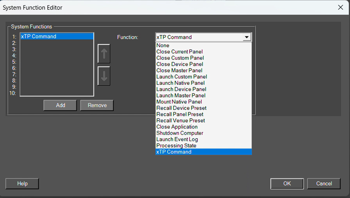
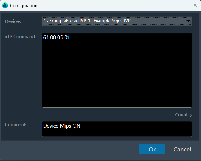
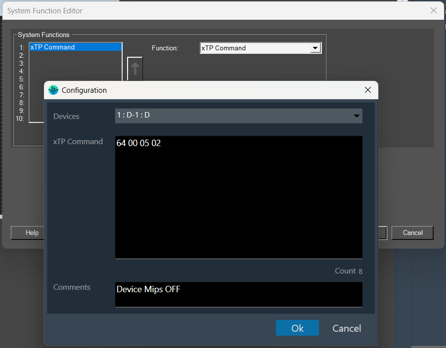
- System Functions: Assign specific system operations to be performed when the button is pressed.
Brings up the System Function editor.
|
Box Design
Combo Box
A Combo Box allows the user to select the value of a device parameter from a drop-down list.Controls can be managed in the Custom Panel designer and, once the Custom Panel is activated, utilized by the end user. This control must be linked to a parameter to function properly.
List Box
A List Box allows the user to select the value of a device parameter from a list. Controls can be managed in the Custom Panel designer and, once the Custom Panel is activated, utilized by the end user. This control must be linked to a parameter to function properly.
Spinner
A Spinner allows the user to change the value of a device parameter by adjusting it up or down; the increment can be specified by the Custom Panel designer. Controls can be managed in the Custom Panel designer and, once the Custom Panel is activated, utilized by the end user. This control must be linked to a parameter to function properly.
Check Box
A Checkbox turns on or off a device parameter value when pressed. Controls can be managed in the Custom Panel designer and, once the Custom Panel is activated, utilized by the end user. This control must be linked to a parameter to function properly.
Common Roter Design Properties
Properties Type
|
Description |
| General |
- Control Info: Shows control type. This propery is Read only.
- Locked: Specifies if the control is locked out so that it cannot be moved or re-sized.
- Checked = Locked
- Unchecked = Unlocked
|
| Parameters |
- Addresses: Enables panel designer to edit addressing information with the added benefit that the values can be validated as a group before being applied to the device.
This editor also allows the user to assign multiple parameters to the control. Click to select Parameter Address Editor.
- Properties correspond to the system explorer.
- Information: Shows information about the Parameter Address.
- Read only. Properties correspond to the system explorer
- Value List: Allows editing of the value range of the control. Brings up the Discrete Values Editor.
- Maximum: Maximum parameter value.
- The largest parameter value.
- Minimum: Minimum parameter value.
- The smallest parameter value.
- Reset Text: Optional text to display in right click context popup.
- Disable Mixed-sate Editor: When checked, disables the mixed-state context menu and editor
|
| Appearance |
- Location: Control location (in pixels) of the control on the Custom Panel. Change X (horizontal) and Y (vertical) values in relation to upper left corner.
You can also drag the control to a different location
- Size: Control size (in pixels). Change width and height values. You can also re-size the control manually.
- Border Style: The style of the Spinner border.
- Choose from drop down menu.
- Border Color: The color of the Spinner border
- Top Margin: The amount of space, in pixels at the top of the control where a label may be placed.
- Bottom Margin: The amount of space, in pixels at the bottom of the control where a label may be placed.
- Left Margin: The amount of space, in pixels to the left of the control where a label may be placed.
- Right Margin: The amount of space, in pixels to the right of the control where a label may be placed.
- Background Image: Brings up the Select Background Image window.
- Background Color: Background color of the control.
- Tool Tip Text: The text that appears on control mouse-over.
- Tab Index: Determines the position of the control in the tab order
- Tab Stop: Specifies whether the control appears in the tab order.
- Checked = Appears
- Unchecked = Does not appear
|
| Combo Box |
- Background Color: The background color of the Combo Box.
- Text Color: The color of the Combo Box text
- Font: Font style for the text in the box. Click on “…” to select desired font.
- Selects from Windows fonts.
- Style: Sets the appearance and functionality of the Combo Box.
- Select from Drop Downlist, Simple or Drop-down
- Selected Item Color: The color of the selected item.
- Check Box Text: The text shown in the Checkbox.
- Checkbox Size: The size of the Checkbox in pixels.
- Checkbox Style: The Checkbox style. Normal, flat, and various colors.
- Label Separation: The space, in pixels between the checkbox and the checkbox text.
|
| List Box |
- Background Color: The background color of the Combo Box Brings up the Select Color window
- Text Color: The color of the Combo Box text. Brings up the Select Color window
- Font: Font style for the text in the box. Click on “…” to select desired font. Selects from Windows fonts.
- Border Style: Sets the style of the List Box border. Choose from syles in a drop down list
Selected Item Color: The color of the selected item. Brings up the Select Color window
|
| Text Attributes |
- Text Font: The font of the Spinner text. Choose from Windows fonts.
- Text Color: The color of the Spinner text. Brings up the Select Color window
- Background Color: The background color of the text area. Brings up the Select Color window
- Value Format: The format used when displaying the value. This is an advanced feature and must follow English conventions.
- Text Alignment: The horizontal alignment of the text. Left, center or right.
- Text Border Style: The border style of the text area. Choose from drop down menu.
|
| Nudge Buttons |
- Nudge Type: Together with the Increment Amount, determines the amount that the control will increment/decrement when a Nudge Button is pressed. Percent, bump or value
- Increment: Together with the Nudge Type, determines the amount that the control will increment/decrement when a Nudge Button is pressed.
|
| Spinner Attributes |
- Spinner Position: Specifies where the up/down arrows are to be located. Right or TopBottom
- Spinner Width: Sets the size of the up/down arrow buttons, in percent of width or height.
- Spinner Button Color: The color of the up/down arrow buttons. Brings up the Select Color window
- Spinner Arrow Color: The color of the up/down arrows. Brings up the Select Color window
- Arrow Width: The width of the base as a percentage of the spinner button width.
|
LED Design
Led Image
An LED is a display-only control that shows the state of a device parameter. The LED control helps the designer to graphically show a certain condition, as defined by the designer, such as a warning. The “LED Image” control allows you to change the entire image of the LED where the “LED Color” control is a simplified control where you only need to change the color of the LED.
Controls can be managed in the Custom Panel designer and, once the Custom Panel is activated, utilized by the end user. This control must be linked to a parameter or system function to function properly. You can also easily add a pre-defined label.
For example, the designer wants to show when the pink noise levels on each of the four inputs of a DriveRack 4800 are more than 10dB. First, he adds an LED and links it to the pink noise on Channel 1.
The designer then goes into the Properties field to the Parameters Value and defines the value with the LED Values Editor.
Led Color
An LED is a display-only control that shows the state of a device parameter. The LED control helps the designer to graphically show a certain condition, as defined by the designer, such as a warning.
Controls can be managed in the Custom Panel designer and, once the Custom Panel is activated, utilized by the end user. This control must be linked to a parameter or system function to function properly. You can also easily add a pre-defined label.
For example, the designer wants to display when pink noise levels on each of the four inputs of a DriveRack 4800 are more than 10dB. First, he adds an LED and links it to the pink noise on Channel 1.
The designer then goes into the Properties field to the Parameters Value and defines the value with the LED Values Editor.
Led Preset Trigger
A preset trigger is a control on a Custom Panel that causes an activation event to execute when a specific condition occurs. The Custom Panel must be activated for the action to be performed. You can, however, set up a venue-wide rule with Logic Rules.
To Set Up a Preset Trigger
Add the preset trigger control to the Custom Panel then do one of the following:
- Right click the control and select edit parameter assignment.
or
- In the properties section of the graph, select the “…” at the right of parameter addresses.
To Reset a Preset Trigger
If the condition for the activation event is set to manual reset, the user must reset the control. Right-click the control on the activated panel and select “Reset Trigger.”
Led Region
The LED Region control sends a single value each time that it is pressed. While a button can be linked to a device parameter, it is more typically linked to a system function.
Controls can be managed in the Custom Panel designer and, once the Custom Panel is activated, utilized by the end user. This control must be linked to a parameter or system function to function properly. You can also easily add a pre-defined label.
Led System Indicator
The system indicator is an LED-style control that allows you to define and show the state of specified devices. For example, on an activated panel, a system indicator will turn red and beep when a device is offline, then return to green when the connection is restored. A right mouse click on the system indicator on an activated panel also shows what state attached devices are in.
Controls can be managed in the Custom Panel designer and, once the Custom Panel is activated, utilized by the end user. This control must be linked to a parameter or system function to function properly. You can also easily add a pre-defined label.
Common LED Design Properties
Properties Type
|
Description |
| General |
- Control Info: Shows control type. This propery is Read only.
- Locked: Specifies if the control is locked out so that it cannot be moved or re-sized.
- Checked = Locked
- Unchecked = Unlocked
|
| Parameters |
- Addresses: Enables panel designer to edit addressing information with the added benefit that the values can be validated as a group before being applied to the device.
This editor also allows the user to assign multiple parameters to the control. Click to select Parameter Address Editor.
- Properties correspond to the system explorer.
- Information: Shows information about the Parameter Address.
- Read only. Properties correspond to the system explorer
- Maximum: Maximum parameter value.
- The largest parameter value.
- Minimum: Minimum parameter value.
- The smallest parameter value.
- Reset Text: Optional text to display in right click context popup.
|
| Appearance |
- Location: Control location (in pixels) of the control on the Custom Panel. Change X (horizontal) and Y (vertical) values in relation to upper left corner.
You can also drag the control to a different location
- Size: Control size (in pixels). Change width and height values. You can also re-size the control manually
- Background Image: Brings up the Select Background Image window
- Background Color: Background color of the control
- Tool Tip Text: The text that appears on control mouse-over.
- Tab Index: Determines the position of the control in the tab order
- Tab Stop: Specifies whether the control appears in the tab order.
- Checked = Appears
- Unchecked = Does not appear
|
| Arrow |
- Maximum Arrows: The maximum number of arrows to display.
- Arrow Direction: The direction the arrows should point.
- Point Left or Point Right
|
| Fader Cap |
- Fader Cap Image: The image displayed for the fader cap.
- Click Browse to locate custom fader caps
- Fader Cap Size: How large the fader cap will be
- Arrow Box Width: The width of the arrow box in pixels
- Vertical Offset: The vertical offset of the fader cap, in pixels, from the fader channel
- Horizontal Offset: The horizontal offset of the fader cap, in pixels, from the fader channel
- Hot Spot: Sets mouse sensitivity to the fader cap or the entire length of the slider
- Highlight Color: The channel highlight color
- Arrow Box Separation: The distance between the arrow box and the fader channel in pixels.
- Label Margin: The amount of space, as a decimal fraction of the width of the control, between the center channel and the tick marks
|
| Channel |
- Channel Color: Color of the fader channel. Default is Dim Gray
- Channel Width: Width of the fader channel in pixels
- Channel Start: Distance, as a percentage of length, from the bottom or left edge to where the fader channel will start.
- Channel End: Distance, as a percentage of length, from the bottom or left edge to where the fader channel will end.
- Channel Center: Distance, as a percentage of width, from the bottom or left edge to where the fader channel will be located.
|
| Scale |
- Display Tick Marks: Option to display the tick marks of the control. Must be set to true for custom ticks to display.
- Checked = Display
- Unchecked = Do not display
- Number of Major Ticks: How many major ticks are displayed.
- Tick Location: The location of the tick marks relative to the fader channel.
- Custom Ticks: Whether to use custom tick values by utilizing the scale editor or not.
- Checked = Display
- Unchecked = Do not display
- Display Tick Values: The value of the ticks to be displayed.
- Value Format: The format of the tick values.
- Labels Inside:
- Major Tick Color: The color of the major tick.
- Major Tick Length: The length of the major tick.
- Number of Minor Ticks: How many minor ticks are displayed.
- Minor Tick Color: The color of the minor tick.
- Minor Tick Length: The length of the minor tick.
- Tick Location: The location of the tick marks relative to the fader channel.
- Font: The font for the ticks.
- Labels Inside: Whether labels are drawn between tick marks and fader channel.
Whether labels are drawn between tick marks and fader channel or not.
- Checked = labels drawn between tick marks and channel.
- Unchecked = tick marks drawn between labels and channel.
- Labels Vertical: Whether labels are displayed vertically or horizontally.
- Checked = labels display vertically
- Unchecked = labels display horizontally, left to right.
- Label Margin: The amount of space, as a decimal fraction of the width of the control, between the center channel and the tick marks.
|
| Nudge Button |
- Nudge Button Location: Location of the nudge buttons.
- None, Center, Above or Below
- Nudge Type: Determines, with the increment amount, how much the control will adjust when a nudge button is pressed.
- Percent – percentage of the total visual display of the control. For non-logarithmic controls, the visual display and the total value of the control will be the same. For logarithmic controls, the visual display will differ from the total value.
- Bump – small increment
- Value – specified increment amount.
- Increment Amount: Determines, with the nudge type, how much the control will adjust when a nudge button is pressed.
- Nudge Button Separation: Distance, in pixels, from the edge to the nudge button.
- Up Image: The static image for the “up” nudge button. Click the button to select a new image.
- Up Pushed Image: The image that displays when the “up” nudge button is pushed. Click the button to select a new image.
- Down Image: The static image for the “down” nudge button. Click the button to select a new image.
- Down Pushed Image: The image that displays when the “down” nudge button is pushed. Click the button to select a new image.
|
| Popup Value |
- Popup Value Position – Fraction: The location of the popup value as a decimal fraction of the width (X) and height (Y) of the control.
- Display Popup Value: Displays the value of the control in a popup, if set to true
- Checked = Display
- Unchecked = Do not display
|
Meter Design
Common Roter Design Properties
Properties Type
|
Description |
| General |
- Control Info: Shows control type. This propery is Read only.
- Locked: Specifies if the control is locked out so that it cannot be moved or re-sized.
- Checked = Locked
- Unchecked = Unlocked
|
| Parameters |
- Addresses: Enables panel designer to edit addressing information with the added benefit that the values can be validated as a group before being applied to the device.
This editor also allows the user to assign multiple parameters to the control. Click to select Parameter Address Editor.
- Properties correspond to the system explorer.
- Information: Shows information about the Parameter Address.
- Read only. Properties correspond to the system explorer
- Maximum: Maximum parameter value.
- The largest parameter value.
- Minimum: Minimum parameter value.
- The smallest parameter value.
- Reset Text: Optional text to display in right click context popup.
|
| Appearance |
- Location: Control location (in pixels) of the control on the Custom Panel. Change X (horizontal) and Y (vertical) values in relation to upper left corner.
You can also drag the control to a different location
- Size: Control size (in pixels). Change width and height values. You can also re-size the control manually
- Background Image: Brings up the Select Background Image window
- Background Color: Background color of the control
- Tool Tip Text: The text that appears on control mouse-over.
- Tab Index: Determines the position of the control in the tab order
- Tab Stop: Specifies whether the control appears in the tab order.
- Checked = Appears
- Unchecked = Does not appear
|
| Arrow |
- Maximum Arrows: The maximum number of arrows to display.
- Arrow Direction: The direction the arrows should point.
- Point Left or Point Right
|
| Fader Cap |
- Fader Cap Image: The image displayed for the fader cap.
- Click Browse to locate custom fader caps
- Fader Cap Size: How large the fader cap will be
- Arrow Box Width: The width of the arrow box in pixels
- Vertical Offset: The vertical offset of the fader cap, in pixels, from the fader channel
- Horizontal Offset: The horizontal offset of the fader cap, in pixels, from the fader channel
- Hot Spot: Sets mouse sensitivity to the fader cap or the entire length of the slider
- Highlight Color: The channel highlight color
- Arrow Box Separation: The distance between the arrow box and the fader channel in pixels.
- Label Margin: The amount of space, as a decimal fraction of the width of the control, between the center channel and the tick marks
|
| Channel |
- Channel Color: Color of the fader channel. Default is Dim Gray
- Channel Width: Width of the fader channel in pixels
- Channel Start: Distance, as a percentage of length, from the bottom or left edge to where the fader channel will start.
- Channel End: Distance, as a percentage of length, from the bottom or left edge to where the fader channel will end.
- Channel Center: Distance, as a percentage of width, from the bottom or left edge to where the fader channel will be located.
|
| Scale |
- Display Tick Marks: Option to display the tick marks of the control. Must be set to true for custom ticks to display.
- Checked = Display
- Unchecked = Do not display
- Number of Major Ticks: How many major ticks are displayed.
- Tick Location: The location of the tick marks relative to the fader channel.
- Custom Ticks: Whether to use custom tick values by utilizing the scale editor or not.
- Checked = Display
- Unchecked = Do not display
- Display Tick Values: The value of the ticks to be displayed.
- Value Format: The format of the tick values.
- Labels Inside:
- Major Tick Color: The color of the major tick.
- Major Tick Length: The length of the major tick.
- Number of Minor Ticks: How many minor ticks are displayed.
- Minor Tick Color: The color of the minor tick.
- Minor Tick Length: The length of the minor tick.
- Tick Location: The location of the tick marks relative to the fader channel.
- Font: The font for the ticks.
- Labels Inside: Whether labels are drawn between tick marks and fader channel.
Whether labels are drawn between tick marks and fader channel or not.
- Checked = labels drawn between tick marks and channel.
- Unchecked = tick marks drawn between labels and channel.
- Labels Vertical: Whether labels are displayed vertically or horizontally.
- Checked = labels display vertically
- Unchecked = labels display horizontally, left to right.
- Label Margin: The amount of space, as a decimal fraction of the width of the control, between the center channel and the tick marks.
|
| Nudge Button |
- Nudge Button Location: Location of the nudge buttons.
- None, Center, Above or Below
- Nudge Type: Determines, with the increment amount, how much the control will adjust when a nudge button is pressed.
- Percent – percentage of the total visual display of the control. For non-logarithmic controls, the visual display and the total value of the control will be the same. For logarithmic controls, the visual display will differ from the total value.
- Bump – small increment
- Value – specified increment amount.
- Increment Amount: Determines, with the nudge type, how much the control will adjust when a nudge button is pressed.
- Nudge Button Separation: Distance, in pixels, from the edge to the nudge button.
- Up Image: The static image for the “up” nudge button. Click the button to select a new image.
- Up Pushed Image: The image that displays when the “up” nudge button is pushed. Click the button to select a new image.
- Down Image: The static image for the “down” nudge button. Click the button to select a new image.
- Down Pushed Image: The image that displays when the “down” nudge button is pushed. Click the button to select a new image.
|
| Popup Value |
- Popup Value Position – Fraction: The location of the popup value as a decimal fraction of the width (X) and height (Y) of the control.
- Display Popup Value: Displays the value of the control in a popup, if set to true
- Checked = Display
- Unchecked = Do not display
|
Note Design
Properties Type
|
Description |
| General |
- Control Info: Shows control type. This propery is Read only.
- Locked: Specifies if the control is locked out so that it cannot be moved or re-sized.
- Checked = Locked
- Unchecked = Unlocked
|
| Parameters |
- Addresses: Enables panel designer to edit addressing information with the added benefit that the values can be validated as a group before being applied to the device.
This editor also allows the user to assign multiple parameters to the control. Click to select Parameter Address Editor.
- Properties correspond to the system explorer.
- Information: Shows information about the Parameter Address.
- Read only. Properties correspond to the system explorer
- Maximum: Maximum parameter value.
- The largest parameter value.
- Minimum: Minimum parameter value.
- The smallest parameter value.
- Reset Text: Optional text to display in right click context popup.
|
| Appearance |
- Location: Control location (in pixels) of the control on the Custom Panel. Change X (horizontal) and Y (vertical) values in relation to upper left corner.
You can also drag the control to a different location
- Size: Control size (in pixels). Change width and height values. You can also re-size the control manually
- Background Image: Brings up the Select Background Image window
- Background Color: Background color of the control
- Tool Tip Text: The text that appears on control mouse-over.
- Tab Index: Determines the position of the control in the tab order
- Tab Stop: Specifies whether the control appears in the tab order.
- Checked = Appears
- Unchecked = Does not appear
|
| Arrow |
- Maximum Arrows: The maximum number of arrows to display.
- Arrow Direction: The direction the arrows should point.
- Point Left or Point Right
|
| Fader Cap |
- Fader Cap Image: The image displayed for the fader cap.
- Click Browse to locate custom fader caps
- Fader Cap Size: How large the fader cap will be
- Arrow Box Width: The width of the arrow box in pixels
- Vertical Offset: The vertical offset of the fader cap, in pixels, from the fader channel
- Horizontal Offset: The horizontal offset of the fader cap, in pixels, from the fader channel
- Hot Spot: Sets mouse sensitivity to the fader cap or the entire length of the slider
- Highlight Color: The channel highlight color
- Arrow Box Separation: The distance between the arrow box and the fader channel in pixels.
- Label Margin: The amount of space, as a decimal fraction of the width of the control, between the center channel and the tick marks
|
| Channel |
- Channel Color: Color of the fader channel. Default is Dim Gray
- Channel Width: Width of the fader channel in pixels
- Channel Start: Distance, as a percentage of length, from the bottom or left edge to where the fader channel will start.
- Channel End: Distance, as a percentage of length, from the bottom or left edge to where the fader channel will end.
- Channel Center: Distance, as a percentage of width, from the bottom or left edge to where the fader channel will be located.
|
| Scale |
- Display Tick Marks: Option to display the tick marks of the control. Must be set to true for custom ticks to display.
- Checked = Display
- Unchecked = Do not display
- Number of Major Ticks: How many major ticks are displayed.
- Tick Location: The location of the tick marks relative to the fader channel.
- Custom Ticks: Whether to use custom tick values by utilizing the scale editor or not.
- Checked = Display
- Unchecked = Do not display
- Display Tick Values: The value of the ticks to be displayed.
- Value Format: The format of the tick values.
- Labels Inside:
- Major Tick Color: The color of the major tick.
- Major Tick Length: The length of the major tick.
- Number of Minor Ticks: How many minor ticks are displayed.
- Minor Tick Color: The color of the minor tick.
- Minor Tick Length: The length of the minor tick.
- Tick Location: The location of the tick marks relative to the fader channel.
- Font: The font for the ticks.
- Labels Inside: Whether labels are drawn between tick marks and fader channel.
Whether labels are drawn between tick marks and fader channel or not.
- Checked = labels drawn between tick marks and channel.
- Unchecked = tick marks drawn between labels and channel.
- Labels Vertical: Whether labels are displayed vertically or horizontally.
- Checked = labels display vertically
- Unchecked = labels display horizontally, left to right.
- Label Margin: The amount of space, as a decimal fraction of the width of the control, between the center channel and the tick marks.
|
| Nudge Button |
- Nudge Button Location: Location of the nudge buttons.
- None, Center, Above or Below
- Nudge Type: Determines, with the increment amount, how much the control will adjust when a nudge button is pressed.
- Percent – percentage of the total visual display of the control. For non-logarithmic controls, the visual display and the total value of the control will be the same. For logarithmic controls, the visual display will differ from the total value.
- Bump – small increment
- Value – specified increment amount.
- Increment Amount: Determines, with the nudge type, how much the control will adjust when a nudge button is pressed.
- Nudge Button Separation: Distance, in pixels, from the edge to the nudge button.
- Up Image: The static image for the “up” nudge button. Click the button to select a new image.
- Up Pushed Image: The image that displays when the “up” nudge button is pushed. Click the button to select a new image.
- Down Image: The static image for the “down” nudge button. Click the button to select a new image.
- Down Pushed Image: The image that displays when the “down” nudge button is pushed. Click the button to select a new image.
|
| Popup Value |
- Popup Value Position – Fraction: The location of the popup value as a decimal fraction of the width (X) and height (Y) of the control.
- Display Popup Value: Displays the value of the control in a popup, if set to true
- Checked = Display
- Unchecked = Do not display
|


