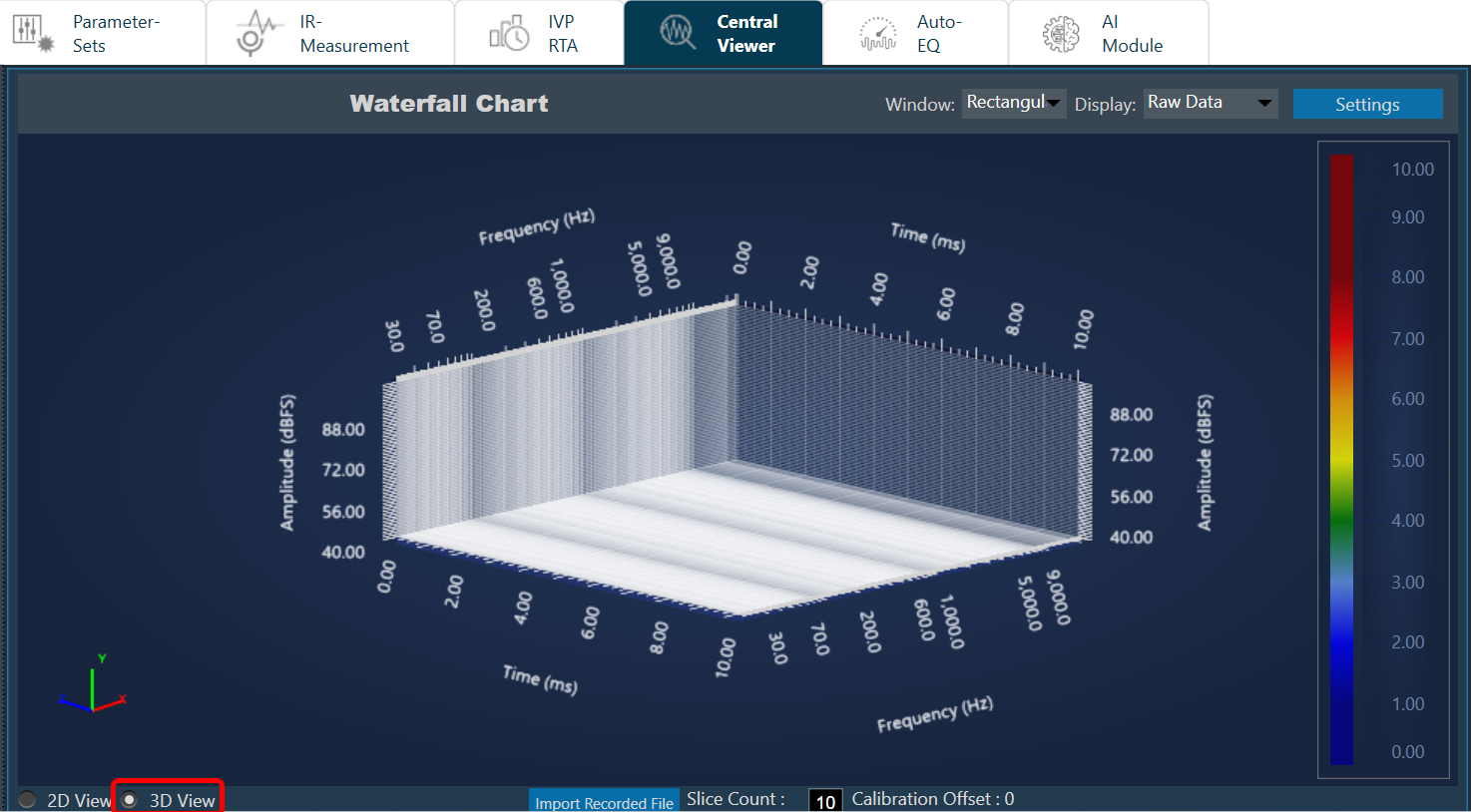
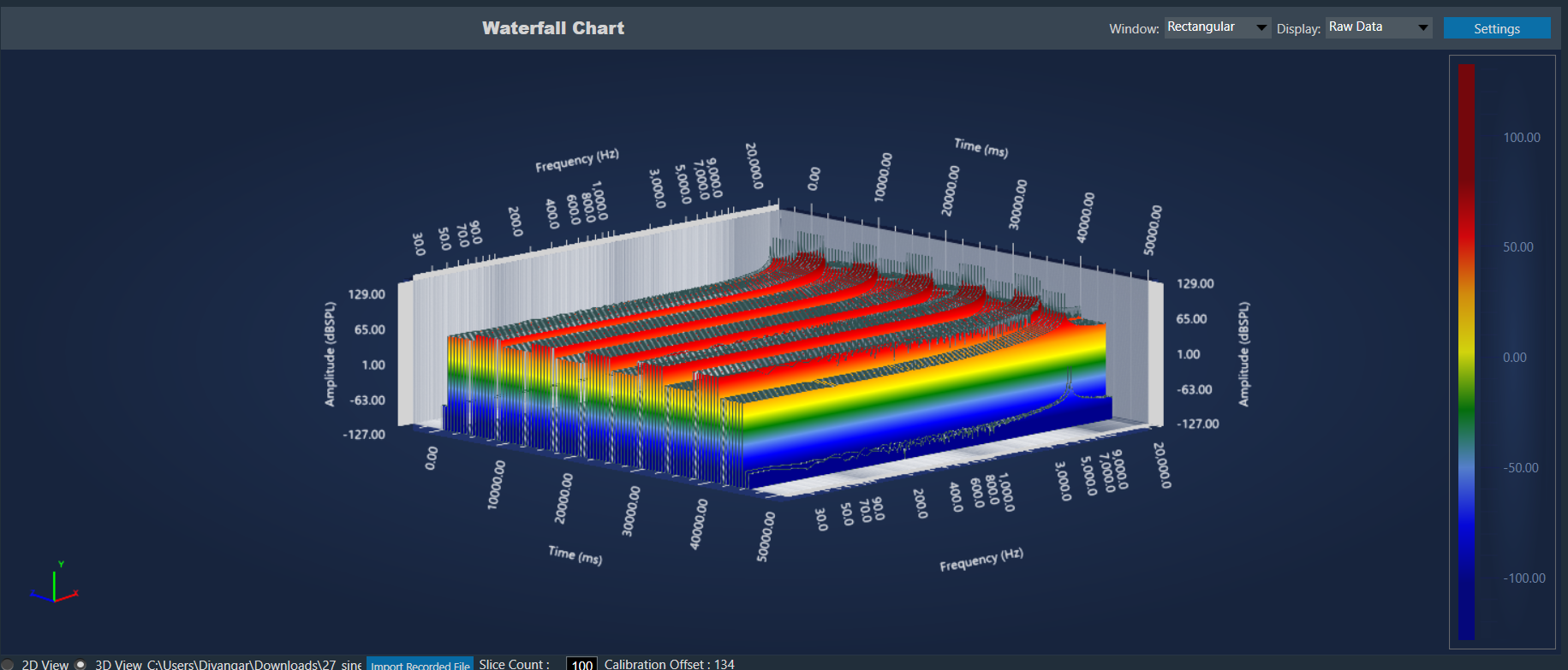
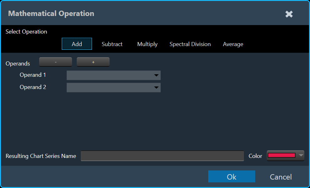
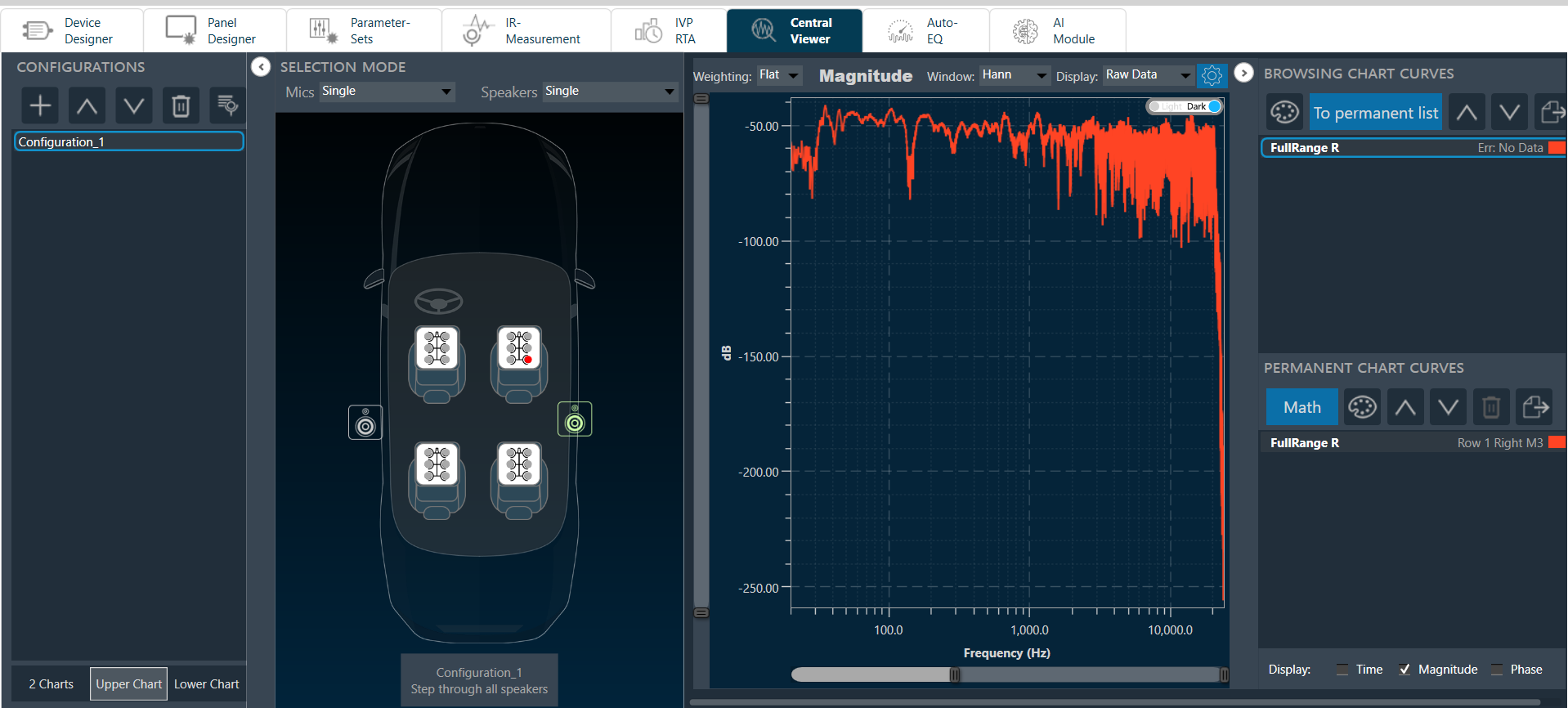
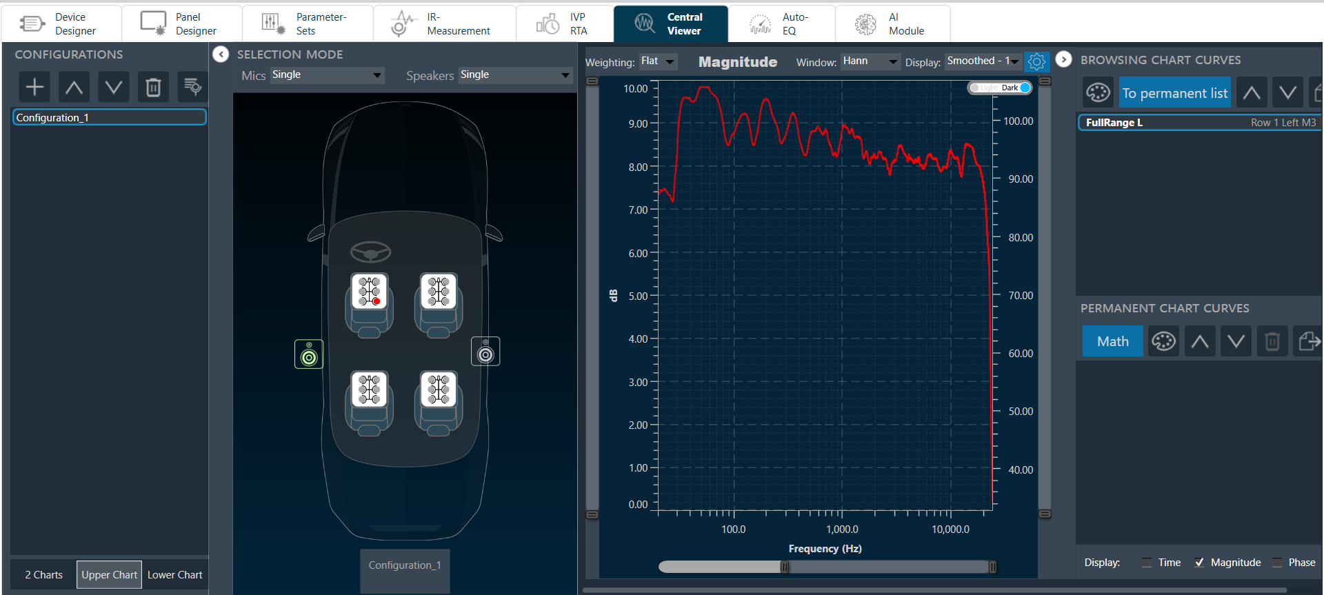
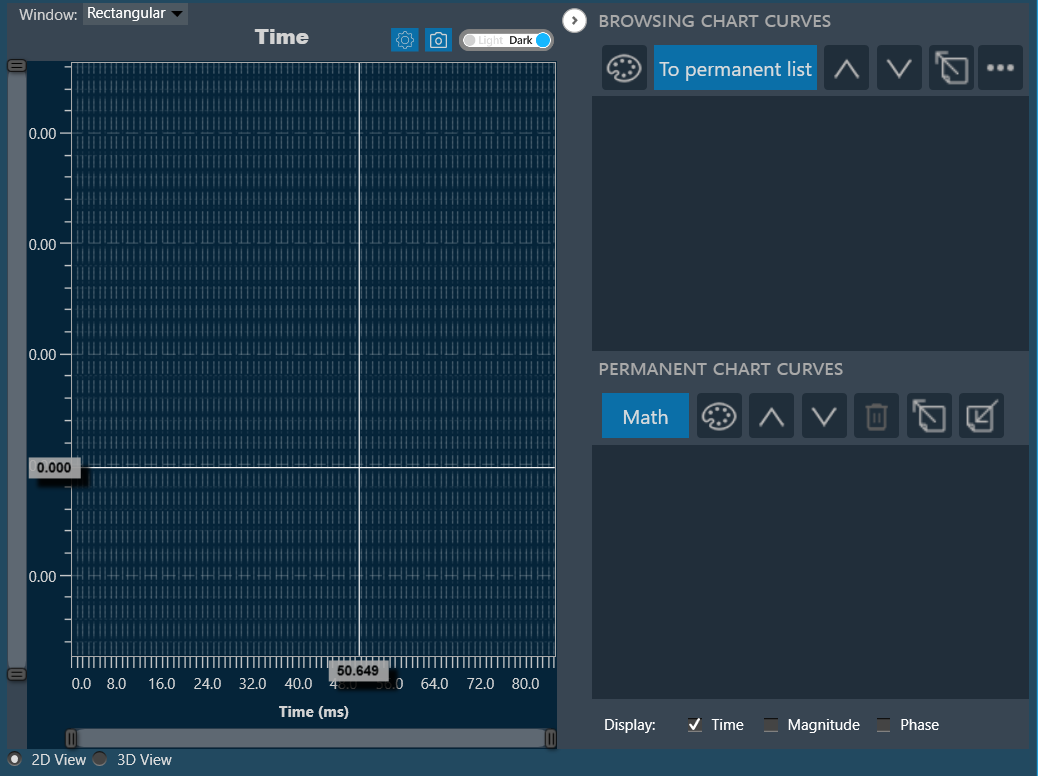
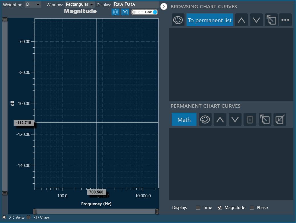
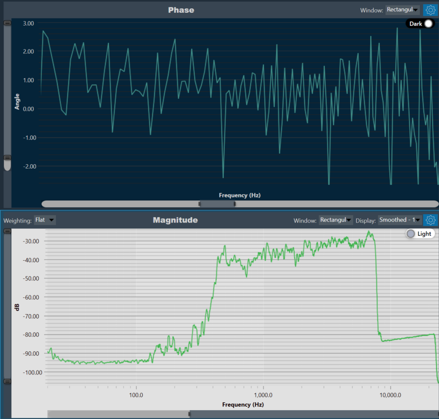
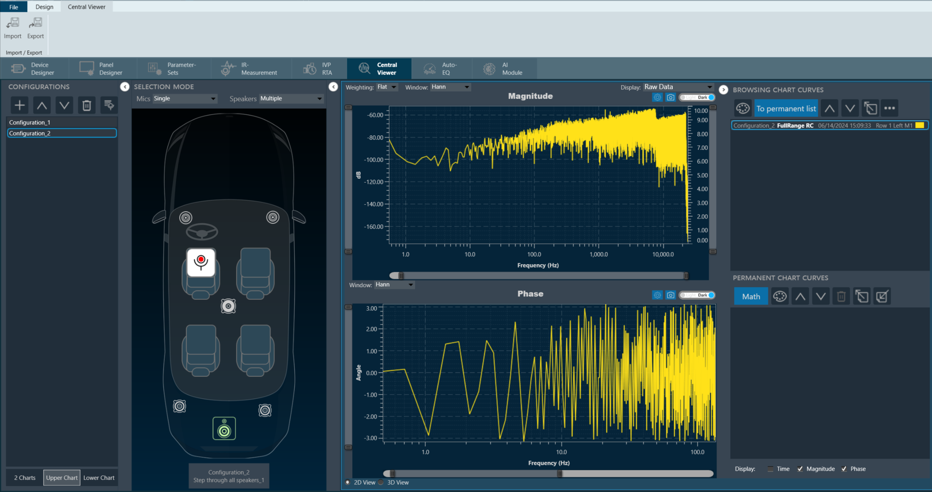
The graph area displays the graphically quantitative data corresponding to the selected configuration. The displayed graph is controlled by a chart selector, for more details, refer to the Chart Selector.
Every chart can hold up to 2 sub-plots. Every sub-plot has its own zoom-bars for the x- and y-axis.
The following options are available for configuration on the Graph.
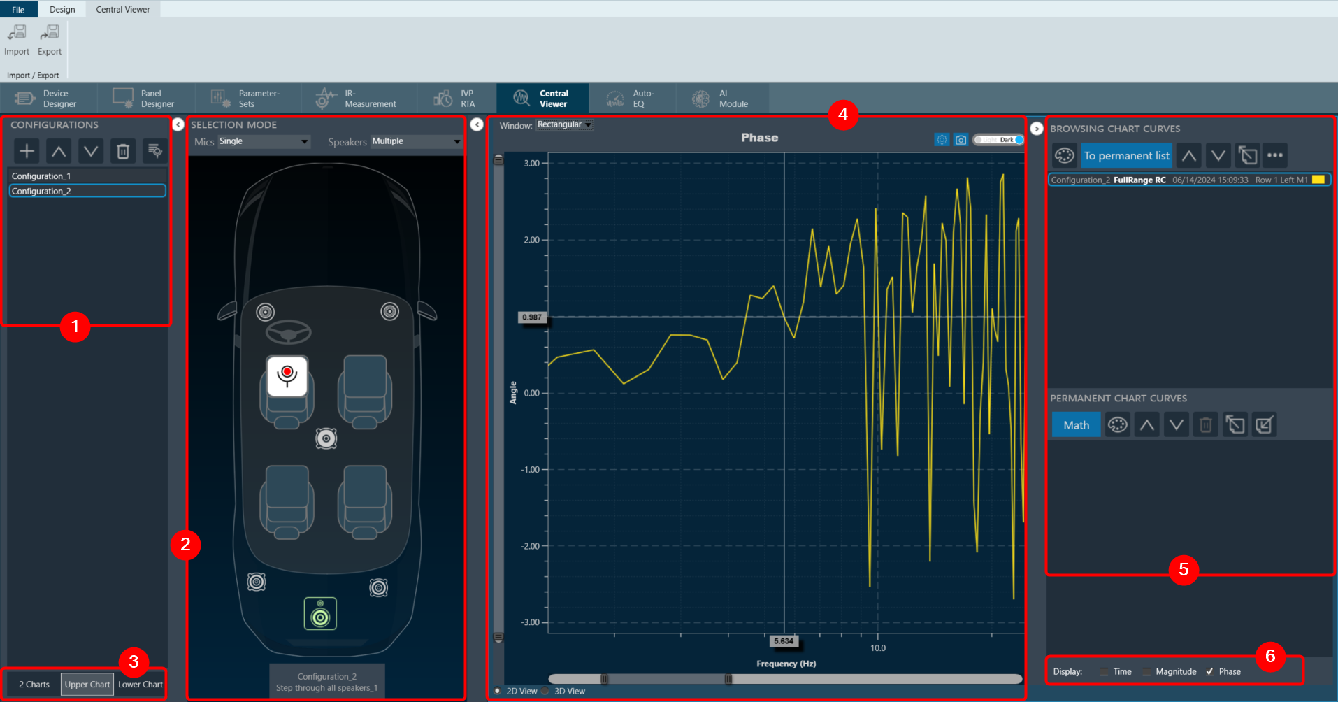
Window
Windowing in FFT (Fast Fourier Transform) is a technique used to reduce spectral leakage and improve the accuracy of frequency analysis. This involves multiplying the time-domain signal by a window function before applying the FFT. Common window functions include the Hamming, Hanning, and Blackman windows, etc.
Windowing reduces the abrupt edges of the signal, which helps to minimize distortion in the frequency domain, especially when analyzing non-periodic signals. Keep in mind that windowing introduces a trade-off between main lobe width and sidelobe levels in the frequency domain.
A Windowing option is placed on top of every graph (Time, Magnitude, and Phase graphs). This sets the display options for the respective graph. Currently available options are:
- Hann: The Hann window can be seen as one period of a cosine “raised” so that its negative peaks just touch zero (hence the alternate name “raised cosine”).
- Rectangular: The rectangular window is the simplest window, equivalent to replacing all but N consecutive values of a data sequence by zeros, making it appear as though the waveform suddenly turns on and off.
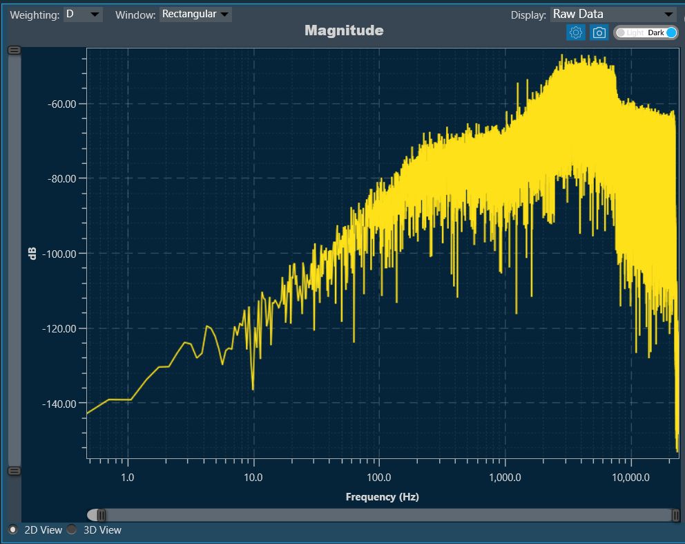
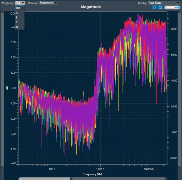
Weighting
The Weighting function allows you to select how to visualize the graph using the specific weighting.
For more details about weighting, refer to the A-weighting.
FFT Length
The FFT Length parameter determines the number of data points used for performing the Fast Fourier Transform (FFT). It directly affects the frequency resolution and the time required to compute the FFT. You can select from the following FFT length options:
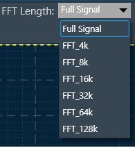
FFT length selection balances frequency resolution and processing speed, with shorter lengths providing faster analysis and longer lengths offering higher resolution. Use the Full Signal option for a detailed analysis of the entire length of the signal.
FFT length impacts phase accuracy by providing finer phase resolution with longer lengths, while shorter lengths may cause phase wrapping or reduced precision, especially at lower frequencies.
Theme
There is a Toggle button (dark/light theme) in the charts in Central Viewer. Once the Toggle button is clicked, the corresponding custom theme can be selected, and the background of the graph gets changed and vice versa.
| Dark Theme |
Light Theme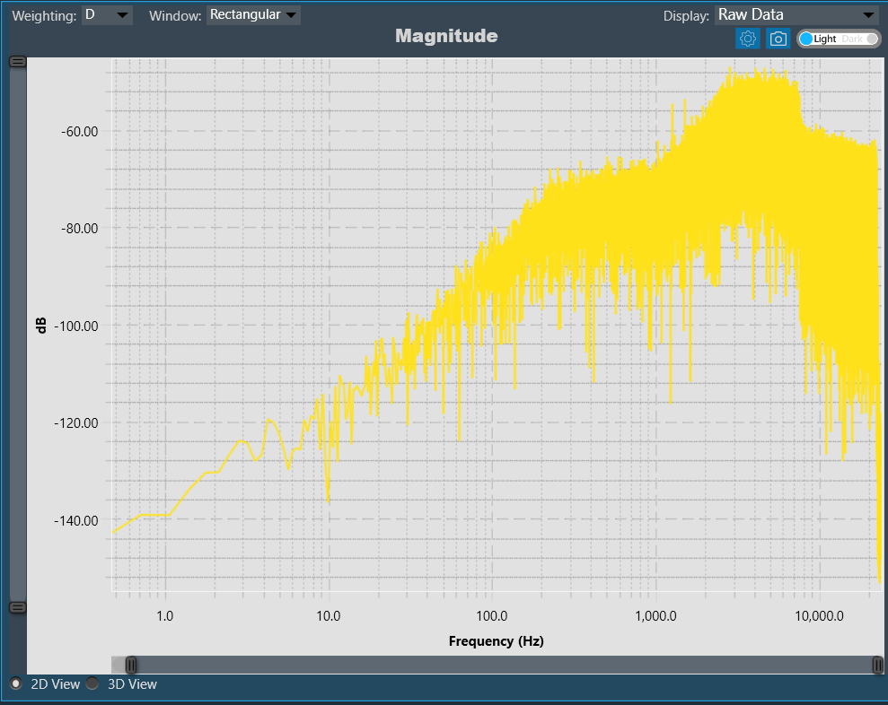 |
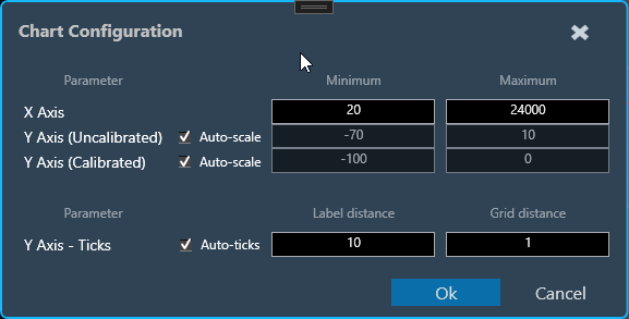
Chart Configuration
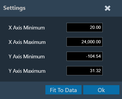
You can configure the axis on the chart configuration window. Click on the gear icon on the top left corner of the graph.
In the chart configuration window, you can set the minimum and maximum range of the X and Y axes. The auto-scale option allows the chart to determine the axis range based on the data. Additionally, the graph zooming out and resetting will be restricted to the axis range defined in the minimum and maximum values.
On the chart configuration window, you can customize the Y-axis gridlines. There are two types of markings on a Y-axis; a minor mark indicated just by small lines on the plot, and a major mark, where values are also added.
- Label Distance: To change the distance between the markings with values.
- Grid Distance: To change the distance between minor marks is indicated by small lines.
You can also keep these distance values blank, which will allow the chart to calculate itself based on the data and zoom level.
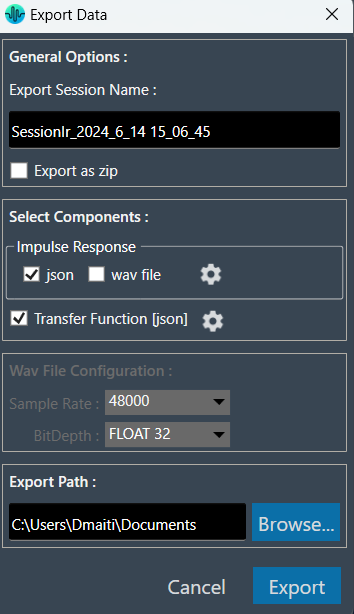
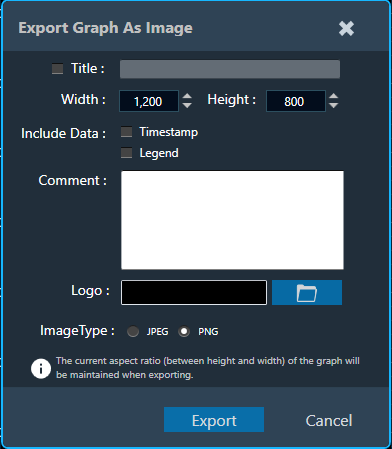
Export to Image
The Export Image feature allows you to export the graphs and certain other details based on the export setting configuration. The exported image file will be available in .png or .jpeg format.
Once you click on the “Export to Image” option, the export setting window for the image will open.
This export setting window includes the following options:

- Title: Enter the image name.
- Image Width: Change the image width.
- Image Height: Change the image height.
- Include Data: Select the option to add a Timestamp and Legend in the image.
- Comments: Enter the specific comment, that you want to be added in the image.
- Logo: Add the desired logo to the image.
Once you configured export settings, click the Export button. The context menu will show you two options, export the image or copy to the clipboard.
- Save image as – option will be opened to save the image to a file.
- Copy the image to the clipboard – will allow you to paste the graph image somewhere else.
The exported image will have the following sections based on the export setting window configuration.
The graph is always present in the exported image. Based on the export setting configuration, additional sections like – Measurement information, Title, Time, User details, Logo provided, Live channel data, and Generator instance details are also present in the exported image.
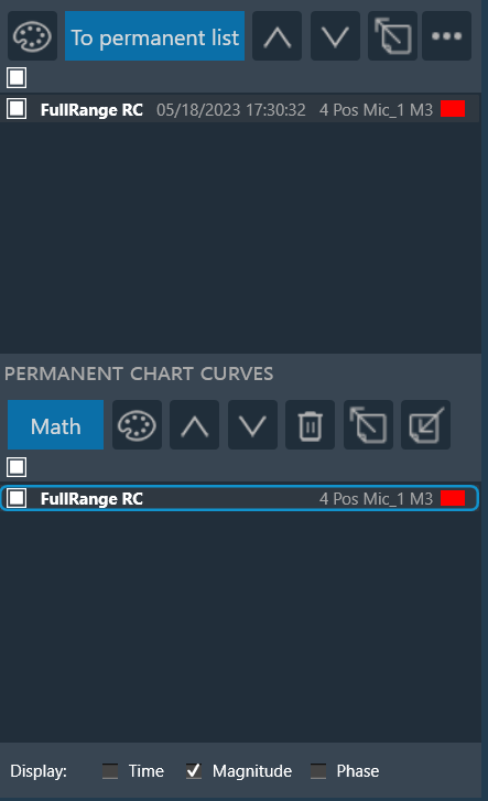
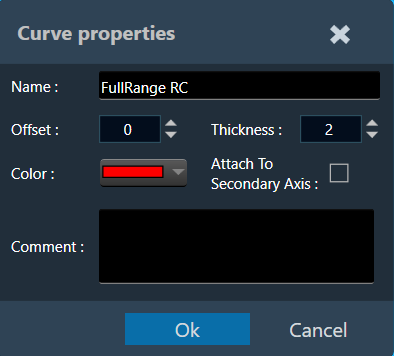
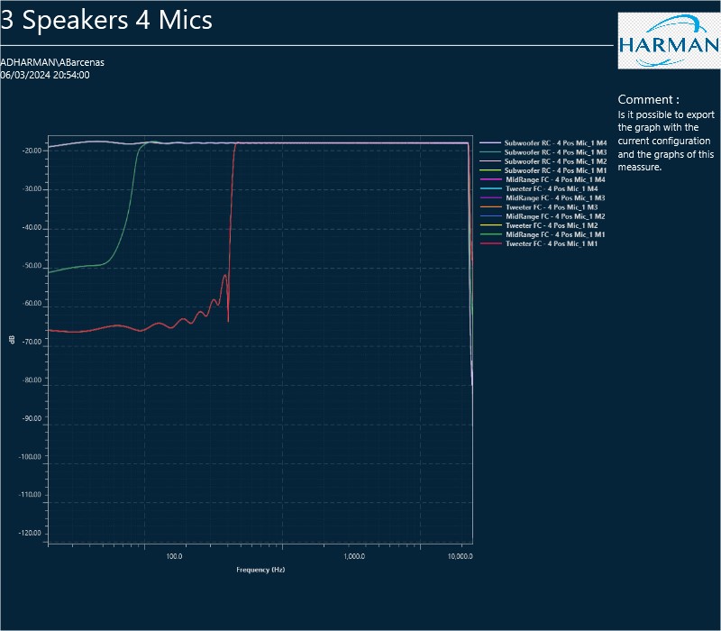
Attach To Secondary Axis
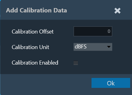
Irrespective of whether the data is calibrated or uncalibrated, both types of information are now visible in the chart plot on both the primary (left) and secondary (right) axes. By default, all curves will be anchored to the primary axis. To attach them to the secondary axis, double-click on any of them and then select the “Attach To Secondary Axis” option from the detail window.
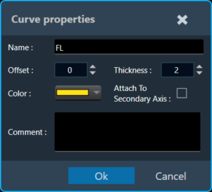
This option will attach the curve to the secondary axis with the same properties as the primary axis, respecting the current chart configuration at all times. With the “AutoScale” option enabled in the chart configuration, you can see that the curve is set to the maximum available readable information width. Automatically setting the minimum and maximum values for both axes depending on which axis the curve is attached to.
Example: Curve attached to the primary axis (Default)
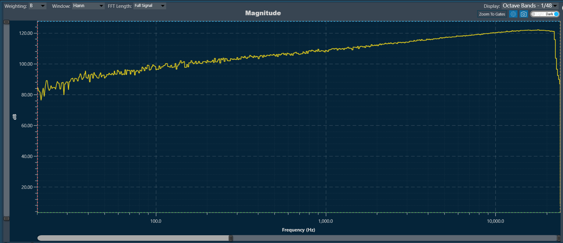
Example: Curve attached to the secondary axis. You can see how the primary axis returns to its default values since it does not contain any readable curves, while the secondary axis returns to the minimum and maximum values that the primary axis had before.
Zoom To Gates
The Zoom To Gates feature allows you to zoom to a specific area in the chart using four gates (two horizontal and two vertical) which you can position by selecting and dragging them to the desired position or if you prefer by placing the value of the position in the chart in the text boxes.
By default, when there are no Curves in chart the values from gates are the limit of visible range of current chart. Only for old projects with that has a loaded curve, the gates will set on the limit of visible range included data.
The Gates is supported for Time, Magnitude and Phase charts.
When you move each gate, the current position will be reflected in each value referred to the bottom of the chart identified with a color.
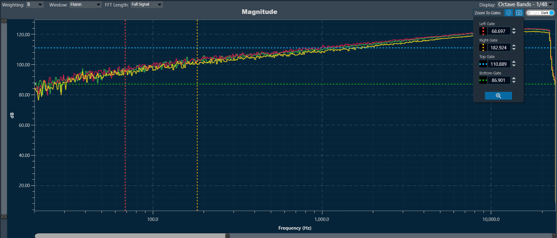
To zoom in on the area between the four lines: Click on the button at the end of the text boxes with the current position values of the gates “Done” and the chart area will automatically position the gates within the limits of the chart and the zoom to the area will have been performed.
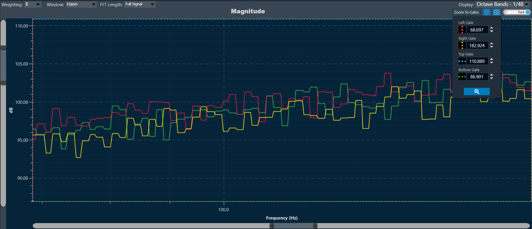
To return to the default value, double-click on any area of the chart.
All gate values will be persistent across projects, meaning you can save their last configuration to be exported or used later with specific values.
Shortcut keys
Shortcut keys to perform the following action on the chart.
| CTRL + Left-click drag |
To zoom into the marked area. |
| Mouse wheel |
To control the zoom level on the X-axis. |
| CTRL + Mouse wheel |
To scroll the chart on the Y-axis. |
| Right Mouse drag |
To move the chart to the Y-axis. |
| ALT + Mouse wheel |
To control chart dragging in the X-axis. |
| SHIFT + Mouse wheel |
To control chart dragging in the X-axis. |
| Double-click |
To zoom chart predefined limits in two steps (first X, then Y axis) |
Zoom and Scroll Controls
The following controls can be used to perform zoom and scroll functions on the graph.
| Alt + MW (Zoom on Y axis) |
Expand the Y-axis to zoom in or out of the values on the graph. |
| Ctrl + MW (Zoom on X axis) |
Expand the Y-axis to zoom in or out of the values on the graph. |
| Shift + MW (Scroll on X axis) |
Scroll the visible graph along the X axis up to the visible or configured limits, that is, if the graph shows the maximum visible value in the configured X, the scroll will not be available. |
| MW (Scroll on X axis) |
Scroll the visible graph along the Y axis up to the visible or configured limits, that is, if the graph shows the maximum visible value in the configured Y, the scroll will not be available. |
MW=Mouse Wheel
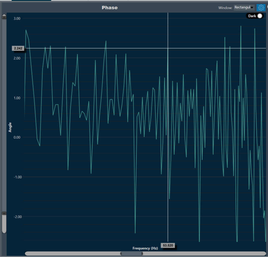
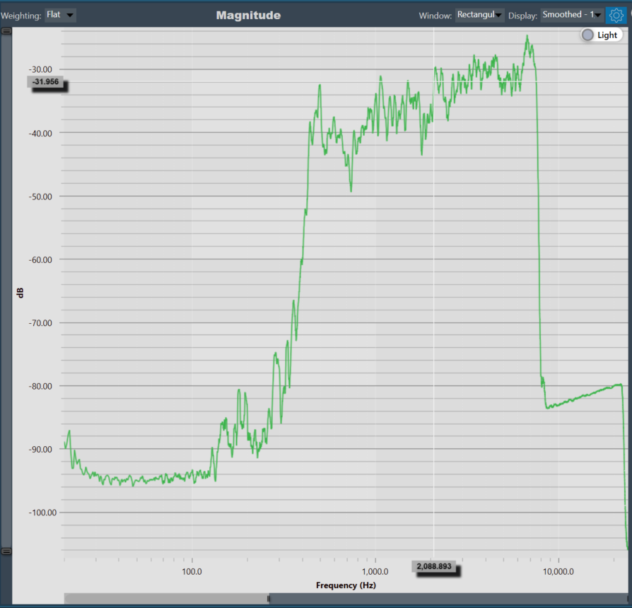
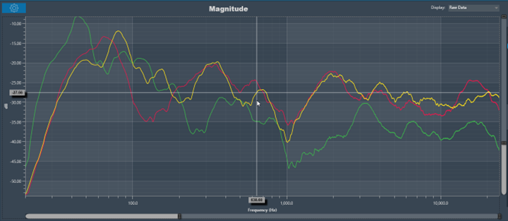
Moving the cursor over the plot will generate a crosshair that indicates values in the X and Y axes. The crosshair will always follow the line closest to the mouse cursor. On the axis, the corresponding values will be drawn.
Below is an example of a chart with a crosshair on top.
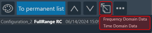
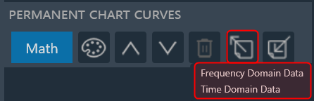
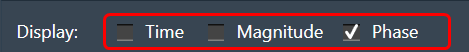
Data can either be displayed in the time (ms) domain or the frequency (Hz) domain. Using the display selector, you can choose the domain for any selected chart. For more details refer to the Domain Selector.