Other Design

Tick Marker

A tick marker is an unlinked control that can be customized to show user-specified values. It can be used with faders and meters to specify particular measurements with unique positions, orientations, colors, etc.
Controls can be managed in the Custom Panel designer and, once the Custom Panel is activated, utilized by the end user. This control must be linked to a parameter to function properly.

 Property Type Options
General
  • Control Info: Shows control type. This propery is Read only.
  • Locked: Specifies if the control is locked out so that it cannot be moved or re-sized.
    • Checked = Locked
    • Unchecked = Unlocked
Appearance
  • Location: Control location (in pixels) of the control on the Custom Panel. Change X (horizontal) and Y (vertical) values in relation to upper left corner.You can also drag the control to a different location.
  • Size: Control size (in pixels).Change width and height values. You can also re-size the control manually.
  • Background Color: The background color of the text areaBrings up the Select Color window.
Ticks
  • Vertical Justification: Vertical justification of the ticks
  • Display Ticks: Whether to display the tick marks of the control or not
    • True = displayed
    • False = not displayed
  • Major Tick Color: Color of the major ticks. Brings up the Select Color window.
    • Default is black
  • Major Tick Count: How many major ticks are displayed. The major tick count must be the same as or larger than the number of major tick labels in order to display all labels.
  • Major Tick Length: The length (in pixels) of the major ticks
  • Orientation: Displayed Horizontal or Vertical
  • Minor Split: Whether or not to split minor ticks on the centered tick marker.
  • Minor Tick Color: Color of the minor ticks. Brings up the Select Color window.
    • Default is blue
  • Minor Tick Count: How many minor ticks are displayed between major ticks
  • Minor Tick Length: The length (in pixels) of the major tick
  • Tick Thickness: Thickness (in pixels) of the tick marks.
Tick Labels
  • Display Labels: Whether or not to display labels on the control.
  • Label Font: Click on “…” to select desired font. Choose from Windows fonts
  • Label Color: Color of the control text. Brings up the Select Color window.
    • Default is black
  • Tick Label Offset: Spacing (in pixels) between tick marks and their labels.
  • Major Tick Labels: The labels for the major ticks. The major tick count must be the same as or larger than the number of major tick labels to display all labels.
Margins
  • High Margin: Spacing (in pixels) between label and top border, limited by size of bounding box.
  • Left Margin: Spacing (in pixels) between label and left border, limited by size of bounding box.
  • Low Margin: Spacing (in pixels) between label and bottom border, limited by size of bounding box.
  • Right Margin: Spacing (in pixels) between label and right border, limited by size of bounding box.

Note

A note adds an icon to a Custom Panel with popup text. A note cannot be linked to a parameter. Controls can be managed in the Custom Panel designer and, once the Custom Panel is activated, viewed (but not changed) by the end user.

 Property Type Options
General
  • Control Info: Shows control type. This propery is Read only.
  • Locked: Specifies if the control is locked out so that it cannot be moved or re-sized.
    • Checked = Locked
    • Unchecked = Unlocked
Appearance
  • Location: Control location (in pixels) of the control on the Custom Panel. Change X (horizontal) and Y (vertical) values in relation to upper left corner.
    You can also drag the control to a different location.
  • Size: Control size (in pixels). Change width and height values. You can also re-size the control manually.
  • Background Color: Background color of the control.
  • Tool Tip Text: Text that appears on control mouse-over.
Note
  • Note Text: Click to enter desired text for note content. Brings up a Control Text editor.
  • Text Color: Text color of the control. Brings up the Select Color window.
    • Default color is black
  • Popup Background Color: Background color for the popup. Brings up the Select Color window.
  • Popup Width: The width of the popup in pixels
  • Popup Height: The height of the popup in pixels
  • Display Direction: The direction in which the popup will appear when the note is clicked. “Auto” will position the popup depending on where the user clicks.
    • Left Up
    • Down Right
    • Upper left Upper right
    • Lower left Lower right

Panel Link

A panel link is a control on a Custom Panel that links to another Custom Panel. Define the link in the panel link section of the properties tab.
Controls can be managed in the Custom Panel designer and, once the Custom Panel is activated, utilized by the end user. This control must be linked to another Custom Panel to function properly.

 Property Type Options
Appearance
  • Background Color: The background color of the text area. Brings up the Select Color window.
  • Background Image: Background image of the control. Brings up the Select Color window.
  • Background Image Layout: Background layout of the image. Tile, Centre, Stretch, and Zoom
  • Font: Click on “…” to select desired font. Choose from Windows fonts.
  • Foreground Color: The foreground color for the panel. Brings up the Select Color window.
Design
  • Panel Name: Enter the name of the panel. Default text is “Panel 1”.
Layout
  • Size: Control size (in pixels). Change width and height values. You can also re-size the control manually.
  • Start Behavior: Behavior of the panel. Manual, CenterScreen, and WindowsDefaultLocation.
  • Start Location: Control location (in pixels) of the control on the Custom Panel. Change X (horizontal) and Y (vertical) values in relation to upper left corner. You can also drag the control to a different location
Window Style
  • Show Control Box: Whether to display control box or not.
  • Form Border Style: Click to select form border style.
    • FixedSingle
    • Fixed3D
    • FixedDialog
    • FixedToolWindow
    • Sizable
    • SizableToolWindow
  • Hide Cursor: Whether or not to display cursor.
  • Icon: Click on “…” to select desired icon.
  • Show Maximize Box: Whether to display maximize box or not.
  • Show Minimize Box: Whether to display minimize box or not.
  • Show Icon: Whether to display icon or not.
  • Show in Taskbar: Whether to display taskbar or not.
  • Size Grip Style: Click to select size grip style. Auto, Show, and Hide

Panel Preset Bar

The panel preset bar manages panel presets. This control is added to the Custom Panel as an unlinked control because it is not linked to a parameter; it creates values as you change parameter settings.
On an activated Custom Panel, you can store, recall, rename, and delete panel presets. On the Custom Panel designer, you can edit it or change its properties.

A panel preset saves the current values and control parameters on a Custom Panel; when additional parameters are added or values are changed, the panel preset must be saved again to include them.

  • Store panel preset: On the activated Custom Panel, change parameter settings as desired then click “Store” on panel preset bar.

On Store Panel Preset dialog, type preset name, and click “OK.” The panel preset is added to the preset list.

If one of the values on a panel preset is changed, the button will turn green to alert you that you need to re-save the panel preset to include the changed value. Simply click the ‘Store’ button.

  • Recall panel preset: Recall panel presets on the activated Custom Panel, either from the title bar or the panel preset bar.
    • TITLE BAR: Right click title bar, select “Recall Preset,” then select the desired preset from the list.
    • PANEL PRESET BAR: Select “Recall.” Select the panel preset from the list and click “OK.”

The panel preset settings are recalled.

  • Rename panel preset: On the activated Custom Panel, select “Store” on panel preset bar. Select the item from the list that you wish to rename.

Type the new name next to “Preset Name” and click “OK.”

  • Delete panel preset: On the activated Custom Panel, select “Delete.” Select the panel preset from the list and click “OK.”
 Property Type Options
General
  • Control Info: Shows control type. This propery is Read only.
  • Locked: Specifies if the control is locked out so that it cannot be moved or re-sized.
    • Checked = Locked
    • Unchecked = Unlocked
Appearance
  • Location: Control location (in pixels) of the control on the Custom Panel. Change X (horizontal) and Y (vertical) values in relation to upper left corner.
    You can also drag the control to a different location.
  • Size: Control size (in pixels). Change width and height values. You can also re-size the control manually.
  • Background Color: Background color of the control.
  • Text Color: Text color of the control.
  • Font: Click on “…” to select desired font. Selects from Windows fonts.
  • Label Text Color: The color of the Label Text
  • Tab Index: Indicates the sequence of an element within the tabbing order of all focusable elements in the document.
  • Tab Stop: Whether the control appears in the tab order.
    • Checked = Appears
    • Unchecked = Won’t appear

Box Design

Combo Box

A Combo Box allows the user to select the value of a device parameter from a drop-down list.Controls can be managed in the Custom Panel designer and, once the Custom Panel is activated, utilized by the end user. This control must be linked to a parameter to function properly.

List Box

A List Box allows the user to select the value of a device parameter from a list. Controls can be managed in the Custom Panel designer and, once the Custom Panel is activated, utilized by the end user. This control must be linked to a parameter to function properly.

Spinner

A Spinner allows the user to change the value of a device parameter by adjusting it up or down; the increment can be specified by the Custom Panel designer. Controls can be managed in the Custom Panel designer and, once the Custom Panel is activated, utilized by the end user. This control must be linked to a parameter to function properly.

Check Box

A Checkbox turns on or off a device parameter value when pressed. Controls can be managed in the Custom Panel designer and, once the Custom Panel is activated, utilized by the end user. This control must be linked to a parameter to function properly.

Common Roter Design Properties

Properties Type
Description
General
  • Control Info: Shows control type. This propery is Read only.
  • Locked: Specifies if the control is locked out so that it cannot be moved or re-sized.
    • Checked = Locked
    • Unchecked = Unlocked
Parameters
  • Addresses: Enables panel designer to edit addressing information with the added benefit that the values can be validated as a group before being applied to the device.
    This editor also allows the user to assign multiple parameters to the control. Click to select Parameter Address Editor.

    • Properties correspond to the system explorer.
  • Information: Shows information about the Parameter Address.
    • Read only. Properties correspond to the system explorer
  • Value List: Allows editing of the value range of the control. Brings up the Discrete Values Editor.
  • Maximum: Maximum parameter value.
    • The largest parameter value.
  • Minimum: Minimum parameter value.
    • The smallest parameter value.
  • Reset Text: Optional text to display in right click context popup.
  • Disable Mixed-sate Editor: When checked, disables the mixed-state context menu and editor
Appearance
  • Location: Control location (in pixels) of the control on the Custom Panel. Change X (horizontal) and Y (vertical) values in relation to upper left corner.
    You can also drag the control to a different location
  • Size: Control size (in pixels). Change width and height values. You can also re-size the control manually.
  • Border Style: The style of the Spinner border.
    • Choose from drop down menu.
  • Border Color: The color of the Spinner border
  • Top Margin: The amount of space, in pixels at the top of the control where a label may be placed.
  • Bottom Margin: The amount of space, in pixels at the bottom of the control where a label may be placed.
  • Left Margin: The amount of space, in pixels to the left of the control where a label may be placed.
  • Right Margin: The amount of space, in pixels to the right of the control where a label may be placed.
  • Background Image: Brings up the Select Background Image window.
  • Background Color: Background color of the control.
  • Tool Tip Text: The text that appears on control mouse-over.
  • Tab Index: Determines the position of the control in the tab order
  • Tab Stop: Specifies whether the control appears in the tab order.
    • Checked = Appears
    • Unchecked = Does not appear
Combo Box
  • Background Color: The background color of the Combo Box.
  • Text Color: The color of the Combo Box text
  • Font: Font style for the text in the box. Click on “…” to select desired font.
    • Selects from Windows fonts.
  • Style: Sets the appearance and functionality of the Combo Box.
    • Select from Drop Downlist, Simple or Drop-down
  • Selected Item Color: The color of the selected item.
  • Check Box Text: The text shown in the Checkbox.
  • Checkbox Size: The size of the Checkbox in pixels.
  • Checkbox Style: The Checkbox style. Normal, flat, and various colors.
  • Label Separation: The space, in pixels between the checkbox and the checkbox text.
List Box
  • Background Color: The background color of the Combo Box Brings up the Select Color window
  • Text Color: The color of the Combo Box text. Brings up the Select Color window
  • Font: Font style for the text in the box. Click on “…” to select desired font. Selects from Windows fonts.
  • Border Style: Sets the style of the List Box border. Choose from syles in a drop down list
    Selected Item Color: The color of the selected item. Brings up the Select Color window
Text Attributes
  • Text Font: The font of the Spinner text. Choose from Windows fonts.
  • Text Color: The color of the Spinner text. Brings up the Select Color window
  • Background Color: The background color of the text area. Brings up the Select Color window
  • Value Format: The format used when displaying the value. This is an advanced feature and must follow English conventions.
  • Text Alignment: The horizontal alignment of the text. Left, center or right.
  • Text Border Style: The border style of the text area. Choose from drop down menu.
Nudge Buttons
  • Nudge Type: Together with the Increment Amount, determines the amount that the control will increment/decrement when a Nudge Button is pressed. Percent, bump or value
  • Increment: Together with the Nudge Type, determines the amount that the control will increment/decrement when a Nudge Button is pressed.
Spinner Attributes
  • Spinner Position: Specifies where the up/down arrows are to be located. Right or TopBottom
  • Spinner Width: Sets the size of the up/down arrow buttons, in percent of width or height.
  • Spinner Button Color: The color of the up/down arrow buttons. Brings up the Select Color window
  • Spinner Arrow Color: The color of the up/down arrows. Brings up the Select Color window
  • Arrow Width: The width of the base as a percentage of the spinner button width.

SKUtility Tool – Graphical Application

The AudioworX Starter Kit Utility GUI Tool (SKUtilityGUI.exe) is a graphical application designed to simplify remote management of Starter Kit hardware. With an intuitive user interface, the SKUtilityGUI simplifies essential operations—such as running system diagnostics, rebooting the Raspberry Pi, resetting the AWX Amp application, and configuring audio hardware. This application is a graphical front-end for the SKUtility command-line tool (described in detail in SKUtility Tool – Command-Line Interface) and communicates over a local network using Ethernet or Wi-Fi to perform remote operations of the Starter Kit.

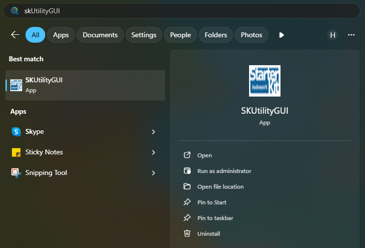
The SKUtilityGUI is installed along with GTT and can be accessed from the start-menu by pressing the “windows” key and typing “SKUtilityGUI” as shown below.

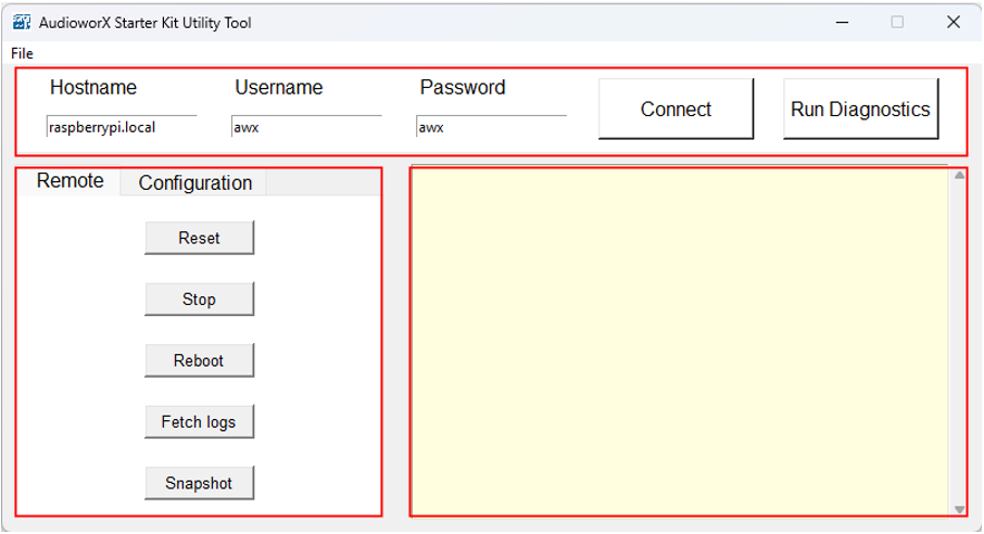
The SKUtilityGUI has the following panes:

  1. Login Pane (top pane): Login credentials and button for connecting remotely to the Starter Kit. Also has a button for running diagnostics.
  2. Function Pane (left-side pane): User functions for remotely operating the Starter Kit.
  3. Output Pane (right-side pane): Output log prints.

To remotely login to a Starter Kit hardware that is available on the same network as the PC, users must specify the login credentials in the login pane and click the Connect button.
The default login credentials for the Starter Kit are pre-filled. Upon changing the login credentials, the SKUtilityGUI saves the details and recalls them on subsequent launch.

The following sections explain the key functions of the SKUtilityGUI in detail.

  1. Running Starter Kit Diagnostics
  2. Starter Kit Remote Control
  3. Starter Kit Configuration

Running Starter Kit Diagnostics


The Run Diagnostics (right-most button on the Login pane) function runs a series of checks to verify if the Starter Kit hardware is configured and is functioning as expected. On running diagnostics, a detailed report will be generated and printed in the output pane on the right-side of the SKUtilityGUI.

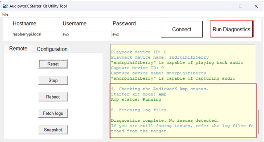
The diagnostics only identifies issues in the configurations of the hardware that may be preventing proper operation of the AWX Amp application. If the Starter Kit is not functioning properly despite the diagnostics report showing no issues, refer to the log files fetched during the diagnostics to debug. The details on debugging using the Amp log file are given in the “AWX Amp Application Logs” section of Starter Kit Troubleshooting.

The “SKUtility Diagnostics Report” section in Starter Kit Troubleshooting describes the steps in the diagnostics in detail and highlights troubleshooting steps for resolving issues detected.

The SKUtilityGUI has a tab-pane on the left-side of the window with 2 tabs, namely, Remote and Configuration. The following sections describe the functions of the two tabs in detail.

Starter Kit Remote Control


The first tab in the Function pane is the Remote tab, which provides actions pertaining to remote operations on the Starter Kit, such as rebooting the Raspberry Pi, stopping and resetting the AWX Amp application, fetching log files and taking a snapshot of the Starter Kit data files. The below figure shows a screenshot of this tab.

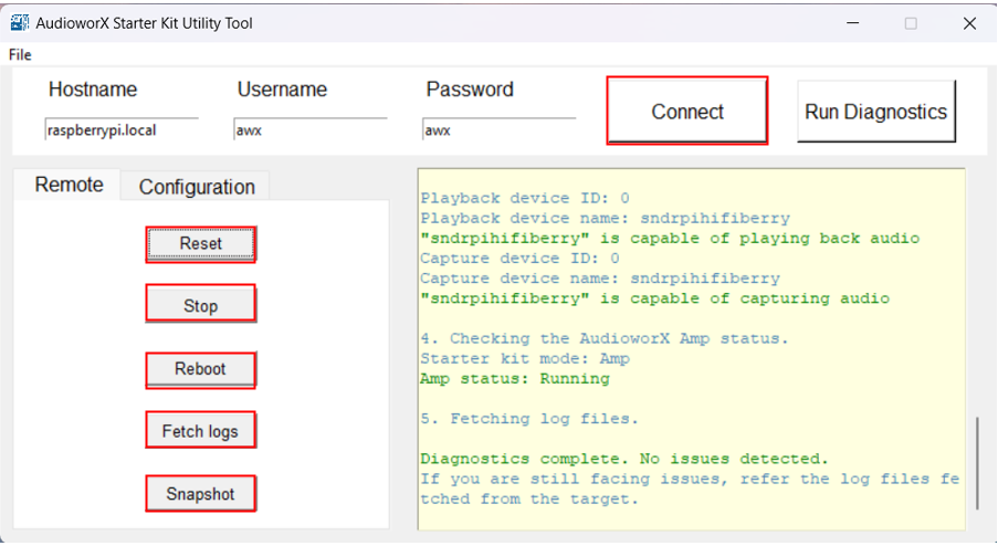
The following are the options available to a user in the Remote tab:

    1. Reset: To reset the AWX Amp application (required when updating the device definition on GTT).
    2. Stop: To stop the AWX Amp application.
    3. Reboot: To reboot the Raspberry Pi remotely. The GUI utility tool will trigger reboot and disconnect automatically. Upon reboot, the user must click the Connect button to reconnect to the Starter Kit. The reboot operation may take some time.
    4. Fetch Logs: To fetch the log files from target. This will open the location of the saved log files on the PC in a File Explorer window.
      This will fetch two log files from the target Starter Kit hardware:

      • awx_log.txt: This file contains logs related to booting up of the Starter Kit hardware and running of the AWX Amp application.
      • VirtualAmpLog.txt: This file contains logs from the xAF framework that include initialization of the audio core, core AO, xAF instances, etc.,
        based on the signal flow flashed on the Starter Kit hardware from GTT.
    5. Snapshot: To take a Snapshot of the Data Files on the Starter Kit Hardware. This will open the location of the saved snapshot file on the PC in a File Explorer window.
      This function allows users to take a back-up of the Starter Kit directory in the Raspberry Pi either as a safety mechanism or to help Harman AudioworX provide debug support.

Starter Kit Configuration


The second tab in the Function pane of the SKUtilityGUI is the Configuration tab. This tab provides configuration actions for the user to modify the behavior of the Starter Kit hardware, and the audio interface connected.

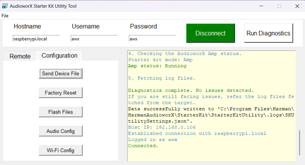
The following sections explain in detail the actions that can be performed on this tab.
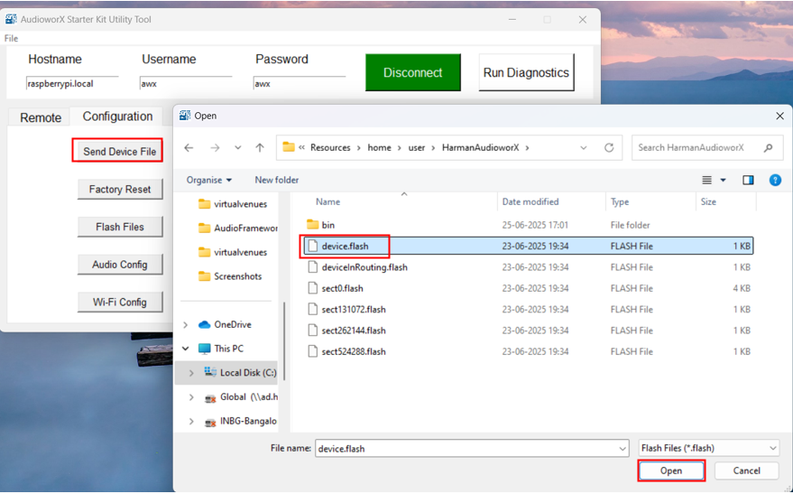
Send Device File

The “device.flash” has the necessary information about the device’s capabilities for the AWX Amp application to setup and run an audio processing pipeline. The steps for generating the “device.flash” file on GTT are illustrated in “Configuring a Custom Device Compatible with the AudioworX Starter Kit” in the “Adding a Device to the Project” section of Creating a New Project on GTT.

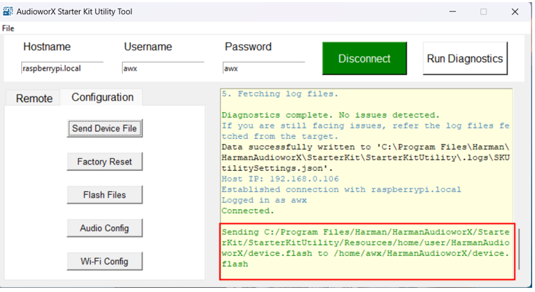
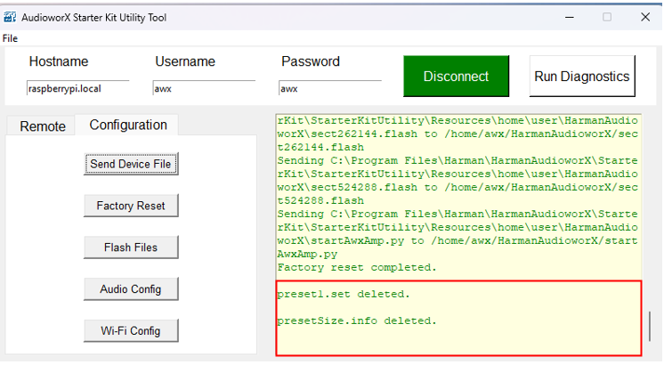
On clicking the Send Device Config button, a file explorer will open, prompting the user to select the device.flash file as shown below.

On completion of the action, a status log will be displayed in the output pane as shown below.
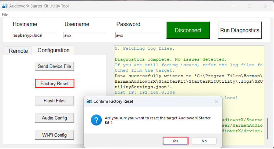
Factory Reset

This function will reset the Starter Kit hardware to its default state. On user confirmation, all files related to the AWX Amp application will be deleted from the Starter Kit hardware and restored to the default state associated with the installation of GTT.

This function can also be used to upgrade/downgrade the Starter Kit to the version of GTT installed on the PC.

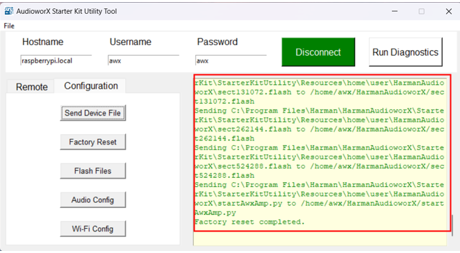
On completion of the action, a status log will be displayed in the output window as shown below.

Flash Files

The AWX Amp application uses flash files for setting up and running audio processing pipelines, which contain information about the device capabilities (audio inputs and outputs, core-type, number of virtual cores, etc.), the SFD, presets, wav files, to name a few. On flashing a new project from GTT, the flash files in the Starter Kit may need to be removed manually for smoothly setting up and running the new audio processing pipeline.

Clicking the Flash Files button opens a window that lists all the flash files that are currently present in the Starter Kit. Users may select one or more files (or all files using the Select All button) listed in the window to remove from the Starter Kit and click the Delete button to continue.

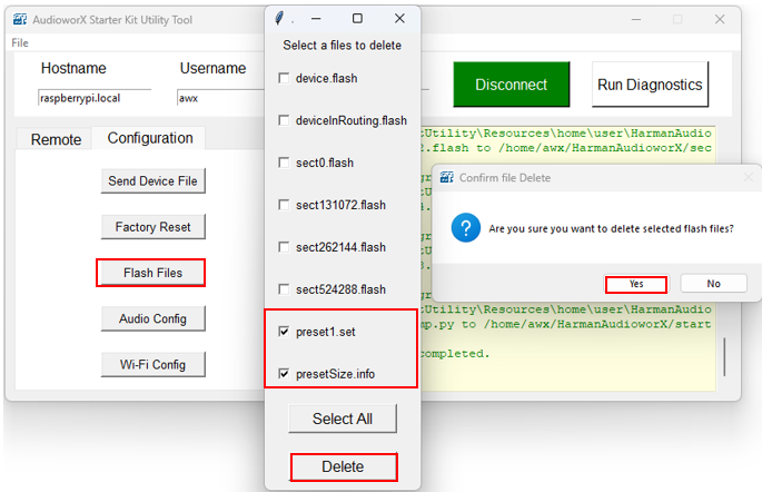
On user confirmation, the selected files will be removed from the Starter Kit (see logs in the output pane).

Audio Config

This function allows users to configure the audio device settings to be used by the AWX Amp application. By default, the Starter Kit is configured to use the HiFiBerry DAC8x and ADC8x Add-on combo as the audio interface, at 48000 Hz sample rate and 2048 sample block length.

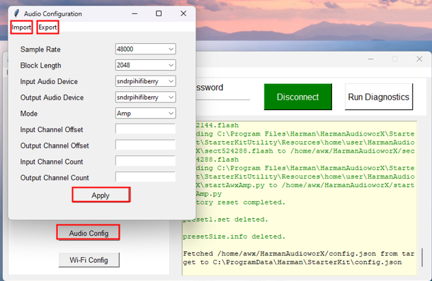
Users can configure the following:

  1. Sample Rate: Currently, the only supported sample rate by the AWX Amp application is 48 kHz. More sample rates will be enabled in future releases.
  2. Block Length: This parameter is the number of samples that the AWX Amp application will fetch and write to the audio device in one cycle. This block length is different from the block length of an Xaf Instance in the SFD, which is variable and can be configured in GTT.
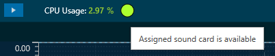
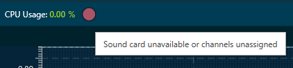
  3. Input Audio Device: Users can choose from one of the available (connected) audio devices for the AWX Amp application to fetch input audio samples from. Note that only audio devices that can capture audio samples will be listed.
  4. Output Audio Device: Users can choose from one of the available (connected) audio devices for the AWX Amp application to output audio samples. Note that only audio devices that can play back audio will be listed.
  5. Mode: Users can choose from one of 2 modes for the Starter Kit to boot into:
    1. Amp Mode – In this mode, the AWX Amp application is automatically started the Raspberry Pi boots up. Users must ensure that the selected audio devices (both input and output) are connected while powering on.
    2. Dev Mode – In this mode, the auto start of the AWX Amp application is disabled and is only meant for developers to debug the audio processing pipeline.
  6. Input Channel Offset and Output Channel Offset: These parameters are used to specify the starting index of the audio channels on the sound card that the amplifier should use. These parameters are useful when using only a sub-set of the available audio input and output channels in the audio interface. For example, when only using the back-side input ports (channels 11 to 16) and output ports (channels 3 to 8) on the TASCAM 16×8 audio interface, users can set the offsets as 11 and 3 for the input and output channels, respectively, and the AWX Amp application will only use the channels from the specified indices, up to the specified number of channels (Input and Output Channel Counts).
  7. Input Channel Count and Output Channel Count: These parameters are used to specify the maximum number of supported audio channels for audio input and output, respectively. While this information is typically retrieved using ALSA APIs, some audio interfaces, like the TASCAM 16×8 audio interface, do not always report the correct channel counts. In such cases, it is necessary to manually specify these values.

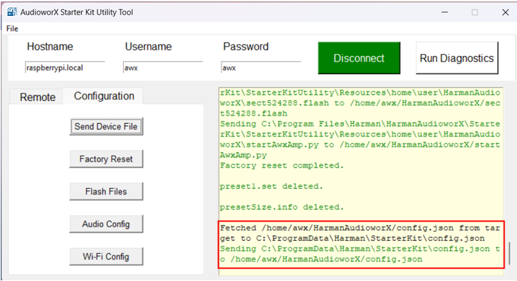
Additionally, users can save and restore audio device configurations using the Export and Import buttons on the top-ribbon bar of the Audio Config window.

Click the Apply button to send the configuration to Starter Kit (see the status message in the output pane). Once the configuration is complete, reset the AWX Amp application using Remote > Reset.

Wi-Fi Config

This function allows users to configure the wireless network settings of the Starter Kit.

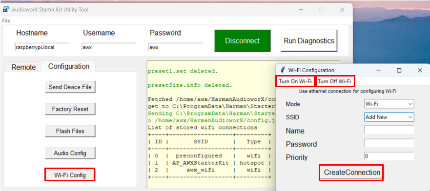
The following are the configuration options available:

  1. Turn On Wi-Fi: This action is used to turn on the Wi-Fi or hotspot module of the Raspberry Pi.
  2. Turn Off Wi-Fi: This action is used to turn off the Wi-Fi or hotspot module of the Raspberry Pi.
  3. Mode: This drop-down menu can be used to select the wireless communication mode of the Starter Kit (Wi-Fi or Access Point/Hotspot).
  4. SSID: This drop-down menu lists all the known Wi-Fi connections to connect to.
    • To add a new connection, users can select the “Add New” option, specify the Name, Password and Priority (optional) of the connection, and click the CreateConnection button to connect to the new Wi-Fi network. The optional Priority parameter can be used to set the priority of the Wi-Fi  or Access Point connection for the Starter Kit to auto-connect on boot-up (range: -999, 999, where higher the number, higher the priority). By default, the priority is set to 0 for Wi-Fi mode and -100 for Access Point (hotspot) mode.
    • To connect to a known network, users can select the SSID from the drop-down menu and click the Connect button.
    • To remove a known network from the list, users can select the SSID in the drop-down menu and click the Delete button.

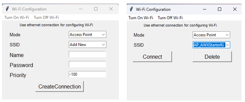
The Starter Kit is configured by default to start up a Wi-Fi hotspot named “AP_AWXStarterKit” with the password “starterkithotspot” to enable direct wireless connection from a PC when wired connection is not possible. Users can connect to this hotspot on first-time use from a PC and reconfigure the Starter Kit using the Wi-Fi Config option in the SKUtilityGUI to connect to a different Wi-Fi network.

Offline Traces Anlaysis

Traces can be analyzed in RTA even if the sound card is not connected. If no sound card is assigned for the input and output channels, RTA will switch to offline mode, allowing you to analyze the captured traces.

In offline mode, there are limited options for analyzing captured traces. The following options can be used for analyzing captured traces while in offline mode.

On the Ribbon bar

Under the Advanced Settings window

The soundcard status is displayed in RTA using a green and red indicator.

  • When the assigned sound card is available and connected.
  • When the assigned sound card is unavailable, or sound cards are not assigned to the input and output channels.

The last applied RTA settings will be retained and available on connecting the assigned sound card.

Fader Matrix Panel

The Fader Matrix panel is a table panel with rows and columns to tune the state variables for the Fader Matrix audio object.
The Fader Matrix Panel features a configurable number of input and output channels, which correspond to the rows and columns, respectively. The dimensions of the Fader Matrix Panel—namely, the number of rows and columns—are determined by the values set for the ‘Audio In’ and ‘Audio Out’ properties of the Fader Matrix Audio object.
The maximum number of input channels, output channels, and control inputs that can be configured is 64.

The Fader Matrix panel window has tabs for grouping output channels sequentially, where each tab displays 12 channels.

Tuning Fader Matrix AO

The minimum value that can be tuned for the Fader matrix audio object is 0, which is the default value.
The maximum tuning value is determined by the ‘Number of Control Inputs’ property of the fader matrix audio object. The tuned cells are highlighted in green to distinguish them from untuned cells. Additionally, you can perform Cut, Copy, Paste, Delete, Undo, and Select All operations on the text values of the fader matrix panel cells using a context menu.

Cell Selection Methods

  • Single cell selection method: You can select a single cell using the mouse by left-clicking or by pressing the tab key on your keyboard. Once selected, the cell will be highlighted, as shown in the example below. The text within the selected cell can be edited.
  • Multiple cell selection methods: There are two ways to select multiple cells.
    • Method 1: By clicking and dragging with the mouse. This method is useful when you are selecting a small range of cells.
    • Method 2: By using keys on the keyboard. This method is useful when rendered outside of the view area when the grid scrolls either vertically or horizontally.
Method 1 Method 2
To select multiple cells using the mouse, follow the steps below.

  1. Place the cursor on a cell.
  2. Select the cell by using the left mouse button and keeping the mouse button pressed.
  3. Drag the cursor in the respective cell. Automatically, the cells will be selected in matrix form.
  4. Leave the mouse button.

The selected cell will be highlighted as you can see in the example below.

To select multiple cells that are rendered outside of the view area when the grid scrolls either vertically or horizontally, you can use the method below for selecting multiple cells.

If you want to select a cell that is rendered outside of the view area when the grid scrolls either vertically or horizontally, you can use the method below for selecting multiple cells.

  1. Click on the first cell of the range.
  2. Use the scroll bar to navigate to the last cell of the range.
  3. Hold the Shift key and click on the last cell of the range. This will automatically select every cell in the matrix form.

The selected cell will be highlighted as you can see in the example below.

Selecting arbitrary cells is not allowed. Selection is always in the form of a matrix.

The selected region is reset and not tracked when changing tabs.

Copy and Paste Functionality

You can copy and paste the factor matrix table data into Excel or vice versa. There are several methods for copying and pasting data.

  • Method 1: To copy panel cell data to Excel.
  • Method 2: To copy data from Excel to the factor matrix table.
Method 1 Method 2
To copy panel cell data to Excel.

  1. Place the cursor on the cell, select the cell by using the left mouse button, and keep the mouse button pressed.
  2. Drag the cursor in the respective cell. Automatically, the cells will be selected in matrix form.
  3. Press Ctrl + C on your keyboard. The content gets copied to the clipboard.
  4. Switch to Excel spreadsheet.
  5. Press Ctrl + V on your keyboard in the desired location within your Excel spreadsheet.
To copy data from Excel to the factor matrix table.

  1. In your Excel spreadsheet, use the cursor on the cell to select the respective cell from Excel.
  2. Press Ctrl + C on your keyboard. This copies the data from the selected cells.
  3. Switch to fader matrix table.
  4. Choose the cell and press Ctrl + V.

Preset Store Functionality

You can save and retrieve a specific configuration using the Store Preset option on the panel.
To do this, configure the tuning parameters, choose an available preset slot, enter a name for the slot, and click on Store Preset. This will save the current tuning data for the selected slot.

If you do not enter a name of the slot, then it will take the default name “New Preset”.

You can switch between preset slots and apply their values by simply clicking on them. Additionally, after clicking to override the preset, you can modify the tuning values in that tab or change the preset name.

To reset the selected preset or all the preset values.

  • Click ResetSelected to clear the preset that is currently selected.
  • Click Reset All to clear every preset in the corresponding native panel.

Performing Measurement

Prerequisites

  • Ensure that the required car is set in the Scene tab; for more details, refer to Scene Setup.
  • Ensure that the speaker setup is configured in the Speaker Configuration tab. For more details, refer to Speaker Configuration.
  • Ensure that the microphone setup is configured in the Microphone Configuration tab. For more details, refer to
    Microphone Configuration.
  • Ensure that you define all measurements, set the mode and parameters, and check the measurement sequence in the
    Measurement Definition tab, for more details, refer to Measurement Definition.

Steps to Perform Measurement Session

  1. Once all the measurement configurations are done as described in the prerequisites, click on the Start
    Measurement Session.
    This will activate the measurement mode.
  2. Enter the session name on the Measurement Setting dialog box, add a Note (optional), and click Ok.
    If you want to optimize the measurement order, select Optimize measuring order. The
    optimization of the measurement order applies when several sequences with different loudspeakers are defined for
    at least one rotating microphone.

    – If no optimization is applied, the measurement will be performed independently for each sequence, resulting in
    the rotation of the microphone over all the seats within each sequence.
    – When optimization is applied, all the measurements that are linked to a seat position are performed one after
    the other, regardless of the sequence to which they belong.
    For large numbers of sequences, this greatly minimizes the number of microphone repositioning.
  3. The measurement module acquisition window will now open as a pop-up window, allowing access to tuning panels in
    the signal flow without obstruction. This enables manual muting and unmuting of necessary speakers through
    panels during measurement acquisition, especially in cases where automatic measurement isn’t feasible.
  4. Once the window opens, the following operation will happen.
    1. In the measurement configuration section, the measurement will start sequentially. After completing
      measurements are displayed in green, and aborted measurements are displayed in red.
      A computer screen shot of a computer Description automatically generated
      In the example below, two “Step through selected loudspeakers” sequences are about to be performed. Due to measurement optimization, the two driver seat measurements will be performed immediately after each
      other, as indicated by measurement numbers 1 and 2.
      A screenshot of a computer Description automatically generated
    2. In the instructions section, a warning is displayed regarding microphone calibration and microphone
      relocation.
      To begin, select the appropriate checkbox. After confirming all instructions, click Measure to start the measurement.
      If you want to stop after each measurement, then select the Manual Measurement (Pause after each
      step)
      option.
      A screenshot of a computer error message Description automatically generated
      This stopped time can be used to further inspect the result in the viewer in the time (max is 5s for IR
      and max 10s for recording) or frequency domain as impulse response (IR) or pure recording.
      During a pause, you can trigger a repetition of the last measurement or skip the next measurement from the sequence list.
      – To repeat the last measurement, click Previous.
      – To skip the next measurement, click Skip.
      Repeating a measurement automatically disables the automatic measurement mode. It can be re-enabled at
      any time.
      A blue square with a cross Description automatically generated
      A pause is automatically activated when the measurement requires user action, e.g., the placement of a
      microphone on another seat.
    3. In the Inputs/ Outputs section, the current input and output levels are shown using the meters.
      A screenshot of a computer Description automatically generated
      Once the actual acquisition is complete and the measurement is only being post-processed, the message “Capture complete! ” appears in the instructions box.
      The result of each measurement is displayed in the Measurement Inspection viewer section.
  5. After completing the measurement, you can navigate between steps by clicking on the previous and skip buttons to view the measurement for the selected step on the chart.
    • The chart will be blank if a step was unsuccessful or did not contain information to display.
    • On the Measurement Inspection viewer, display the result of each measurement.
      A computer screen shot of a car Description automatically generated
  6. Once all steps of the measurement procedure are completed, click Finalize to store the measurement.

You can rename the session at any point during the measurement. Click Cancel to discard the measurement

Generally, you can exit the Measurement window only when a session is cancelled or finalized.

The following actions are restricted during a measurement session:

  • Opening Sound Card Configuration in IR Measurement
  • Opening Device Output Mapping in IR Measurement
  • Opening  Generator Settings in IR measurement
  • Opening  Reset all in IR measurement
  • Opening Import in IR measurement
  • Opening  Test Sound in IR measurement
  • The “Start Measurement Session” button is disabled
  • Application Exit
  • New Project Import
  • New Project Create
  • Delete Project
  • Open Project
  • Save and Go Back in SFD
  • Save in Device View

If you try to perform any one of the above actions, a message will be shown “Measurement session in progress”.
A yellow rectangle with black text Description automatically generated

Limiter Supplement Guide

The Limiter object can be used to create a hard-stop peak limit on an input signal.  Because it operates on a feedback basis only, there is the possibility for the input signal to overshoot the limit set by the user for a short duration while the algorithm pulls down the signal gain.

The basic trade-off of any feedback limiter is strict regulation to the threshold versus distortion. The more aggressively the limiter is working to pull down (attack) the signal level to the threshold, the more distortion will be produced. Distortion, fluttering and/or pumping can also be produced when the signal level is released from regulation, if the resulting gain lift happens too fast.

Limiter Operation Description

  • Attack Phase – When the Limiter detects that the Threshold value has been exceeded, it reduces the gain at a rate set by a combination of the Attack parameter and how much the input signal exceeds the Threshold value. The gain is reduced until the signal level is at or below the Threshold value. The faster the gain is reduced, the more distortion will be created. There is a minimum attack time time period during which the algorithm is determining signal level.
  • Hold Phase – After the signal drops below the Threshold value, the Limiter will hold the gain steady for a time determined by the Hold parameter. It stops the gain reduction phase and begins to hold. Then at the point when the signal has fallen below the Hold threshold value, the Release phase begins.
  • Release Phase – The gain is raised back to the starting gain, set by the Gain parameter, at a rate determined by the Release parameter. The faster the gain is raised, the more distortion will be created.

Limiter Tuning Parameters In-Depth Description

  • Gain – this is a gain stage before the limiting portion of the algorithm, which sets the starting gain. This gain is applicable before limiting starts, after limiting is fully released and while no limiting is occurring. Gain changes during limiting will be added to this value.
  • Threshold – this is the peak level under which the Limiter will attempt to keep the signal. Overshoot can happen during the Attack phase, both while the algorithm is computing signal level and while reducing gain to meet the Threshold value.
  • Hold Threshold – this is the signal level, relative to the Threshold value, under which the Release phase will begin. This small offset keeps the algorithm from changing phases too quickly and provides an extra guard against exceeding the Threshold value, helping to reduce fluttering and distortion.
  • Attack Time – this is how fast, and thus how aggressively, the Limiter will pull down the signal to meet the threshold. If strict adherence to the Threshold parameter is desired, then Attack should be set very low. This will produce more distortion than a more relaxed Attack value, but if the input signal is not anticipated to exceed the Threshold by very much, then the distortion will be relatively low. Worst case is when the Attack is set low and the input signal level is high compared to the Threshold value. There is a minimum attack time the user can set, which corresponds to the time period during which the algorithm is determining signal level.
  • Hold Time – this sets the time during which the Limiter will hold the gain value steady. Having a non-zero value here can smooth the Limiter operation so that fluttering and pumping are less audible.
  • Release Time – this sets the time during which the Limiter will begin raising the gain back to the original value. Extremely short release times cause very fast gain changes which can lead to fluttering, pumping and distortion.

Filter Objects General Information

About Biquad Topology

  • Direct Form I (DFI)
  • Direct Form II (DFII)
  • Transposed Direct Form II (TDFII)

Direct Form I (DFI)

Structure: The DFI structure implements the zeros of the transfer function first, followed by the poles. It uses two separate delay lines for the input and output signals.

Advantages Disadvantages
  • Straightforward Implementation: It directly implements the biquad difference equation, making it conceptually simple.
  • Single Summation Point: This can be advantageous in fixed-point processors, as it reduces the risk of overflow at intermediate summation stages if a double-width accumulator is used.
  • Less Susceptible to Overflow: The zeros are implemented first, which can attenuate the signal before it enters the recursive (pole) section, potentially reducing the internal signal levels and the risk of overflow.
  • Better for Parameter Modulation: Some sources suggest DFI handles parameter modulation more gracefully than DFII, with fewer artifacts.
  • Higher Memory Requirement: It requires twice the number of delay elements compared to Direct Form II, increasing memory usage.
  • Potentially Higher Quantization Noise: Without a double-width accumulator, the quantization noise introduced after each multiplication in the feedback path can be amplified by the poles.
  • Longer Critical Path: The signal passes through all the feedforward and feedback coefficients sequentially, which can limit the maximum achievable clock rate in hardware implementations.

Direct Form II (DFII)

Structure: The DFII structure rearranges the DFI structure by using a single delay line for both the input and output signals. It implements the poles first, followed by the zeros.

Advantages Disadvantages
  • Memory Efficient (Canonical Form): It is a canonical form, meaning it uses the minimum number of delay elements required for a second-order filter.
  • Potentially Faster Code Execution: Some implementations might lead to slightly faster code compared to DFI.
  • Higher Risk of Overflow: The poles are implemented first. If the filter has a high Q-factor or gain near the resonant frequency, the internal signal levels in the delay line can become very large, leading to overflow, especially in fixed-point implementations.
  • More Sensitive to Quantization Noise: Quantization errors introduced within the feedback loop are directly fed back and shaped by the poles, potentially leading to more noticeable noise.
  • Poor Parameter Modulation Behaviour: DFII is known to produce artifacts like clicks and pops when filter parameters are changed rapidly due to the high gain that can occur in the state variables.

Transposed Direct Form II (TDFII)

Structure: The transposed form of DFII is obtained by reversing the signal flow graph. Branch points become summers, and summers become branch points. The transfer function remains the same. It also uses a single delay line.

Advantages Disadvantages
  • Memory Efficient (Canonical Form): Like DFII, it is also a canonical form with minimal delay elements.
  • Lower Quantization Noise: Generally considered to have better numerical properties and lower quantization noise compared to the direct forms, especially in floating-point implementations where each multiplication and potentially each addition is rounded.
  • Better Robustness: It often exhibits robustness similar to DFI in terms of handling internal signal levels compared to the direct DFII. The zeros are effectively implemented before the feedback path influences the output.
  • Preferred for Floating-Point DSP: Due to its better noise characteristics, it is often preferred in floating-point digital signal processing.
  • Longer Critical Path: Similar to DFI, the transposed structure can have a longer critical path through the feedback loop, potentially limiting the maximum clock rate in hardware.
  • Can be Less Intuitive: The transposed structure might be less directly related to the standard difference equation, making the implementation and analysis slightly less intuitive.
  • Potential for Limit Cycles: In fixed-point implementations, transposed forms can sometimes be more prone to limit cycles (self-sustained oscillations at low levels) under certain conditions.

Summary

Feature Direct Form I (DFI) Direct Form II (DFII) Direct Form II Transposed
Memory Usage High Low (Canonical) Low (Canonical)
Overflow Risk Lower Higher Moderate
Quantization Noise Potentially Higher Higher Lower
Computational Cost Moderate Moderate Moderate
Critical Path Longer Shorter Longer
Parameter Modulation Better Poor Good
Fixed-Point DSP Good (with double acc.) Can be problematic Generally Good
Floating-Point DSP Acceptable Acceptable Preferred