Refer below topics to generate the VST3.x plugin with an external audio object.
Steps to add source code for external audio objects.
Steps to generate the VST3 plugin.
Steps to add source code for external audio objects
Steps to add source code for external audio objects
Place the source code for the new audio object under external src.
Place the header file under the external.
The audio object header file name should be similar to the audio object class name. For example, if the audio object name is CTemplate, the header file name should be Template.h
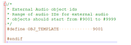
Update externalincAudioIds.h with the pre-processor macro definition for the new audio object.
AudioIds.h
The name of the pre-processor definition should be OBJ_“header file name“.
For example, if the name of the class is CGain, the header file name should be Gain.h and the pre-processor definition in AudioIds.h should be #define OBJ_GAIN 9002.
Once the steps above are complete, proceed to generate the VST3 plugin following the steps in the next section.
Steps to generate the VST3 plugin
Pre-Requisites:
Python 2.7
Cmake version 3.21+, 3.5 confirmed NOT to work
Microsoft Visual Studio 2017 or later
Steps to generate the VST3 plugin
Open the command prompt in Administrator mode.
Browse to the external folder and run bat to clean up any previous build artifacts.
Run the batch file bat. Once the build is successful, the library with the external audio object, the VST3 plugin, and the corresponding DLL will be copied to the path: public/lib/win64
The VST3 plugin will also be generated in C: Program FilesCommon FilesVST3.
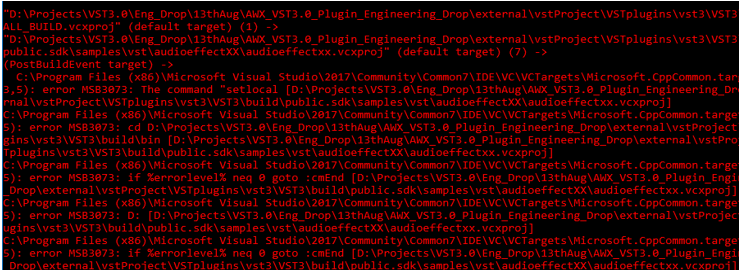
VST3 Plugin name: vst3. If you are building in non-administrator mode, you might see a warning that starts like this.
Warning when opened in Non-Admin mode
But this can be ignored. This is a post-build script that gets executed after the Plugin and DLL are generated.
It is recommended not to have long folder names for the build path. CMAKE does not allow the total directory path name to exceed 264 characters.
Users who intend to integrate xAF framework into the platform, kindly contact AudioworXSupport@harman.com for framework integration guide and expert support.
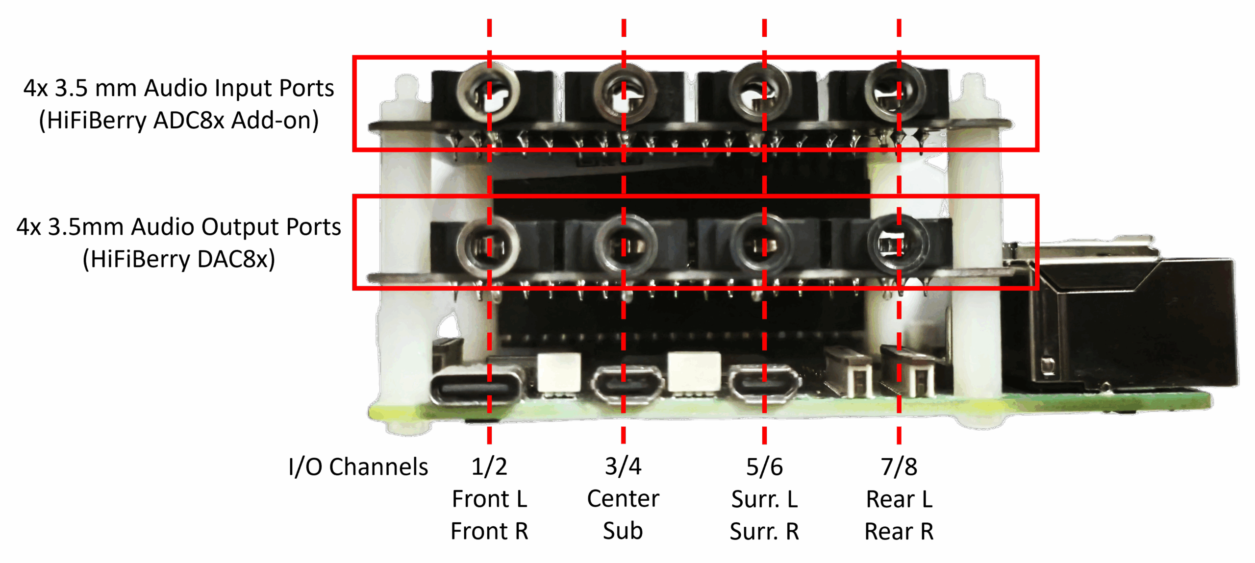
In the AudioworX Starter Kit, the Raspberry Pi 5 functions as the audio processor running the AWX Amp Application. This application receives raw audio input streams from and sends back processed audio to HiFiBerry ADC8x add-on and DAC8x HATs via the 4 stereo input audio ports and the 4 stereo output audio ports, respectively. In the rest of the document, the Raspberry Pi 5 with the HiFiBerry HATs together (the core of the Starter Kit) is referred to as the “AudioworX Starter Kit” or simply, the “Starter Kit”.
The following sections describe the hardware connections needed for a functional AudioworX Starter Kit in detail.
The Starter Kit can be used in both active and passive speaker setups. In both cases, the Starter Kit requires the following basic hardware connections to be made:
Direct ethernet connection to the PC using an ethernet cable,
8-channel line audio input via the 4 stereo audio input ports (top row – HiFiBerry ADC8x Add-on) using 3.5mm connectors,
8-channel line audio output via the 4 stereo audio output ports (bottom row – HiFiBerry ADC8x Add-on) using 3.5mm connectors,
The power supply.
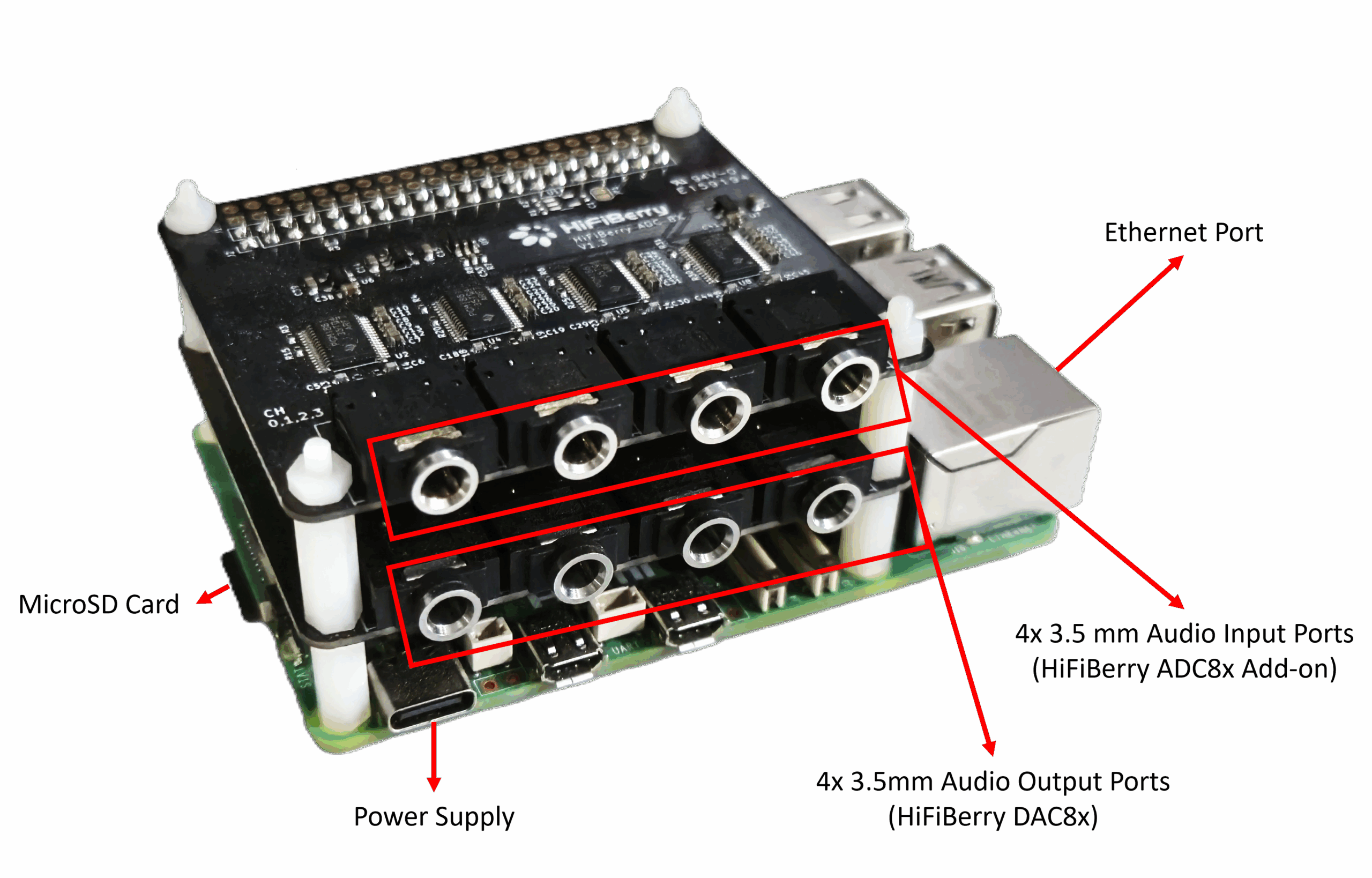
The image below shows the Starter Kit and its connection ports.
For the Starter Kit to be fully operational, the PC and the Raspberry Pi must be accessible to each other through a Local Area Network (LAN) and the preferred mode is via direct ethernet connection as indicated in the block diagram in the active and passive speaker setup block diagrams given in the following sections.
However, in situations where a direct ethernet connection cannot be made, the Starter Kit functions as a Wi-Fi hotspot (access point) named AP_AWXStarterKit with the password “starterkithotspot” for the PC to directly connect via Wi-Fi. Refer to section “Starter Kit Configuration > Wi-Fi Config” in SKUtility Tool – Graphical Application for more details.
Hardware Connections in Active Speaker Setups
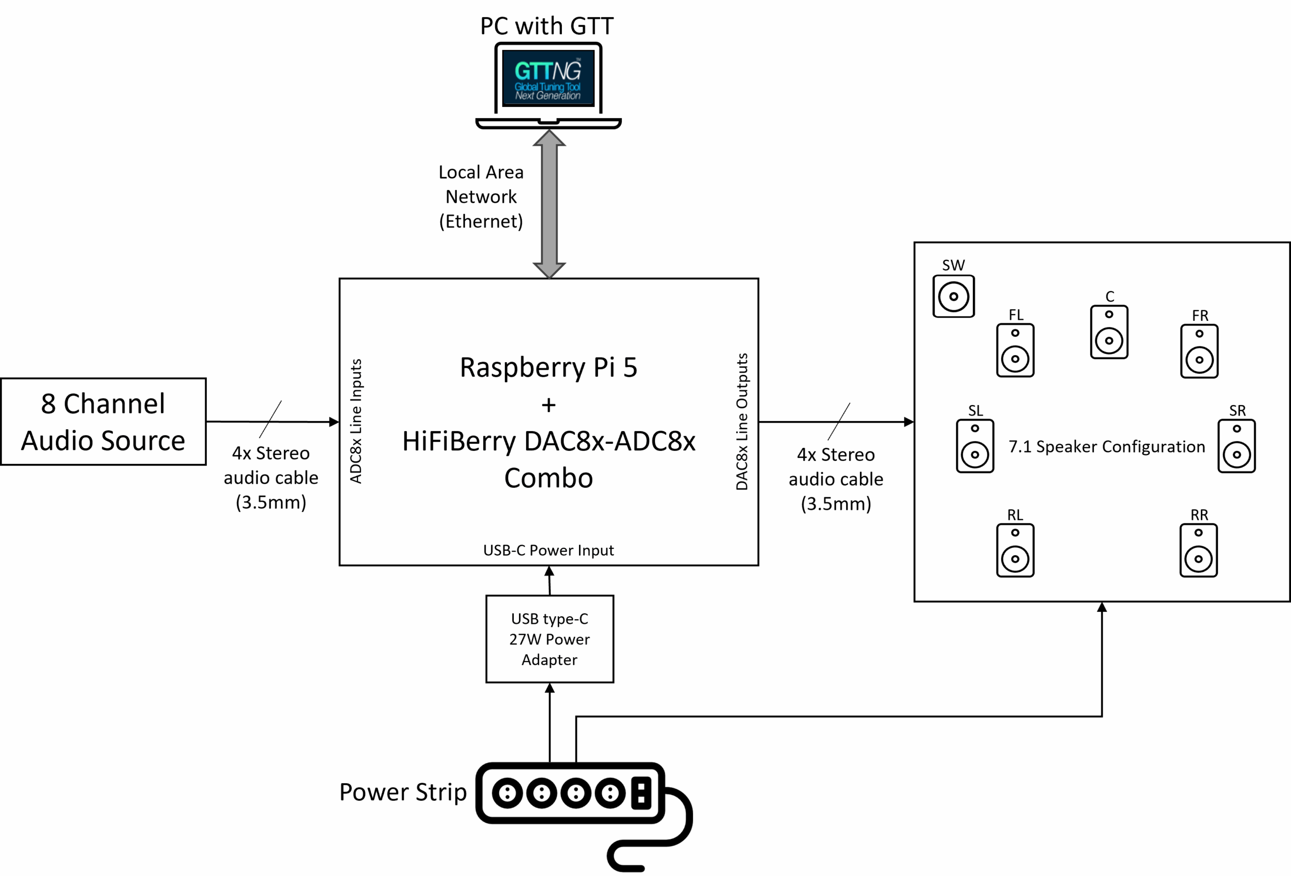
For multi-channel active speaker setups (powered speakers) on test benches or in listening rooms, the audio output channels on the Starter Kit can be directly connected to the speakers, enabling a full 7.1 speaker configuration. The below block diagram shows the hardware connections in an active speaker setup.
The Starter Kit has been configured by default to run the example project described in The Starter Kit Example Project. In this configuration, the audio output channels follow the 7.1 speaker configuration, and the speakers are expected to be connected to the 3.5 mm audio output ports as follows:
Front Left and Front Right speakers to the first port,
Center speaker and the Subwoofer to the second port,
Surround/Side Left and Surround/Side Right speakers to the third port, and,
Rear Left and Rear Right speakers to the fourth port.
The above diagram assumes 7.1 audio for the input ports as well (in line with The Starter Kit Example Project. Channels 1 and 2 (Front L and Front R) are typically used for a stereo input, and the rest of the channels may be used as deemed fit for the audio processing pipeline application, for example, microphones with pre-amp (since the inputs are line-level).
Generally, in a standard TRS (tip-ring-sleeve) 3.5 mm audio jack, the tip carries the left channel, and the ring carries the right channel audio. However, identifying them and connecting them to the correct speaker requires careful consideration. To simplify this, the Starter Kit example project has a Router audio object in its signal flow to route the signals correctly in software.
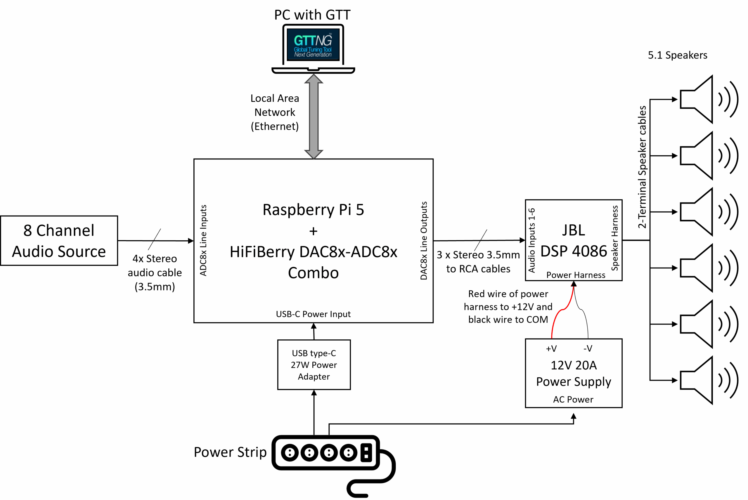
Hardware Connections in Passive Speaker Setups
The description in this section uses the JBL DSP-4086 car audio amplifier for illustrative purpose. However, an AudioworX Starter Kit package may contain a different amplifier, may be similar in usage and specification, whose integration steps may vary.
For a multi-channel passive speaker setup like in a car, an additional power amplifier is needed since the HiFiBerry DAC8x can only output line-level signal (+4 dBu, approx. 2.1Vrms), which is insufficient to drive passive speakers in most cases.
For such systems, the Starter Kit package includes a JBL DSP-4086 car audio amplifier (or similar), a 6-input and 8-output amplifier that can drive 4Ω or 8Ω loudspeakers up to a maximum of 40W per channel. The on-board DSP in the amplifier is deliberately bypassed and the amplifier is configured to pass-through the 6 input audio channels to the first 6 output channels (the last 2 output channels are not used), with only power amplification to drive the speakers, thereby fully centralizing all audio DSP functions to the AWX Amp application in the Raspberry Pi 5.
The block diagram below shows the hardware connections for such systems.
Hardware Connections for the JBL DSP-4086
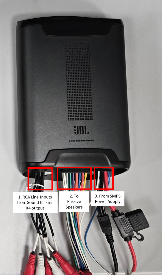
The following connections are to be made at the JBL DSP-4086 amplifier end:
RCA Audio Inputs from the Starter Kit (bottom row of 3.5 mm ports), using 3.5mm to RCA stereo cables:
First output port of the Starter Kit to Channels 1 and 2 of the JBL amplifier,
Second output port of the Starter Kit to Channels 3 and 4 of the JBL amplifier,
Third output port of the Starter Kit to Channels 5 and 6 of the JBL amplifier.
Speaker Harness to the passive speakers via speaker cables (each speaker output has a + and – terminal labelled on the JBL speaker harness wires):
Channels 1 and 2 to the Front Left and Front Right speakers,
Channels 3 and 4 to the Center and Sub-woofer speakers,
Channels 5 and 6 to the Side Left and Side Right speakers.
Power from the SMPS Power Supply:
Red wire (positive power terminal) to the +V terminal of the SMPS power supply,
Black wire (negative power terminal) to the COM terminal of the SMPS power supply,
Blue thin wire (Remote In) to the +V terminal of the SMPS power supply.
JBL DSP-4086 Car Amplifier Connections
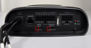
4. Ensure that the physical switches on the JBL amplifier are set to the following states:
“Input Level” switch to “LO” (extreme left position),
“Turn-on Mode” switch to “REM” (extreme left position).
JBL DSP-4086 Input Level and Turn-On Mode States
The next section describes how to verify if the Starter Kit is configured properly and is functioning as expected.
Verifying the Starter Kit Connections
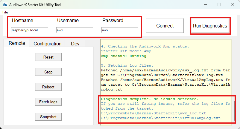
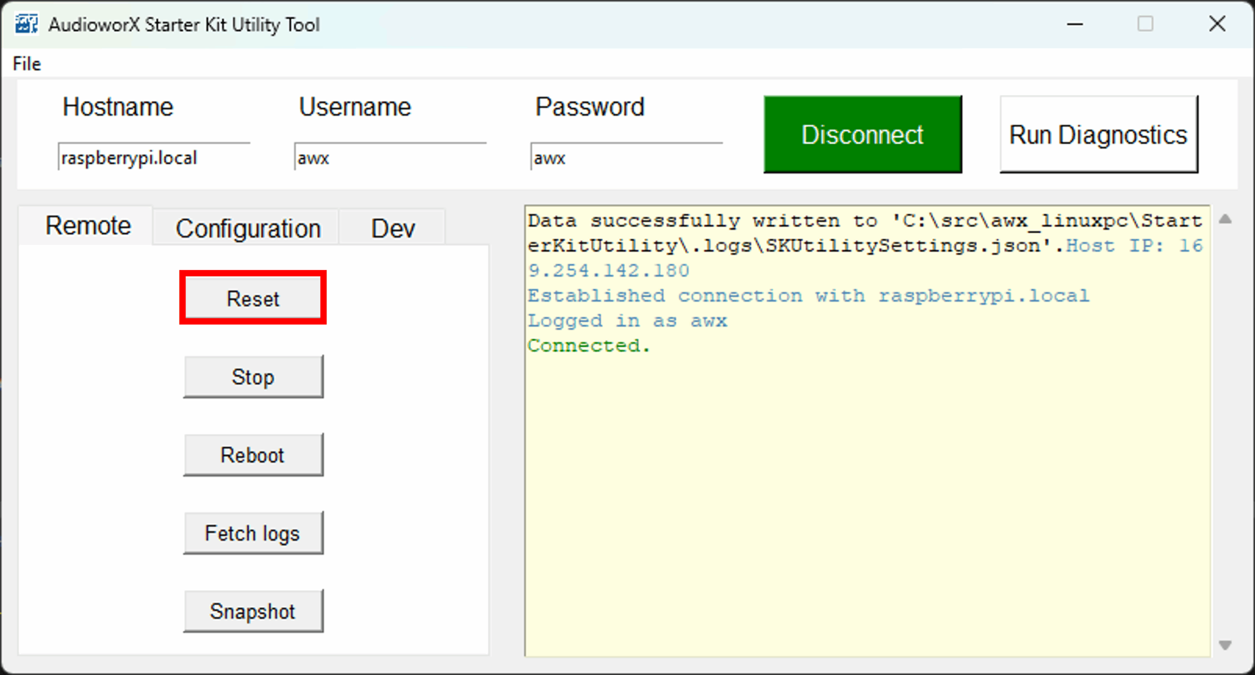
The SKUtility tool’s “Diagnostics” feature can be used to verify if the Starter Kit hardware is properly configured, connected and is functioning as expected. To run diagnostics:
Ensure that the Starter Kit is powered on,
Run the SKUtilityGUI.exe from the start-menu,
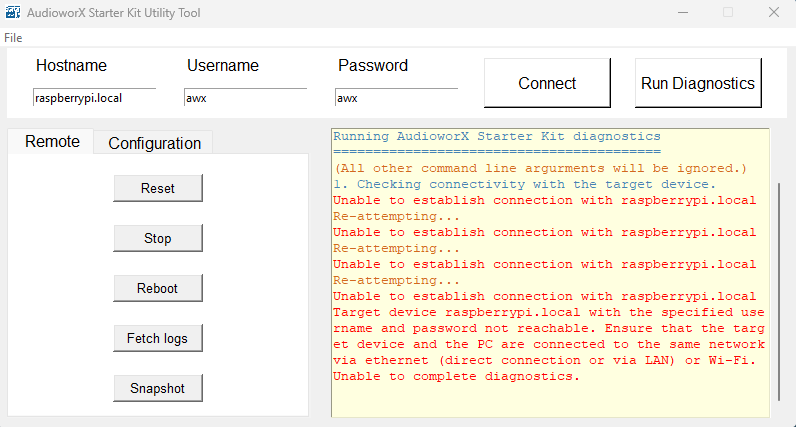
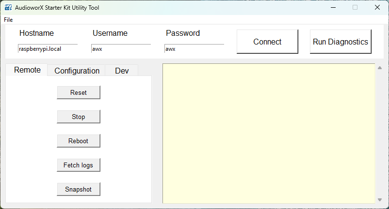
Type in the user credentials to log into the Starter Kit (the default credentials are pre-filled as shown in the below figure).
Press the “Run Diagnostics” button.
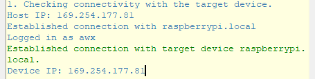
This will print a log in the right-hand side pane of the SKUtilityGUI as shown below.
SKUtility Diagnostics
If the Starter Kit is properly configured, the text “Diagnostics complete. No issues detected.” will be displayed in the log as highlighted above. If the diagnostic detects issues with the Starter Kit, refer to Starter Kit Troubleshooting.
The SKUtility Diagnostics feature only verifies the basic configuration. Troubleshooting the speaker connections is out-of-scope for the diagnostic tool (including the amplifier connections and configuration). The most basic method for diagnosing audio output is to use a pair of headphones and manually plug it into each audio output port to verify audio output.
AudioworX Starter Kit packages received directly from Harman AudioworX contain hardware components that are pre-configured. The above instructions are sufficient to begin executing GTT workflows with the Starter Kit. If the components are purchased independently, write to Harman AudioworX support at AudioworXSupport@harman.com to receive detailed steps on configuring each component.
Once the Starter Kit hardware has been set up and verified using the SKUtility diagnostics, it is ready to interact with the GTT application for implementing and tuning audio processing pipelines.
GTT includes an example project for the AudioworX Starter Kit that can be used a starting point for users to get familiar with the AudioworX workflows. This project implements a simple signal flow, custom tuning panels and some presets to showcase common AudioworX workflows that are explained in the GTT user guide.
The following sections guide first-time users through the initial setup of AudioworX using the Starter Kit.
The Home Screen of GTT provides options for importing a project, creating a new project, opening an existing project, exploring some high-level features of GTT, etc. For more details, refer Home screen options page. To open the Starter Kit example project:
Go to the Sample Projects tab.
Double click the “AWXExampleProjectStarterKit” project.
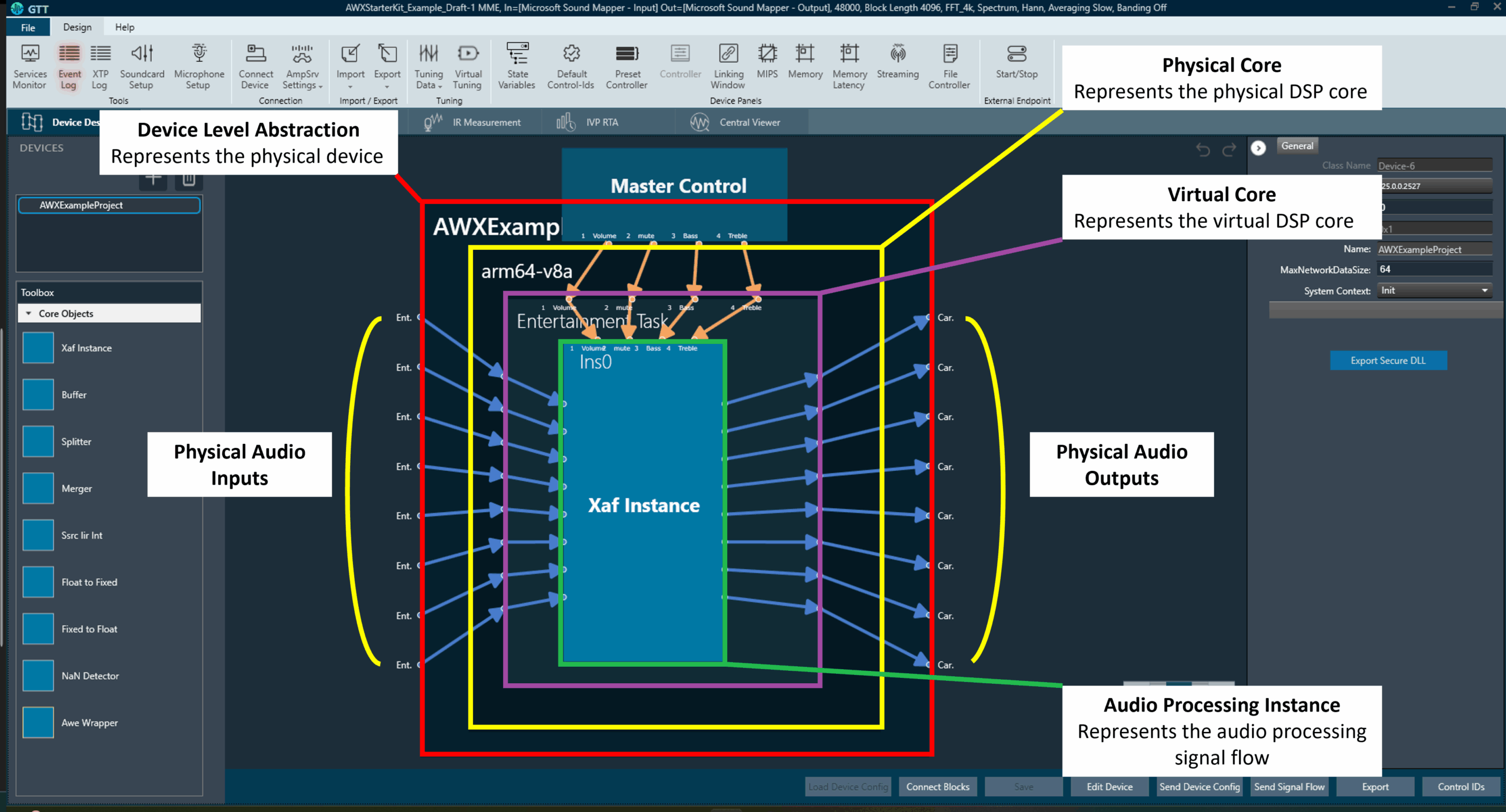
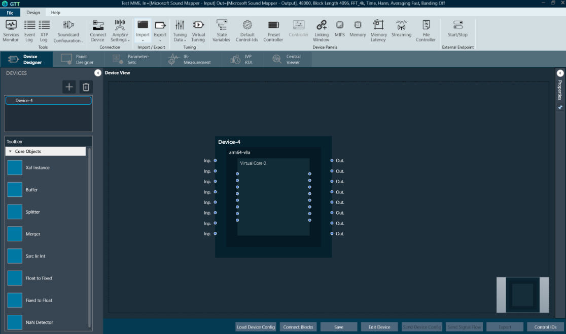
On opening the example project, the first view that is shown is the Device Designer view. This tab shows a high-level view of the audio system, showing the audio device and its abstractions as shown in the below figure.
The Device Level Abstraction (AWXExampleProject1): This represents the physical device or the target device with physical audio inputs and outputs. The Starter Kit supports up to 8 audio output channels and 8 audio input channels which are provided by the HiFiBerry DAC8x and ADC8x add-on HATs. These channels are highlighted as “Physical Audio Inputs/Outputs” in the above image.
The Physical Core (arm64-v8a): This block represents the Digital Signal Processor (DSP) core that performs the audio processing. Although the Raspberry Pi 5 has four 64-bit Arm v8a Cores, currently, only one of the cores is supported for performing audio processing operations by the AWX Amp application. Other AudioworX amplifiers may have more than one DSP core, each of which will be represented separately in the Device Designer view.
The Virtual Core (Entertainment Task): This block represents a single virtual core performing a specific audio task. A virtual core processes audio at a user defined sample rate and block length, which can be configured in the “Edit Device” menu at the bottom of the Device Designer tab (also explained in Create Device File).
In this example, the virtual core has 8-channel audio input and gives out a 7.1 channel output (8 channels in total). This block is populated with core objects that can be dragged-and-dropped from the “Toolbox” pane on the left-side of the Device Designer view and interfaced together to perform operations such as sample rate conversion, buffering, routing, that may be required by the main audio processing instances called the “Xaf Instance”. For more details, refer to Core Objects Toolbox.
A physical core may have more than one virtual core, each of which will be handled by a separate OS thread.
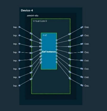
The Audio Processing Instance (Xaf Instance): This block represents the core of the audio processing pipeline which is designed using the Signal flow Designer tool to implement a signal flow (Refer to Xaf Instance in Core Objects Toolbox). The rest of the Starter Kit documentation only briefly explains concepts that are relevant to a first-time user in the context of the AudioworX Starter Kit.
The Starter Kit is pre-configured with all the necessary data files to run the example project on first boot. Users may skip to the Connecting to the AudioworX Starter Kit for Tuning section for establishing connection between GTT and the Starter Kit. However, the following sections highlight important steps that are specific to the Starter Kit and users are encouraged to read them before continuing with tuning the signal flow.
Configuring AmpSrv2 Settings
The project’s AmpSrv2 settings must be configured for GTT to be able to communicate with the Starter Kit hardware for operations such as sending the audio processing signal flow and tuning.
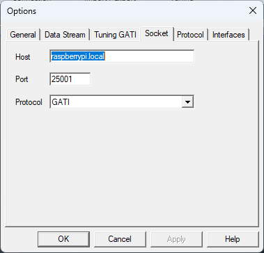
Steps to configure AmpSrv2 settings:
On the Device Designer tab, click on AmpSrv Settings on the top ribbon bar and click Configure.
In the AmpSrv window, go to File> Options>Socket, and set the hostname to “raspberrypi.local” and the port to “25001”.
Click Ok to close the AmpSrv2 settings window and minimize the AmpSrv2 window.
On the Device Designer tab, click on AmpSrv Settings and click on Save from the drop-down menu to save the settings.
For AmpSrv2 Settings details, refer to the Connectionpage.
Sending the Device Configuration to the AudioworX Starter Kit
The device configuration has information on how the physical and virtual cores, the Xaf instances (which are the core of the signal processing flows) and other core AOs are interconnected to form the audio processing pipeline. As previously mentioned, the Starter Kit is pre-configured with the required data files, which includes the device configuration to run the example project on first boot.
For a different project or if any changes have been made to the example project, it is important to send the device configuration to the Starter Kit, to ensure the AWX Amp application can set up and execute the audio processing pipeline.
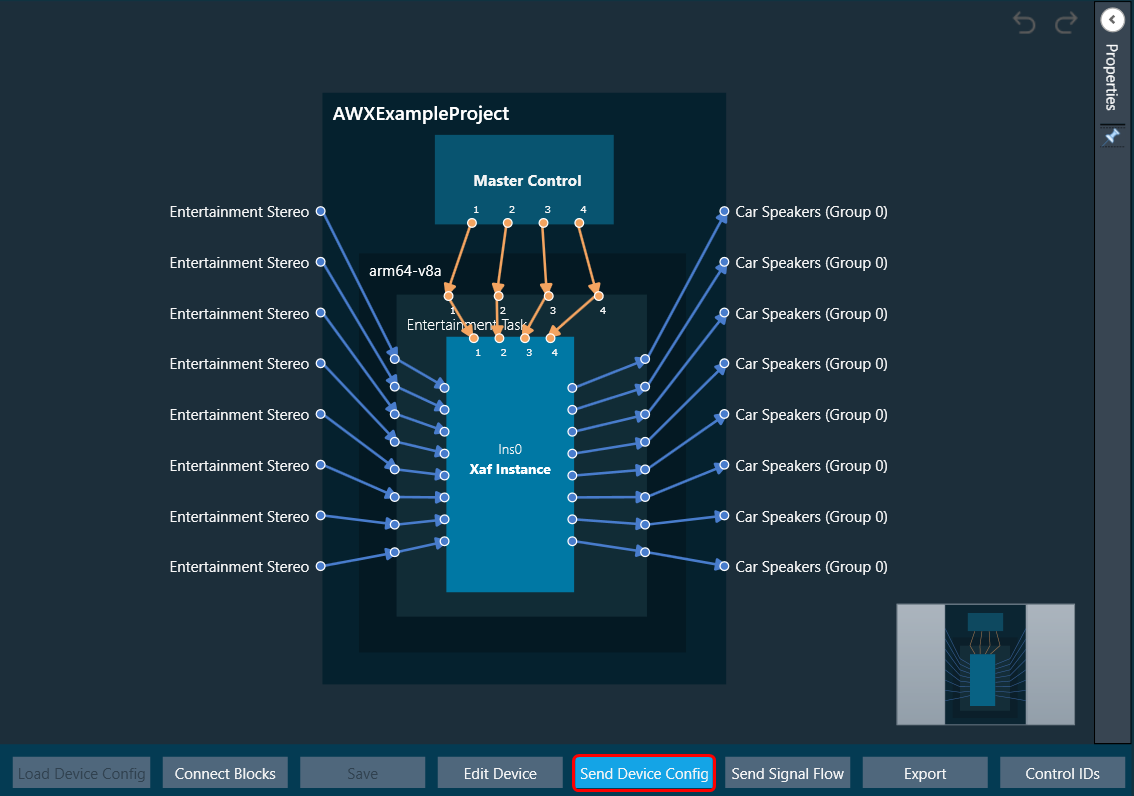
Steps to send the device configuration defined in the GTT project to the Starter Kit hardware:
On the Device Designer tab, click on Send Device Config.
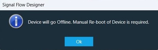
GTT may prompt the user to reboot the target amplifier (the Starter Kit) on successfully sending the device configuration.
In such cases, the AWX Amp application running in the Starter Kit must be reset from the SKUtility Tool. With the Starter Kit connected on the SKUtility tool, go to the “Remote” tab and click the Reset button.
Other AudioworX-based amplifiers may require a full reboot cycle to properly configure and run the SFD.
Connecting to the AudioworX Starter Kit for Tuning
Once the device configuration has been sent to the Starter Kit hardware and the AWX Amp application has been reset (only needed if prompted by GTT), GTT can connect with the Starter Kit for tuning.
Steps to connect GTT to the Starter Kit:
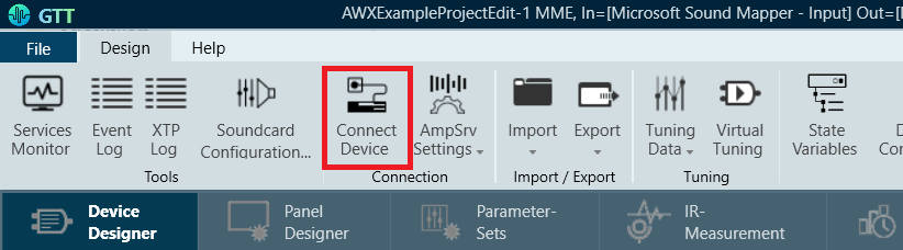
Click the Connect Device button located in the top ribbon bar to initiate device connection.
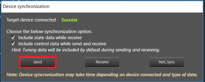
A “Device Synchronization” window will pop up. Click the Send button to send the tuning data. This synchronizes the tuning parameters of the active SFD in the Starter Kit to the states of the parameters as set in the GTT project.
Once the data has been sent and the device has been connected, the audio processing pipeline and its signal flow can be tuned in real-time.
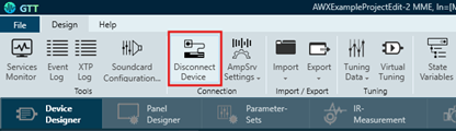
To stop tuning and disconnect the Starter Kit from GTT, click the Disconnect Device button in the top ribbon bar of the Device Designer tab.
Tuning the Audio Processing Pipeline
The audio processing pipeline can be tuned in two ways: using the State Variables button in the top ribbon bar or by using a custom panel.
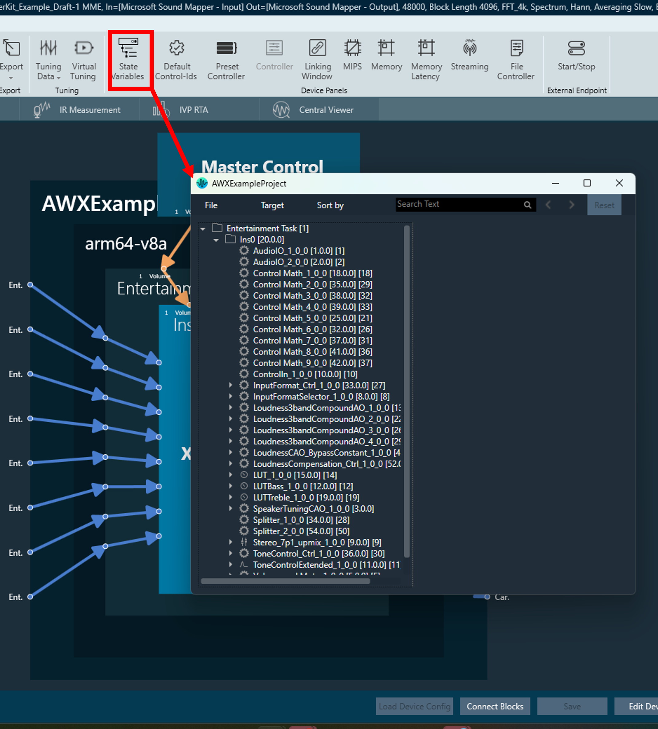
Tuning using State Variables
The State Variables explorer can be accessed from the top ribbon bar in the “Device Designer” tab as shown below.
The rows in the State Variable explorer correspond to the names of the specific AOs in the signal flow. Expanding the row items in the tree display the tunable parameters of the AOs can be set in the right-half of the window.
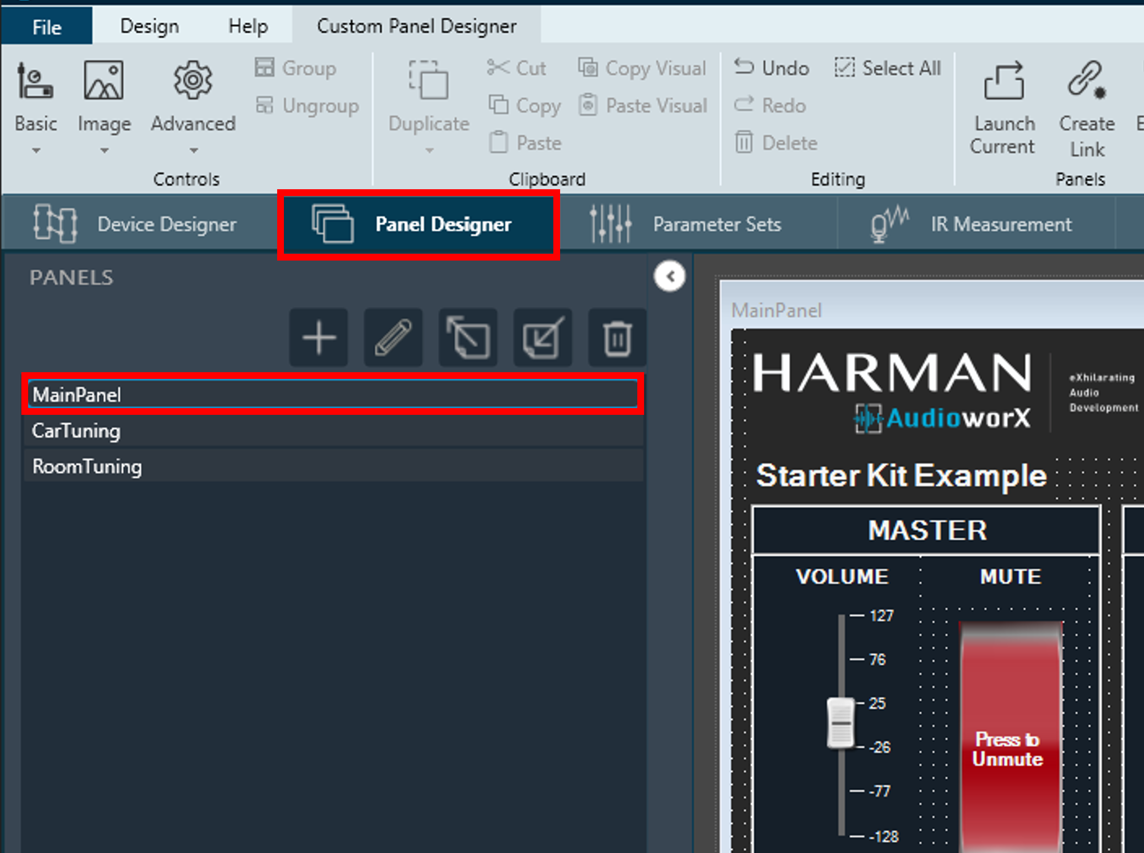
Tuning using the Custom Panel
GTT offers the capability to design custom interface panels specific to the signal flow in the project using drag-and-drop method, allowing the user to define their own tuning interfaces with simple steps from the “Panel Designer” tab. For details on custom panel creation and usage, refer to Create a Custom Panel in GTT.
The AudioworX Starter Kit example project includes three custom tuning panels designed for tuning the audio processing pipeline by exposing essential tuning parameters for the AOs in the signal flow, namely:
MainPanel – high-level tuning (volume, mute, bass, treble, preset selection and links to other sub-panels),
CarTuning – car view for system level tuning parameters that depend on locations of the speakers and their spectral characteristics,
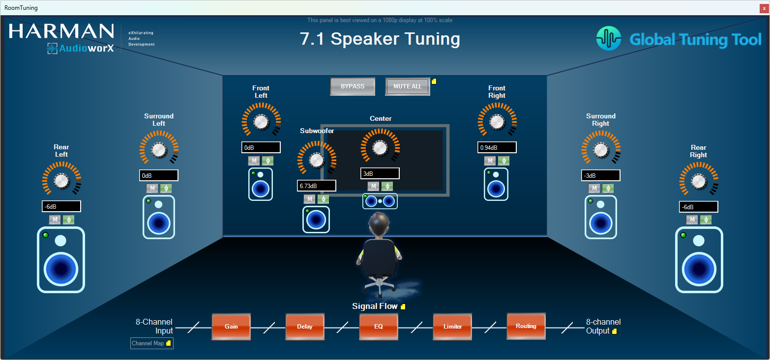
RoomTuning – room view for system level tuning parameters that depend on locations of the speakers and their spectral characteristics for a 7.1 audio system,
To launch the panel, go to the “Panel Designer” tab and double-click the item named MainPanel in the Panels pane on the left-hand side of the view as shown below.
The panels in the Starter Kit example GTT project have “Notes” (yellow icons resembling sticky-notes) that contain special instructions or descriptions of the associated features which can be read by clicking on the icon. Additionally, the UI items, such as faders, buttons, drop-down menus, etc., have tooltips with brief descriptions that are displayed on hovering the mouse pointer over them.
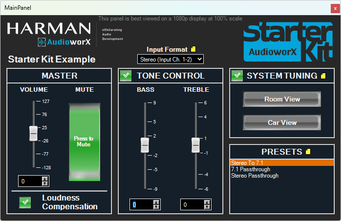
The main panel has high-level tuning parameters such as volume, mute, etc., and offers capabilities to turn on and off features such as Loudness Compensation, Tone Control and System Tuning. Apart from the controls mentioned, this panel also has buttons to open sub-panels for System Tuning interfaces. Below is an image showing the main panel.
With the HiFiBerry ADC8x add-on, up to 8 input channels are supported, allowing for a variety of use cases. In the example project, 2 formats of audio input are supported which are selectable from the Main Panel:
Stereo Input: In this format, only the input channels 1 and 2 are used and the signal is up-mixed to all 8 output channels. The rest of the input channels (3 to 8) are disregarded.
7.1: In this format, the 8 input channels are assumed to be in the 7.1 channel configuration, which are processed and output through the 8 output channels. The input channel configuration is as follows:
Channel 1 -> Front Left
Channel 2 -> Front Right
Channel 3 -> Center
Channel 4 -> Subwoofer
Channel 5 -> Surround/Side Left
Channel 6 -> Surround/Side Right
Channel 7 -> Rear Left
Channel 8 -> Rear Right
The example project contains an object named “Speaker Tuning” to enable fine tuning of the audio signals sent to the physical speakers accounting for their locations from the listening position and their spectral characteristics. Two tuning panels have been included in the project, one providing the view of a room with a 7.1 speaker setup and the other providing the view of a car with 8 speakers, which can be opened by clicking the buttons named Room Interface and Car Interface, respectively.
AudioworX Starter Kit Example GTT Project – System Tuning Car View
The following are the key features of the two panels:
Gain, mute and phase invert controls for individual speakers,
LED indicators to show when audio content is playing through a given speaker (enabled by turning on the Streaming feature in GTT),
Global mute and bypass functions,
Signal flow representation at the bottom, showing the audio objects involved, whose native panels can be accessed by clicking their respective boxes for tuning.
Additionally, in the Room View, the speaker icons double-up as mute buttons to mute the individual speakers.
The Main Panel also has a “Presets” pane that lists presets stored in the Parameter Sets tab of GTT. The following section describes how to save and recall tuning presets.
Saving and Recalling Tunings using Parameter Sets
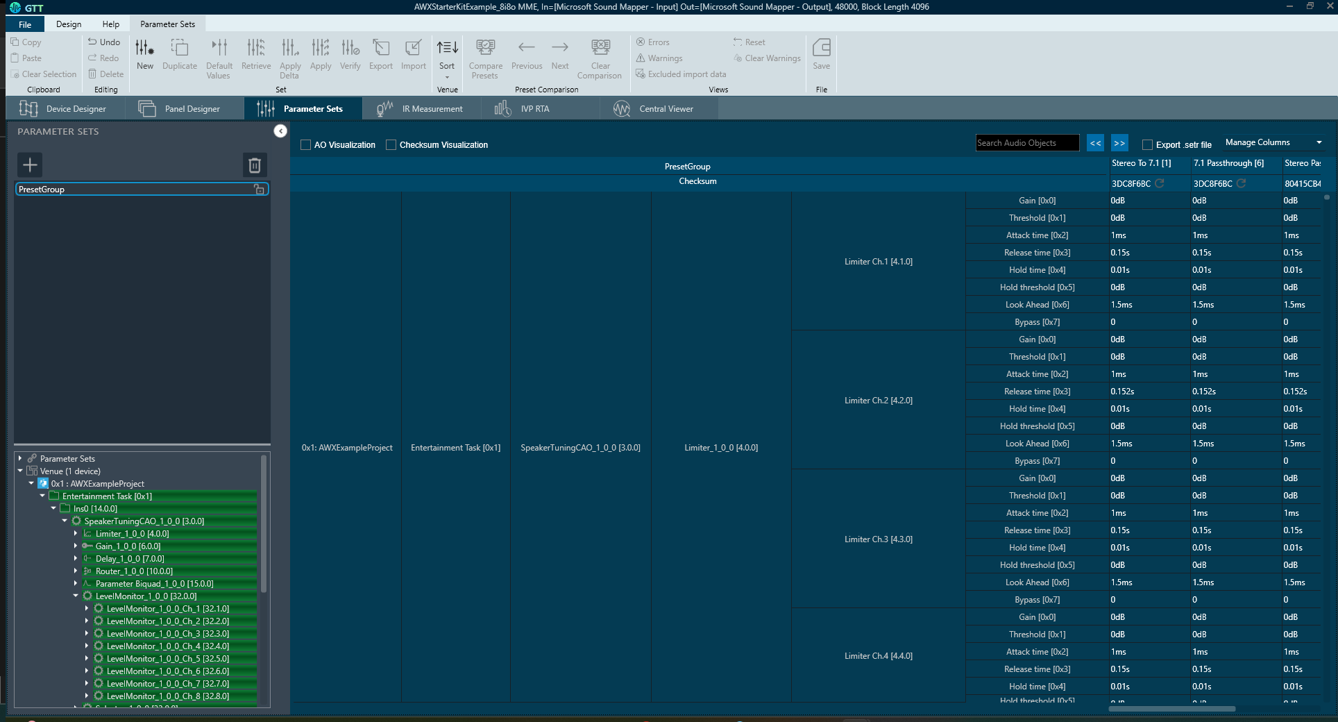
GTT enables users to save and recall tunings as presets from the “Parameter Sets” tab of GTT.
In the Starter Kit example project, 3 presets are created, namely:
“Stereo To 7.1”: In this preset, all the features are turned on, the input stereo audio is up-mixed to 7.1 channel configurations and specific tunings are applied to the individual output channels to account for the speaker positions as an example. Note that only the first two input channels are active in this preset.
“7.1 Passthrough”: In this preset, all the processing features are turned off and the 8 input channels are passed through directly to the output channels with only the volume and mute controls.
“Stereo Passthrough”: In this preset, all the processing features are turned off and the 2 input channels are passed through to the corresponding output channels. Note that although the System Tuning feature may appear to be turned on, internally, there is no gain, delay, EQ, etc., applied to the 2 input channels.
For detailed information on the Parameter Sets tab and its features, refer to Parameter Set Components.
Saving Custom Tunings
To save the values of all the parameters upon tuning into a preset:
Go to the Parameter Sets tab.
Select the “PresetGroup” on the left-side pane,
Click the New button on the top ribbon bar. This will create a new column named “Set<N>”, where N is the index of the new set. This may be overwritten as needed.
Right-click the new column and select Retrieve to populate it with the current tuning settings.
To overwrite an existing preset, right-click the preset column to be overwritten and click Retrieve.
In the example project, the presets (described above) store all tuning parameters in the signal flow. However, they may also be customized to store only a sub-set of all the tuning parameters in the signal flow using “Set Group” (left-side pane in the “Parameter Sets” view). For details on creating a new set group with a sub-set of tuning parameters, refer to Create a Parameter Set in GTT.
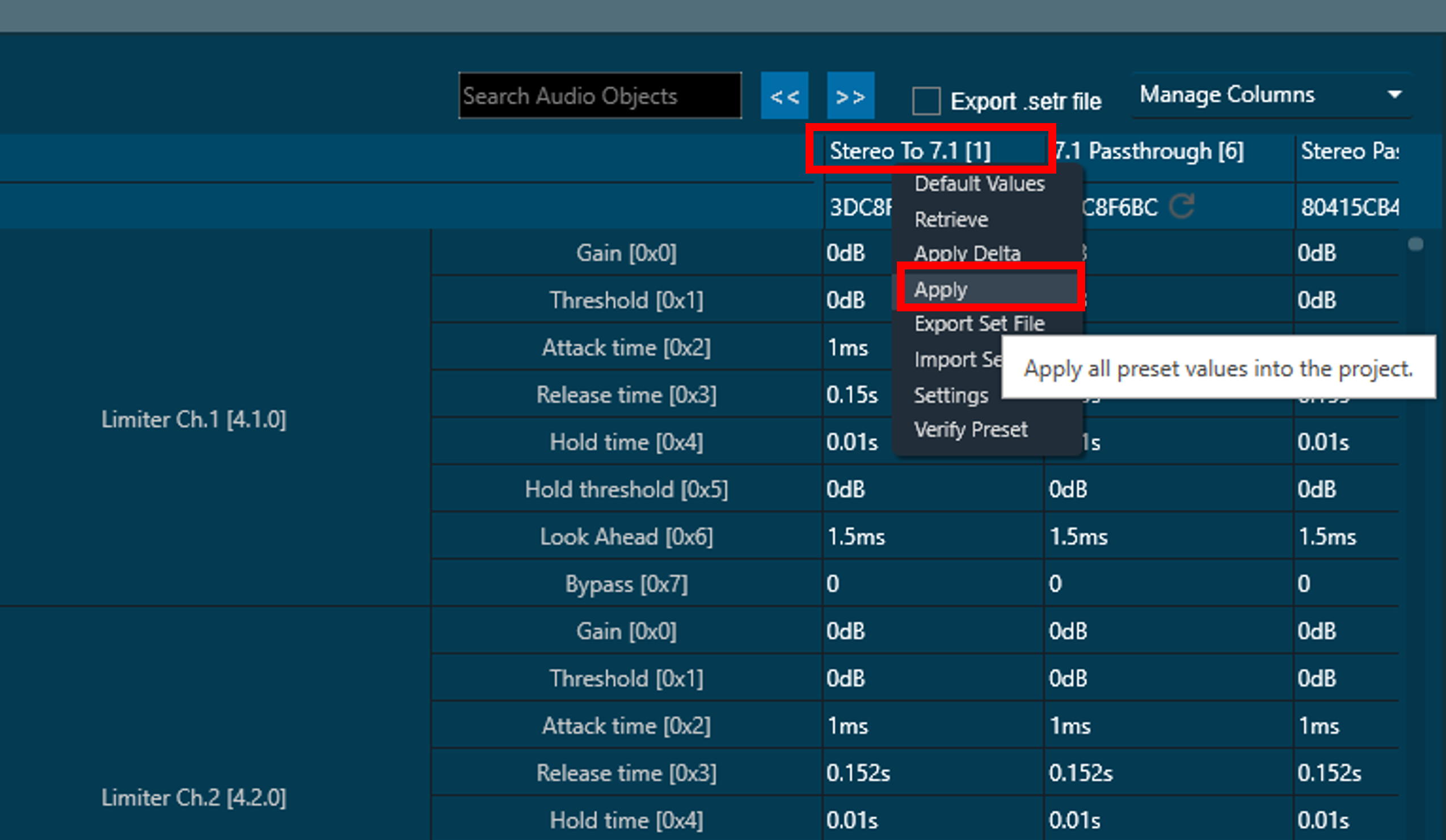
Applying Tunings from a Saved Preset
A preset can be applied to the target by right clicking the preset name and clicking the Apply button as shown below:
Applying a preset sets the tuning parameters in a live signal flow running in a target device (here it is the Starter Kit), only if the device is connected. If the target device (here, the Starter Kit hardware) is not connected to the GTT session, only the local states of the parameters within GTT will be updated, which then needs to be sent while connecting the device as described in Connecting to the AudioworX Starter Kit for Tuning
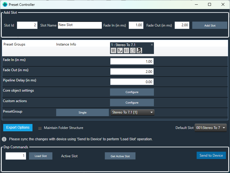
Managing Presets using the Preset Controller
GTT provides a method for recalling and managing presets using data files stored in the target device’s flash memory using the “Preset Controller”, which is accessible from the “Device Designer” tab of GTT as shown below.
Presets made in the Parameter Sets tab can be mapped to slots in the Preset Controller, which represent preset files on the target device, for quick recall of presets. For more details on this feature, refer to Configure Preset Controller.
In the Starter Kit example GTT project, there is a single pre-made preset slot named “Stereo To 7.1”, which is intended as the startup configuration of the AudioworX Starter Kit upon boot-up and is set as the default slot. This slot is mapped to the “Stereo To 7.1” preset that is saved in the Parameter Sets tab, which is described in the previous section.
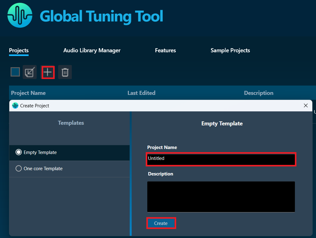
This section outlines the process to be followed for creating a new project with a custom device type, providing instructions for efficiently creating a project environment that supports custom audio configurations and leveraging the full capabilities of GTT with the Starter Kit.
Click the + button in the “Projects tab” of the “Home Screen” of GTT.
Select Empty Template and provide project title and description.
Click the Create button to create a new empty project.
Adding a Device to the Project
The first step after creating a GTT project is to add a device to the project, either from a template or by defining a custom device, within which the audio processing pipeline will be implemented. GTT provides the capability for defining a device with a custom number of audio inputs, outputs, virtual cores processing audio data at custom sample rates and block lengths, etc., to build audio systems requiring precise audio data handling, ensuring that the audio system is fully customized to support the project’s audio processing needs.
GTT can also learn the capabilities of an AudioworX amplifier within which the audio processing pipeline is to be built by querying the target amplifier.
The following section provides instructions on how to define a custom device that is compatible with the Starter Kit hardware.
Configuring a Custom Device Compatible with the AudioworX Starter Kit
A custom device can be defined by creating a “device file” that contains information on the physical cores available on the target amplifier, virtual cores configured for audio processing at custom sample rates and block lengths within each physical core, and groups of audio input and output channels to stream audio data to the virtual cores.
The device file can be customized to support complex audio workflows, enabling scalability, optimized resource usage, and the flexibility to handle different audio streams simultaneously.
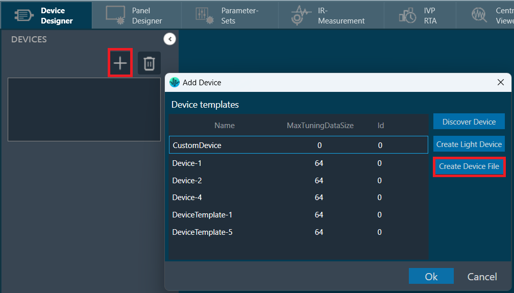
Steps to create a custom device file:
Click the + button in the “Devices” pane of the Device Designer tab.
Select the Create Device File option on the right side of the window.
Creating a Device File
This will open a “Device File Editor” where a user can define the high-level capabilities of the device.
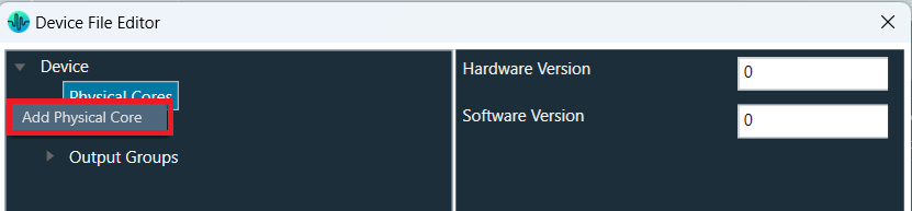
First, a physical core must be created to describe the DSP core that the target amplifier is equipped with and provide details on its MIPS and core-type. An AudioworX supported amplifier hardware may have more than one DSP core that can be used for audio processing, each of which need to be separately added to the device file.
Steps to create the physical core in the device file editor for the Starter Kit:
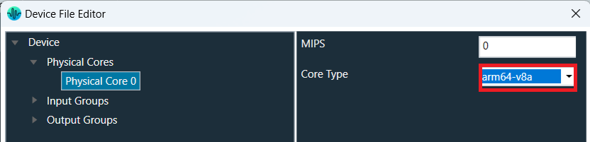
Right-click Physical cores and click Add Physical Core.
Select Physical Core 0 choose arm64-v8a in the Core-type drop-down menu, which corresponds to the processor core type of the Raspberry Pi 5. This is an essential step to ensure that the GTT project is compatible with the Starter Kit.
The Starter Kit currently only supports one Physical Core of type “arm64-v8a” despite the Raspberry Pi 5 having a quad-core processor.
Further steps on adding and defining “Virtual Cores” and detailed information on the “Device File Editor” can be found in Create Device File.
Device level Input and Output Groups can also be edited in the “Device File Editor” to suit the needs of the audio processing pipeline. Here, the user is expected to set the properties of audio input and output data streams that the physical device is capable of, including the number of channels, sample rate of the audio data and the format of the audio data.
The Starter Kit currently only supports the following configuration:
Sample rate: 48,000 Hz
Max. number of input channels: 8
Max. number of output channels: 8
Audio data format: Float
As a last step after editing the device file, click Save Device Template and save the device.flash file on local file system. This device.flash file must be sent to the Starter Kit hardware using the Starter Kit Utility to make the kit fully aware of the exact device defined in GTT.
To send the exported device.flash file, with the Starter Kit connected in the SKUtilityGUI.exe tool, go to Configuration > Send Device File, select the file to send, and click Open. For the Starter Kit to adopt the new device configuration, remove all other flash files from Configuration > Flash Files, and reset the AWX Amp application using Remote > Reset.
For more details on how to send the device.flash file refer to “Flash a Device File” in the “Starter Kit Configuration” section of SKUtility Tool – Graphical Application.
Discovering the Device Properties from the AudioworX Starter Kit Hardware
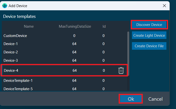
GTT can learn the device capabilities using the “Discover Device” option in the “Add Device” menu. The discovered device type can then be used in the GTT project to design the audio processing pipeline.
Ensure that the AWX Amp application is running in the Raspberry Pi for GTT to be able to learn from the Starter Kit Hardware. Refer to the “Running Starter Kit Diagnostics” section of SKUtility Tool – Graphical Application.
Steps to query the Starter Kit hardware to discover the device properties based on the device.flash file that has been already flashed on to the kit:
Launch AmpSrv2 from the Desktop or from the Windows Start bar.
Go to File > Options > Socket and set the host name as “raspberrypi.local” and port as “25001”.
While keeping the AmpSrv2 window open, in the “Add Device” window of GTT, click the Discover Device button. This will get the device information from the Starter Kit hardware and display as a new device under the templates list (“Device-4” in the below figure).
Select the device and click Ok to add the device into the GTT project.
For the device capabilities to be discoverable from the Starter Kit hardware, the Starter Kit should have been previously flashed with a device.flash file.
By default, the Starter Kit is configured with a device.flash file that corresponds to the device type used in the example project. This file can be restored in case it was deleted using Configuration > Factory Reset.
More details on this can be found under “Starter Kit Configuration” in SKUtility Tool – Graphical Application.
Leveraging AudioworX Audio Features
GTT facilitates enhanced testing and experimentation with custom audio setups, providing flexibility and control over the audio workflow.
The GTT system includes “Xaf instances” and Core AOs using which developers can enhance audio processing systems, ensuring seamless integration and efficient handling of audio tasks. AudioworX provides a robust framework for manipulating audio data while taking full advantage of GTT’s advanced functionalities to deliver optimized performance and enhanced audio output.
The center pane of the “Device Designer” tab in GTT is the “Device View” where the audio processing pipeline is built. Refer to the “Importing The Example Project” section in Getting Started with the Example Project for a detailed explanation of the device level abstractions in the “Device View”.
The “Toolbox” pane on the left-side provides a set of objects that can be dragged, dropped, and interconnected to complete the audio processing pipeline.
The following steps show how a simple audio processing pipeline can be developed:
Connect the pins in physical core (block named “Device-4”) and virtual core (block named “Virtual Core 0”).
Drag and drop an “Xaf Instance” from the left-side “Toolbox” pane to “Virtual Core 0” and set input and output channels as 8 and 8 (illustrative only), respectively.
Now, connect the pins on the added “Xaf Instance” and “Virtual Core 0”.
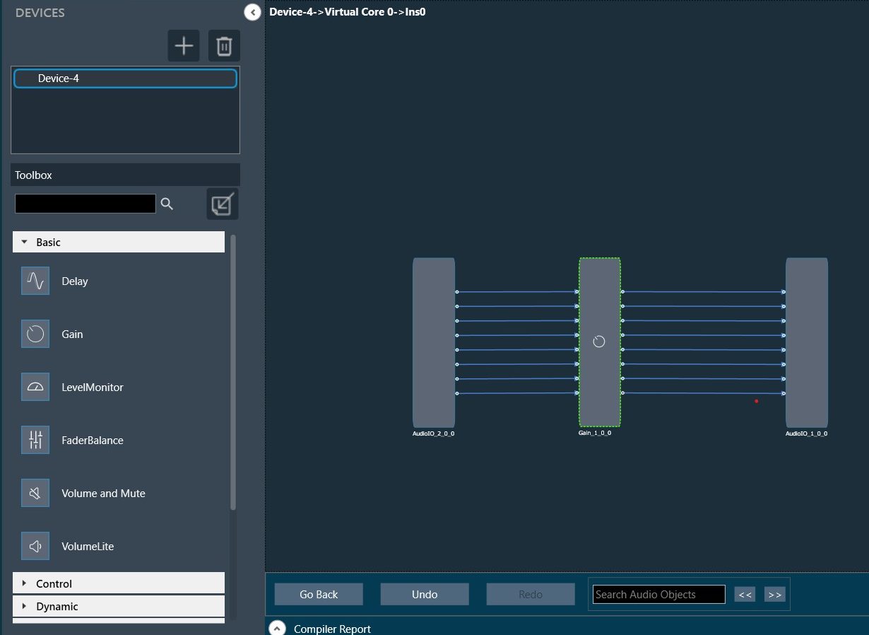
Double-click the Xaf Instance to edit/add the AOs and define a signal flow.
Drag and drop the required AOs into the designer and connect them as needed. The below figure shows a Gain object of 8 channels that is added to the signal flow.
Once the connections have been made as required, click Save to save the signal flow design and click Go Back to return to the “Device view”.
The audio processing pipeline or the signal flow can now be sent to the Starter Kit as described in the “Sending the Device Configuration to the AudioworX Starter Kit” section of Getting Started with the Example Project and can be tuned thereafter as described in the “Connecting to the AudioworX Starter Kit for Tuning” section of Getting Started with the Example Project.
The SKUtility Tool has a command-line interface (CLI) that is included in the GTT installation. It is a Python script (SKUtility.py) that enables users to programmatically control the Starter Kit for advanced use-cases that may require rebooting, resetting, etc., without human intervention. This page describes the CLI tool and its usage in detail. Common useful commands are given in Useful SKUtility Commands.
The SKUtility.py script is not “installed” in the PC environment along with GTT and requires to be run from the GTT installation directory where it is stored.
Installing the Python Pre-Requisite Packages
The SKUtility.py is a Python script and requires Python 3.12 to be installed on the PC to be able to run. Download Python 3.12 and install it on the PC before proceeding.
The SKUtility.py script can be found in the default GTT installation directory “C:\Program Files\Harman\HarmanAudioworX\StarterKit\StarterKitUtility”. This directory has a requirements.txt file that lists all the python dependencies needed to run the script and remotely operate the Starter Kit hardware. To install the Python dependencies:
Open a Command Prompt window (or any terminal of choice of the user, for example, PowerShell, MSYS2 or git bash) from the start-menu,
Change directory to the location of the SKUtility.py script in the GTT installation directory as follows:
cd C:\Program Files\Harman\HarmanAudioworX\StarterKit\StarterKitUtility
Run the following command to install the python pre-requisites as shown below:
python3 -m pip install -r requirements.txt
SKUtility.py Usage
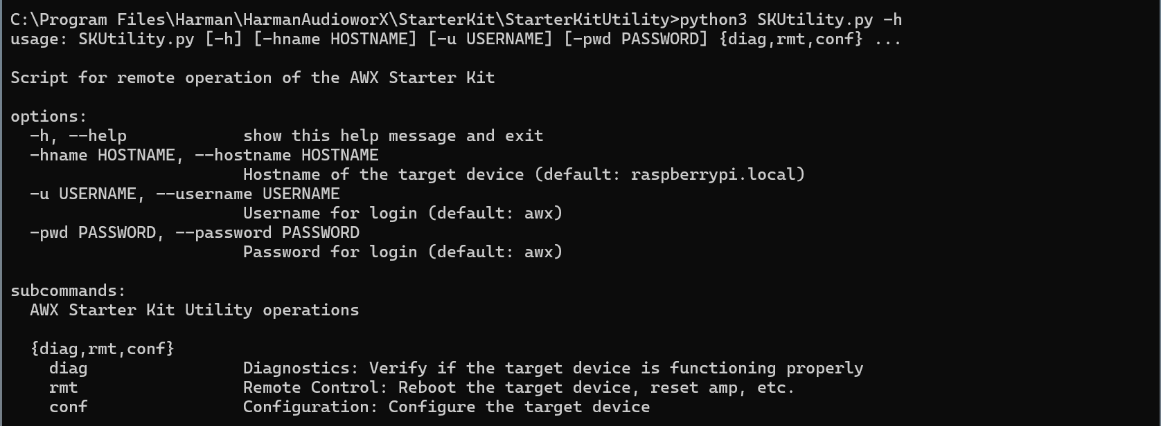
The “SKUtility.py” script takes command-line arguments as shown in the help text, which can be displayed by running the following command:
python3 SKUtility.py -h
SKUtility Command-line Help Text
The script, by default, connects to a target with the hostname “raspberrypi.local” and the username and password as “awx” (default credentials for the Starter Kit). This can be changed using the “-hname” argument for the hostname, “-u” argument for the username and “-pwd” argument for the password, if they are different from the default.
The Utility tool supports operations/actions that are classified into 3 functions or sub-commands:
Sub-command
Function
Description
diag
Diagnostics
Verify if the target device is connected and is functioning as expected
rmt
Remote Control
Perform actions such as rebooting the Raspberry Pi, resetting the AWX amp application, etc.
conf
Configuration
Configure the audio device to use and Wi-Fi to connect to
The following sub-sections describe each function in detail along with the usage.
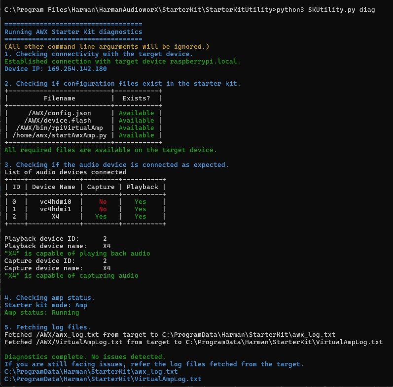
SKUtility Diagnostics
This function runs a series of checks to verify if the Starter Kit hardware is functioning as expected. The diagnostics report can be generated by running the command:
python3 SKUtility.py diag
Following is an example report that shows a working Starter Kit setup.
The diagnostics only finds issues in the configurations of the hardware that may be preventing proper operation of the AWX Amp application. If the Starter Kit is not functioning properly despite the diagnostics report showing no issues, refer to the log files fetched during the diagnostics to debug. The details on debugging using the Amp log file are given in the “AWX Amp Application Logs” section of Starter Kit Troubleshooting.
The “SKUtility Diagnostics Report” section in Starter Kit Troubleshooting describes the steps in the diagnostics in detail and highlights troubleshooting steps for resolving issues detected.
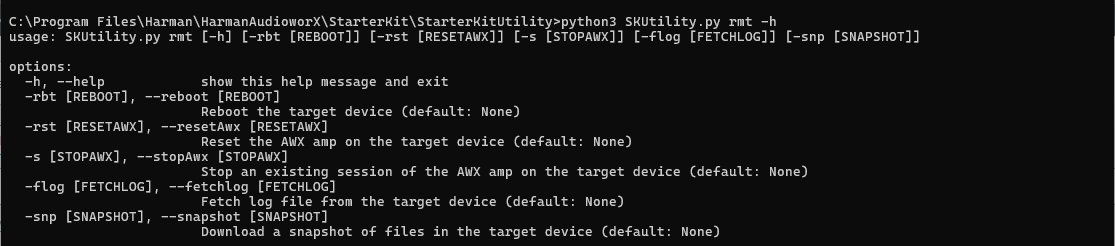
SKUtility Remote Control
This function/sub-command provides actions such as rebooting the Raspberry Pi, resetting the AWX Amp application, fetching log files and taking a snapshot of the Starter Kit data files.
The following image shows the help text for this function.
SKUtility Remote Control Command-line Help Text
The following are the actions that can be executed under the Remote-Control function:
Remote-Control Function
Command
Reboot the Raspberry Pi
To reboot the Raspberry Pi remotely, run the command python3 SKUtility.py rmt -rbt The utility tool will then trigger reboot and wait until the Raspberry Pi is booted up and reachable by the PC. This command may take about a minute.
Reset the AWX Amp Application running in the Starter Kit Hardware
To reset the AWX Amp application (needed when updating the device definition on GTT), run the command python3 SKUtility.py rmt -rst
Stop the AWX Amp Application
To stop the AWX Amp application, run the command python3 SKUtility.py rmt -s
Fetch Log Files
To fetch the log files from target, run the command
python3 SKUtility.py rmt -flog
This will fetch two log files from the target Starter Kit hardware and open the file location with the following files:
awx_log.txt: This file contains logs related to booting up of the Starter Kit hardware and running of the AWX Amp application.
VirtualAmpLog.txt: This file contains logs from the xAF framework that include initialization of the audio core, core AO, xAF instances, etc., based on the signal flow flashed on the Starter Kit hardware from GTT.
Take a Snapshot of the Data Files on the Starter Kit Hardware
The SKUtility.py can be used to take a snapshot of the data files in the Starter Kit hardware, either for saving the state of the Starter Kit or to send Harman AudioworX support for debugging, run the command: python3 SKUtility.py rmt -snp
This will take a snapshot, fetch a .zip file from the Starter Kit, and open the file location.
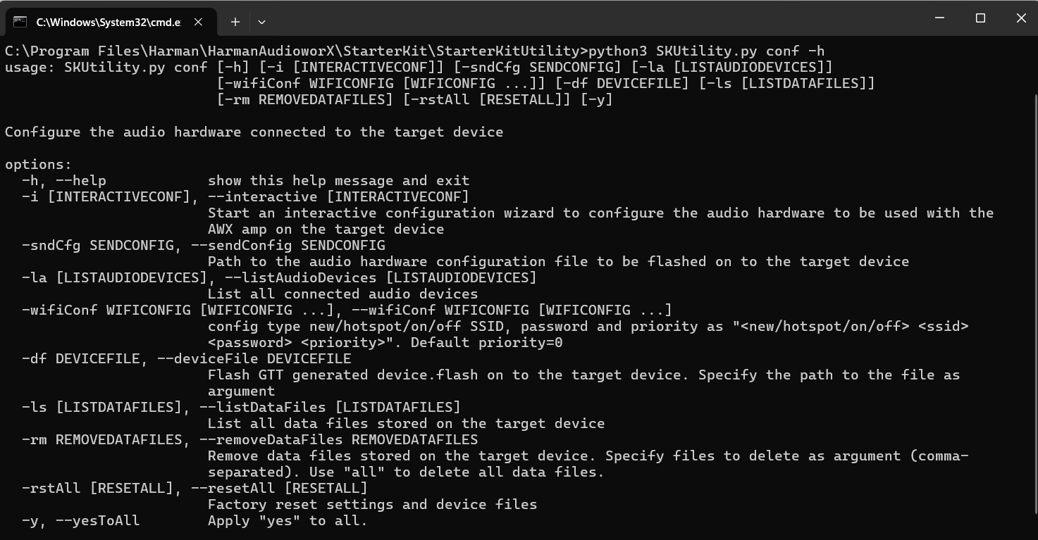
SKUtility Configuration
This function provides configuration options for the user to configure the behavior of the Starter Kit hardware, and the audio interface connected. The following is the help text for this function.
The following are the actions that can be executed under the Configuration function:
SKUtility Configuration
Descriptions
Interactive Audio Device Configuration
The utility tool provides an interactive setup wizard for configuring the audio device to be used by the AWX Amp application. This is necessary when using a different audio interface than the Creative Sound Blaster X4.
To start the interactive setup wizard, run the command python3 SKUtility.py conf -i
The wizard takes the user through the following steps:
Specify the name of the .json file to save the configuration locally. This is useful to avoid going through the interactive menu if the user wants to revert to a known configuration. Type the file name (default file name is if no input is provided is “config.json”) when prompted.
Set the start-up mode for the Starter Kit hardware. The Starter Kit can be set to boot up in one of 2 modes.
Amp Mode – In this mode AWX Amp application is automatically started on when the Raspberry Pi is booted up.
Dev Mode – In this mode, the auto start of the AWX Amp application is disabled. This mode is only meant for developers.
If no input is provided by the user, the default mode chosen in the “Amp” mode.
Select the device for capture and playback from the displayed list of connected audio devices with their audio capabilities. Type the IDs for capture and playback devices when prompted.
Set the selected configuration on the Starter Kit hardware by sending the saved config.json file to the target hardware.
The below figure shows the interactive configuration menu where the no input is provided for the filename and the Starter Kit modes, and the sound card named “X4” (Creative Sound Blaster X4) is chosen as the device for both input and output.
Send a Previously Saved Audio Device Configuration
This is used to send a previously saved audio device configuration file generated by the interactive wizard.
run the command:
python3 SKUtility.py conf -sndCfg
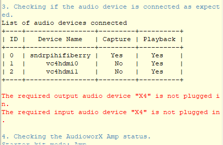
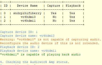
List Audio Devices Connected to Raspberry Pi
To list the audio device connected to Raspberry Pi, run the command. python3 SKUtility.py conf -laThis command will display all the connected audio capable devices along with their capture and playback capabilities.
Set a Wi-Fi for Raspberry Pi to Connect
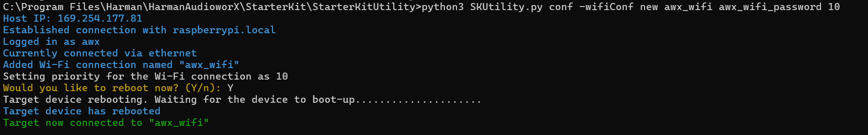
This command is used to configure a new Wi-Fi for the Starter Kit to connect to, by specifying the ssid (Wi-Fi name), password and optionally, the auto-connect priority for the Wi-Fi. Run the command: python3 SKUtility.py conf -wifiConf new <SSID> <password> <priority>The below figure shows how to configure a Wi-Fi named “awx_wifi” with the password “awx_wifi_password” and an auto-connect priority of 10.
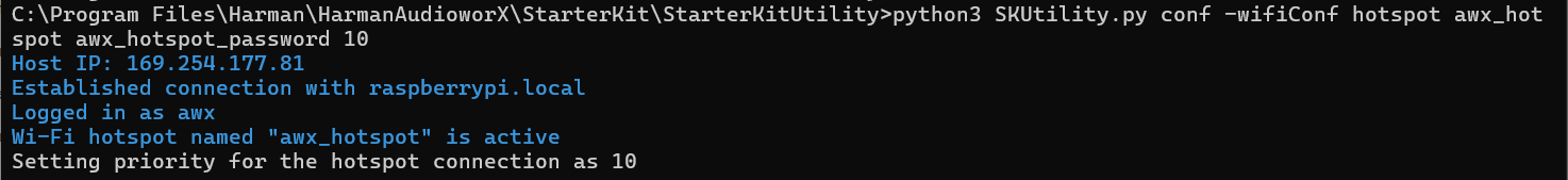
The optional “priority” parameter can be used to set the priority of the Wi-Fi connection for the Starter Kit to auto-connect on boot-up in the range (-999, 999), where higher the number, higher the priority. By default, the priority is set to 0. This parameter is useful when there are multiple Wi-Fi connections available and to prioritize them as required. The user can choose to reboot the Starter Kit to save changes and connect to the Wi-Fi network based on priority. The above figure shows that the Starter Kit has successfully connected to the new Wi-Fi on reboot. The user can also configure the Raspberry Pi 5 to behave as a Wi-Fi hotspot for the PC to connect to, using the following command: python3 SKUtility.py conf -wifiConf hotspot <SSID> <password> <priority>
To turn off the Wi-Fi on Raspberry Pi, use below command:python3 SKUtility.py conf -wifiConf off
To turn on the Wi-Fi on Raspberry Pi, use below command:
python3 SKUtility.py conf -wifiConf on
Flash a Device File
To flash a device file generated from GTT on to the Starter Kit hardware, run the command:
python3 SKUtility.py conf -df <device file path>
The “device.flash” is necessary for a signal flow to run on the AWX Amp application. The steps for generating the “device.flash” file on GTT are illustrated in “Configuring a Custom Device Compatible with the AudioworX Starter Kit” in the “Adding a Device to the Project” section of Creating a New Project on GTT.
List Data Files on the Starter Kit
To list the data files that are currently stored in the Starter Kit, run the command:
python3 SKUtility.py conf -ls
The AWX Amp application makes use of data files with the extensions “.flash”, “.set” or “.info” sent from GTT for initializing the device, signal flow, presets, etc.
Remove Data Files from the Starter Kit
To delete data files (“.flash”, “.set”, “.info”) from the Starter Kit hardware, run the command:
python3 SKUtility.py conf -rm <list of files to be deleted or wildcards>
It may be required by a user to delete some or all the data files to roll back actions or start afresh before flashing a new project with device definition being different than the project that the Starter Kit hardware is currently flashed with. For example, the new project may have a different number of audio inputs, outputs, xAF instances, virtual cores, etc. In such cases, the user may need to wipe out the data files from the Starter Kit and flash new data files from GTT. The files that are stored in the Starter Kit hardware can be listed by using the “-ls” argument. Alternatively, to remove all data files from the Starter Kit hardware, run the command: python3 SKUtility.py conf -rm a
Running the “conf -rm a” command will all data files command will also delete the “device.flash” file which will have to be restored as directed in Flash a Device File or by resetting configuration (given below).
Reset All Configurations to Default
To reset the Starter Kit hardware to its default state, run the command:
python3 SKUtility.py conf -rstAll
The reset all action goes through the following steps:
Get confirmation from the user to reset all configurations. If confirmed, all files related to AudioworX will be removed from the Starter Kit hardware and restored to their default states, effectively re-installing the version that is included in the GTT installation.
Go through the interactive audio device configuration step if required by the user. For complete details of this step refer to Interactive Audio Device Configuration.
The following sections explains them and how to troubleshoot problems.
SKUtility Diagnostics Report
The Starter Kit diagnostics, goes through a series of steps to verify the hardware connections and configuration of the Starter Kit.
Following are the different stages:
Verify that the Starter Kit hardware is reachable by the PC over the LAN.
Verify that the configuration files and AWX Amp application are present in the target Starter Kit hardware.
Verify that the audio hardware required by the set audio configuration are connected and verify their playback and capture capabilities.
Verify that the AWX Amp application is running if the Starter Kit hardware is set to “Amp” mode.
Fetch log files for further diagnosis.
The diagnostics only verifies and flags issues related to connectivity between the PC and the Starter Kit, configuration files on the Starter Kit, audio hardware connected and configured for the AWX Amp application and the status of the amp application. Harman AudioworX Support can be contacted to diagnose issues outside of these.
The following sub-sections provide instructions on how to fix the issues identified in the diagnostics report.
Issues in Connectivity
If there is a connectivity issue between the PC and the Starter Kit, it will be identified in the very first step of the diagnostics. In such cases, the diagnostics will exit soon after as shown below:
To fix this issue, ensure that the Starter Kit and the PC are both on the same network. As mentioned in Hardware Components Setup of this document, direct connection between the PC and the Starter Kit over ethernet is preferred due to zero network traffic. However, there may be situations where a direct connection is not possible, for example, if the PC’s ethernet port is already in use or the PC does not have an ethernet port at all.
In such cases, the Starter Kit’s hotspot feature may be used to establish connection between the PC and the Starter Kit. The Starter Kit is configured to automatically start a Wi-Fi hotspot with the following login credentials, when it is not connected to any known Wi-Fi network:
SSID: AP_AWXStarterKit
Password: starterkithotspot
Connect to this hotspot from the PC to first establish direct Wi-Fi connection to the Starter Kit and then run the diagnostics again. Step one of the diagnostics should be successful, indicating that the Starter Kit is accessible from the PC.
The IP address of the Starter Kit starts with a number other than ”192“or ”169“, which indicates that the PC is connected to the Starter Kit’s Wi-Fi hotspot. The user must be warned that in this setup, the PC will no longer have access to the internet via Wi-Fi. For convenience, it is recommended that the Starter Kit is configured to connect to a common Wi-Fi network using the instructions in “Starter Kit Configuration > Wi-Fi Config” in SKUtility Tool – Graphical Application after connecting to the Starter Kit hotspot.
Issues with Configuration Files
The second step of the diagnostics verifies if all the files that are required for functioning of the Starter Kit are present in the file system of the Starter Kit. If the diagnostic report indicates missing files, a simple brute-force solution would be to reset all files to their original states using the Configuration >Factory Reset button in the Starter Kit Utility, which is described in SKUtility Tool – Graphical Application.
All the data files in the Starter Kit will also be restored to their original states (corresponding to the example project), which means that any changes made to the audio hardware configurations or the signal flow flashed on the device (.flash files) will be lost, and need to be reconfigured.
It is recommended to take a snapshot for back up using the SKUtility UI Tool before resetting all the configurations.
The following table shows the solution to restore individual files:
Missing File
Solution
/home/<user>/HarmanAudioworX/config.json
Reconfigure the audio device using Audio Config in SK Utility tool.
/home/<user>/HarmanAudioworX/device.flash
Export device file and send it to the device (refer to Configuring a Custom Device) using the Send Device File option in the SKUtility tool.
All other files
Restore all files using Factory Reset option in the SK Utility tool.
Issues with the Audio Device
The Starter Kit diagnostics verifies if the audio input and output devices set in the audio device configuration are connected. Below is an example diagnostic report showing an error with the audio device:
If such an error is shown, verify if the required audio device is physically connected is powered on.
Two separate audio devices, one for input and the other for output, may be used simultaneously. If the input or output device is not capable of capture or playback, respectively, the diagnostic report will show a warning (in yellow).
If this is not intended, reconfigure the audio device using the SKUtility Tool.
Issues in the AWX Amp Application
The AWX Starter Kit has two start up modes set via the interactive config menu described under “Configuration > Audio Config” in SKUtility Tool – Graphical Application.
Amp mode
Dev mode
Step 4 in the diagnostics verifies the status of the AWX Amp application based on the mode that is configured. If the Starter Kit hardware is set to “Amp” mode, the AWX Amp application is expected to be running.
An error may be reported in this step for the following reasons:
Failure in any of the previous steps.
The expected audio interface is not available at the time of amp start-up. Ensure that the audio device is plugged in and powered on (if the interface has dedicated power) before powering-on the Raspberry Pi 5 (not required for the HiFiBerry HATs).
Problem in starting the AWX Amp application due to audio device setup or framework initialization, refer to AWX Amp Application Logs section.
Once the issues detected are rectified, reset the AWX Amp application from Remote > Reset in the SKUtilityGUI, or using the python3 SKUtility.py rmt -rst command and re-run the diagnostics. If problems persist, contact Harman AudioworX support by following the information given in Reporting Issues section.
AWX Amp Application Logs
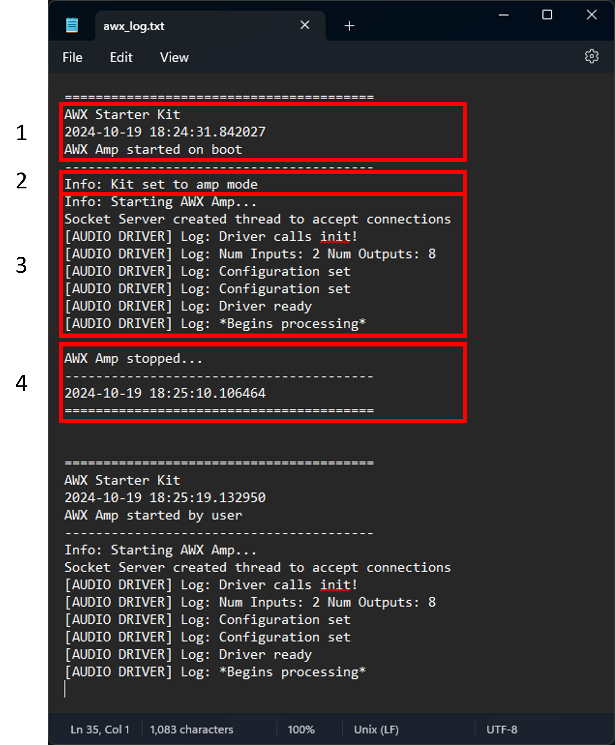
The Starter Kit produces logs at different points showing information on boot times, the AWX Amp application start and stop times and includes logs from the AWX Amp application showing initialization and configuration statuses during the audio driver setup and writes them into a file named awx_log.txt in the Starter Kit. This file can be fetched from the Starter Kit using Remote > Fetch Logs in the SKUtilityGUI, or by running the command python3 SKUtility.py rmt -flog.
Following figure shows an example log file in the Starter Kit.
AWX Amp Application Logs
The above figure shows 4 parts in a log:
Start Time: This part of the log shows the boot time and date if the log was generated at boot time, or the start time and date of the AWX Amp application if the amp was reset or started using the Starter Kit Utility. The first half (highlighted text) shows logs generated on boot, and the second half shows logs generated at amp reset by the user (notice the text “AWX Amp starter by user”).
Amp Mode: This part shows the mode in which the Starter Kit is configured. This text is only shown at boot time and not when the amp is started using the Start Kit Utility, as shown in the second half of the figure.
AWX Amp Application Logs: This part of the log shows logs generated by the AWX Amp application, which includes logs from the amp front-end, audio driver, etc. Logs related to SFD initialization from the xAF framework can be found in the other log file (VirtualAmpLog.txt), which is downloaded along with the awx_log.txt file.
AWX Amp Stop Time: Finally, the last part of the log indicates the stop time of the AWX Amp application. Note that this part of the log will not be printed if the Starter Kit is abruptly powered off or shutdown while the AWX Amp application is still running.
The latest logs are written to the end of the file. The above figure shows that the amp may be running since the end of the log file has logs from the AWX Amp application and not the stop time.
Running the “Reset All Configurations” command will remove all log files on the Starter Kit hardware. Before resetting configurations, it is recommended that a snapshot is taken using Remote > Snapshot in the SKUtilityGUI or fetch the log files using Remote > Fetch Logs.
Reporting Issues
For reporting issues related to the AudioworX Starter Kit, write to AudioworXSupport@harman.com with the following information:
Subject line — “AudioworX Starter Kit – short description of the issue faced”
Detailed description of the issue.
Attach the following files (if any).
The GTT project file (.gttd) used, which can be exported from GTT (File > Export Project).
Snapshot of the flash files on the Starter Kit hardware which can be generated using Remote > Snapshot in the SKUtilityGUI, or the command python3 SKUtility.py rmt -snp. The snapshot will be downloaded to “C:\ProgramData\Harman\StarterKit”.
The AudioworX Starter Kit is a complete hardware setup that provides a comprehensive experience of AudioworX and its features with minimal setup time. The Starter Kit, much like other AudioworX amplifiers, depends on the Global Tuning Tool (GTT) Windows application for designing signal flows, sending them to the target amplifier, tuning in real-time, selecting presets, etc. The Starter Kit offers a smooth onboarding experience into AudioworX workflows by simplifying steps for integration into an audio system using commonly available hardware components and supplementary software tools.
This document is a comprehensive guide on using the AudioworX Starter Kit as a target amplifier. It includes detailed setup instructions, connection diagrams, software installation steps, GTT integration for signal flow design and tuning, and troubleshooting tips.
Fully packaged AudioworX Starter Kit (hardware components, accessories, etc.) is currently available on request and the rest of this document addresses those users who possess the Starter Kit package directly received from Harman AudioworX. To request for an AudioworX Starter Kit package, please write to AudioworXSupport@harman.com.
Alternatively, users who may be interested in assembling their own Starter Kits from scratch may refer to Assembling and Configuring Starter Kit Components for instructions.
The AudioworX Starter Kit also has developer options enabling algorithm developers to build and test custom Audio Objects in AudioworX. This feature requires a special license which may be requested by writing to AudioworXSupport@harman.com.
For more details, you can refer below video explaining overview of the AudioworX Starter Kit, showing its hardware and software components, use cases and capabilities.
The AudioworX Starter Kit consists of hardware and software components which require basic setup before being able to function as a target amplifier that can interact with GTT. The following sections highlight them and provide steps for installation.
The AudioworX Starter Kit package consists of the following hardware components:
Raspberry Pi 5 8 GB RAM variant (low-cost pocket-sized Linux computer),
27 W power adapter for the Raspberry Pi (USB Type-C),
Micro SD Card with custom 64-bit Raspbian OS image (plugged into the Raspberry Pi 5),
HiFiBerry DAC8x (Includes 4-stereo 3.5mm line audio output ports) mounted on the Raspberry Pi 5,
HiFiBerry ADC8x Add-on (Includes 4-stereo 3.5mm line audio input ports) mounted on the Raspberry Pi 5,
6-channel power amplifier with power supply for passive speaker setups (JBL DSP 4086or equivalent),
Ethernet cable for connecting the Raspberry Pi 5 to the PC (recommended).
For the full Starter Kit experience, the user is expected to have access to:
Speakers for audio output (6 passive speakers or 8 active speakers),
A stereo analog audio source (PC or mobile phone with audio out).
The power amplifier is only required if the speakers being used for audio playback are passive. For active speaker setups (powered speakers), the Starter Kit can be used without the amplifier. Refer to Hardware Components Setup for more details.
Software Pre-requisites
The following is a list of software applications to be installed on a Windows PC to use the Starter Kit:
Download and install the above-mentioned pre-requisites on a Windows PC. For steps on how to install GTT and its pre-requisites, refer to Installing AudioworX Setup.
The GTT installation includes the AudioworX Starter Kit Utility tool (SKUtility), a graphical application that can be used to remotely operate the Starter Kit hardware over the network, for actions like verifying hardware connections, audio device configuration, resetting the AWX Amp application running on the Raspberry Pi, rebooting the Raspberry Pi, etc. This tool is described in detail in SKUtility Tool – Graphical Application and can be found in the following directory (default GTT installation folder):
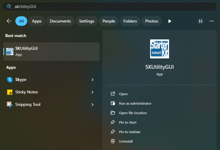
The SKUtility tool can also be accessed directly from the Start-Menu by pressing the “Windows” key on the keyboard, followed by the keyword “SKUtilityGUI”. Below is a screenshot showing the same.
The SKUtility Tool is also available as a command-line application written in Python 3.12, installed in the same directory as the graphical application. For more information, refer to Starter Kit Utility Tool (SKUtility) Overview.